Explore print ads known for sharp ideas, visual craft, typography, and powerful one-frame storytelling across magazines and newspapers.



Paradise Hill

Paradise Hill
Paradise Hill is a striking print campaign launched in New Zealand in August 2015 for Home Magazine, crafted by the renowned ad agency FCB. Positioned within the media industry, this campaign leverages a singular, impactful media asset to capture the essence of Home Magazine’s brand identity, appealing to a discerning audience seeking inspiration and insight into modern living spaces. The creative approach blends compelling visuals and sophisticated messaging to elevate the magazine’s presence in a competitive marketplace, reinforcing its authority and relevance. The campaign’s timing and location were strategically chosen to resonate with the evolving tastes and lifestyle aspirations of New Zealand’s readership during that period. By utilizing print as the primary medium, Paradise Hill effectively harnessed the tactile and immersive qualities of physical media, creating an intimate connection with the target audience. This campaign stands as a testament to FCB’s expertise in delivering elegant and memorable advertising solutions tailored to the unique demands of the media sector. Regarding the requested JSON metadata for the associated YouTube video, the following structure can facilitate information extraction: { "title": "Paradise Hill – Home Magazine Print Campaign", "brand": "Home Magazine", "agency": "FCB", "country": "New Zealand", "date": "August 2015", "industry": "Media", "medium": "Print", "media_asset_count": 1 }.
Yellow short stories - Cervepar | Clapboard Ad Archive
Yellow short stories marks a bold intervention by Cervepar and Ogilvy in Paraguay’s public interest advertising landscape, using the familiar vehicle of print news to challenge pervasive stereotypes about national reading habits in 2014. The campaign’s central creative gambit—embedding brief classics of world literature into the tabloid pages of Diario Popular as if they were lurid, sensationalist headlines—ingeniously hijacked the mechanics of yellow journalism to change habits rather than headlines, smuggling canonical narrative into the country’s most accessible media touchpoint. What Clapboard’s taxonomy would classify as FORMAT#12—Parody or Borrowed Format—this execution leverages the trust and reach of tabloid reporting only to subvert expectation, reframing stories of intrigue, betrayal, and redemption from the literary canon in the tropes and typography of urgent local news, thus neutralizing the typical barriers that keep classic fiction confined to the classroom or the elite reader. Far from a dry literacy push, the campaign recognizes and gamifies the public’s appetite for drama, offering Paraguayans who may never have chosen to pick up a novel the unexpected thrill of immersion in timeless tales—without signaling education or patronizing its audience. This creative approach not only reframed the role and relevance of classic literature in everyday Paraguayan life but also succeeded in making reading cool, participatory, and communal for over a million people, many encountering literature in this form for the first time. In leveraging anthropology as much as advertising, Cervepar and Ogilvy demonstrate a precise understanding of medium, message, and audience: by blurring entertainment with edification in a context built for maximum engagement, they invite population-wide reappraisal of both reading and news consumption. The Print medium’s tactile immediacy amplified the campaign’s impact, fostering cultural reappraisal at the intersection of mass communication and personal discovery. In a public service market category often marked by self-seriousness or didacticism, Yellow short stories proves the elasticity of format and audience appetite when creative technique is fused to local insight. Clapboard rates this 69/100. For the category and beyond, Yellow short stories matters because it proves that even the most entrenched cultural assumptions are malleable when context, creativity, and cultural fluency converge.
Inspired by nature - Batavo | Clapboard Ad Archive
Batavo’s Inspired by nature campaign, developed by NBS for the Brazilian market in the Food & Drink category in 2012, signaled a decisive creative shift for dairy branding through its striking print execution that literally harnessed nature as both subject and medium. As consumer appetites shifted toward authenticity, Batavo’s core message centered on the claim that its dairy products derive from natural inspiration, an idea visually encapsulated by using natural paints crafted from fresh fruits to build not just the campaign’s aesthetics but its very argument for purity. Eschewing direct narrative, demonstrations, or the reliance on celebrity or testimonial devices, the work instead focused on an arresting symbolic linkage between the literal process of the ad’s creation and the promised virtues of the brand: just as fruit pigments yield organic and vivid art, Batavo’s products extend nature’s integrity to the table. This approach sits squarely within what Clapboard’s taxonomy identifies as FORMAT#9—Symbolize the Benefit, leveraging visuals as persuasive metaphor with the fruit-based paints standing in for the wholesome, unprocessed ingredients consumers increasingly seek. By fusing creative technique with product DNA, NBS and Batavo created a piece in which the media and message were indivisible, setting the brand apart in a saturated dairy market fixated on faux-natural language but rarely committing at the executional level. Against the backdrop of intensifying health, wellness, and sustainability trends, the campaign’s uncompromising use of natural materials for the ad’s palette became its own proof—a sensory alignment that deepened perceived trust and differentiation while sidestepping the industry’s typical reliance on artificiality or overpromise. This creative clarity not only reinforced Batavo’s positioning as a nature-inspired pioneer, but also underpinned a broader brand ambition: to make naturalness measurable, seen, and felt at every touchpoint. Clapboard rates this campaign 63/100. For brands seeking to move the natural foods conversation from abstract claims to tangible experience, Batavo’s Inspired by nature marks a significant case study in how substance, medium, and message can be made inseparable when amplified with single-minded creative purpose.
The hidden ad - Mortein | Clapboard Ad Archive
The hidden ad for Mortein, created by Havas and launched in Brazil in Year: 2015, stands out as a compelling exercise in visual subtlety for the House and Garden category, leveraging the core truth that household threats often exist unseen until their effects become uncomfortably clear. By threading its message through the everyday domestic environment, the campaign reframes pest control as a foundational—if almost invisible—component of modern home life, framing Mortein not just as a reactive purchase but as an ongoing household guardian. The print execution resists the urge toward scare tactics or direct confrontation, instead opting for a creative direction that asks viewers to look twice, echoing the way pests manifest: quietly and without warning, compounding the sense of security that Mortein provides in the background of daily life. In both art direction and narrative concept, the work exemplifies what Clapboard’s taxonomy describes as FORMAT#3—Symbolize the Problem, employing metaphor and visual analogy to represent the domestic risk Mortein addresses rather than depicting it literally, which sharpens the consumer understanding of why vigilance—like effective pest solutions—often goes unrewarded when done well. Through its single, tightly crafted visual asset, the campaign ensures the brand infiltrates consumers’ consciousness in the same way pests do—without overt disruption, but with lasting effect—making it clear that true household comfort extends beyond what is readily seen. Where many category peers lean on overt dramatisation, The hidden ad sets itself apart by trusting the viewer’s intelligence to connect the metaphorical dots, and through this restraint, transforms Mortein from a last-resort remedy into an essential, proactive partner in domestic wellbeing. The campaign has earned a Clapboard score of 63/100. By fluidly integrating product relevance with creative symbolism, The hidden ad signals a growing sophistication in house and garden advertising, where brands must capture not just attention, but also the deeper anxieties and motivations of contemporary homeownership.
Everything described - Accessible Media | Clapboard Ad Archive
Accessible Media’s Everything Described campaign, created by TBWA and launched in Canada in 2015, tackled a brief both uniquely challenging and intrinsically meaningful within the public service sector: make television accessible—by design—for blind audiences. Confronting the paradox of reaching one of advertising’s most difficult-to-contact demographics through a print medium, the campaign directly foregrounded Accessible Media Inc.’s core innovation: audio-described video content that unlocks conventional television for those who cannot see. Steering away from the emotional gravitas or personal storytelling approaches common to the category, TBWA deployed an execution squarely in what Clapboard’s taxonomy would classify as FORMAT#1—Demonstration, using the print platform to explicitly convey, both conceptually and functionally, how described video works and why it matters. The campaign’s central creative device distilled the brand’s promise down to a single, potent visual element, which elegantly dramatized the act of describing imagery, both simulating and explicating for the sighted what blind audiences experience and, crucially, what Accessible Media provides. In eschewing metaphor and abstraction for direct exposition, Everything Described not only demonstrated inclusivity as a product feature but also reframed accessibility as an essential, mainstream expectation rather than a marginal service. Rooted in a refined messaging strategy and an uncluttered graphic approach, the campaign reinforced Accessible Media’s leadership within the accessibility landscape while normalizing adaptive media practices for a broader Canadian audience. This clarity served both the mission and the medium: the audience receives not a plea for sympathy but an unambiguous invitation to participate in equal entertainment. The campaign earns 63/100 in Clapboard’s global creative archive. As industry conversation around universal design gains velocity, Everything Described stands as a benchmark for how purposeful, audience-first communication can shift accessibility from afterthought to baseline.
Ripped - Humanoide | Clapboard Ad Archive
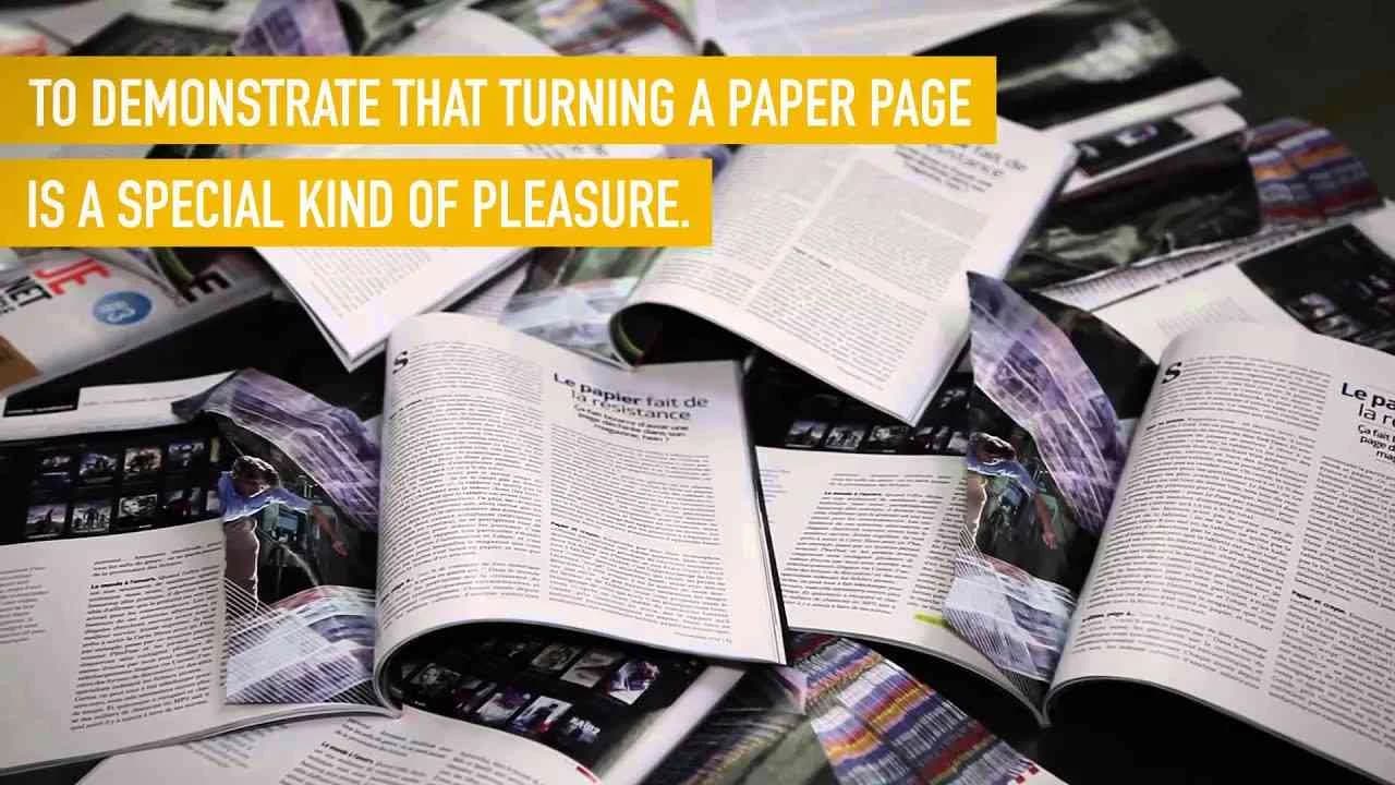
Glory Paris’ campaign for Humanoïde, launched in France in Year 2015, is an audacious and poetic intervention at the uneasy intersection of technology journalism and material culture, executing a singular creative act that transforms absence into meaning. By physically tearing out a single page from every copy of Humanoïde’s third issue—a print magazine dedicated to exploring technology’s impact on society with the deliberately provocative tagline technology is the opium of people—the campaign puts into striking focus the irreplaceable tactile satisfaction of the printed page at the precise moment when print is perpetually pronounced endangered. Glory Paris disrupts the anticipated experience of a flawless, complete publication, prompting immediate, visceral awareness of loss: that missing leaf becomes a direct analogy for the gradual erosion of analogue and paper-based pleasures in a culture increasingly dominated by digital formats. Rather than harping on nostalgia or enumerating the virtues of print, this concept leverages what Clapboard’s taxonomy would classify as FORMAT#3—Symbolize the Problem—converting the missing page from a flaw into a case study of cultural scarcity, transforming what could be perceived as damage into a highly shareable conversation-starter about the media landscape and the value of sensory engagement. In Humanoïde’s context, this gesture resonates with special acuity given that the publication itself, by its very subject matter, might logically be expected to exist solely online—yet persists on newsstands, guided by editorial ambition to challenge the digital determinism surrounding technological innovation and its societal impacts. The campaign’s inclusion of a feature by acclaimed novelist Laurent Gaudé on the intimacy of paper for writers enriches the message, anchoring a critical, artistic perspective within the magazine’s forward-facing, tech-literate identity. The act of selling an intentionally incomplete product courts both discomfort and desire: it denies readers an expected satisfaction while also reminding them, palpably, of what would be forfeited if the physical artifact were lost altogether, and in doing so, affirms paper’s enduring ability to provoke emotion and debate in the face of seamless, sterile digital interaction. With the campaign targeting the Media and Entertainment market category—speaking to a generation that is as likely to swipe as to turn—Glory Paris crafts a brand moment that forces a collective reconsideration of what constitutes completeness and value in the magazine experience. The campaign earns a score of 63/100 in Clapboard’s global creative archive. In an era when symbolic acts can recalibrate industry debate, Glory Paris’ work for Humanoïde reminds brands and publishers that sometimes provoking a sense of real loss is the most incisive way to spark appreciation for what endures.
Lucy - Elmsta 3000 Horror Fest | Clapboard Ad Archive
Lucy is Saatchi & Saatchi’s entry into the print campaign lexicon for Elmsta 3000 Horror Fest, engineered in Sweden in 2015 to elevate the festival’s stature within the Nordic recreation and leisure category through genre-savvy communication. Built on a single print execution, Lucy leverages the iconography and narrative hallmarks of classic horror cinema to immerse audiences and stir anticipation, all in keeping with the festival’s identity as a locus for horror aficionados. The campaign zeroes in on suspense and menace, constructing a visual and textual tableau in Swedish that hints at narrative backstory—effectively forging a sense of foreboding before the audience even sets foot in the event. Saatchi & Saatchi’s creative device situates the work squarely within what Clapboard’s taxonomy would classify as FORMAT#12—Parody or Borrowed Format, drawing on the tropes, moods, and semiotics of horror films to both pay homage and craft a distinct brand mythos for Elmsta 3000. By subverting or stylizing recognizable genre codes, Lucy positions the festival as not just an event, but a cultural moment attuned to its audience’s appetite for layered references and genre literacy, an approach that feels both contemporary and steeped in tradition. In a time when digital campaigns dominate the entertainment space, the use of print as the sole medium for Lucy is an intentional counter-current, signaling a commitment to impact through tactile, bold, and suspense-laden storytelling that lingers in the imagination of those who encounter it. The campaign’s reach, driven by the strength of its creative proposition and its alignment with the festival’s brand DNA, reinforces the strategic capacity of well-executed print campaigns—even in niche verticals deeply reliant on experiential promise and fan community. Clapboard rates this 63/100. As festivals and leisure experiences increasingly blur the line between event marketing and transmedia storytelling, Lucy signals how astute genre borrowing can crystallize a brand’s allure while stoking collective anticipation in even the most selective audience segments.
0.99 - SOS Children's Villages | Clapboard Ad Archive
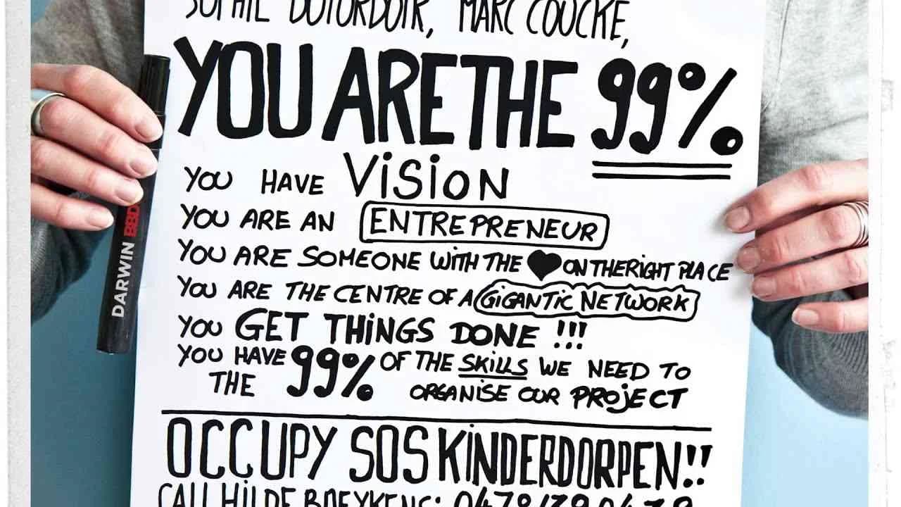
SOS Children's Villages' 99% campaign, created by BBDO in Belgium for the public service sector in 2013, represents a sharp recalibration of fundraising strategy through meticulously focused, high-stakes targeting. When the charity faced the colossal task of renovating Chantevent—Belgium's largest SOS village, a network of clustered homes providing vital, family-based care for abandoned children—the organization eschewed traditional mass-market appeals in favor of isolating their appeal to six captains of industry whose personal involvement could transform the project virtually overnight. This decision to sidestep mainstream outreach channels, recognizing their ineffectiveness with such an inaccessible, influential audience, led to a creative solution that wields symbolic communication as its primary lever; the entire concept orbits the stark figure 99%, a compelling visual metaphor reflective of the vast number of people unable to help at scale, framed against the pivotal 1% whose engagement might alone close the funding gap. Rather than illustrating hardship or soliciting wide empathy, the campaign repurposes the language of exclusivity so often associated with luxury or membership to convey the unique weight of responsibility—and opportunity—resting on these few targeted individuals. In alignment with what Clapboard's taxonomy would classify as FORMAT#3—Symbolize the Problem, the campaign eschews overt narratives for a conceptual device that signals urgency, scarcity, and the high cost of inaction through absence rather than presence. The single print asset embodies this reductive, minimalist strategy: a statement not just of need, but of precise intentionality, foregrounding the outsized consequence one decision can accrue in the third sector. By inviting the select few into a role that the other 99% cannot fill, the campaign deftly subverts the conventions of public service communications, leveraging a sense of rarefied duty while maintaining clarity and relevance for its hyper-specific audience; the resultant effect is equal parts motivator and challenge, transforming philanthropic inertia into prospective legacy. Clapboard rates this 64/100 in its global creative archive. As one of the more conceptually assertive efforts in targeted nonprofit fundraising, 99% matters to the industry because it demonstrates just how powerfully the lever of symbolic focus can raise the stakes—and the standards—for advancing urgent causes in an environment saturated by generic outreach.
Responsive print ad - Correio da Manhã | Clapboard Ad Archive
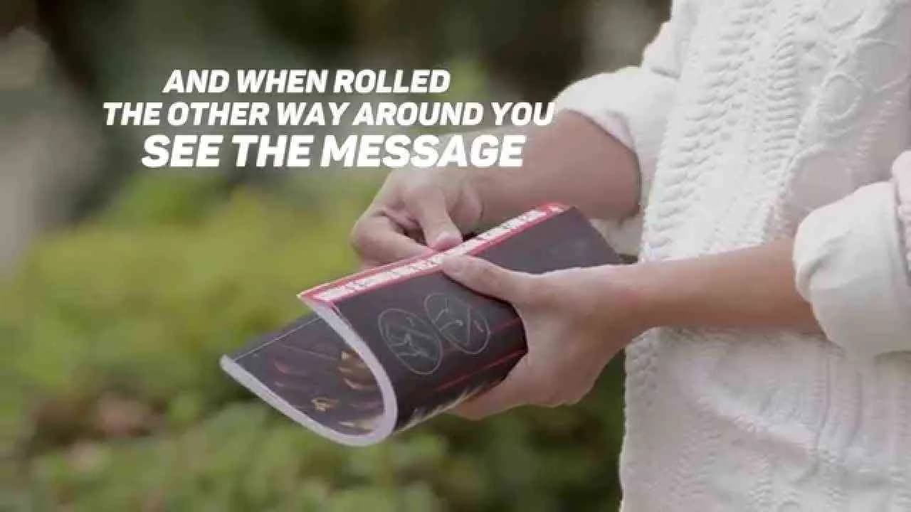
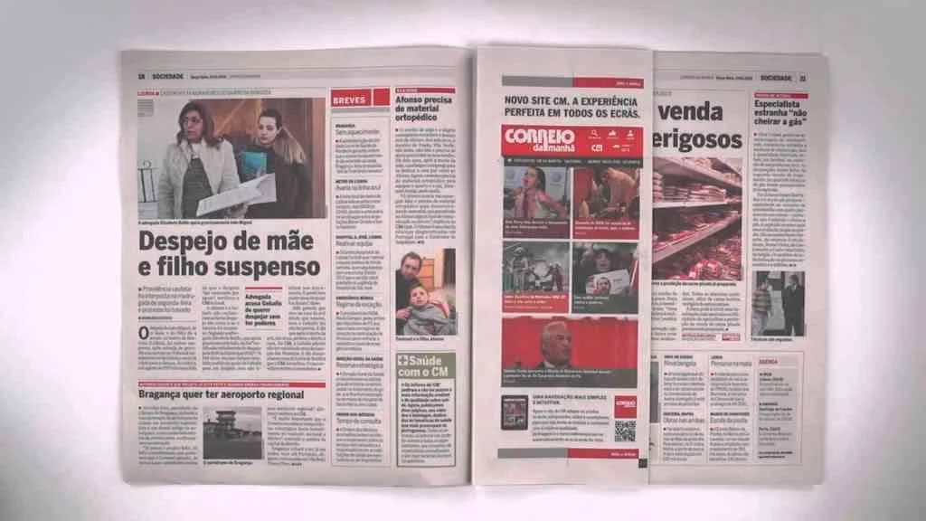
Correio da Manhã’s 2015 print campaign, Responsive print ad, stands as a pointed demonstration of how legacy media brands can retool classic formats for the digital paradigm, enlisting Ogilvy to deliver a tactile metaphor for digital responsiveness that is both conceptually sharp and visually decisive. The idea is direct: as Correio da Manhã launched its new website, Ogilvy engineered a print ad whose content physically morphs as readers fold the page, precisely mirroring the adaptive logic of web pages across devices. Each fold transforms the available space, and with it, the ad’s information layout—just as websites seamlessly resize from desktop to tablet to smartphone, so too does this single printed sheet. This analog responsiveness operates as a clear, hands-on demonstration of the site’s fluid accessibility, ensuring that media category readers experience firsthand how the brand’s new digital presence puts content at their fingertips in every context. Positioned squarely in what Clapboard’s taxonomy classifies as FORMAT#1—Demonstration, the work avoids narrative extras or symbolic overtures, preferring a pure product interaction that gets out of its own way: the paper doesn’t hint, explain, or sell, it simply does, unmistakably showing the principle of digital-age customization transposed into print. This creative move both signals Correio da Manhã’s responsiveness to shifting reader behaviors and underscores the enduring malleability of the print medium in the face of digital ascendancy. Ogilvy’s solution is notable for its selectivity—a single asset, focused execution, zero reliance on celebrity or story—and so every element serves the core message: the platform is new, accessible, and now optimized for all devices, an invitation and a proof-of-concept delivered in one moment. By reducing the theme of digital transformation to an intuitive, paper-based interaction, the campaign finds resonance in the lived experience of its newspaper audience, bridging the abstract with the physical and making the prospect of change not just real but playful. The campaign earns 73/100 in Clapboard’s global creative archive. This campaign matters to the industry because it proves that even traditional formats have the capacity for direct, demonstrable innovation when brands approach category conventions with a digital-first mindset.
Sony Sideline Challenge - Sony | Clapboard Ad Archive
Sony’s Sideline Challenge, developed with FCB for the Alpha6000 Cyber-shot in 2015, stands as a distinctively audacious move within the electronics sector, repositioning the expectations of both amateur photography and product demonstration. The central campaign idea leveraged a direct invitation: ordinary New Zealanders, not credentialed photographers, were handed the new Alpha6000 and tasked with capturing six of the biggest sporting events in a single weekend, a campaign concept that transformed the national newspaper — New Zealand’s largest — into the ultimate stage for proof over promise. When the Monday edition appeared, the results were unmissable: for the first time in the paper’s 150-year history, amateur action shots entirely replaced the traditional output of professional sports photographers, each visually rich image doubling as a piece of native advertising that spoke powerfully to the Alpha6000’s advanced performance and accessibility. This mechanism goes beyond conventionally staged endorsements and sits squarely in Clapboard’s FORMAT#1—Demonstration category, as real users, in high-stakes live environments, validated Sony’s claim that its midpriced mirrorless rivals expensive DSLRs in speed, clarity, and handling. By contextualizing these amateur-captured photos within the credibility of trusted editorial space, the brand moved past hyperbole to a transparent, consumer-driven narrative, garnering a 240% surge in web traffic and an emphatic 74% increase in market share for the Alpha6000. With FCB’s guidance, Sony precisely targeted a market dynamic increasingly wary of unauthentic messaging, turning conventional sports page advertising both on its head and into a living, photographic product trial. In a crowded field where brands like Canon tout professional-grade innovation, Nikon leans on heritage, and Fujifilm underscores creative aesthetics, Sony’s approach reframed the conversation by collapsing the perceived distance between pro gear and consumer access — a direct demonstration given cultural currency and press legitimacy. Clapboard rates this 82/100. What makes this campaign matter is not simply its tactical execution, but its signal that the future of product demonstration in technology marketing may best be staked on authentic, high-stakes public proof rather than aspirational narrative alone.
The last family portrait - WATERisLIFE | Clapboard Ad Archive
The last family portrait from WATERisLIFE, devised by Deutsch for the United States market in 2015, stands as a haunting meditation on the stakes of water insecurity within public service marketing. Using the emotionally universal tradition of family photography, the campaign transforms a minimalist print execution into social commentary, enlisting the cultural gravitas of a family portrait to dramatize not a moment of celebration, but a potential final chapter brought on by unsafe or unavailable water. With its documentary and social experiment cues, the work transcends functional messaging by presenting the family portrait as a symbol; rather than confronting audiences with direct imagery of illness or statistics, it instead freezes families at the precipice of loss, prompting a visceral emotional response to the abstract tragedy of water scarcity. This technique, positioned in what Clapboard’s taxonomy classifies as FORMAT#3—Symbolize the Problem, extends beyond literal storytelling to foster contemplation, empathy, and urgency, convincingly underlining WATERisLIFE’s brand mission as a humanitarian catalyst. Deutsch injects the print medium with gravitas, targeting a socially conscious American audience likely to be moved by humanitarian challenges that intersect with universal values—family, continuity, and collective responsibility. In a landscape where other water charities champion transparency, innovation, or infrastructural sustainability, WATERisLIFE uses the deeply relatable fear of family dissolution to cut through compassion fatigue and data-driven detachment, rendering a global crisis immediate and near. The campaign’s restraint in visual language—eschewing overt distress in favor of metaphor—invites audience projection and emotional participation, a strategy that foregrounds the public interest category’s core communication challenge: converting sentiment into advocacy and eventual action. By using the language of memory and loss, the campaign compels Americans to see water not as an abstract overseas issue, but as a force with the power to fracture something as fundamental as the family unit. Clapboard rates this 63/100. In bringing an intimate lens to an urgent social issue, the campaign reminds the industry that the most effective public service creative often renders the global existential by making it painfully personal.
Waterproof - Adolfo Dominguez | Clapboard Ad Archive
Adolfo Domínguez’s Waterproof campaign, created with CHINA part of LLYC, propels the Spanish fashion house’s message of conscious longevity into sharper focus for 2025 as it debuts across Brazil, Mexico, Spain, and in-store touchpoints in over 50 countries. Anchored by the bold platform Sé más viejo (Be Older), the campaign uses waterproofness as a vividly cinematic metaphor for resilience against the relentless churn of disposable, trend-led fashion — a symbolism brought to life by UFC champion Ilia Topuria, whose soaked presence in the brand’s garments visually signals endurance and defiance. Choosing the iconic song Resistiré as its soundtrack, Waterproof audibly cements a narrative of strength and perseverance, amplifying the emotional impact for audiences fatigued by fast fashion’s impermanence. The creative strategy goes beyond product demonstration, instead leveraging what Clapboard’s taxonomy classifies as FORMAT#9—Symbolize the Benefit, using exaggerated visuals and metaphors to highlight the positive effects of investing in timeless, purposefully crafted clothing. The juxtaposition of archive pieces from Adolfo Domínguez’s inaugural collections with the latest designs, charged by a palette of vibrant color and texture, bridges heritage and contemporary relevance, positioning the brand as an industry outlier championing a considered, sustainable wardrobe. By deploying an integrated mix of digital, outdoor, and print media, Waterproof achieves wide cultural penetration and anchors the Sé más viejo mindset as a distinct alternative to fast fashion—challenging consumers to think differently about longevity, value, and personal style within the apparel category. The campaign signals Adolfo Domínguez’s intent not just to sell garments but to provoke a cultural reset around fashion consumption, adopting the language of resistance to guide a new generation toward mindful purchase decisions. Clapboard rates this 61/100. For an industry reckoning with its own environmental legacy, Waterproof demonstrates that the strongest brands are those unafraid to champion countercultural ideals when connecting purpose, heritage, and creative vision.
.webp)
Creative Collaboration Platform: The Backbone of Modern Creative WorkWhat is a creative collaboration platform?Clapboard defines a creative collaboration platform as the operational core for today’s distributed creative teams. This is not a collection of digital collaboration tools stitched together; Clapboard’s system
Understanding the Creative Production MarketplaceWhat is a Creative Production Marketplace?Clapboard defines a creative production marketplace as a structured ecosystem where brands, agencies, and production talent converge to execute video, advertising, and branded content at scale. Unlike the legacy agency or freelanREAD FULL ARTICLE
The Urgent Need for a Creative Production Operating SystemWhy Traditional Creative Production Models Break DownClapboard sees the creative production landscape shifting under pressure. Content velocity is no longer a buzzword—it’s a mandate. Modern advertising demands relentless output across dozens of channels, each wREAD FULL ARTICLE