
Varun Katyal | Founder, Clapboard
Varun Katyal is the Founder & CEO of Clapboard and a former Creative Director at Ogilvy, with 15+ years of experience across advertising, branded content, and film production. He built Clapboard after seeing firsthand that the industry’s traditional ways of sourcing talent, structuring teams, and delivering creative work were no longer built for the volume, velocity, and complexity of modern content. Clapboard is his answer — a video-first creative operating system that brings together a curated talent marketplace, managed production services, and an AI- and automation-powered layer into a single ecosystem for advertising, branded content, and film. It is designed for a market where brands need content at a scale, speed, and level of specialization that legacy agencies and generic freelance platforms were never built to deliver. The thinking, frameworks, and editorial perspective behind this blog are shaped by Varun’s experience across both the agency world and the emerging platform-led future of creative production. LinkedIn: https://www.linkedin.com/in/varun-katyal-clapboard/

How Color Symbolism Drives Emotional Impact
Understanding the Power of Color Symbolism
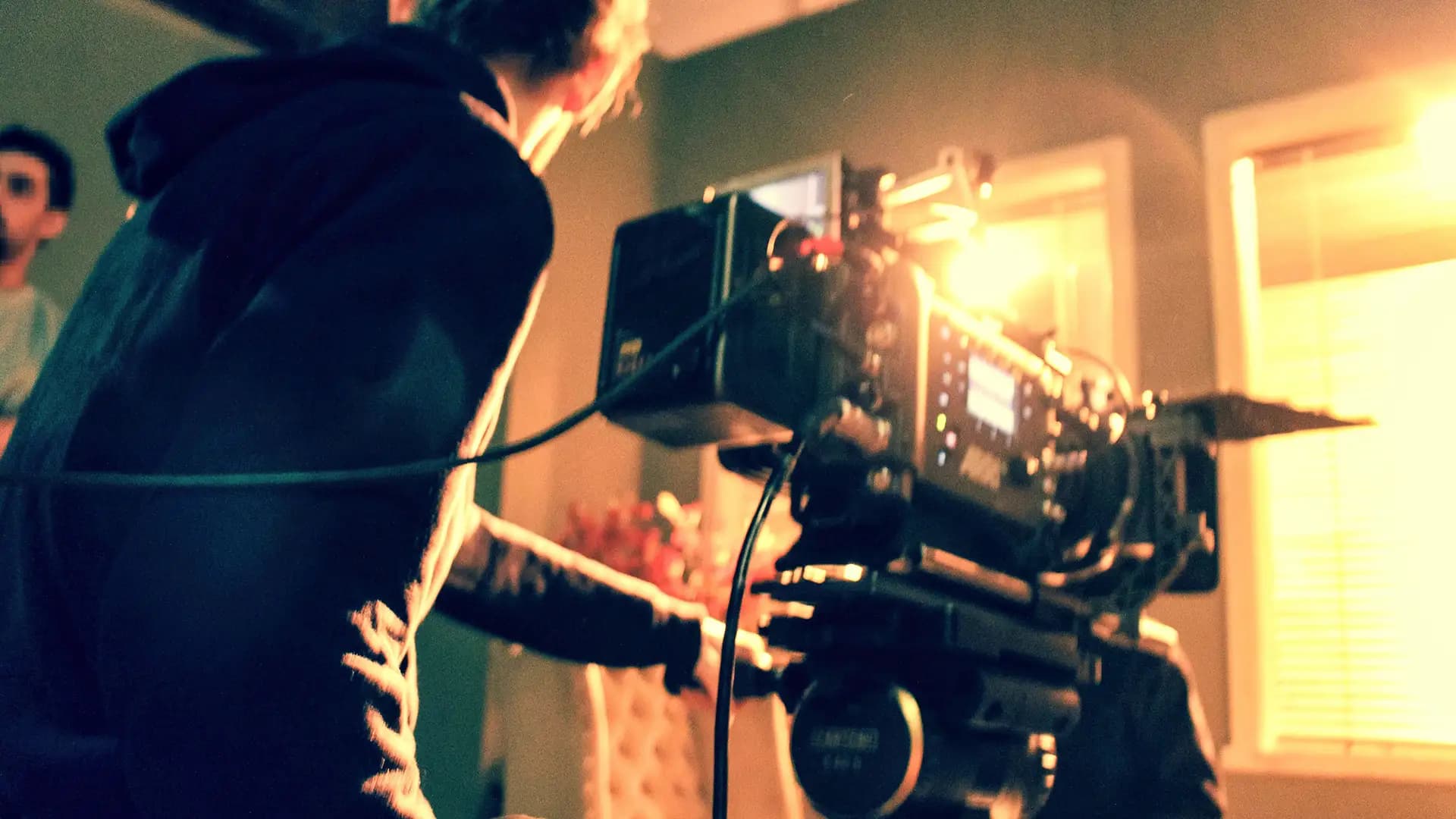
Color symbolism is not window dressing. It’s a core narrative device, as fundamental as casting or location. On set, every color choice—whether in wardrobe, lighting, or production design—carries a psychological payload. Audiences read these signals instinctively, often before a line is spoken. The right hue can telegraph subtext, set expectations, or destabilize them. In a saturated visual landscape, color symbolism is a director’s and cinematographer’s silent collaborator, shaping story beneath the surface.
Emotional Responses Triggered by Color in Storytelling
The emotional symbolism of color is hardwired into our perception. Red, for example, signals urgency, danger, or passion—think of the way a splash of red in an otherwise muted frame draws the eye and tightens the viewer’s pulse. Blue, by contrast, calms or distances, often used to evoke melancholy or introspection. Yellow can inject optimism or unease, depending on saturation and context. These associations aren’t arbitrary; they’re the result of both evolutionary responses and cultural reinforcement. In commercial work, a brand’s signature color isn’t just a logo—it’s an emotional shortcut, priming the viewer’s reaction before a product is even named.
Color Symbolism Across Cultures and Genres
Context is everything. Color symbolism is not universal. White, for example, reads as purity or new beginnings in Western narratives, but it can signal mourning in parts of Asia. Green might evoke envy or inexperience in one story, renewal or prosperity in another. Genres also dictate color codes: horror leans into desaturated palettes and sickly greens to unsettle, while romantic comedies flood the frame with warm, inviting tones. Effective use of color psychology in stories requires more than taste—it demands an awareness of the audience’s cultural and genre expectations, and the nerve to subvert them when the story calls for it.
Guiding Audience Perception Through Visual Symbolism
The most effective visual symbolism is deliberate. On a practical level, this means collaborating closely with production designers and colorists, mapping emotional beats to color arcs. A shift from cool to warm lighting can mark a character’s emotional thaw. Strategic use of recurring colors—a protagonist’s red scarf, a villain’s sterile blue environment—anchors themes and guides the audience’s subconscious. But restraint is key. Overloading a frame with symbolic color dilutes its impact. Each choice must earn its place, supporting narrative intent rather than overwhelming it.
Practical Considerations for Using Color Symbolically
Intentional color symbolism demands technical rigor. Lighting conditions, camera sensors, and post-production workflows all shape how color is rendered and perceived. A red dress under tungsten light reads differently than under daylight LEDs. Color grading can amplify or mute emotional symbolism, but only if the onset choices are precise. Creative leaders must also consider deliverables—streaming platforms, social feeds, and out-of-home screens all shift color fidelity. The craft lies in making color symbolism resilient across formats, ensuring the emotional signal survives from monitor to audience.
For practitioners, color in film is not an afterthought—it’s embedded in every creative decision. Harnessing color symbolism with intention transforms mood and tone, elevating the work from visually competent to emotionally resonant.
What Are the Main Types of Symbolism?
Overview of Symbolism in Literature and Film
Symbolism isn’t window dressing. It’s the backbone of subtext in storytelling—those images, objects, or motifs that carry weight beyond their literal presence. When we talk about the types of symbolism, we’re talking about a set of creative levers that allow directors, writers, and cinematographers to load meaning into every frame or paragraph. Whether you’re crafting a commercial or a feature, symbolism in storytelling is how you get the audience to feel something before they consciously know why.
Defining Symbolism: Core Categories and Their Purpose
Let’s get precise. The symbolism definition, in practical terms, is the use of an element—visual, auditory, or conceptual—to represent something beyond itself. But not all symbolism is created equal. In narrative work, five principal forms of symbolism recur:
- Visual symbolism: The most immediate. Colors, shapes, and recurring images. Think of a character always framed by open doors—suggesting opportunity or escape. In film, this is where the camera and production design do their heaviest lifting.
- Conceptual symbolism: Abstract ideas embodied through theme or structure. This is less about what’s seen and more about what’s felt. A story about a crumbling building as a metaphor for a failing relationship is conceptual at its core.
- Character-driven symbolism: When a character’s traits, actions, or arc become emblematic of broader ideas—innocence, corruption, resilience. The protagonist isn’t just a person; they’re a vessel for something larger.
- Environmental symbolism: The world itself becomes a symbol. Weather, landscape, or cityscapes reflect internal states or narrative stakes. Rain isn’t just rain—it’s grief, rebirth, or cleansing, depending on context.
- Object-based symbolism: Props or items that accrue meaning through repetition or context. A locket, a broken watch, a red balloon—these objects become shorthand for memory, lost time, or freedom.
How Types of Symbolism Influence Storytelling
The forms of symbolism you choose define how an audience interacts with your work. Visual and object-based symbolism operate on a gut level—they’re immediate, almost primal. Conceptual and character-driven forms demand more from the viewer, rewarding close reading or attentive viewing. Environmental symbolism is the bridge, working on both conscious and unconscious levels. The best storytellers layer these types, creating resonance that lingers long after the credits roll or the campaign ends.
Symbolism isn’t just for art-house cinema or literary novels. In branded content, a recurring motif or color palette can shift perception and deepen engagement. In commercials, a single symbolic image can carry an entire campaign’s emotional weight. The main types of symbolism are tools—versatile, potent, and, in the right hands, transformative.
This section sets the foundation. Next, we’ll break down each category—visual, conceptual, character-driven, environmental, and object-based—showing how they function in real-world narrative devices and why they matter for anyone serious about craft. For a primer on the broader landscape, see our guide to symbolism explained.
Character Symbolism and the Art of Persona
How Characters Embody Symbolic Meaning
Character symbolism is not an academic exercise—it's a tool for encoding meaning directly into the DNA of a narrative. In both literature and film, characters and their attributes often become living symbols, carrying the weight of themes, ideas, or even entire worldviews. A character’s object, gesture, or recurring action can transform from mere detail into a shorthand for their internal journey or the story’s philosophical core. The feather in Forrest Gump is a textbook example: it’s not just a prop, but a visual metaphor for chance, fate, and the unpredictable arc of a life (StudioBinder, 2023). When a character’s choices or traits are charged with this kind of narrative symbolism, they operate on two levels—driving the plot and reinforcing the film’s deeper intent.
Symbolic characters are not always overt. Sometimes, it’s a subtle exaggeration—a costume detail, a repeated phrase, a posture—that signals a trait or theme. Think of the way innocence is telegraphed through wide, unblinking eyes, or how greed is rendered in a character who hoards, physically or emotionally. In ensemble casts, each persona can function as a symbolic node within a larger constellation, representing facets of the human experience or societal archetypes (Open Book Publishers, 2023). The best symbolic storytelling is rarely didactic; it operates through suggestion, letting the audience connect the dots and feel the resonance.
The Difference Between Archetypes and Character Symbolism
It’s easy to conflate archetypes with character symbolism, but the distinction matters for anyone serious about craft. Archetypes are recurring templates—The Hero, The Mentor, The Trickster—drawn from the collective unconscious and recognized across cultures. They provide a familiar foundation for audiences, anchoring stories in universal patterns. Symbolism, by contrast, is specific and contextual. A symbolic character is crafted to represent a particular idea, emotion, or transformation within a unique narrative environment. Where an archetype is a vessel, symbolism is the message inside it. Understanding this difference is essential for creative leaders who want to move beyond clichés and build characters that both resonate and surprise.
A symbolic character can begin as an archetype but gains depth when particularized—when the narrative assigns them a symbolic function that transcends their template. The “Shadow” archetype, for example, might symbolize personal guilt in one story, societal oppression in another. The key is to avoid letting archetypes do all the heavy lifting. Instead, layer in narrative symbolism that is organic to the world and the character’s arc. This is where character development becomes more than a checklist; it’s an act of authorship.
Techniques for Creating Symbolic Characters
Crafting memorable symbolic characters demands intentionality. Start by identifying the theme or idea you want to amplify. Then, choose traits, actions, or motifs that can carry that meaning visually or behaviorally. This doesn’t mean reducing a character to a single trait, but rather threading a symbolic logic through their journey. Use objects, recurring actions, or even the arc itself as vehicles for symbolism—always in service of the story, never at the expense of authenticity.
In practical terms, collaborate with every department. Costuming, set design, and even camera movement can reinforce character symbolism. A recurring prop, a color palette, or a blocking choice can all become part of the symbolic storytelling toolkit. The result: characters who are not just believable, but unforgettable—living, breathing symbols that challenge, reinforce, or subvert the themes at play.

Religious and Spiritual Types of Symbolism in Stories
When we talk about types of symbolism in storytelling, religious and spiritual motifs are where the stakes rise and the meanings deepen. These aren’t just set dressing or iconography for iconography’s sake. They’re loaded with centuries of interpretation, cultural memory, and existential questioning. The distinction is clear: religious symbolism is grounded in the formal language and imagery of established faiths—crosses, halos, mandalas—while spiritual symbolism is broader, more abstract, often personal or universal. Both, however, are used to interrogate faith, morality, and the metaphysical, inviting the audience to look beyond the literal and confront what they believe about the world and themselves.
Key Religious Symbols in Storytelling
Religious symbolism in narrative is never accidental. The cross isn’t just a geometric shape; it’s a visual shorthand for sacrifice, redemption, and the weight of history. The dove, the lamb, the burning bush—each comes pre-loaded with meaning, especially in Western storytelling, where Christian iconography dominates the visual and narrative vocabulary (Fiveable, 2023). But the palette is broader: in Islamic art, geometric patterns and calligraphy become vessels for the divine; in Hindu epics, the lotus and the river are recurring symbols of purity and transcendence. These symbols are not just decorative—they’re functional, guiding the viewer toward a deeper layer of interpretation.
Spiritual Symbolism and Its Narrative Power
Spiritual symbolism operates with more latitude. It doesn’t require alignment with a specific doctrine. Instead, it trades in the universal: the journey, the light at the end of the tunnel, the mountain as a site of revelation. These symbols tap into collective unconscious and personal yearning. A character’s walk through a desert isn’t just a plot device—it’s a metaphor for spiritual trial, emptiness, and transformation. This is the kind of symbolism that transcends religious boundaries and allows for audience projection, making the story resonate on a metaphysical level regardless of creed.
Navigating Sensitive Symbolic Themes
Deploying religious or spiritual symbolism is not without risk. The line between homage and appropriation is razor-thin, especially in a global media landscape. Symbols that carry sacred meaning for one group can come across as cliché, tokenistic, or even offensive when mishandled. The challenge is to avoid the trap of using these symbols as mere exotic garnish or narrative shortcuts. Authentic engagement with religious motifs demands research, respect, and clarity of intent. There’s also the risk of overloading a narrative with so much symbolic freight that the story buckles under its own allegorical weight.
But when done with care, religious and spiritual symbolism can bridge the physical and metaphysical, serving as a visual and narrative shorthand for complex ideas (Encyclopædia Britannica, 2023). The best work doesn’t just use symbolism for effect—it leverages it to ask bigger questions, to unsettle, and to provoke genuine reflection. On set, I’ve seen how a single symbolic prop or gesture can shift the emotional temperature of a scene, making the abstract tangible. For creative leaders, the lesson is simple: don’t reach for religious or spiritual symbols unless you’re prepared to reckon with the depth they bring. In the hands of a practitioner who respects their weight, these symbols aren’t just decorative—they’re transformative.
The Role of Nature Symbolism in Narrative World-Building
Nature symbolism is a director’s shortcut to deeper resonance. When deployed with intent, it does more than decorate the frame—it shapes the psychological terrain of a story. The natural world becomes a silent collaborator, embedding mood, foreshadowing shifts, and reflecting the inner lives of characters. In commercial and narrative work alike, the decision to foreground a looming thunderhead or a wilting flower isn’t arbitrary. It’s a calculated move to build narrative gravity.
Common Examples of Nature Symbolism
Weather is the most immediate tool in the box. Rain rarely just means rain; it signals cleansing, melancholy, or impending conflict. A sudden burst of sunlight in a grey landscape can mark hope or revelation. Landscapes themselves—dense forests, barren deserts, stormy seas—carry their own symbolic weight, often standing in for emotional states or societal forces. Flora and fauna round out the palette: a crow overhead, a field of wildflowers, the encroachment of ivy on stone. Each element can be tuned to reinforce or subvert expectation.
Using Environment to Reflect Character and Plot
Environmental symbolism is most effective when it mirrors or contrasts with character arcs. A protagonist in turmoil might be framed against a churning ocean, externalizing their inner chaos. Conversely, a character’s calm resolve might be underscored by the stillness of a frozen lake. The interplay between setting and mood is rarely accidental; it’s a form of visual subtext that sharpens both story and performance. In branded content, this can manifest as a product launch shot at dawn—signaling new beginnings—or a campaign set in a bustling city park to evoke vitality and community.
Nature Symbolism in Cinematic World-Building
Symbolism in setting is foundational to immersive world-building. Establishing shots do more than locate the action; they set the emotional and thematic stakes. The choice of natural imagery—mist rising over a valley, lightning splitting a night sky—tells the audience what kind of world they’re entering and what rules govern it. In genre work, these choices are heightened: the oppressive humidity of a southern gothic, the stark emptiness of a sci-fi wasteland. Even in commercial filmmaking, environmental symbolism signals brand values and aspirations without a word of dialogue.
Nature can also embody transformation or conflict. Seasonal shifts—autumn leaves falling, spring buds breaking ground—function as visual metaphors for change, loss, or renewal. When a setting evolves alongside the narrative, it reinforces the sense that the world is alive, reactive, and consequential. This is world-building at its most potent: the environment is not just a backdrop but a participant, shaping and shaped by the story.
For creative leaders, understanding the strategic use of nature symbolism is non-negotiable. It’s not about prettiness or cliché, but about leveraging environmental cues to anchor mood, theme, and transformation. In the hands of a thoughtful team, natural imagery becomes a language—a way to speak to the audience’s subconscious and elevate the work beyond the literal. That’s the difference between a setting and a world.

Animal Symbolism: Instinct, Archetype, and Narrative Power
Animal symbolism runs deeper than mere visual shorthand. Across cultures and centuries, symbolic animals have carried the weight of our collective instincts, anxieties, and aspirations. In storytelling with animals, every choice—whether a wolf, a serpent, or a stag—draws on a lineage of meaning that predates cinema and even the written word. The challenge for the modern storyteller isn’t just to select the right creature, but to wield its archetypal power with both precision and restraint.
Animal Symbolism in Folklore and Myth
The roots of animal symbolism are tangled in myth and ritual. From the Egyptian jackal-headed Anubis to the Norse ravens Huginn and Muninn, animal archetypes have personified forces beyond human control—death, wisdom, fate. In folklore, animals often serve as stand-ins for human desires and fears: the fox as cunning, the lion as nobility, the snake as danger or transformation. These motifs endure because they tap into instincts that are, frankly, older than language itself.
Choosing the Right Animal Symbol for Your Story
Selecting symbolic animals is never arbitrary. The right choice amplifies character and theme, while the wrong one risks cliché or confusion. In commercial work, a client might gravitate toward a wolf for its perceived strength, but context is everything: in some cultures, wolves evoke menace, not leadership. The nuances of animal symbolism demand both research and intuition. Ask what the animal evokes in your intended audience, not just what it means in a reference book.
Modern Uses of Animal Symbolism in Film and Literature
Contemporary filmmakers and writers still deploy animal motifs, but the approach has evolved. Subtlety is the mark of modern animal symbolism—think of how a recurring crow in a narrative can suggest foreboding without ever being named as such. In branded content, animal archetypes can humanize a message or anchor a campaign in a universal emotion. The best uses are rarely on-the-nose; they let the audience do some interpretive work, rewarding attention without spoon-feeding meaning.
Cultural context is non-negotiable. A snake’s meaning in Western storytelling often differs sharply from its symbolism in Asian traditions, where it might represent renewal or wisdom instead of deceit. As global audiences become more discerning, lazy or unexamined animal symbolism stands out as tone-deaf. To avoid this, practitioners must interrogate their choices—testing not just for visual impact, but for resonance and relevance.
The power of animal symbolism lies in its ability to bypass rational analysis and speak directly to instinct. But wielding that power demands discipline. Overuse or bluntness turns archetype into stereotype. The most effective storytelling with animals is economical and intentional: a single feather, a distant howl, a fleeting shadow. In the right hands, even the briefest animal motif can charge a story with layers of meaning that linger long after the credits roll.
Object Symbolism: Everyday Items, Extraordinary Meaning
Object symbolism is the art of transforming the mundane into the meaningful—a worn photograph, a half-empty glass, a pair of shoes left by the door. In the hands of a skilled storyteller, symbolic objects become narrative shorthand, distilling complex themes or emotional states into something tangible. It’s not just a technique reserved for highbrow cinema or classic literature; it’s a tool that, when wielded with intent, sharpens the impact of commercials, branded content, and feature films alike.
How Objects Gain Symbolic Power in Stories
Symbolism in film doesn’t happen by accident. An object gains symbolic weight through context, repetition, and the emotional charge it accumulates over time. A prop introduced early—a lighter, a necklace, a battered notebook—can accrue meaning as the story unfolds. Audiences read between the lines, connecting the physical object to a character’s journey or the film’s central theme. This process is deliberate: the object is staged, lit, and framed to focus attention, and its presence is reinforced at key moments. The more the audience sees it, the more they invest in its significance.
Iconic Examples of Object Symbolism
Consider the spinning top in “Inception”—a simple toy that becomes the axis of reality and illusion. Or the red coat in “Schindler’s List,” a flash of color that cuts through monochrome to symbolize innocence amidst horror. Even in commercials, a single cup of coffee can stand in for warmth, routine, or human connection. These symbolic objects work because they are woven seamlessly into the narrative fabric, never feeling forced or ornamental.
Guidelines for Using Symbolic Props Effectively
Effective props in storytelling are chosen with precision. The best symbolic objects are visually distinctive yet plausible within the story world. They don’t call attention to themselves until the narrative demands it. Overuse is the enemy—when every object is loaded with meaning, the audience stops caring. Symbolism should serve the story, not overshadow it.
When selecting a prop for symbolic use, ask: Does this object have a natural place in the character’s life? Can it anchor a theme or emotional arc without explanation? Will it reward repeat viewing or deeper analysis? If the answer is yes, you’re on solid ground. If not, it’s just set dressing. The most resonant narrative props are those that feel inevitable, not arbitrary.
There’s risk in leaning too hard on object symbolism. Audiences today are visually literate—they spot heavy-handed motifs a mile off. Subtlety is essential. The object should invite interpretation, not dictate it. When done right, the payoff is lasting: a single prop can echo in the viewer’s mind long after the story ends, becoming a visual motif that lingers beyond the frame.
Object symbolism is not a shortcut; it’s a discipline. It demands restraint, clarity of intent, and a willingness to let the audience do some of the work. In an industry obsessed with spectacle, the quiet power of a well-chosen object remains one of the most effective ways to anchor meaning—and elevate the ordinary to the extraordinary.
Types of Symbolism and Their Creative Trade-offs
Every director, cinematographer, or creative lead faces a central question: which types of symbolism best serve the story, and at what cost? The answer is never one-size-fits-all. Symbolism is a double-edged tool—powerful, but only when wielded with precision and intent. In practice, the choice between overt and subtle symbolism, and the layering of multiple symbolic elements, directly shapes not just the narrative but the audience’s experience of meaning.
Weighing Overt and Subtle Symbolism
Overt symbolism is unmistakable. A red balloon drifting through a grey cityscape, a crucifix in the background of a redemption arc—these are signals the audience can’t miss. The advantage: clarity. Overt symbolism ensures the intended message lands, especially when the creative brief demands accessibility or when the audience’s symbolic literacy is uncertain. But there’s a trade-off. Heavy-handed symbolism can flatten nuance, telegraphing intent so clearly that it leaves no room for interpretation. It can also disrupt immersion, pulling the viewer out of the story and into the mechanics of its construction.
Subtle symbolism, by contrast, operates in the margins. The recurring motif of water in a character’s arc, the slow fade of color from a wardrobe palette—these require patience and attention. Subtlety respects the audience’s intelligence and rewards repeat viewing. Yet, it risks being missed entirely, especially in commercial or branded content where attention is fragmented. Subtlety can also slow pacing, as layers build over time and require space to breathe. The risk: your message may be lost, or worse, misread.
How Much Symbolism Is Too Much?
Stacking symbolic elements can add richness, but it’s a high-wire act. Too many competing symbols can muddy the narrative, distract from the core message, or create conflicting interpretations. In my experience, the most effective projects are those where symbolism is tightly aligned with the creative decisions underpinning the story—each symbol serving a clear purpose, each layer intentional. When symbolism becomes ornamental rather than integral, it dilutes impact and risks alienating the audience. The real discipline lies in restraint: knowing when to pare back, and when to let a single, resonant image carry the thematic weight.
Pacing is another casualty of over-symbolism. Every symbolic beat takes time to land. In a 30-second spot, there’s little room for visual riddles; in a 90-minute feature, there’s more latitude to let motifs evolve. The edit suite becomes a crucible for these decisions—what stays, what goes, and how each choice affects the rhythm and emotional arc of the piece.
Audience Interpretation and Symbolic Clarity
The effectiveness of any symbolism technique is ultimately determined by the audience’s ability to decode it. Audience literacy—both cultural and cinematic—sets the boundaries for how much you can layer, and how subtle you can afford to be. In a campaign targeting a broad demographic, clarity often trumps cleverness. For a niche or cine-literate audience, you can push further, trusting viewers to pick up on deeper cues.
Balancing symbolism is an act of empathy and strategy. It’s about understanding not just what you want to say, but how your audience will receive it. The best symbolism isn’t just clever or beautiful; it’s functional, serving both narrative and viewer without drawing attention to its own cleverness. In the end, the most resonant symbols are those that feel inevitable—born from the story, not imposed upon it.
Debunking Common Myths About Symbolism in Storytelling
Top Misconceptions About Symbolism
Symbolism in storytelling is a tool, not a universal code. Too often, it’s treated as a puzzle with one correct answer, or as a secret language only auteurs speak. The reality is simpler and more nuanced—symbolism is everywhere, but it’s rarely as rigid or deliberate as industry lore suggests.
Let’s start with the most persistent myth: that every symbol is intentional. On set, not every blue shirt or rainstorm is a calculated metaphor. Sometimes, a prop is just a prop. Cinematographers and directors make hundreds of decisions under pressure—budget, weather, client feedback—and not every choice is loaded with narrative symbolism. Audiences and critics love to find patterns, but the creator’s intent is often more pragmatic than poetic.
Recognizing Intentional vs. Accidental Symbolism
Another misconception is that all symbolism carries a single, definitive meaning. In practice, symbols are flexible. A red light in one scene might signal danger; in another, it’s just a practical source. The meaning of a symbol shifts with context, genre, and even the viewer’s own experience. As a cinematographer, I’ve seen the same image interpreted in ways I never anticipated. That’s the point—symbols invite engagement, not dogma.
There’s also the belief that symbolism is reserved for highbrow cinema or literary projects. Commercial directors and brand creatives use visual shorthand all the time. A coffee cup in a morning scene, a car key tossed on a table—these are small, accessible forms of symbolism. They add texture and subtext, whether the project is a thirty-second spot or a feature. Narrative symbolism isn’t confined to festival films; it’s embedded in the grammar of visual storytelling, from TikTok to television.
Does Every Story Need Symbolism?
It’s tempting to think that every story must be layered with symbols to be meaningful or memorable. That’s another trap. Some of the most effective campaigns and films are direct, even blunt. Symbolism is a tool, not a requirement. Overloading a project with forced motifs can distract from clarity and dilute emotional impact. The best work uses symbolism with intention—sometimes sparingly, sometimes not at all.
Open interpretation is a strength, not a weakness, of symbolic storytelling. Audiences bring their own references and baggage to every image. The danger isn’t in symbols being misunderstood, but in creators over-explaining or policing interpretation. The craft is in designing visual cues that resonate, not in dictating what every shot must mean.
Common Symbolism Myths and the Reality
- Myth: All symbolism is intentional. Reality: Much is accidental, shaped by circumstance and practical decisions.
- Myth: Symbolism always carries a single meaning. Reality: Meaning is fluid, shaped by context and audience.
- Myth: Symbolism is only for literary or art films. Reality: It’s present in all genres, often in subtle, everyday forms.
To avoid symbolism mistakes, approach each project with clarity of intent but stay open to how symbols might evolve or be perceived. Don’t fall for storytelling myths that limit creative possibilities. Symbolism in storytelling is a living language—one that works best when it’s flexible, not formulaic.
Conclusion
Symbolism in storytelling is not a decorative flourish. It is the scaffolding that holds up the emotional and thematic architecture of any narrative. Whether you’re framing a branded spot or shaping a feature’s core motif, understanding the nuances of narrative symbolism is what separates surface-level work from stories that endure. Every creative decision—lens choice, lighting cue, prop placement—either supports or undermines the symbolic layer. Over years on set, it becomes clear: audiences may not consciously parse every symbol, but they feel the difference when a story resonates on multiple levels.
Different types of symbolism—visual, auditory, contextual—each offer unique avenues for depth. Visual motifs can anchor a campaign’s message without a word spoken. Auditory cues can reinforce a character’s arc or subtly foreshadow a shift in tone. Contextual symbolism, woven through production design or recurring narrative elements, gives stories a sense of cohesion that’s difficult to fake. The best creative teams don’t treat these choices as afterthoughts; they’re deliberate, embedded from pitch to post.
For senior marketers and creative leaders, fluency in symbolism is more than a creative flex—it’s a strategic asset. It informs storytelling strategies and strengthens the connective tissue between brand, message, and audience. When narrative symbolism is thoughtfully deployed, it elevates the work, making even the most commercial brief feel cinematic and layered. This is not about chasing complexity for its own sake, but about achieving clarity and resonance through intentional creative decisions.
As the industry evolves, the craft of symbolism continues to demand attention and experimentation. The most compelling projects are those where every element serves both the immediate story and the deeper thematic symbolism beneath it. Keep exploring, keep refining—because the stories that last are always those with something beneath the surface.
FAQs
What is symbolism in storytelling?
Symbolism in storytelling is the use of images, objects, colors, or actions to represent ideas or concepts beyond their literal meaning. It’s a way to embed deeper layers of meaning within a narrative, allowing audiences to engage with the story on a more intuitive and emotional level. Effective symbolism is rarely accidental; it’s crafted with intent.
What are the different types of symbolism?
Symbolism takes many forms. Visual symbolism uses imagery, color, and composition. Objects—like a broken watch or a locked door—carry metaphorical weight. Actions or gestures can symbolize transformation or conflict. Even narrative motifs, recurring sounds, or lighting cues can operate as symbols. Each type serves to reinforce a story’s themes without overt exposition.
How does color symbolism affect emotions in stories?
Color symbolism is a powerful lever for emotional resonance. Warm hues can signal comfort or danger; cool tones may evoke calm or detachment. The cultural context matters, but the emotional reaction is often immediate. When used with intention, color can shape mood, foreshadow events, or subtly influence how viewers interpret a character’s state of mind.
What role do characters play in symbolism?
Characters often personify symbolic ideas. A protagonist may embody hope, resilience, or corruption. Their choices, wardrobe, or even physical traits can serve as shorthand for larger concepts. The best symbolic characters never feel forced—they’re grounded in the narrative, allowing the symbolism to emerge organically through their actions and evolution.
How is nature used symbolically in storytelling?
Nature is a perennial source of symbolism. Storms might signal turmoil or change; sunlight can represent hope or revelation. Landscapes, seasons, and animals are all fair game. These elements externalize internal states or thematic shifts, giving the audience a visual and emotional anchor without relying on explicit dialogue or narration.
What are common myths about symbolism in storytelling?
One myth is that symbolism must be obscure or intellectual. In reality, the most effective symbols are accessible and resonate intuitively. Another misconception: every detail must carry symbolic weight. Overloading a story with symbols dilutes their impact. Symbolism should serve the narrative, not distract from it.
How can I effectively use symbolism in my writing?
Start with your story’s core themes, then identify images or motifs that naturally reinforce them. Less is more—choose symbols that feel authentic to your world and characters. Repetition, variation, and restraint are key. Test if the symbolism adds depth or simply draws attention to itself. If it’s the latter, cut it.


LEAVE A COMMENT
Your email address will not be published.