The Clapboard Ad Archive features top outdoor billboard campaigns showcasing creative OOH advertising and iconic media executions for professional reference.
OOH Outdoor


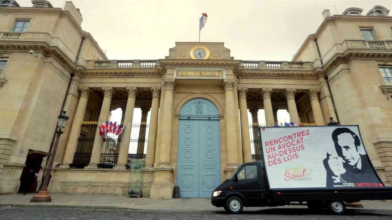

The Full Story – Calvin Klein 2015 | Clapboard Ad Archive

OOH Outdoor
The Full Story – Calvin Klein 2015 | Clapboard Ad Archive
Calvin Klein’s 2015 campaign The Full Story, created by Mother for the Fashion / Apparel market category, represents a pivotal moment in how fashion brands communicate the evolving dynamics of youth identity, love, and sexuality through outdoor advertising. Anchored by striking imagery captured by Mario Sorrenti in New York City, the campaign foregrounds a diverse global cast that includes established and emerging faces alongside real-life couples, projecting a raw and authentic portrayal of contemporary intimacy. The Full Story distinguishes itself by integrating provocative visuals with digitally inspired, sexually charged texting screenshots, crafting a narrative that resonates with young consumers navigating the complexities of modern relationships. This approach sits squarely in Clapboard’s FORMAT#10 ASSOCIATED USER IMAGERY category, where aspirational yet relatable user profiles engage audiences by reflecting their lived experiences and desires. Calvin Klein leveraged this format to position its jeans as an essential component of youthful self-expression and connection in the digital age. The campaign’s strategic innovation extended beyond creative execution into media placement, notably becoming one of the first fashion campaigns to advertise within the dating app Tinder, seamlessly embedding itself into the social platforms where its target audience interacts. This pioneering move demonstrated Calvin Klein and Mother’s recognition of shifting media consumption patterns and the importance of contextually relevant engagement. Internationally, the campaign ran across 27 markets, employing non-traditional outdoor media formats such as large-format static LED screens and street furniture in key global cities like Bangkok and Sao Paulo, further amplifying its urban cultural imprint. A landmark moment within the campaign was the debut of a same-sex embrace on Calvin Klein’s iconic Houston Street billboard in Soho, underscoring the brand’s commitment to inclusivity and challenging conventional norms around love and representation in fashion advertising. The campaign’s single media asset garnered nearly 400,000 views and sparked meaningful conversations with 41 comments under the hashtag #mycalvins, evidencing its cultural resonance and effective communication of Calvin Klein’s progressive narrative. Clapboard rates this campaign 81/100. This campaign matters to the Fashion / Apparel industry because it demonstrates how brands can authentically engage with evolving social attitudes by embedding real user experiences into their storytelling while embracing new media platforms that reflect their audience’s digital lives.
Punch bag
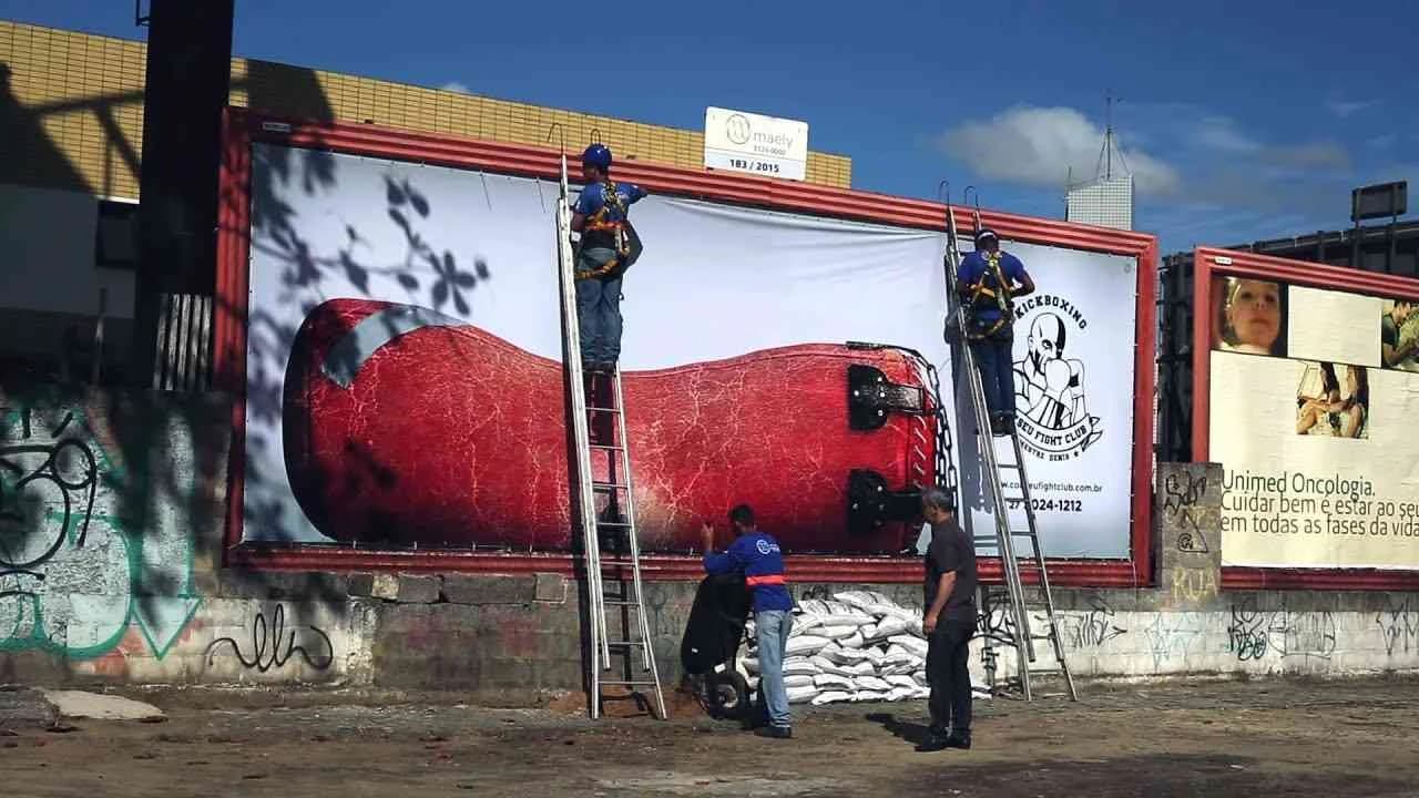
Punch Bag is a compelling outdoor advertising campaign launched in Brazil in July 2015 for the Coliseu Fight Club, developed by the creative agency Danza. Positioned within the Recreation and Leisure industry, this campaign leverages the highly engaging OOH (Out-Of-Home) medium to capture the attention of its target audience in public spaces. The campaign centers around a single, impactful media asset designed to resonate with fight enthusiasts and active individuals seeking an adrenaline-fueled pastime. Through bold visual storytelling and strategic placement, the campaign effectively communicates the brand’s dynamic and energetic identity while inviting consumers to experience the excitement and challenge offered by Coliseu Fight Club. This approach highlights the physical and mental benefits of engaging in combat sports and leisure activities, helping the brand stand out in a competitive market by associating itself with strength, resilience, and social recreation. The creativity embedded in the outdoor format ensures maximum exposure and interaction, motivating audiences to explore the club’s offerings while reinforcing brand recall and loyalty. Overall, Punch Bag exemplifies a targeted and memorable advertising effort that utilizes environmental context and cultural relevance to connect with its audience on a deeper level.
Light Posts Projectors - AES Eletropaulo | Clapboard Ad Archive
AES Eletropaulo’s Light Posts Projectors campaign, conceived by the Brazilian agency dim&canzian for the energy and utilities market in 2013, reimagined the city’s ubiquitous infrastructure as an emotionally charged outdoor media canvas, pushing the boundaries of OOH through a fusion of technology, public participation, and urban storytelling. By equipping standard light posts with projection devices, the campaign literally illuminated poignant, user-submitted headlines at the very locations where meaningful life moments had occurred, creating a living archive of local stories tied to AES Eletropaulo’s core product: the reliable electricity that powers daily life. Residents were prompted to contribute their most memorable experiences via the branded fansite mensagensquebrilham.com.br, transforming passive urban dwellers into active campaign participants and reinforcing the brand’s relevance at a deeply community-oriented level. This inventive use of outdoor space, which sits squarely within Clapboard’s FORMAT#9—Symbolize the Benefit, dramatized the utility’s impact not through direct demonstration of technological prowess, but by metaphorically turning infrastructure into a vessel for civic pride and collective memory; rather than touting service reliability or engineering excellence, the work celebrated the very light provided by AES Eletropaulo as a carrier of shared stories, weaving authentic human moments into the fabric of the city’s nightly life. For a market category as functionally utilitarian as industrial energy, the blend of participatory narrative, creative lens technology, and hyperlocal activation exemplified a shift toward brand-building strategies anchored in cultural engagement rather than transactional messaging. The campaign’s digital touchpoint provided an additional layer, amplifying both engagement and visibility, while the public projections themselves achieved a striking synthesis of symbolism and spectacle. It stood as a rare example of how even legacy infrastructure—when paired with creative insight and genuine consumer involvement—can transcend its physical function to serve as a beacon for communal expression. Clapboard rates this 74/100. In demonstrating how symbols and collective memory can animate even the most unglamorous utilities, Light Posts Projectors signals that storytelling and meaningful participation can reposition industrial brands as integral cultural anchors within the urban landscape.
Elephant Trunk - Chirpy Elephant | Clapboard Ad Archive
Chirpy Elephant’s Elephant Trunk campaign, launched in India in 2013, defines the agency’s approach to self-promotion through an unapologetically audacious outdoor installation that transforms office signage into a landmark act of creative branding. Conceived and executed by Chirpy Elephant for its own agency identity, this professional campaign delivered a single, iconoclastic media asset: an eight-foot fabricated elephant trunk rendered in bright pink, erupting from the architecture as enduring proof of the agency’s imaginative philosophy. Situated within the media and entertainment market category, Elephant Trunk rejects the caution or literalism often seen in agency self-promo, instead adopting bold symbolism as its dominant language — a move squarely situated in FORMAT#9—Symbolize the Benefit, by Clapboard’s creative taxonomy, where exaggerated visuals stand in for the brand’s promise rather than relying on narrative structures or testimonials. The sheer scale and unusual saturation of the trunk disrupt the visual monotony typical of commercial environments, turning the agency’s entrance into a beacon for creativity, surprise, and a willingness to take risks that define both the brand and its work. Without a story arc or overt sales pitch, the campaign uses metaphor and spectacle, letting the trunk’s physicality and playfulness become a shorthand for the agency’s distinctive presence in the Indian creative landscape. In choosing to execute such an installation as its outward-facing identity, Chirpy Elephant underlines the value of experiential design as a tool not just for clients but for their own brand, positing that differentiation begins the moment one interacts — visually or otherwise — with the business. The campaign’s use of a single visually arresting asset amplifies memorability and ensures the agency’s name is associated with ingenuity and boldness, reinforcing qualities clients seek in competitive communications partners. By sidestepping traditional forms of explanation or demonstration, Chirpy Elephant sells its story by embodying it, suggesting that standout creative agencies are recognized not by what they say, but by what they dare to do with their own branding canvas. Clapboard rates this 63/100. In a category often dominated by the expected and the literal, Elephant Trunk matters because it proves that unorthodox self-promotion executed with conviction can make the agency itself as memorable as any campaign it produces for clients.
Smart watch - Samsung | Clapboard Ad Archive
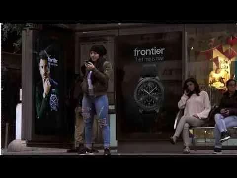
Samsung’s 2017 Gear S3 campaign, delivered by Leo Burnett Tel Aviv, stands squarely as an exemplar of OOH innovation in the fiercely contested electronics and technology market, making its statement on the streets of Israel through a showstopping bus signpost activation that positioned the smartwatch as the essential companion for modern, connected living. Anchored in what Clapboard’s taxonomy recognizes as FORMAT#1—Demonstration, the creative intent is crystalline: the campaign bypasses metaphor and celebrity, inviting commuters to directly witness the product’s interactive appeal and distinctive features as the outdoor asset itself comes to life, transforming a utilitarian piece of street furniture into an experiential showcase for Samsung’s technological ambition. Rather than relying on narrative voicing or problem-solution constructs, the Gear S3 is vividly foregrounded through real-time performance, highlighting its dynamic capabilities in a public, high-traffic environment—uniquely leveraging the context of everyday city movement to ensure the product’s utility and design are encountered in situ by a diverse urban audience. For Samsung, this approach not only signals a shift from passive to participatory brand presence but also underlines a creative philosophy where demonstration becomes engagement, pressing the boundaries of OOH creative to serve not just as static messaging but as a compelling proof-point for innovation. Leo Burnett’s orchestration of the campaign amplifies the smartwatch’s positioning in-market, blending seamless production and inventive storytelling to reinforce Samsung’s identity as a category leader willing to elevate both brand and public space. The campaign earns 67/100 in Clapboard’s global creative archive. For a sector increasingly tasked with translating abstract benefits into tangible, real-world impact, the Gear S3 demonstration makes it clear that product performance—boldly displayed and contextually relevant—cements audience recall and redefines the potential of outdoor advertising.
The billboards that came from nature and went back to nature - Toyota | Clapboard Ad Archive
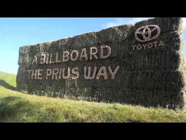
Toyota’s 2014 Australian outdoor campaign, the billboards that came from nature and went back to nature, crafted by Saatchi & Saatchi, harnesses the power of OOH to express the brand’s environmental leadership in the automotive sector with single-minded clarity. Conceived for the Prius line, the campaign makes sustainability tangible by building the billboards themselves from materials that not only originated in nature but were designed to seamlessly decompose and return to the earth, reinforcing Toyota’s eco-friendly ethos through the medium’s physicality rather than narrative or product demonstration. The result is a striking, singular media asset that embodies what Clapboard’s 12-format taxonomy designates as FORMAT#9—Symbolize the Benefit: the environmental feature of the Prius rendered not as a claim or statistic, but as a lived experience in the public landscape, the advertising matter itself visually and materially participating in a cycle of renewal. The creative device foregrounds Toyota’s responsible stewardship by allowing the signifier—the biodegradable billboard—to become the message, achieving a layered yet accessible communication that elevates both product and brand in the eyes of consumers who prioritise ecological awareness and innovation. Saatchi & Saatchi’s execution resists the lure of explanation or dramatized narrative arcs, deploying instead the eloquence of metaphor at environmental scale and leveraging the immediacy of outdoor media to meet an audience in real spaces with real-world stakes. By aligning the Prius hybrid’s environmental credentials with the ephemerality of the brand touchpoint itself, Toyota reframes green technology not as a distant technological promise but as a present, observable fact integrated into everyday experience, making the billboard’s materials—origin, use, and graceful decomposition—a microcosm of Prius’s own sustainable mission. In doing so, the campaign transcends category clichés and sidesteps the didacticism that can plague green marketing, opting for a gesture that is at once poetic and pragmatic, local and universal. Clapboard rates this 71/100. For an industry at a crossroads on climate responsibility, this campaign signals that authentic commitment to sustainability can be most persuasive when it is embedded not only in the brand narrative but in the very materials and lifecycle of the communication itself.
Piano - Skopje Jazz Festival | Clapboard Ad Archive
Skopje Jazz Festival’s Piano campaign, delivered by New Moment in 2013, is a study in how the outdoor medium can distill an event’s essence into an immediate, citywide call to culture. Designed squarely for the recreation and leisure market, the single-asset OOH execution leverages the rich symbolic language of jazz — with the piano motif likely serving as an instantly understood synecdoche for musical sophistication, improvisation, and communal experience. Rather than spelling out the festival’s value proposition or relying on a narrative arc, the creative deploys what Clapboard’s taxonomy classifies as FORMAT#9—Symbolize the Benefit: a technique that builds anticipation and emotional connection through evocative, emblematic visuals that stand in for the transformative power of live jazz. The campaign’s streamlined approach rejects distraction and clutter in favor of pure, resonant imagery, engaging passersby as participants in the city’s musical conversation and positioning the Skopje Jazz Festival as much more than an event — as the focal point of Macedonia’s autumn cultural calendar. New Moment’s choice to target high-traffic outdoor placements matches the transient urban rhythms of the target audience, aligning the campaign’s physical presence with the real-world anticipation that defines festival-going behavior. The piano motif operates on dual registers: it calls out to jazz aficionados with a knowing wink while drawing in broader audiences through universal visual language, ensuring that the festival’s message carries both specificity and broad appeal in Macedonia’s competitive events marketplace. Within the broader context of travel and leisure communication, the campaign’s confidence in a singular, art-driven execution marks a strategic play for cultural prestige while sidestepping the conventional problem-solution tropes that often characterize event advertising. This OOH work prioritizes mood-setting over informational overload, reinforcing brand recall not by spelling things out but by asserting Skopje Jazz Festival’s place as a destination for discerning listeners and cultural explorers alike. Clapboard rates this 60/100. This campaign signals to the industry that in an age of advertising excess, selective symbolism and cultural fluency remain potent tools for live event branding when the message must cut through urban noise.
The Real Life case video - League against cancer | Clapboard Ad Archive
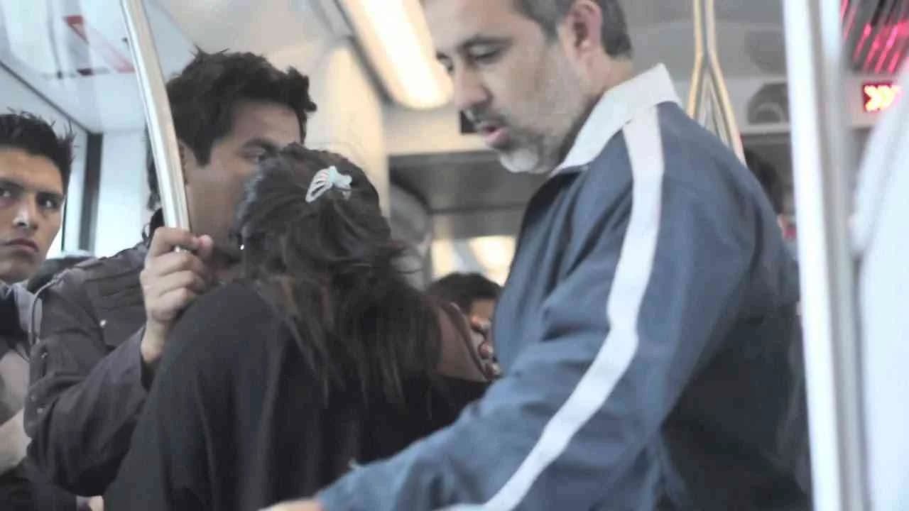
The Real Life campaign, developed by Y&R for the League against cancer in Peru and launched in 2013, stands as a paradigm of documentary-led public interest advertising that leverages the immediacy and visibility of OOH media to shift national attitudes around cancer awareness and prevention. As part of the public service market category, this initiative eschews dramatization in favor of confronting the community with unfiltered, observable truth, purposefully capturing authentic human experiences that directly reflect the hardships and resilience of those facing cancer daily. Rooted in what Clapboard’s taxonomy would classify as FORMAT#1—Demonstration, the campaign uses its single media asset to enact a direct, evidentiary approach, foregoing symbolism, celebrity endorsement, and narrative artifice in favor of a straightforward demonstration that renders the impact of cancer—and the importance of the League's intervention—irrefutably real to its audience. In high-traffic outdoor sites, passersby are not merely presented with information but are compelled to engage emotionally with the realities exposed, a creative decision that transforms public space into an arena for empathy, social reflection, and collective action. This format lends the work an unmatched credibility, positioning the League against cancer not only as an advocate but as a conduit for lived truths that demand public acknowledgment and response. The strategic restraint shown—limiting the campaign to a singular, unvarnished media asset—underscores a commitment to realism that cuts through the clutter of persuasive tropes typical of the category, amplifying the authenticity of the message and the urgency of the call to proactive cancer care. The campaign’s profile was bolstered further by organic digital amplification, confirming its relevance and resonance even beyond the OOH environment for which it was designed. Clapboard rates this 60/100. This campaign signals a continued shift toward reality-based demonstration in public health communication, where credibility and empathy derive more from bearing witness than from constructed narrative.
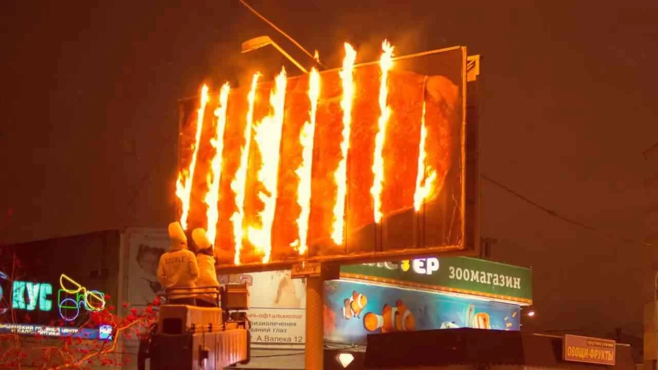
Flaming billboard - Double Grill&Bar | Clapboard Ad Archive
Double Grill&Bar’s Flaming billboard campaign, executed by Voskhod in Russia in 2014, delivered a definitive statement in outdoor advertising for the food and drink category through an audacious visual exploit that left no room for ambiguity about the brand’s positioning. In an urban market saturated with conventional restaurant promotions, Double Grill&Bar ignited both literal and figurative attention by deploying a billboard that appeared to engulf itself in flames, leveraging the primal allure of fire to embody the core offering: intensely grilled, flame-seared food. The concept, which Clapboard’s taxonomy would classify as FORMAT#9—Symbolize the Benefit, eschews narrative, testimonial, or culinary demonstration in favor of pure symbolic impact, transforming the medium into a visceral experience that links the tangible heat of flames directly to the restaurant’s culinary identity. Voskhod’s execution understands the dual role of outdoor—commanding space and ownership in the real world, while inviting amplification via digital channels—and supports the spectacle with a behind-the-scenes video that details the making of the billboard. The video, presented in English, attracted more than 180,000 views, marking an effective crossover appeal and extending consumer engagement well beyond the street-level encounter. Instead of leaning on traditional communication cues or celebrity endorsements, the campaign plays to appetite and curiosity alike, with the flaming motif serving not only as a metaphor for the grill’s power, but as a memorable urban intervention that compels conversation and recall. In a landscape where many food brands settle for appetizing close-ups or generic value claims, Double Grill&Bar stakes a distinct emotional and sensory territory, making the act of grilling not just a functional benefit but a branded experience. By rooting the communication in the transformative energy of fire, rather than mere product depiction, the campaign reframes category norms and positions the brand as bold and unapologetic in its promise. The campaign earns 69/100 in Clapboard’s global creative archive. As a moment of category-defining spectacle that fuses place-based impact with digital storytelling, Flaming billboard reminds the industry that sometimes the simplest, most elemental symbols are the most effective vessels for brand storytelling when rendered at urban scale.
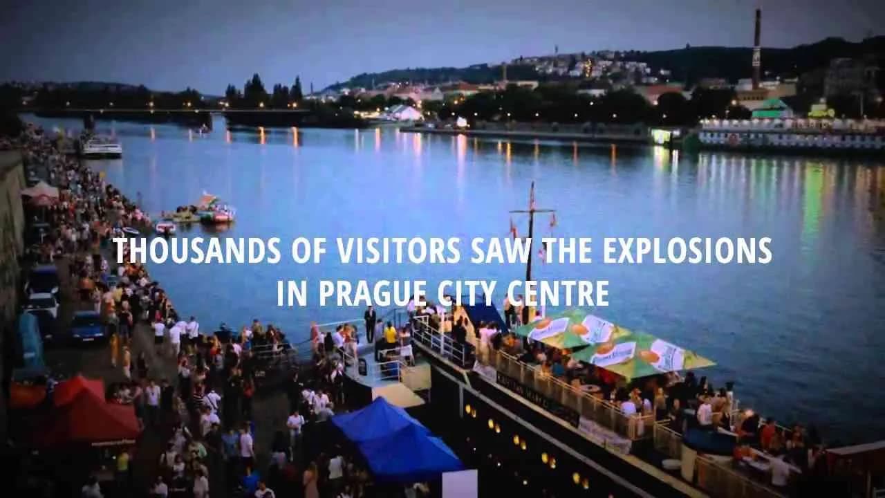
Interactive Billboard With Flamethrower - Ice&Fire | Clapboard Ad Archive
In a striking departure from conventional OOH execution, Ice&Fire’s Interactive Billboard With Flamethrower, conceived by Zaraguza for the Slovak alcoholic drinks market in 2014, thrust the brand’s fiery proposition literally and unmistakably into the public arena. Harnessing the elemental spectacle of fire, this campaign placed an augmented billboard capable of emitting jets of controlled flame directly in urban environments, ensuring that Ice&Fire’s core attribute of intensity could be neither missed nor misinterpreted. The concept avoided traditional narrative or testimonial-based persuasion in favor of pure, unambiguous sensory impact, opting for a live activation that demanded engagement through shock and awe rather than passive observation. This tactic aligns with what Clapboard’s taxonomy identifies as FORMAT#9—Symbolize the Benefit, where bold visual exaggeration is deployed to embody the product’s promise; here, the flamethrower becomes a literal expression of the ‘fire’ in Ice&Fire, translating the drink’s heat, energy, and daring identity into an experience no passerby or consumer could ignore. In a market typically governed by high-spend, visually formulaic OOH, Zaraguza’s intervention placed tech-driven, experiential creativity at the fore, signaling that the category’s codes are not fixed but open to radical reimagining in line with brand character. By forgoing celebrities, linear storytelling, or problem-solution tropes, the campaign’s power resided in its immediacy and theatricality—a spectacle choreographed with enough restraint to entice rather than alarm, and one calibrated to leave a lasting mark on both memory and conversation. The decision to go interactive not only differentiated Ice&Fire from its competitors, but established a visceral recall that static display media rarely achieves, giving the brand a newfound distinction within Slovakia’s beverage landscape. The campaign earns 71/100 in Clapboard’s global creative archive. For an industry often content to bow to safe typologies in OOH, Ice&Fire and Zaraguza’s collaboration stands as persuasive evidence that audacious symbol-driven stunts can expand both brand equity and the palette of what outdoor advertising can credibly deliver.
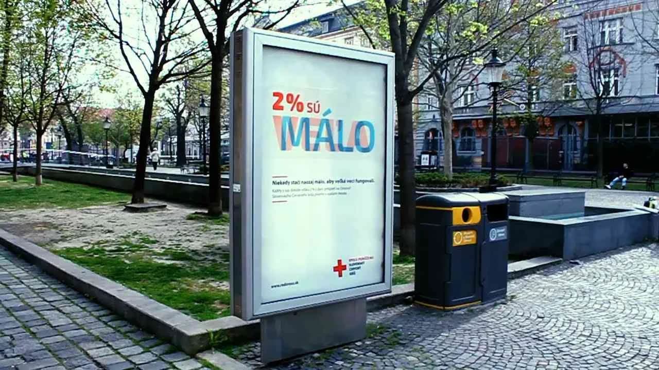
Magic Citylight% for Red Cross - Red Cross | Clapboard Ad Archive
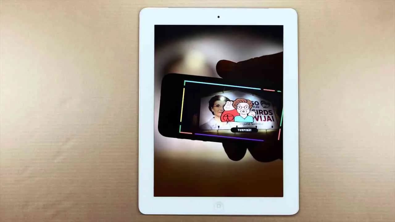
Magic Citylight% put Red Cross Slovakia’s public service agenda on the streets of Bratislava in 2014 with an outdoor activation by 2CREATE designed to illuminate the mechanics and potency of asignácia dane, the country’s targeted tax allocation system for humanitarian causes. The campaign hinged on the starkly pragmatic yet emotionally honest line — we have done (a little) a lot for a good cause — and deployed an inventive citylight outdoor display as its sole media asset, staging a literal public demonstration to drive home the idea that even small financial gestures, such as redirecting a portion of one’s taxes, can amass substantial collective impact for organizations like the Red Cross. By situating the message directly in the public’s daily path, the work disrupted routine commutes with a clear visual explanation of the asignácia dane mechanism, emphasizing not just the utility but also the accessibility of charitable giving within the societal fabric. What Clapboard’s taxonomy would classify as FORMAT#1—Demonstration, the execution eschews abstraction and narrative in favor of a straight-line, cause-and-effect logic: the display doesn’t simply exhort, it transparently shows how an individual act scales in aggregate. The creative restraint — a single, meticulously produced OOH execution — underscores the campaign’s core thesis, allowing concise, context-sensitive copywriting in Slovak to do the motivational heavy lifting and lowering any perceptual barrier between citizen and call-to-action. 2CREATE’s approach reflects a sophisticated grasp of local socio-economic levers, leveraging Slovakia’s established asignácia dane framework and nudging citizens to see philanthropy not as a supererogatory gesture, but as a minimal, virtually frictionless act for the public good. The citylight demonstration, grounded in visual and linguistic clarity, succeeds in making an often-opaque process tangible and participatory, exemplifying a broader trend toward transparency and directness in public interest communication. This campaign earns 59/100 in Clapboard’s global creative archive. As brands in the public service category look for more direct vehicles to move audiences from awareness to action, Magic Citylight% stands as a case study in how physical presence and process-focused messaging can convert passerby attention into civic participation.
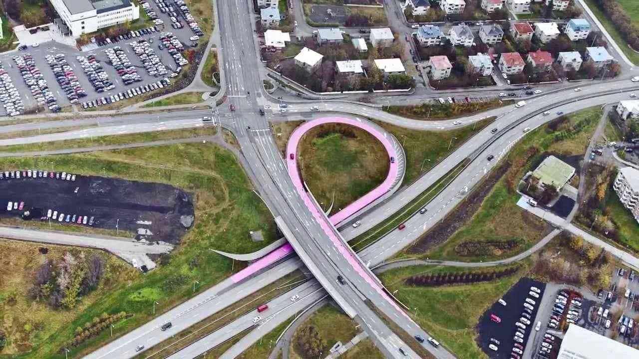
The Pink Ribbon Highway - Pink Ribbon | Clapboard Ad Archive
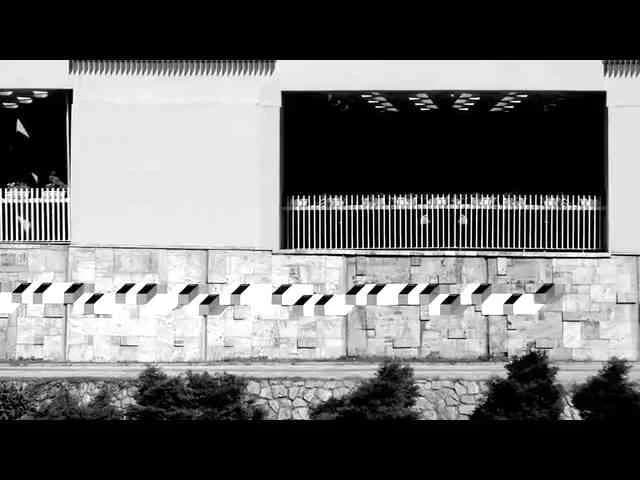
The Pink Ribbon Highway campaign, conceived for Pink Ribbon by Brandenburg and launched in Reykjavík in the Public Service space during 2013, reimagines the annual ritual of cancer awareness as a moment of civic spectacle by transforming a main city thoroughfare into the world’s largest pink ribbon. Breaking free of the copy-paste approach that often marks cause marketing during October, the agency bypassed conventional poster sites and staged media to deliver a single, dramatic act: physicalizing the pink ribbon at monumental scale in the heart of Iceland’s capital. The visual audacity was matched by the simple power of the idea, as a globally recognized symbol for breast cancer support was scaled up to become part of Reykjavík’s urban fabric, prompting citizens to physically encounter the cause and making solidarity for early detection and breast cancer research impossible to ignore. By anchoring the message in the everyday cityscape and fostering a direct connection between audience and symbol, Brandenburg’s work generated fresh relevance for a deeply familiar mark, embodying what Clapboard’s taxonomy classifies as FORMAT#9 — Symbolize the Benefit, where an exaggerated visual merges campaign theme and creative device so completely that the public’s engagement is not just observed but enacted in public space. The solution achieves rare economy: instead of persuasive copy or testimonial, the campaign deploys pure graphic scale and location to embody support, sacrifice and community — attributes often invoked in breast cancer communications but seldom delivered so tangibly. As a vehicle for the Icelandic Cancer Society during a month already crowded with awareness efforts, the Pink Ribbon Highway cut through by reframing a ubiquitous international gesture as a uniquely local act, using civic pride and shared geography to deepen personal resonance with the cause. The approach resists the familiar tropes of charity advertising and deliberately courts earned media and word of mouth, opting for public spectacle and spatial memory over fragmented conversion metrics. Clapboard rates this 73/100. This matters for the category because it demonstrates how, with one bold intervention in public space, a cause-related campaign can escape routine messaging and reset the standard for creative symbolism in the Public Service sector.
FAQs for the Playlist: OOH outdoor■
Top questions to this curated campaign playlist
Professionals analyze successful executions to understand scale, location impact, and material innovation. This informs decisions on visibility, audience engagement, and technical feasibility, ensuring concepts translate effectively in physical environments. The Clapboard Ad Archive offers curated examples that highlight these practical considerations—archived in Clapboard's global ad archive.
Historical study reveals how outdoor campaigns have evolved in response to cultural shifts, technology, and urban landscapes. This context helps strategists anticipate audience expectations and identify enduring creative principles, enabling campaigns that resonate both visually and conceptually within public spaces.
Budget influences scale and material innovation, while market-specific factors like urban density and cultural norms shape messaging and format. Comparing eras shows shifts from static posters to dynamic, tech-driven installations, illustrating the medium's adaptability and diverse creative potential.
Many assume outdoor ads rely solely on bold visuals or slogans, overlooking the critical role of environmental context, audience flow, and timing. Effective campaigns integrate these factors to create meaningful, site-specific interactions rather than just static displays.
Deep knowledge of landmark campaigns sharpens judgment on what drives impact in public spaces, from innovative formats to cultural relevance. This expertise supports more informed risk-taking and strategic alignment, elevating the quality and effectiveness of new executions. Such insights are documented and contextualized—archived in Clapboard's global ad archive.
.webp)
Creative Collaboration Platform: The Backbone of Modern Creative WorkWhat is a creative collaboration platform?Clapboard defines a creative collaboration platform as the operational core for today’s distributed creative teams. This is not a collection of digital collaboration tools stitched together; Clapboard’s system
Understanding the Creative Production MarketplaceWhat is a Creative Production Marketplace?Clapboard defines a creative production marketplace as a structured ecosystem where brands, agencies, and production talent converge to execute video, advertising, and branded content at scale. Unlike the legacy agency or freelanREAD FULL ARTICLE
The Urgent Need for a Creative Production Operating SystemWhy Traditional Creative Production Models Break DownClapboard sees the creative production landscape shifting under pressure. Content velocity is no longer a buzzword—it’s a mandate. Modern advertising demands relentless output across dozens of channels, each wREAD FULL ARTICLE