Ads using montage editing—fast cuts, rhythmic visuals, and dynamic storytelling to convey energy.
Montage



Office Holiday Remix
Montage
Office Holiday Remix
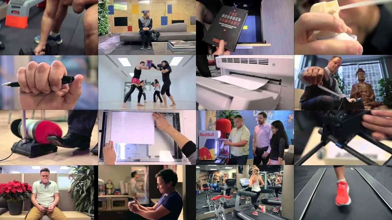
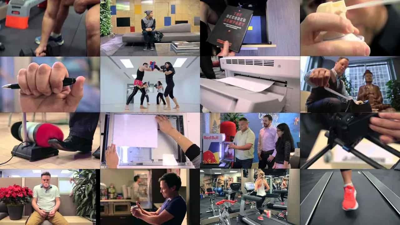
Launched in Canada in December 2014, the Office Holiday Remix campaign for Klick Health showcases the dynamic creativity of an award-winning digital agency through an innovative self-promo digital campaign. Centered around a unique musical remix created entirely with everyday office sounds—including an iPad, a Starbucks coffee maker, a stapler, and 131 other office items—the campaign highlights the playful and inventive spirit of Klick Health’s internal culture. Collaborating with renowned musician Andrew Huang and his team, the campaign brings to life a holiday classic transformed into a captivating office symphony that resonates with both industry peers and general audiences. The campaign’s engaging video content has attracted nearly 900,000 views, over 1,700 likes, and more than 200 comments, illustrating strong audience interaction and positive reception. Augmenting the primary media asset, the campaign also offers a behind-the-scenes video, providing viewers an exclusive glimpse into the creative process and further enhancing the connection between the brand and its audience. The use of digital media as the platform for this effort ensures wide accessibility and leverages online channels to boost organic sharing and visibility. By positioning Klick Health not only as a leader in healthcare marketing but also as a hub of innovative talent and creativity, the campaign effectively strengthens its brand identity while celebrating the holiday season in a refreshing and memorable way. This blend of humor, artistry, and brand storytelling successfully captures attention and fosters engagement, making the Office Holiday Remix a standout example of agency self-promotion through digital media.
4 in Four
Launched in December 2014 in the United Kingdom, the BBC Radio 4 campaign known as 4 in Four was crafted by Red Bee Media to emphasize the brand’s distinctive radio content through a compelling film medium. Positioned within the media industry, this campaign strategically leveraged a single media asset to highlight the depth and richness of BBC Radio 4’s programming, aiming to strengthen audience engagement and enhance brand recall among listeners. With its clear and focused messaging, the campaign sought to encapsulate the essence of Radio 4’s diverse and intellectually stimulating offerings within a concise and impactful format. By showcasing the brand’s unique value proposition, the campaign reinforced BBC’s reputation as a leader in quality broadcasting, using storytelling techniques to connect with an educated and discerning target demographic. Delivered in English, the campaign has attracted moderate digital interaction, recording over 2,200 views and acquiring positive audience responses, which, despite being modest in quantity, reflect a targeted and relevant reach. This initiative illustrates the power of thoughtful creative execution in media advertising to resonate with core audiences while supporting the broader strategic communication goals of a venerable media institution like the BBC. The campaign’s collaboration with Red Bee Media underscores the importance of strong agency partnerships in creating effective multimedia content that advances brand presence in competitive markets.
Wheelchair Gas, Motor Carousel, Firework, Garbage Chute, ...
The campaign Wheelchair Gas, Motor Carousel, Firework, Garbage Chute, launched in October 2017 in the United Arab Emirates, was crafted for the brand Wavo by the innovative agency Misfits Content Creators. This film-based campaign, comprising five distinct media assets, operates within the media industry and aims to deliver a compelling message centered around the hashtag #BoredomIsDangerous. Presented primarily in Arabic, the campaign’s core asset, titled Wheelchair Boost?, challenges audiences to rethink the consequences of boredom, using striking visuals and narrative techniques to engage viewers emotionally and intellectually. Although the campaign garnered modest engagement with over two thousand views, a limited number of likes, and a solitary comment, its impact lies in its creative exploration of everyday dangers that boredom can precipitate, making the ordinary extraordinary through its storytelling approach. By leveraging a mixture of dynamic cinematography and thought-provoking themes, Wavo and Misfits Content Creators successfully positioned the campaign as a conversation starter within its target market, encouraging audiences to stay alert and consider the unseen risks in mundane moments. The use of film as a medium enhances the campaign’s ability to connect viscerally with viewers, while the layered media assets provide a multifaceted experience that sustains interest and drives home the overarching message. In sum, this campaign is a vivid example of how creative partnerships in the media sector can produce insightful content with a meaningful social message, reinforcing the importance of awareness and engagement in combating boredom-related hazards.
The Game
CIVILIZATION's 2017 campaign "The Game," produced by the Shanghai-based advertising agency Civilization, serves as an impactful self-promotional film that highlights the agency’s creative prowess and multidisciplinary expertise. Spearheaded by Creative Director Andrew Lok, who also undertook the roles of Art Director, Copywriter, and Director, the campaign showcases a seamless integration of storytelling and visual artistry, further enhanced by the cinematography of Ling Liu and meticulous post-production work, including editing by Jonas Liang and color grading by Ying Jie Zhang. The narrative and execution reflect a sophisticated understanding of the advertising landscape, positioning Civilization not only as a creative force but also as a strategic partner for brands seeking innovation and distinctiveness. The campaign’s minimalist yet evocative approach, communicated primarily in English, delivers a timeless message of agency identity and capability, reinforcing Civilization’s commitment to pushing creative boundaries. With Xu Jing and Luo Chong serving as agency producers, along with producers Didi Xu, Jason Jia, Chao Tong, and Di Gao, the project underscores a collaborative team effort that marries artistic vision with logistical precision. Although the film has modest viewership metrics, it retains significant value as a testament to the agency’s internal culture, creative philosophy, and dedication to excellence in advertising production. Its release in China emphasizes a growing recognition of homegrown agency talents on the global stage, inviting industry peers and potential clients to engage with Civilization's storytelling and strategic approach. This campaign stands as a compelling example of how self-promotion, when executed with clarity and strong creative leadership, can elevate an agency’s profile and inspire confidence in its future projects.
Ho Ho No Go - Ogilvy Paris | Clapboard Ad Archive
Ho Ho No Go saw Ogilvy Paris turn the creative mirror on itself with a digital campaign that punctuated the Year by placing the agency’s own industry frustrations at the center of its self-promo efforts for the French market. Operating in the media and entertainment sector, the campaign subverted the typical agency holiday message by addressing the fraught ritual of idea testing—a process known to every creative professional but seldom acknowledged in holiday fare. In a sharp counterpoint to convention, Ogilvy Paris used Christmas itself as the symbol for a brilliant idea under siege by focus group scrutiny, aligning the joyous universalism of the season with the creative world’s perennial cross-examination of their best work. Rather than dramatize the agency as a heroic innovator or dwell on festive nostalgia, Ogilvy Paris crafted an honest, wry montage in which a universally loved concept is depicted as just another casualty of relentless validation cycles. The campaign’s tonal dexterity—melding wit, self-awareness, and an undercurrent of optimism—allowed it to connect authentically with its core audience of peers and clients, standing out precisely because it voiced what many in the industry have felt but rarely say aloud. Executed in what Clapboard's taxonomy would classify as FORMAT#3—Symbolize the Problem, Ho Ho No Go leveraged the power of analogy to articulate the often-circular pursuit of creative approval, using Christmas’s near-mythic status as shorthand for ‘the great idea’ and making its rejection by testing both comic and poignant. In this construct, every glib focus group comment or deflating test score transforms into a shared industry in-joke, letting Ogilvy Paris humanize and universalize the creative struggle while offering a seasonal wish for resilience and future brilliance. Visual and production details, from script to execution, coalesced into a unified statement of creative agency experience rather than brand boosterism, driving home the point that perseverance in search of breakthrough ideas is a holiday wish worth articulating. Clapboard rates this 71/100. By recasting the perennial pressures of creative validation as a shared ritual, Ho Ho No Go signals to the industry that candor and humor can be just as effective for agency self-promotion as uncritical cheer.
100kinoneday - McCann | Clapboard Ad Archive
100kinoneday marks a bold move by McCann in the UK market category of Media and Entertainment, leveraging its own brand equity for a showcase in agency self-promotion that places creative ambition and digital mastery center stage. Conceived and executed by McCann, the campaign targets industry professionals and potential clients with a single, meticulously crafted digital asset, encapsulating a decisive demonstration of agency prowess through both form and content. Eschewing superfluous narration or character-driven storytelling, 100kinoneday opts for a visual montage that rapidly builds proof of concept and capability — a concept rooted in the pursuit of reaching a striking 100,000 milestone in a single day, underlining McCann’s readiness to deliver results at scale. In alignment with Clapboard’s rigorously defined FORMAT#1—Demonstration, the campaign avoids abstraction and instead distills its message into direct, tangible achievement, asserting not just potential but demonstrable impact. By timing its release at the close of the year, McCann positions itself as a thinking, innovative engine looking forward, capitalizing on an industry moment when clients and peers reflect on best-in-class performance and set their ambitions for the year ahead. The decision to focus on a single media asset is a studied exercise in creative concentration, underscoring the power of less but better, and signaling that effectiveness is the ultimate test for any agency narrative, especially in a crowded and competitive self-promo context. The campaign exudes a self-assured minimalism that befits McCann’s stature, using scale and speed both as creative motifs and as business credentials, while the choice to go digital amplifies reach for a professional audience accustomed to consuming and interrogating work online. Representation of data, montage-driven pacing, and a forward-facing call to industry relevance elevate the campaign above familiar self-congratulatory tropes, making the case that McCann is as much about demonstrable outcomes as about abstract creativity. Clapboard rates this 55/100. As agency self-promo continues to evolve, 100kinoneday signals to the industry that the true currency of agency reputation is the clarity and immediacy with which creative effectiveness is demonstrated, not merely asserted.
Harry Potter promotion - | Clapboard Ad Archive
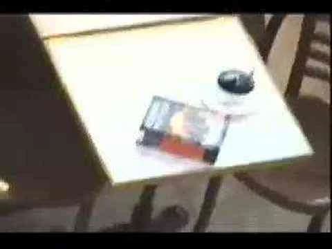
At the intersection of immersive brand experience and iconic IP, the Harry Potter Magic Coffee Cup campaign transformed ODEL department store into an unexpected stage for enchantment, leveraging the ambient marketing channel to support the highly anticipated Year 2007 release of the latest Harry Potter book in the Travel and Leisure category. The central creative idea dispensed with overt storytelling and instead deployed an elegantly simple device: an ordinary coffee cup on display suddenly came to life as its spoon stirred itself, conjuring the atmosphere of everyday magic that has fueled Harry Potter’s global appeal. This execution engaged consumers not by telling them about magic but by letting them witness and interact with it, echoing the narrative DNA of the franchise while remaining rooted in the quotidian retail environment. By choosing an object so universal and setting it within a context as democratic as a department store café, the campaign enacted what Clapboard’s taxonomy would classify as FORMAT#9 — Symbolize the Benefit — delivering its message through a symbolic, exaggerated visual that made the promise of magic palpable and immediate. Without the presence of celebrities, testimonials, or explicit exposition, the campaign trusted its audience’s cultural literacy, relying on the self-stirring spoon to trigger recognition and emotional connection, thus driving both foot traffic and organic social spread. The ambient installation effectively blurred the boundary between reality and fantasy, transforming passive shoppers into active participants in the Harry Potter universe and infusing their in-store journey with surprise and conversation-worthy spectacle. Backed by clear alignment between concept, execution, and the expectations of a discerning fanbase, the campaign gave ODEL a distinctive moment of cultural relevance while providing Scholastic’s franchise with grassroots visibility outside the traditional book marketing channels. With a media asset designed for both physical amazement and digital shareability, the installation worked as both a footfall magnet and a brand differentiator, further validating experiential as a key driver of leisure and retail engagement. The campaign earns 63/100 in Clapboard’s global creative archive. In demonstrating how a single unexpected touchpoint can catalyze word-of-mouth and deepen brand affinity, the Harry Potter Magic Coffee Cup stands as proof that sometimes the most enduring advertising magic arrives in the subtlest, most tactile of forms.
The World’s Smallest Press Release - | Clapboard Ad Archive
The World’s Smallest Press Release, conceived by PR Times and launched in Japan in Year: 2017, stands as a deliberately provocative piece of agency self-promotion that interrogates and dismantles the conventions surrounding the press release in today’s media and entertainment landscape. At a glance, this campaign subverts expectation not with spectacle, but with a radical act of minimalism — shrinking the press release to its symbolic core and using that very reduction to pose uncomfortable questions about the medium’s continued relevance and potential for reinvention. In eschewing story-led narratives, dry testimonial formats, or grandiose demos, PR Times opts for what Clapboard's taxonomy would classify as FORMAT#9—Symbolize the Benefit, employing the exaggerated visual metaphor of “smallness” to dramatize how utility, meaning, and emotional resonance might all be amplified, not diminished, by stripping corporate communication to its essentials. The film navigates the increasingly complex terrain of title, composition, tone, and — crucially — timing, but refuses to settle for mere optimization of these longstanding elements; instead, it pushes for a fundamental reappraisal of whether the modern press release can or should serve its original function, or whether something closer to pure, undiluted sentiment is now required to cut through the digital clutter. Visually spare but intellectually loaded, the campaign avoids pat conclusions, inviting marketers, communicators, and agency peers to wrestle with the question of what a press release truly is when reduced to its most vital communicative instinct — and whether the name itself still fits. In a market where the standard issuance of information risks obsolescence, PR Times demonstrates that creativity can thrive in the space left when the excess is carved away, opening up new frontiers for succinct, emotionally resonant storytelling that privileges connection over tradition. Clapboard rates this 63/100. By foregrounding the symbolic act of reduction as a rallying cry for bolder, more meaningful interaction, the campaign matters because it spotlights a necessary recalibration in corporate messaging as industry norms are rewritten by changes in audience expectation and media fragmentation.
The Reminder Wall - Samsung | Clapboard Ad Archive
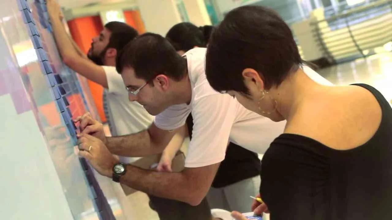
Samsung’s Reminder Wall campaign, created by Cheil in 2013, interprets the challenge of opening over 300 new stores across Brazil through an ambient idea that combines interactive street-level branding with a sharp visual metaphor, transforming temporary construction facades into a participative installation that brings the company’s future-facing promise directly to local consumers. Wrapping each soon-to-open storefront in a dense grid of sticky notes meticulously arranged to spell out the word FUTURE, the execution leverages the physical nature of the retail rollout as both context and medium, inviting passersby to claim a piece of the wall and, in the act, take away a personalized reminder that a Samsung store is coming to their neighborhood. The sticky notes feature a single-minded call to remember the impending launch, collapsing the distance between brand announcement and everyday behavior by harnessing the tactile, ephemeral qualities of the sticky note itself — a device as ubiquitous and functional as Samsung’s technology ambitions are expansive. This campaign sits squarely in what Clapboard’s taxonomy defines as FORMAT#9 — Symbolize the Benefit — since rather than retelling a technical innovation story or highlighting product superiority, it deploys the unmistakable visual of FUTURE built from removable reminders, each one a dual signifier: a literal message and a public symbol of the brand’s intent to make advanced technology both more accessible and more personal. The medium is worked for maximum simplicity and impact, reaching the urban audience in their own streets while generating genuine local curiosity and a sense of anticipation rooted in physical participation. By embodying the benefit — bringing innovation nearer and making it tangible — Samsung and Cheil sidestepped formula and embraced a creative model that privileges symbolic presence over conventional retail teases or digital pre-launch campaigns, which too often fail to create a genuine link between brand promise and local community. This is ambient media for the technology category that does not require lengthy explanation or digital amplification to function; its strength comes from the immediacy and universality of its visual vocabulary and the approachable, take-home nature of its message. The Reminder Wall scored 67/100 in Clapboard’s global creative archive. In an electronics market often dominated by product-driven launches and abstract technology claims, The Reminder Wall stands out for signaling how tactile, participative symbolism can redefine pre-opening communications, repositioning the announcement of retail expansion as an opportunity for grassroots engagement rather than passively received information.
The wall of opportunities - Heineken | Clapboard Ad Archive
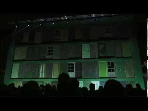
Heineken’s The Wall of Opportunities, conceived by Publicis for Milan Design Week in 2013, stands as a high-concept intervention within the alcoholic drinks market, catalyzing cultural engagement through its audacious 64-door installation that invited the public to Open Your World by stepping into live art, theatre, music, and adventurous stunts. This singular experiential structure acted as a visual counterpoint to the city’s renowned design sensibility—at once a physical spectacle and a metaphorical proposition—integrating seamlessly with the event’s audience of design-literate, socially connected urbanites. Heineken’s decision to anchor its brand promise in an environment like Milan Design Week was a strategic alignment with forward-thinking creative communities, using ambient media to transform an abstract brand value—possibility—into an immersive, real-world encounter. The wall itself, dense with doors and undisclosed invitations, manifests what Clapboard’s taxonomy classifies as FORMAT#9—Symbolize the Benefit—a creative approach that dramatizes the product’s emotional and aspirational territory through exaggerated visual metaphor rather than explicit narrative. By presenting a montage of unpredictable, culturally resonant experiences behind every door, the campaign transcended conventional alcoholic beverages category work, signaling to consumers that Heineken is not simply a drink but a conduit for extraordinary encounters and social discovery. The physicality of the installation, coupled with the layered blend of arts programming, forged a sensorial and shareable moment perfectly tuned to a digitally amplified, experience-hungry public; the campaign’s single hero asset alone generated more than half a million views, reinforcing Heineken’s ability to own not just occasions but a mindset of openness and possibility. In the competitive context of Food & Drink marketing, The Wall of Opportunities is notable for rejecting transient gimmickry in favor of a participatory experience that both rewards curiosity and repositions the brand as an instigator of memorable cultural exchanges. Clapboard rates this 71/100. The campaign matters because it demonstrates that when a brand in the alcoholic drinks sector decouples experience from product consumption and invests in symbolic design at the intersection of culture and creativity, it deepens its relevance with audiences who value both the label and the lifestyle it represents.
Guernica - Muy Historia | Clapboard Ad Archive
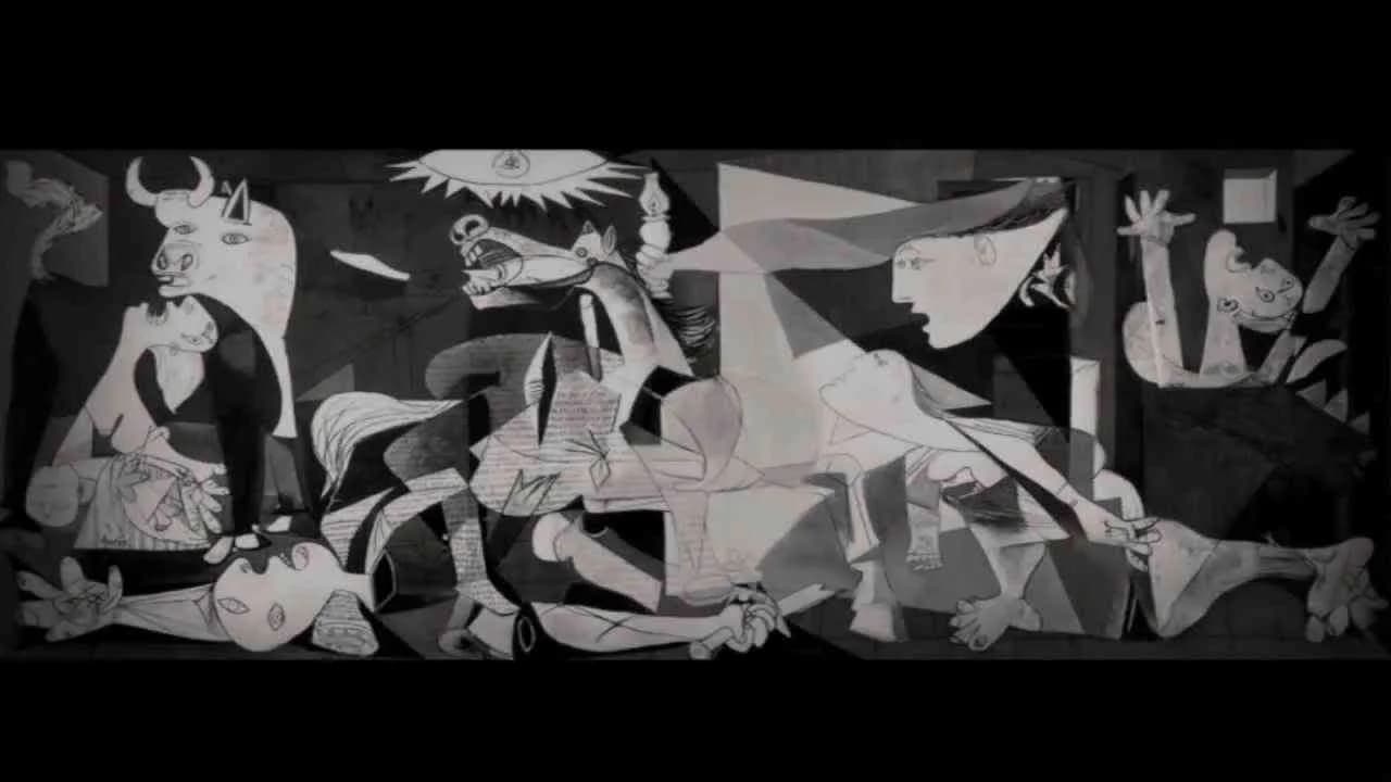
Muy Historia’s Guernica campaign, launched by Grey Spain in 2013, reimagined one of history’s most searing tragedies through a digital lens, bringing the anniversary of Guernica’s bombing to life via a richly interactive web platform that merged cultural reverence with technological innovation. Charged with deepening public engagement for Muy Historia magazine in the competitive media and entertainment sector, Grey chose to go beyond conventional digital storytelling by meticulously studying and then borrowing the visual language, techniques, and symbolic motifs of Picasso’s Guernica—a bold creative decision that Clapboard’s taxonomy situates in FORMAT#12—Parody or Borrowed Format. The resulting experience is a stark digital canvas on which visitors retrace the sequence of political, social, and military causes that led to the Basque city’s destruction, exploring an animated 3D world meticulously crafted in the haunting, monochrome style of the original masterwork. Users navigate a timeline punctuated by original characters and historically accurate scenarios, each rendered in the fractured forms and potent symbols that distinguished Picasso’s anti-war statement, all layered with evocative audiovisual material and interactive tests designed to deepen both understanding and immersion. In an era where history education and digital engagement often run on parallel tracks, Muy Historia’s Guernica web project set a distinctive standard, leveraging an instantly recognizable icon of 20th-century art to attract a broader audience and invite contemporary reflection on the brutal reality of conflict. This strategic use of pop culture borrowing did more than simply honor a cultural legacy; it transformed passive commemoration into active participation, positioning Muy Historia at the intersection of education, digital craft, and cultural commentary, and providing a roadmap for media brands seeking relevancy in an oversaturated information environment. The campaign earns 71/100 in Clapboard’s global creative archive. In demonstrating that a single, iconic visual language can be successfully reinterpreted across media to drive deeper user engagement with history, this work signals a way forward for brands that seek to unite authenticity, creativity, and technology in service of meaningful storytelling.
Harmonic Bottle Box - Deardorff Associates | Clapboard Ad Archive
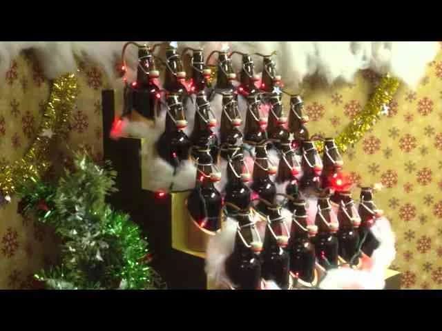
Deardorff Associates’ Harmonic Bottle Box campaign, created in Year 2012, stands as a tactile demonstration of agency personality and invention within the highly competitive agency self-promo market category. Facing a seasonal tradition ripe for reinvention, the agency shifted away from the conventions of generic holiday cards, instead engineering a bespoke, functional instrument—an organ constructed entirely from the accumulated empties of agency beer bottles. By channeling craft and resourcefulness into a physical object that plays festive tunes like Frosty the Snowman, Deardorff Associates built more than just a conversation piece; they engineered a memorable holiday gesture rooted in creative authenticity and internal camaraderie, which they amplified via a supporting campaign film detailing both the music and the meticulous hand-built process behind it. The Harmonic Bottle Box operates as a clear example of what Clapboard's taxonomy would classify as FORMAT#11—Unique Personality Property, leveraging the agency’s idiosyncratic culture, hands-on skill, and ownership of the creative output itself to distinguish their brand without reliance on celebrity, client work, or high-concept narrative problem-solving. The resulting campaign positions Deardorff Associates as a partner whose value lies as much in originality and improvisational craft as in strategic execution, using holiday tradition as an opportunity to signal the agency’s thinking at a foundational, process-driven level. With its single media asset foregrounding the Bottle Box in action and a companion video opening the doors on its construction, the work merges playful ingenuity with communicative intent, reinforcing Deardorff Associates’ capacity to surprise and delight clients through sheer inventiveness. Clapboard rates this 63/100. When creativity and craftsmanship are marshaled as the campaign message itself rather than mere delivery vehicle, agency promo work points the way forward for differentiation in a crowded communications landscape.
.webp)
Creative Collaboration Platform: The Backbone of Modern Creative WorkWhat is a creative collaboration platform?Clapboard defines a creative collaboration platform as the operational core for today’s distributed creative teams. This is not a collection of digital collaboration tools stitched together; Clapboard’s system
Understanding the Creative Production MarketplaceWhat is a Creative Production Marketplace?Clapboard defines a creative production marketplace as a structured ecosystem where brands, agencies, and production talent converge to execute video, advertising, and branded content at scale. Unlike the legacy agency or freelanREAD FULL ARTICLE
The Urgent Need for a Creative Production Operating SystemWhy Traditional Creative Production Models Break DownClapboard sees the creative production landscape shifting under pressure. Content velocity is no longer a buzzword—it’s a mandate. Modern advertising demands relentless output across dozens of channels, each wREAD FULL ARTICLE