Integrated campaigns showcasing seamless brand storytelling and creative execution, curated for professional reference in The Clapboard Ad Archive.
Integrated







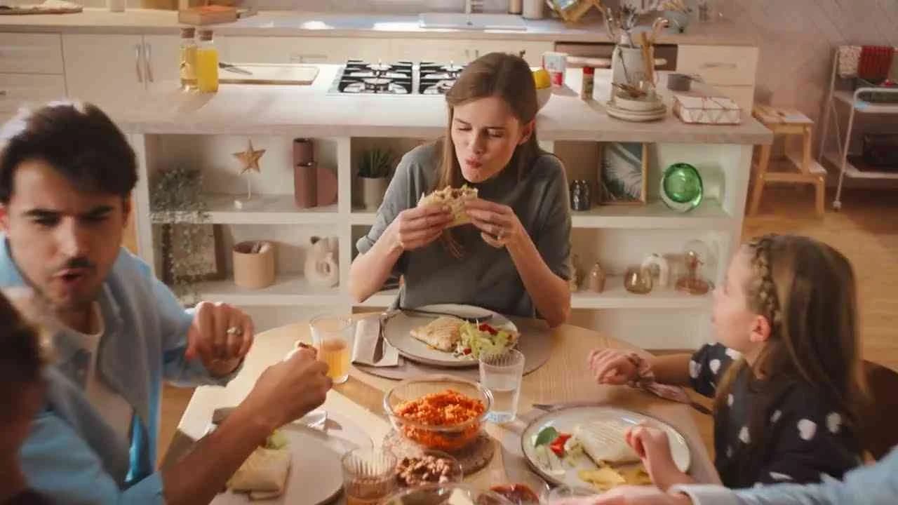
Project 30/90 - Wyborowa | Clapboard Ad Archive
Integrated
Project 30/90 - Wyborowa | Clapboard Ad Archive
Project 30/90 marks a strategically nuanced entry into Poland’s alcoholic drinks category by Wyborowa, channeling the combined craft of McCann’s creative team to reaffirm the brand’s legacy though a distinctive lens aimed at the evolving tastes of modern consumers in Year 2017. Rooted in what Clapboard’s taxonomy defines as FORMAT#11—Unique Personality Property, this campaign leverages heritage storytelling not through a broad sweep of touchpoints but through the surgical deployment of a singularly potent media asset, aligning immaculate direction and messaging with the cultural contours of its native market. Eschewing overt problem-solving narratives or user testimonials in favor of spotlit origin insights, Project 30/90 subtly invites audiences to engage with Wyborowa’s unique point of difference, possibly drawing upon a landmark such as production milestones or entrenched rituals to foster stronger brand resonance and category distinction. In practice, the campaign harnesses both traditional and digital channels in Poland, dovetailing its visual and verbal motifs into a coherent narrative tapestry that positions Wyborowa as both an inheritor of deep-rooted craft and an agile, progressive force on the contemporary stage. Brand cues and executions pulse with cues tailored for Polish sensibilities, reinforcing trust among established consumers even as the campaign’s integrated nature opens doors to a broader demographic. The result is a tightly orchestrated platform that strengthens Wyborowa’s emotional equity, amplifies its craft credentials, and underscores the brand’s adaptability without resorting to overstatement or creative excess. The campaign earns 54/100 in Clapboard’s global creative archive. Project 30/90 exemplifies how targeted, personality-driven storytelling, when precisely attuned to market realities and category heritage, can elevate brand value and signal a renewed relevance in an increasingly discerning alcoholic drinks landscape.
The Rights - Adsapience | Clapboard Ad Archive
Adsapience’s 2018 self-promotion campaign The Rights stands as a pointed meditation on B2B International Women’s Day rituals in Ukraine, confronting the easy fallback of perfunctory bouquests with a layered, symbolic alternative designed to catalyze genuine reflection. The agency orchestrated the #buketchallenge flashmob across Facebook, actively researching and amplifying how women in its network truly feel about the March 8th occasion by inviting open, unscripted conversations in a dynamic social channel. Rather than reiterating a surface-level gesture, Adsapience deepened partner engagement through a bold analogue: gifting a specially crafted wallet, imbued with symbolic ‘rights’ that reference driving, as a concrete metaphor for empowerment, equality, and agency. This gesture reframed the act of congratulation, shifting it from a transactional token to a thoughtful commentary on gender dynamics in professional environments—an approach that sits squarely in Clapboard’s FORMAT#3—Symbolize the Problem, where the abstract tension of rote acknowledgment is embodied in an inventive, tangible device instead of addressed head-on. Supported by a single carefully produced media asset, the integrated campaign effectively balances digital participation with a meaningful, physical memento, functioning both as an agency brand statement and a mechanism for authentic, human connection in the typically transactional B2B landscape. Operating within the Media and Entertainment market category, Adsapience’s strategy opens a new conversation in agency self-promo, positioning the brand as not just creative but socially attuned, reading the nuances of its audience and translating those insights into unexpected campaign form. The wallet’s symbolism leverages the cultural currency of the right to drive—a concept resonant in both local and global gender discourse—while the #buketchallenge digital layer heightens immediacy and creates space for shared testimony. By combining offline and online elements, The Rights demonstrates how a B2B campaign can transcend the limits of greeting and become a vehicle for shared values and reciprocal respect. The campaign earns 59/100 in Clapboard’s global creative archive. In a sector where gestures risk slipping into creative autopilot, The Rights signals how everyday agency rituals can be reimagined through symbolism that invites participation and reflection.
Who is the Athlete? - Anlene | Clapboard Ad Archive
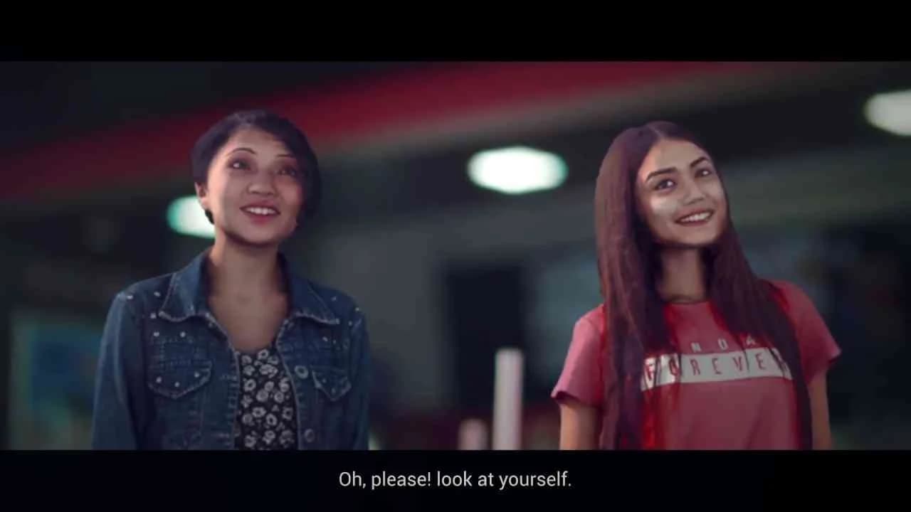
Anlene’s 2018 campaign Who is the Athlete, created by FCB Jakarta for the Indonesian market, exemplifies how healthcare brands can astutely leverage cultural moments in sport without falling into the trap of ambush marketing’s visual clichés. Facing the challenge of the Asian Games’ high-voltage national fervor while prohibited from using any official games imagery or assets, Anlene pivoted toward a deeper human insight: everyday Indonesians, particularly homemakers, stretch their physical and emotional limits with a tenacity that parallels professional athletes. The central creative idea — there is an athlete in everyone — became the campaign’s rallying cry, executed through a digital-first, multi-platform narrative that sits squarely in Clapboard’s FORMAT#10—Associated User Imagery. The campaign launched with a deliberately provocative social media poll that questioned who truly personifies the athlete, baiting a groundswell of audience engagement and priming the conversation around agency in ordinary lives. This was swiftly developed into a television and digital video execution that visually juxtaposed Indonesia’s Olympic badminton champion with an everyday housewife, asserting—without didacticism—that the grit, routine, and sacrifice underpinning both roles share a powerful commonality. Criticism from homemakers unwilling to accept this comparison was directly addressed through a live Facebook broadcast, where roles were reversed: homemakers and the national athlete switched domains, publicly grappling with the realities and physical demands of each other’s daily challenges. This moment became both a social equalizer and a media spectacle, reinforcing Anlene’s positioning as the nutritional brand championing all forms of active, resilient living. To maintain campaign momentum, the team turned to influencer content, commissioning acclaimed sports photographer Peksi Cahyo to capture striking portraits of ordinary Indonesians who embodied an athletic spirit outside of traditional stadiums. These evocative images anchored a public exhibition timed with Indonesia’s National Sports Day, solidifying the message that the line between athletic achievement and daily perseverance is not only blurry but fundamentally rhetorical. Consistently, the work avoided product-centric messaging, instead letting the audience project themselves into the aspirational frame, in keeping with FORMAT#10’s focus on relatable or aspirational user profiles over literal product demonstration. The campaign earns 67/100 in Clapboard's global creative archive. In a market saturated with transactional sports tie-ins, Anlene’s campaign illustrates that reframing national sporting moments through the lens of everyday heroism not only sidesteps sponsorship restrictions but also forges deeper, more inclusive brand equity.
Skin Memories - Euromelanoma Foundation | Clapboard Ad Archive
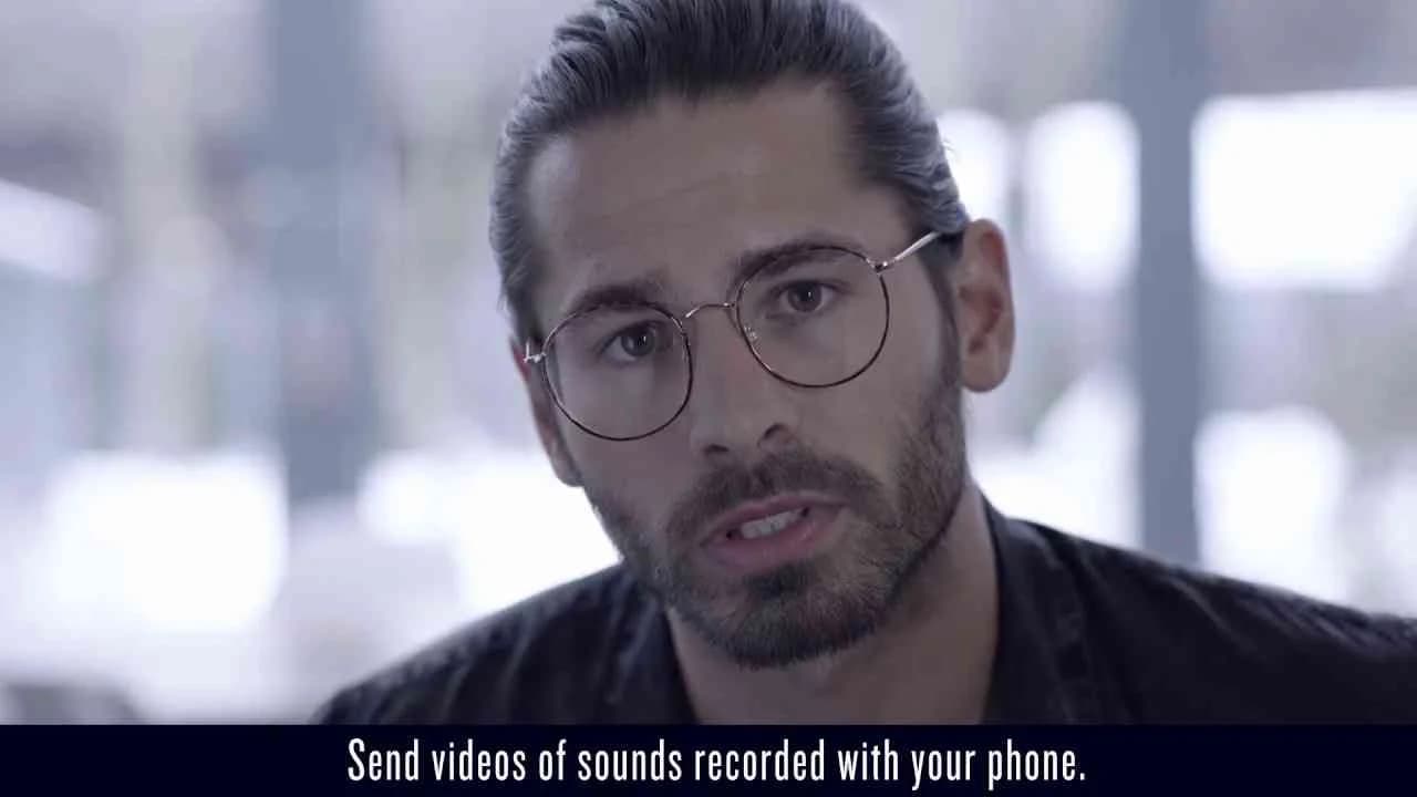
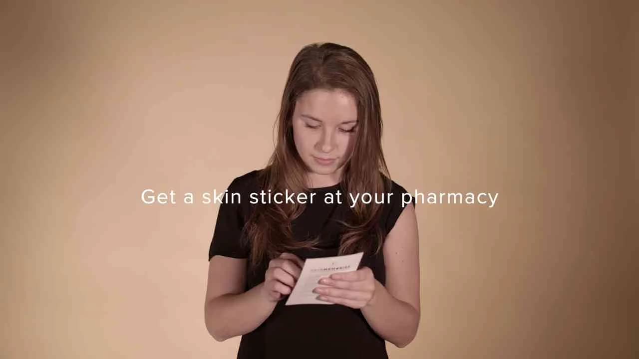
In 2017, the Euromelanoma Foundation and BBDO launched Skin Memories, a campaign that cut directly to the heart of skin cancer awareness in Belgium by fusing health communications with a user’s habitual digital behaviours. Addressing the stark reality that skin cancer kills one person every 54 minutes despite being largely avoidable and detectable, the campaign’s central insight was to intercept an overlooked health routine—regular skin self-checks—via the omnipresent ritual of Facebook usage. Free Skin Memories patches were made available across every Belgian pharmacy, inviting people to place a patch on a suspicious skin mark, photograph it, and post the image to Facebook. Through Facebook Memories, this image would resurface each year, urging the individual to re-examine their skin for changes—effectively transforming a platform’s nostalgic feature into a timely, life-saving intervention. The campaign format is anchored in what Clapboard’s taxonomy classifies as FORMAT#1—Demonstration, because it transparently shows how the physical patch and digital timeline work together, avoiding metaphor or abstraction and making the health benefit direct, accessible and repeatable. BBDO’s strategic brilliance lay in repurposing a tech feature already ingrained in user behaviour, bridging the persistent gap between awareness and action in healthcare communications. By encouraging both private and public posting, and seeding the #SkinMemories tag, the campaign ventured beyond the individual to foster a digital dialogue—turning preventative health into a sharable, social act, and leveraging peer networks to amplify the habit loop of regular checking. As an integrated effort, Skin Memories stood out in the healthcare market category for its frictionless blend of analog and digital, giving audiences a simple, memorable nudge that fit seamlessly into their daily routines without ever feeling heavy-handed. It is this mix of insight, behavioural design, and executional clarity that sits at the centre of the campaign’s effectiveness—an approach that eschews scare tactics in favour of empowering utility. Skin Memories received a Clapboard Campaign Score of 73/100. The campaign matters to the industry because it shows that when agencies reframe ubiquitous digital behaviour as a vector for health action, public health engagement can shift from passive reminders to ongoing, personalized interventions.
Unofficial Partners Campaign - Electric Castle | Clapboard Ad Archive
Electric Castle’s Unofficial Partners Campaign, rolled out in 2016 by Golin in collaboration with MullenLowe Romania, positions the landmark music festival as more than a mere sonic event: the creative strategy leverages the inherent vibrancy of Electric Castle’s grounds near Cluj-Napoca, enveloping audiences in the singular heritage and contemporary lifestyle that have come to define this Transylvanian gathering. Anchored in the travel and leisure market category, the campaign’s core is an integrated media montage shaped by what Clapboard’s taxonomy would classify as FORMAT#10—Associated User Imagery: it unfolds as a visual tapestry of authentic festival-goers, deliberately framing Electric Castle as the locus for a community who both reflect and magnify the festival’s magnetic, creative spirit. There is no staged narrative or product emphasis; instead, the work prioritizes inclusivity and realness, amplifying Electric Castle’s brand equity as a cultural catalyst through the depiction of diverse attendees swept into shared moments of music, discovery, and connection. Golin’s creative approach sidesteps traditional celebrity endorsement and avoids gimmick-driven excess, focusing instead on building audience identification—the campaign crafts a sense of aspiration by depicting participants as unofficial partners themselves, rendering the festival’s atmosphere aspirational not in the sense of exclusivity, but as an open invitation to belong. The single, concentrated media asset is both a stylistic distillation of the Electric Castle ethos and a strategic lever for deepening emotional engagement in the Romanian context, its local-language storytelling resonating with core festival demographics. This focus on authentic human experience and community identity helps bolster the brand’s reputation as a leader in Romania’s evolving festival scene, reinforcing its perennial draw as a trendsetting, must-attend event. Clapboard rates this 58/100. Within a festival landscape saturated by spectacle and hyperbole, the campaign matters for reminding the industry that audience self-identification and genuine participation remain central to building enduring cultural brands.
#DoItTogether - Indesit | Clapboard Ad Archive
Indesit's #DoItTogether campaign, launched in Italy in 2017 by JWT, marks a decisive intervention in the ongoing discourse on gender roles within the household by constructing a creative premise that upends the expected: a loving husband and devoted father who single-handedly manages the full spectrum of domestic chores, presented less as a plausible reality and more as a cultural provocation. By framing this almost fantastical figure as its protagonist, the campaign underscores the glaring disparity revealed in contemporary data — that women remain overwhelmingly responsible for household duties — and thereby invites viewers to interrogate the entrenched assumptions underpinning everyday family life. The strategy eschews literal demonstration in favor of what Clapboard’s taxonomy classifies as FORMAT#3 — Symbolize the Problem — deploying a clear symbolic inversion to dramatize the invisible burdens carried by so many women and to position Indesit as a brand willing to challenge convention within the consumer durables market. Rather than prescribing solutions through overt messaging, the integrated creative leans into analogy, using the protagonist’s improbable circumstance as both a mirror and a critique, with an underpinning call for collective action signaled by the campaign’s rallying cry to “do it together.” This approach establishes Indesit at the intersection of commercial and cultural relevance, aligning its suite of home appliances with progressive values that extend beyond utility to encompass social responsibility. JWT’s campaign achieves sharp cut-through in a crowded category by elevating the conversation from product benefit to shared purpose, leveraging a single, memorable media asset to catalyze self-reflection and discourse across Italian households. For creative professionals tracking the evolution of gender representation in advertising, #DoItTogether sits as a studied case in using narrative device — rather than didacticism — to address systemic inequality, ensuring the work resonates as much for its communicative craft as for its social intent. The campaign earns 63/100 in Clapboard’s global creative archive. This work matters because it exemplifies how a consumer durables brand can transcend commoditized messaging when it adopts culturally charged storytelling that compels audiences to reconsider personal responsibility at home.
Her street view - Touche pas à ma pote | Clapboard Ad Archive
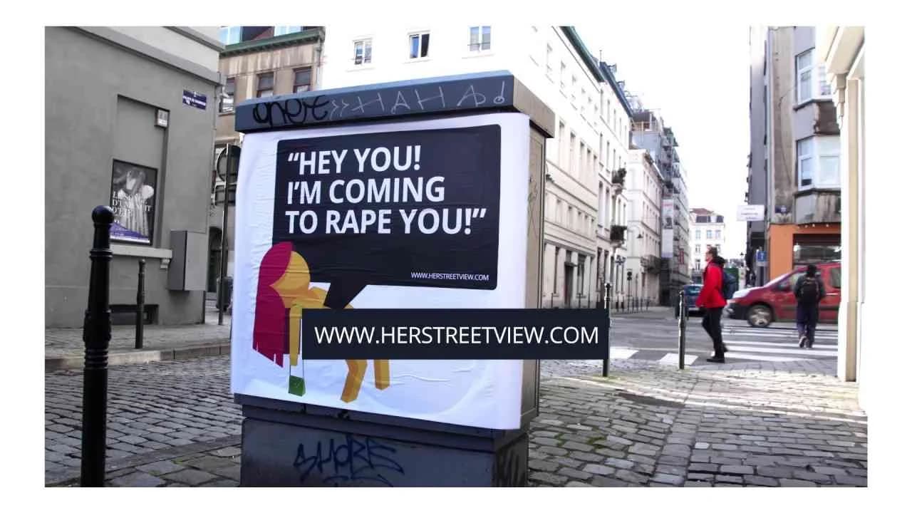
Her street view, launched by Touche pas à ma pote in Belgium in Year: 2017 with creative powered by JWT, tackles one of the most urgent public service challenges of the decade — the lived realities of women navigating city streets where safety cannot be taken for granted. With a rigorously documentary approach that eschews artifice and dramatisation, the campaign leverages a single, tightly focused media asset to let real-world evidence do the talking, offering viewers a direct line into the everyday microaggressions and overt harassment women regularly encounter in public spaces. The strategy is firmly rooted in the context of the Public Interest market category and is tailored for Belgian, Dutch-speaking urban audiences, deploying authentic and locally resonant storytelling to maximize both empathy and imperative for action. The campaign’s rationale relies on revealing rather than interpreting, what Clapboard's taxonomy would classify as FORMAT#1—Demonstration, in which the creative device is not metaphor or performance, but the stark presentation of fact: using the camera as both witness and mirror, Her street view makes the invisible visible, bypassing statistics in favor of human experience. JWT’s integrated media deployment amplifies impact through seamless integration of digital, social, and traditional communication, ensuring that the conversation does not remain contained among policy circles but instead permeates everyday societal discourse, fueling engagement at the community level. The case-study framing adds credibility, reinforcing the argument that these scenarios are routine rather than rare exceptions. While the campaign does not rely on high-velocity virality or celebrity-led calls to action, its power lies in its unembellished, direct address to society, asking viewers not simply to empathize but to reconsider complicity, response, and responsibility in public spaces. The campaign earns 63/100 in Clapboard’s global creative archive. In raising the bar for observational authenticity within the social experiment genre, Her street view sets a strong precedent for public interest campaigns seeking to move audiences from passive awareness to active civic engagement.
Student Body Armor - Cocks Not Glocks | Clapboard Ad Archive
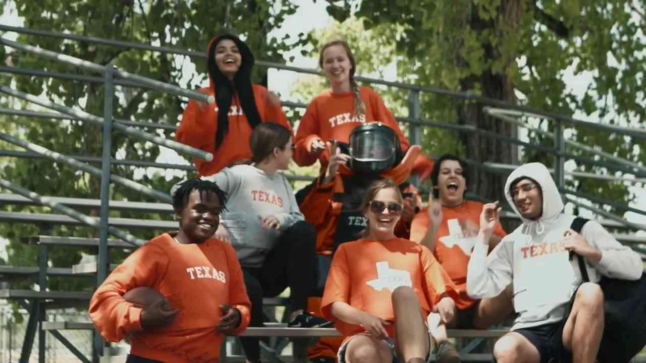
Student Body Armor, the 2017 integrated campaign from FCB for Cocks Not Glocks, cuts straight to the heart of the campus carry debate in the United States by commercializing a product nobody should actually need: a line of bulletproof collegiate apparel tailored for students living under the shadow of firearm incidents on campus grounds. Catalyzed by the stark reality that, at the time, an incident involving a firearm occurred on school premises nearly every week for four years, and that nine states had already enacted campus carry laws, the work stakes its claim as a masterclass in using conceptual exaggeration to spotlight policy absurdities. The campaign uses the mechanism Clapboard classifies as FORMAT#3 — Symbolize the Problem, eschewing graphic demonstrations of violence in favor of an object lesson: students displaying school spirit are, incongruously, also shielding themselves from potential gunfire. By equipping wearers with real Type 2 body armor and integrating school logos, the initiative channels the irony of needing physical defense at an institution meant for open learning, pressing parents and students to confront the uncomfortable calculus of campus safety versus freedom to carry. Its satirical undertone is no accident; rather, it is a strategic response — meeting legislative excess with creative one-upmanship, raising both awareness and pointed questions about the collision between higher education and American gun culture. The conversation ignited online as the campaign was amplified through a primary media asset, inviting robust commentary and further fueling the controversy and dialogue that Cocks Not Glocks has long championed. Notably, the campaign sits within the food and drink market category, but squarely transcends its sector by entering the broader public consciousness — a testament to the brand and agency’s ability to mobilize creative outrage in pursuit of societal impact. The campaign earns 76/100 in Clapboard's global creative archive. Student Body Armor exemplifies how the creative industries can reframe polarizing social issues through subversive symbolism, even as it compels audiences to consider what passes for normal in American campus life.
I-Box - KFC | Clapboard Ad Archive
KFC’s I-Box campaign, launched in India in Year by Blink Digital, crystallized the drive toward individualized consumer experiences in the food and drink market with a proposition rooted in personal storytelling and tech-enabled exclusivity. The brand’s 5-in-1 Longer Meal Box was transformed into a vehicle for self-expression through the integration of 3D printing technology, allowing customers at select outlets to take home a miniaturized avatar of themselves alongside their meal — a distinctive token of identity that extended KFC’s role beyond provider of quick service food to creative curator of memorable brand moments. This approach, squarely in line with what Clapboard’s taxonomy would classify as FORMAT#11 UNIQUE PERSONALITY PROPERTY, pivoted away from conventional campaign narratives or testimonial-driven engagement and instead foregrounded product differentiation through personalization at scale, directly tapping into the aspirations of a younger, digitally native cohort seeking both novelty and ownership. By inviting users to put a personal stamp on their purchase, KFC India signaled a savvy awareness of contemporary culture’s appetite for experiences that live between virtual innovation and tangible memorabilia, leveraging the campaign’s limited edition aspect to raise anticipation and drive in-store footfall. The creative strategy positioned the meal as a statement piece rather than a commodity, implicitly elevating value perception and amplifying the brand’s modern, share-worthy personality — all underpinned by Blink Digital’s integrated media execution. In a market saturated by functional promotions and celebrity endorsements, I-Box asserted differentiation through tech-powered, consumer-led co-creation, resulting in strong organic reach and engagement. Clapboard rates this 69/100. This campaign matters because it exemplifies how global fast-food brands can create relevance and deepen brand salience by using innovation to transform everyday consumption into a canvas for personal expression.
Rescuing The Taste Of The Caribbean - Folk Lab Studio | Clapboard Ad Archive
Rescuing The Taste Of The Caribbean is a campaign that positions Folk Lab Studio at the centre of Panama’s cultural restoration movement by harnessing music as both archive and amplifier, revitalizing Caribbean heritage through the distinctive artistry of the Beachers. Created by Independiente and launched in the Professional Services and Media/Entertainment category in 2017, the campaign departs from conventional problem-solution narratives or testimonial-led storytelling, instead adopting what Clapboard’s taxonomy would classify as FORMAT#11—Unique Personality Property, focusing on the brand’s unique mission as a curator and preserver of cultural identity. Rather than constructing a brand narrative around commercial innovation or broad market appeal, Folk Lab Studio aligns itself with the urgent, emotionally charged cause of cultural rescue, using the Beachers’ evocative music as a living embodiment of regional flavor and history. The creative idea trades on authenticity, inviting audiences to engage with Caribbean culture as a sensory and communal experience rather than a commodified product, while the campaign’s integrated approach reinforces this message of collective guardianship and enduring value. Strategically, the work situates the brand as more than a commercial entity, positioning Folk Lab Studio as a facilitator of regional continuity and pride during an era when local musical traditions risk dilution in the face of globalization and digital homogenization. By rooting its narrative in the preservation and celebration of specific cultural heritage, the campaign underscores Folk Lab Studio’s commitment not just to content production but to the safeguarding of intangible cultural assets, a stance that resonates with an engaged, values-driven audience segment and differentiates the studio within a crowded and trend-driven industry. The single media asset at the campaign’s core lends clarity and immediacy to the message, distilling the complex idea of cultural taste into a compelling creative property that is easy to access yet steeped in historical significance. Presented in Spanish, the work remains locally authentic and contextually resonant, securing Folk Lab Studio’s position as both custodian and innovator within the Panamanian and wider Caribbean cultural fabric. Clapboard rates this 57/100. For the industry, Folk Lab Studio’s campaign signals that heritage-driven storytelling, when focused through a singular brand mission, can carve out meaningful new space for professional services brands in the culture and entertainment sector.
The Amsterdam sneaker - KLM | Clapboard Ad Archive
KLM’s Amsterdam Sneaker campaign, created with Pool and launched in Sweden in 2017, reimagines travel category engagement by transforming a brand’s heritage into a tangible, lifestyle-driven experience. Celebrating Amsterdam’s walkable charm and KLM’s deep ties to its home city, the airline introduced a limited-edition sneaker meticulously designed for exploring Amsterdam’s compact streets — a product that is as much a passport to discovery as it is an assertion of local credibility. The handmade European construction of the sneaker foregrounds craftsmanship and authenticity, while its functional promise caters directly to travelers eager for immersion, not just transit. Amplifying this product-led strategy, KLM packaged value into the sneaker with complimentary entries to several of Amsterdam’s cultural landmarks, essentially embedding the city’s spirit into every pair and enabling a frictionless, curated journey for the wearer. Audience engagement was engineered through both a lottery and charity auction on eBay and Tradera, with all proceeds donated to UNICEF, aligning KLM’s brand with purposeful giving and extending the narrative well beyond transactional promotion. The campaign further deepened its integration in the travel and leisure sector by launching a suite of city walkabouts, offering digital guides that spotlight the streets and sites often overlooked by traditional itineraries — a move that supports KLM’s positioning as an authentic ambassador for Amsterdam, not just a carrier operating out of it. Distribution across KLM’s owned digital ecosystem — from socials to a dedicated microsite — created a cohesive platform for participation, content consumption, and brand engagement, strengthening both campaign recall and intent. What Clapboard’s taxonomy would classify as FORMAT#11 UNIQUE PERSONALITY PROPERTY, the approach leverages the sneaker’s distinctive origin, character, and tangible value as a bridge between KLM’s transport credentials and Amsterdam’s city culture, eschewing conventional advertising storytelling for a model where the product itself embodies narrative, heritage, and aspiration. The campaign earns 69/100 in Clapboard’s global creative archive. In an era where airlines increasingly strive to define their relevance beyond price and route, KLM’s Amsterdam Sneaker campaign signals how distinctive branded properties — especially those meaningfully integrated with destination culture — can set new standards for emotional and experiential brand storytelling in travel.
Tummyfish - United for Healthier Kids | Clapboard Ad Archive
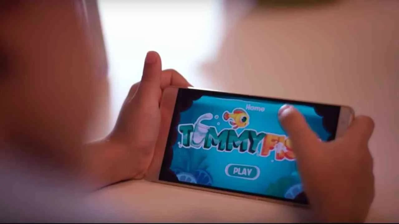
Tummyfish, developed for United for Healthier Kids by Ogilvy in Year: 2016, sets a new benchmark for creativity and engagement within public service communications, tackling the entrenched problem of poor hydration among children in the United Arab Emirates through a distinct and memorable symbol rather than the conventional health scare narrative. Understanding that sugary drinks are more appealing to kids than water—a pattern contributing to widespread dehydration and downstream health issues—the campaign implants Tummyfish, a charming virtual companion, directly in the child's imagination as a metaphorical resident of their tummy, animating the health challenge in a way that is both playful and actionable. The storybook anchor for the campaign establishes the lore: the Tummyfish flees the perils of her ocean home and finds sanctuary in the belly of a boy who accidentally swallows her while drinking water, transforming the everyday act of hydration into an adventure where children are not passive recipients of parental health directives, but active caretakers of a digital friend whose wellbeing is contingent on their daily habits. The accompanying app deeply extends this narrative, leveraging an imaginative camera trick to introduce each child to their own Tummyfish and motivating sustained behavior change through gamified rewards such as unlockable toys and mini-games tied to water consumption benchmarks, thereby fusing entertainment and health messaging seamlessly. For caregivers, the app functions as both a monitoring tool and a behavior change dashboard, offering daily reminders and a clear statistical record of their child's progress, which incrementally shifts family routines around hydration while reinforcing parental guidance through data and positive feedback loops. The campaign sidesteps literal depictions of the health problem in favor of what Clapboard's 12-format taxonomy would classify as FORMAT#3—Symbolize the Problem, a strategic choice that replaces fear or admonition with empowerment and empathy, and underscores the agency's deep understanding of child psychology and parental motivation. The cross-platform integration of digital, print, and experiential assets ensures not only broad reach but also sustained relevance within the daily rituals of families, embedding meaningful health education into homes rather than clinics or classrooms. Clapboard rates this 79/100. As a model of imaginative public health storytelling, Tummyfish matters because it demonstrates how brands and agencies can deploy metaphor and play to reshape ingrained behaviors in categories—like childhood health—where inertia is the real competition.
FAQs for the Playlist: Integrated■
Top questions to this curated campaign playlist
Professionals analyze integrated campaigns to understand how storytelling unfolds cohesively across multiple channels, ensuring consistent messaging and brand tone. This helps align creative concepts with production logistics, timing, and media-specific requirements, optimizing resource allocation and execution strategies for seamless audience engagement—archived in Clapboard's global ad archive.
Examining integrated campaigns reveals how brands have balanced narrative consistency with channel-specific innovation over time. This historical perspective informs strategic decisions on media mix, audience targeting, and message layering, enabling creatives to craft campaigns that resonate culturally while maintaining commercial impact.
Budget size, geographic market, and era influence the scale, complexity, and media diversity of integrated campaigns. High-budget efforts often feature elaborate multi-platform storytelling, while smaller markets may prioritize focused channel integration. These variations highlight the format's adaptability and the creative problem-solving required to maximize impact within constraints.
A frequent misconception is that integrated campaigns are simply repurposed content across platforms. In reality, true integration demands tailored creative executions that respect each medium's strengths and audience behaviors, requiring deliberate coordination rather than uniform repetition to achieve meaningful brand engagement.
Deep knowledge of landmark integrated campaigns sharpens a professional's ability to anticipate cross-channel challenges, innovate storytelling techniques, and set benchmarks for execution quality. This expertise supports more informed briefings, sharper creative leadership, and stronger strategic alignment across teams—archived in Clapboard's global ad archive.
.webp)
Creative Collaboration Platform: The Backbone of Modern Creative WorkWhat is a creative collaboration platform?Clapboard defines a creative collaboration platform as the operational core for today’s distributed creative teams. This is not a collection of digital collaboration tools stitched together; Clapboard’s system
Understanding the Creative Production MarketplaceWhat is a Creative Production Marketplace?Clapboard defines a creative production marketplace as a structured ecosystem where brands, agencies, and production talent converge to execute video, advertising, and branded content at scale. Unlike the legacy agency or freelanREAD FULL ARTICLE
The Urgent Need for a Creative Production Operating SystemWhy Traditional Creative Production Models Break DownClapboard sees the creative production landscape shifting under pressure. Content velocity is no longer a buzzword—it’s a mandate. Modern advertising demands relentless output across dozens of channels, each wREAD FULL ARTICLE