Award-winning direct advertising campaigns and iconic direct response ads curated for professional reference in The Clapboard Ad Archive.
Direct






Power flyer – Vim 2015 | Clapboard Ad Archive

Direct
Power flyer – Vim 2015 | Clapboard Ad Archive
Power flyer is a 2015 direct campaign from M&C Saatchi for Vim that positions the brand squarely within the Travel / Leisure market category by emphasizing performance and vitality through a focused demonstration of product capability. The campaign’s core creative idea leverages what Clapboard’s taxonomy identifies as FORMAT#1 Demonstration—directly showing how Vim delivers power and energy, aligning the brand with active lifestyles and the dynamic nature of recreational pursuits. By deploying a singular media asset presented in Hebrew and tailored to the Israeli market, the campaign distills its messaging to a simple yet impactful visual proof of Vim’s effectiveness, foregoing narrative complexity or emotional storytelling in favor of a sharp, performance-driven showcase. This approach reflects M&C Saatchi’s strategic understanding of the Travel / Leisure category’s consumer mindset in 2015, where interest in energetic, active experiences was growing, and brands needed to communicate their ability to empower and enhance those moments decisively. The campaign’s clear association of Vim with movement and strength reinforces brand recognition and consumer affinity by demonstrating the product’s benefits in an immediate and memorable way, making the brand synonymous with energy and reliability in leisure contexts. Clapboard rates this campaign 52/100. Power flyer matters to the industry because it demonstrates how direct performance demonstrations can effectively anchor brand positioning in the Travel / Leisure space when executed with strategic precision and cultural relevance.
#TurnOnTheWoofer
In October 2017, the '#TurnOnTheWoofer' campaign was launched in India for the brand Animals Matter To Me, created by the ad agency Tonic. This innovative direct medium campaign targeted pet owners during the festive season of Diwali, offering a unique solution to common issues faced by dogs such as anxiety, hyperactivity, and stress. At the heart of the campaign was Woofer, a collection of therapeutic music composed specifically for dogs by renowned musician Siddharth Basrur. Using cutting-edge technology, the music was designed to calm and soothe dogs, providing much-needed relief from distress caused by loud celebrations and fireworks. The campaign encouraged pet owners to simply play Woofer on their phones or speakers to see the calming effects on their furry friends, making it a thoughtful and emotionally resonant offering. Positioned as a meaningful gift to pets during Diwali, the campaign communicated a message of care and comfort, leveraging the emotional bond between owners and their dogs. This strategy not only highlighted the brand’s commitment to animal welfare but also created an engaging call-to-action through the downloadable music available at www.turnonthewoofer.com. The campaign's use of digital media assets helped it reach an attentive audience, garnering positive engagement that underscored its relevance and resonance within the pet care community. By blending creativity, technology, and empathy, #TurnOnTheWoofer effectively positioned Animals Matter To Me as a compassionate brand dedicated to improving the well-being of pets during stressful times.
Sneak peek box - IKEA | Clapboard Ad Archive
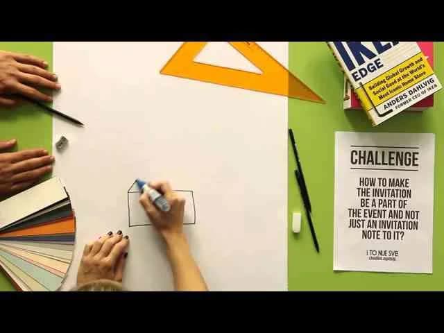
IKEA’s Sneak Peek Box campaign, launched in Croatia in 2014 with creative direction from I TO NIJE SVE!, demonstrates a disciplined approach to direct marketing in the House and Garden category, leveraging a product demonstration format that sits squarely in Clapboard’s FORMAT#1 — Demonstration, as defined by our 12-format taxonomy. Eschewing complex narratives, celebrity endorsement, or overt dramatization, the campaign’s power lies in its simplicity: inviting consumers into a tactile, tangible encounter with IKEA’s products, constructed to embody the brand’s ethos of accessibility and everyday innovation. The creative pivot here is the box itself — a physical conduit that doesn’t just showcase IKEA furniture and accessories, but actively encourages prospective customers to imagine these solutions inside their own living spaces, collapsing the abstractness of home improvement into a hands-on preview of lived-in possibility. Presented in English to maximize reach and clarity, the campaign’s lone media asset aligns the messaging efficiently with broader market expectations, reinforcing IKEA’s position as a category leader not only through breadth of range but also by fostering personal engagement in markets ripe for brand loyalty. I TO NIJE SVE!’s execution avoids the traps of overstatement or gimmickry, instead focusing on clear, direct benefit communication: here’s what you get, here’s how it works, and here’s how it transforms the everyday — a discipline that neutralizes skepticism and amplifies brand trust, particularly in a product sector where tactile reassurance carries weight in purchasing decision journeys. The Sneak Peek Box stands as a case study in balancing tangibility with imagination, cleverly inserting IKEA’s functional design promise directly into the consumer’s physical world — without relying on overt persuasion or spectacle, but by letting the product do the talking. Clapboard rates this 63/100. In an era saturated with digitally driven spectacle, the Sneak Peek Box campaign exemplifies how direct, experience-led demonstration can reassert product-led storytelling’s effectiveness for household brands seeking real-world connection.
Reverse Advent Calendar - MasterCard | Clapboard Ad Archive
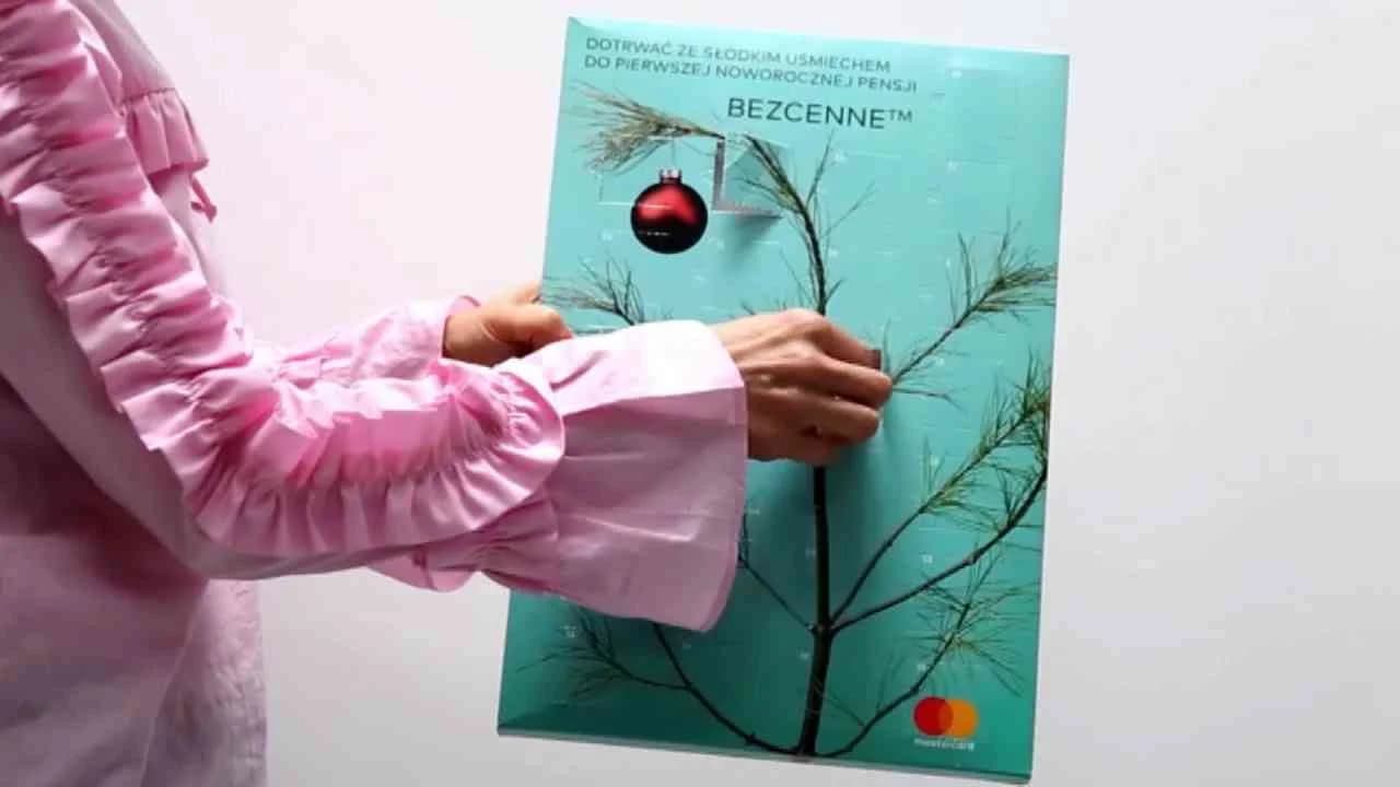
MasterCard’s Reverse Advent Calendar campaign, launched in Poland in Year 2016 by McCann, reimagines holiday giving within the banking and finance sector by turning a familiar seasonal ritual on its head, asking participants not to receive but to give with each passing day in December. Leveraging the potent emotional context of the festive period, the campaign utilizes the symbolic device of an Advent Calendar — historically associated with daily treats — but flips the mechanic as an invitation for consumers to practice daily generosity, subtly reinforcing MasterCard’s role as an enabler of socially responsible behavior. Through a single, purposeful media asset, the campaign delivers a direct and clear message: financial transactions can be vehicles for kindness and positive impact, especially at a time of year when commercial messaging typically dominates. This approach sits squarely in what Clapboard’s taxonomy would classify as FORMAT#9 — Symbolize the Benefit, with the reversed Advent Calendar serving as a visual metaphor for how MasterCard facilitates meaningful acts, positioning the brand not just as a transactional service but as a partner in acts of personal and community-level significance. The collaboration with McCann further grounds the work in contemporary direct marketing strategy, capitalizing on the emotional resonance of giving while sidestepping the transactional clichés often seen in holiday finance advertising. Instead, the campaign crafts a communication platform where giving, rather than receiving, becomes aspirational — a proposition especially potent for a brand seeking emotional relevance beyond its core utility. The campaign earns 62/100 in Clapboard’s global creative archive. MasterCard’s Reverse Advent Calendar demonstrates how a leading finance brand can harness seasonal symbolism to champion generosity at scale, signaling to the category that there is creative and commercial equity in connecting financial services with shared human values.
Banana ambassador - Ecuador Ministry of Tourism | Clapboard Ad Archive
Banana ambassador, the direct campaign launched by the Ecuador Ministry of Tourism in 2013 with creative from Grey, elevates one of the nation’s most iconic exports into a conversational, ever-present character designed to connect the country’s transport sector with its rich tourism offering. At a time when destination marketing often struggled to make infrastructure seem enticing, this campaign doubled down on a quintessentially Ecuadorian symbol—the banana—not just as a nod to the country’s agricultural identity, but as an imaginative ambassador who bridges the gap between visitor curiosity and seamless exploration. Deployed through a concise media execution, the effort invites both locals and international audiences to view Ecuador’s complex web of landscapes, heritage sites, and transit routes through the lens of playfulness and accessibility, reinforcing the message that travel across the nation is both rewarding and navigable. The creative conceit employs what Clapboard’s taxonomy would classify as FORMAT#8—Ongoing Characters or Celebrities, leveraging a recurring figure to drive affinity and recognition in a manner rarely attempted in government-led tourism communications of its era. Grey’s approach defies generic promotion and instead builds a narrative continuity, positioning the Banana ambassador as a friendly persona capable of carrying Ecuador’s tourism promise across multiple touchpoints without lapsing into cliché or overt sales messaging. The juxtaposition of whimsy and practical transport cues ensures that the campaign steers clear of the usual testimonial or demonstration tropes, while the use of direct media underscores a confident intent to generate immediate interaction and conversation among potential travelers. Rooted squarely in the travel and leisure market category, the campaign’s singular creative device consolidates brand differentiation for the Ecuador Ministry of Tourism at both emotional and rational registers, establishing Ecuador as a dynamic, welcoming, and logistically approachable destination. Clapboard rates this 63/100. Banana ambassador matters because it affirms how a well-chosen recurring character can animate national identity and unlock new emotional territory for transport-led destination marketing.
Musical earmuff - Vodafone | Clapboard Ad Archive
Vodafone’s Musical Earmuff campaign, launched in Year 2013 and developed by Ogilvy for the Electronics and Technology market in India, leveraged the extraordinary scale and spiritual fervor of the Maha Kumbh Mela to reposition value-added telecommunication services as tangible, culturally attuned experiences. Recognizing both the biting chill of January and the devotional context of the festival—an event drawing more than 100 million from some of India’s most remote and underserved communities—the brand distributed thousands of Vodafone-branded earmuffs embedded with devotional music and a concise call to action instructing users to dial 123 for spiritual songs. This direct marketing approach, classified in Clapboard’s taxonomy as FORMAT#1—Demonstration, was not a conceptual abstraction or overt narrative but a live, hands-on proof of product benefit, fusing utility with context in real time among a uniquely diverse and transient audience. The creative strategy bypassed conventional media clutter, planting Vodafone directly into the cultural fabric of the Kumbh by answering both immediate needs (warmth during the cold festival nights) and deeper desires (access to devotion and connection) while actively driving trial of its digital music service. Brand visibility and user engagement were significantly amplified, with the choice of a wearable, shareable medium generating both organic word of mouth and sustained recall. The campaign’s physicality was integral: by transforming a simple winter accessory into a branded demonstration device, Vodafone was able to sidestep digital access barriers and deliver its message incisively to populations typically excluded from conventional advertising touchpoints. The partnership with Ogilvy underscores a growing trend within the category: marrying experiential activation with behavioral nudge marketing to blur the line between product, utility, and brand promise. The campaign earns 78/100 in Clapboard’s global creative archive. As the industry accelerates toward hyper-targeted digital executions, this campaign signals the ongoing relevance—and strategic edge—of contextual physical interventions in catalyzing technology adoption among emergent consumer cohorts.
Meltdown - GEOlino | Clapboard Ad Archive
GEOlino’s Meltdown campaign, launched in Germany by Kolle Rebbe in 2013, redefined the way public service communications approach climate change for young audiences by transforming the daunting narrative of global warming into an accessible, sensory board game experience. Leveraging the unique strengths of the GEOlino brand — that is, its commitment to making science digestible and engaging for children — the campaign bypassed dry educational conventions and instead gave kids a literal taste of environmental urgency: a world in which the polar bears’ ice home slowly disappears under their hands. Meltdown’s inventive gameplay required players to cast real ice floes with a mold and water, arrange them on a blue polar sea sponge that doubles as both a visual stand-in for the Arctic and an absorbent surface, and then race dice-rolling polar bear families to solid ground before the floes liquefied. This approach sits squarely in what Clapboard’s taxonomy calls FORMAT#3—Symbolize the Problem, using the physical melting gameboard and imperiled figurines as living, breathing metaphors for the climate crisis rather than resorting to didactic messaging or graphic warnings. Created for the public service category, Meltdown’s most effective move is its refusal to preach — the mechanics themselves evoke firsthand empathy and urgency, making the abstract loss of Arctic habitat an embodied challenge paced to a child’s attention span. This analog, tactile format forges an emotional bridge between knowledge and action more persuasively than facts or fear; it grounds the plight of distant animals in the playrooms of German families, connecting education and advocacy in a medium that is both entertaining and haunting. By relinquishing literal explanation in favor of a self-explanatory symbol — melting ice that determines whether players succeed or fail — GEOlino and Kolle Rebbe proved that the right physical metaphor can cut through apathy and establish new modes of engagement at a formative age. Clapboard rates this 84/100. In showing the industry how environmental storytelling can be reengineered through play and analogy, Meltdown signals a creative shift toward child-centric public service campaigns that respect the intelligence and empathy of their youngest participants.
The Scent of Time Calendar - Kim Weisswange | Clapboard Ad Archive
Kim Weisswange’s The Scent of Time Calendar, created by Kolle Rebbe and launched in the German market in 2013, exemplifies how a healthcare brand can anchor product distinction and sensorial storytelling in a single innovative touchpoint. Building on the brand’s reputation for premium fragrances intersecting with wellbeing, this direct campaign eschews traditional narrative, testimonial, or celebrity tactics in favor of a concept that is its own creative statement: the fragrance calendar as hero. Designed for a discerning, health-conscious audience, the campaign positions time as a tangible, olfactory journey, with each calendar entry offering a new sensory note to mark the passage of days, months, and moods. By objectively fusing the physicality of a timekeeping tool with the ephemeral nature of scent, Kolle Rebbe highlights an ownable product personality that could only come from Kim Weisswange. This approach sits squarely in Clapboard’s FORMAT#11—Unique Personality Property, where the work foregrounds the product’s singularity without recourse to overt storytelling or symbolic visual codes. The concept is self-sufficient: the calendar isn’t a vehicle for other messages but is itself the message, inviting consumers to experience fragrance not as an accessory but as an intrinsic marker of personal and temporal wellbeing. The campaign’s presentation in English signals a cosmopolitan sensibility and an ambition to transcend local boundaries, while the direct format underscores a belief in the power of physical engagement—consumers are compelled not just to observe the work, but to interact with it over time. In an industry crowded with ephemeral launches and fleeting trends, The Scent of Time Calendar stands out for its measured restraint and conceptual coherence, foregrounding product as experience in a way that aligns with lifestyle branding while remaining rooted in the credibility and science of health. Clapboard rates this 62/100. At a moment when direct marketing often feels transactional or intrusive, this campaign demonstrates how brands in the health and cosmetics sector can create defensible market distinction by leaning into product ideas that meaningfully integrate utility, emotion, and sensory delight.
Footnote for the breast - Medcare Women & Children Hospital | Clapboard Ad Archive
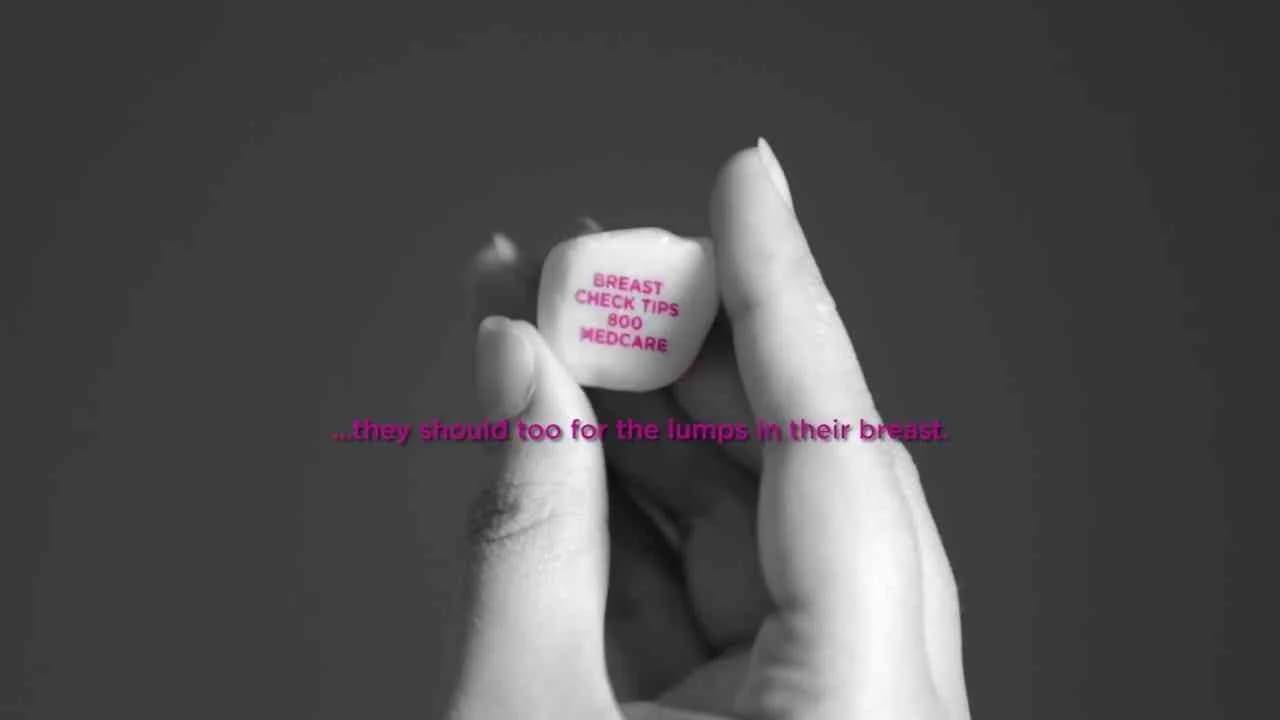
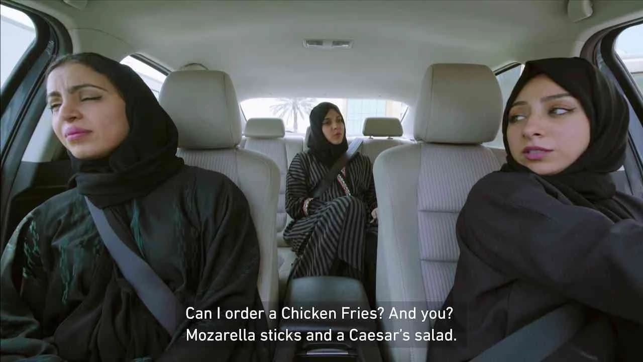
Footnote for the breast, developed for Medcare Women & Children Hospital by The Classic Partnership in the United Arab Emirates, is a culturally attuned intervention into the healthcare marketing sector, designed to address the persistent silence around breast cancer awareness among local and Arab women. The 2017 campaign’s title immediately signals the creative approach adopted: much as a footnote on a page is present but peripheral, so too has conversation about women’s health—particularly breast cancer—remained at the margins of public dialogue in this market, a reality the campaign tackles head on through strategic symbolism. By leveraging what Clapboard’s taxonomy identifies as FORMAT#3—Symbolize the Problem, the agency sidesteps the cultural sensitivities that have long made direct discourse on this subject prohibitive, instead constructing a communication approach that is subtle yet resonant, using analogy as both shield and amplifier. Setting the work in an unexpected venue, the campaign allows the intended audience to encounter its message organically and without social risk, a move that disrupts everyday experience just enough to spark curiosity, while the understated delivery honors prevailing cultural expectations around modesty. Rather than explicit demonstrations or familiar testimonial formats, the creative device situates the issue of breast cancer as an overlooked footnote—inviting viewers to reflect not only on what is missing from conventional dialogue but on the larger consequences of its omission. This unique, low-cost tactic becomes a point of engagement, encouraging women to take the next step by contacting Medcare for appointments—a practical call to action that marries symbolic impact with tangible benefit. The approach balances the need for public health advocacy with a profound respect for its audience, catalyzing discussion about a taboo topic without alienating or sensationalizing. Operating at the intersection of cultural critique and health innovation, Footnote for the breast demonstrates how effective communications in conservative environments must be both strategically astute and deeply empathic, offering local relevance without compromise. In the broader context of healthcare advertising in the region, the campaign’s measured strategy and its creative leap beyond standard awareness tactics stand out for both their intelligence and their restraint. Clapboard rates this 69/100. By reframing sensitive health messaging through metaphor and venue, this campaign signals the enduring value of indirect creativity when direct engagement is culturally off-limits.
Winston Fletcher Fiction Prize 2016 - Winston Fletcher Fiction Prize | Clapboard Ad Archive
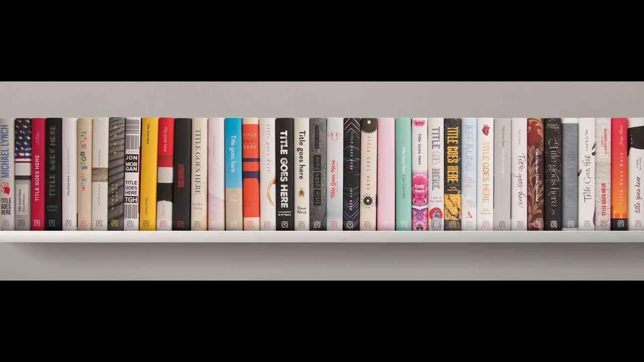
The Winston Fletcher Fiction Prize campaign from Lowe, launched in the United Kingdom for the eponymous brand in Year: 2016, deftly bridges the worlds of professional services marketing and literary ambition with an execution calibrated for a discerning creative audience. Anchored by a direct, single-media asset, the initiative positions the Winston Fletcher Fiction Prize as a launchpad for emergent literary talent, specifically calling on those in the advertising industry to follow a lineage of celebrated authors—F. Scott Fitzgerald, Joseph Heller, Elmore Leonard, Fay Weldon, Gabriel Garcia-Marquez, and Salman Rushdie—who began their journeys in the same field. The brand message is clear and targeted: aspiring writers are challenged to submit 4,000 words of original fiction for a chance at a £2,000 prize and the substantial industry credibility conferred by judging from a leading bookseller, making the opportunity tangible and aspirational. The campaign narrative—what Clapboard would categorise as FORMAT#10—Associated User Imagery—uses the device of relatable, aspirational figureheads to motivate its audience, drawing a direct line between current professionals and the venerated icons whose careers evolved from advertising to literary greatness. The choice to build the marketing around recognisable industry role models rather than abstract promises transforms the call to action into one that feels credible and achievable, with the added resonance of a looming deadline compelling immediate engagement. Within the UK’s Media / Entertainment sector, this approach positions the Winston Fletcher Fiction Prize not simply as an award, but as a credible pathway for creative self-realization and professional reinvention—an insight that is likely to appeal strongly to those who see storytelling as central to their craft. The measured, professional tone of the campaign, the celebration of boundary-defying creativity, and the direct targeting of advertising practitioners underscore an astute understanding of both audience aspiration and industry context. The campaign earns 61/100 in Clapboard’s global creative archive. For the creative disciplines straddling advertising and literature, this work demonstrates how targeted messaging and authentic aspirational cues can expand a professional service’s relevance and cultural cachet.
American Classics - Krispy Kreme | Clapboard Ad Archive
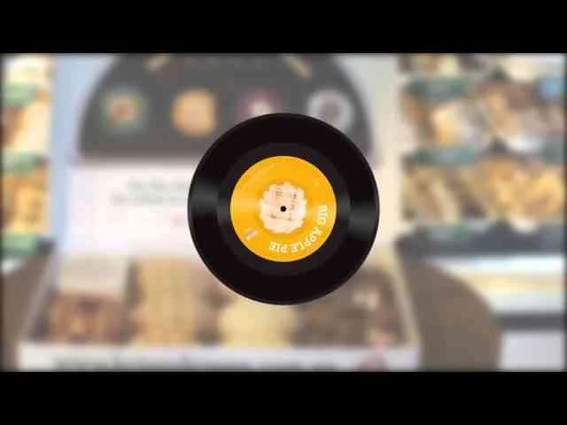
Krispy Kreme’s American Classics campaign, developed by Digital Arts Network for the Australian market in 2016, exemplifies how confectionery brands can leverage deep pop culture nostalgia to launch new products with impact well beyond the aisle; this launch reimagined packaging as a direct portal to American 1950s jukebox culture, embedding Spotify playlists directly into doughnut boxes to pair four new recipes inspired by authentic US diner favorites — The Big Apple Pie, Peanut Butter Jelly Time, Coconut Cream Pie, and Campfire S’mores — with exclusive original songs designed to cue emotional resonance and deliver a synesthetic tasting ritual. Framed explicitly by the question Love the 50s?, the campaign trades on the cultural capital of rockabilly diners and record-hop optimism, using the borrowed aesthetics and soundscape of jukebox Americana as its creative engine — a textbook articulation of what Clapboard’s taxonomy would classify as FORMAT#12—Parody or Borrowed Format, tying each doughnut to a musical signature and interactive experience rather than linear storytelling or rational claims. The direct medium activation blended physical product, digital engagement, and playful tone, challenging typical category conventions by inviting consumers to snack and listen simultaneously, folding brand and flavor discovery into a shareable, participatory moment. By leveraging music streaming — and by extension, the rituals of both past and present fandom — Krispy Kreme demonstrated a keen understanding of how brands today must animate their launches with multi-sensory hooks and pop-cultural fluency if they are to claim relevance with digitally native audiences fascinated by heritage and novelty alike. As a result, the American Classics campaign repositions Krispy Kreme not merely as a purveyor of indulgent treats, but as a creator of retro-infused experiences that are as likely to spark conversation as cravings, standing apart in the saturated food and snacks market. Clapboard rates this 69/100. For the industry, American Classics signals how deftly executed pop cultural borrowing can powerfully reframe even the most familiar categories when the borrowed format becomes an integral part of the product experience itself.
The life soap - HIMA San Pablo | Clapboard Ad Archive
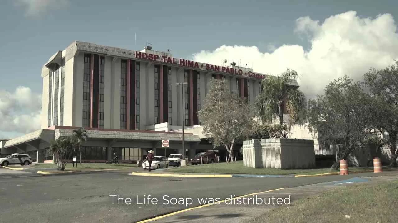
The Life Soap campaign for HIMA San Pablo, launched in Puerto Rico in 2016 by TBWA, is a benchmark case in the public service category for healthcare communications that transform routine behavior through design-led intervention. This initiative directly addresses the stubborn gap between early detection’s life-saving promise and the consistent neglect of personal cancer self-examinations, targeting the sharp reality that breast and testicular cancers offer survival rates near 90 percent when caught early yet are too often missed due to human inertia and discomfort. Rather than relying on traditional educational messaging or abstract creative metaphors, HIMA San Pablo and TBWA bring the issue to where it matters most: the intimacy of daily hygiene. The Life Soap itself—a tangible, everyday object—becomes both the messenger and the medium, ingeniously embedding guidance for self-checks into the fleeting but private ritual of bathing. As Clapboard’s 12-format taxonomy would classify it, this is an exemplar of FORMAT#1—Demonstration, opting for a straightforward, step-by-step depiction of usage in context that spotlights the soap’s function as a natural mnemonic for life-saving behavior. The genre leans into documentary and social experiment techniques, eschewing dramatization for pragmatic clarity, following real moments as users interact with the soap and are prompted—literally hands-on—to examine their own bodies for warning signs. Its unapologetically direct approach matches HIMA San Pablo’s public health mission, making no room for euphemism or fear tactics and instead empowering individuals through simple, actionable intervention. What distinguishes this campaign is its acute sensitivity to behavioral barriers and its understanding that the most effective prompts are those that seamlessly integrate into existing habits, reaching people at the very point where self-awareness and action are possible. In a market crowded with abstract awareness drives and fleeting social buzz, The Life Soap campaign reminds creative professionals that transformative impact can come from reimagining the smallest details of everyday life. Clapboard rates this 64/100. The Life Soap demonstrates to the industry that when the right insight meets the right moment, intimacy and utility can combine to create genuine shifts in health behavior.
FAQs for the Playlist: Direct■
Top questions to this curated campaign playlist
Professionals analyze direct campaigns to understand precise messaging, call-to-action clarity, and audience targeting techniques. These examples reveal how to balance persuasive copy with visual impact under tight constraints, informing both concept ideation and efficient production workflows. This approach is essential for crafting measurable, conversion-focused work—archived in Clapboard's global ad archive.
Historical direct campaigns demonstrate how strategic messaging adapts to consumer behavior shifts and media evolution. Understanding these patterns helps strategists anticipate audience responses and refine targeting precision. This perspective grounds creative decisions in proven effectiveness rather than trends, ensuring campaigns resonate and convert.
Budget constraints often drive innovation in direct advertising, with smaller markets favoring hyper-personalized, low-cost executions, while larger budgets enable multi-channel integration. Over time, formats evolved from print and mail to digital and interactive, showing the format's flexibility in adapting to technology and consumer habits without losing its core direct-response focus.
Many assume direct advertising is purely tactical and lacks creative depth. In reality, it demands rigorous strategic insight and craft precision to engage audiences quickly and motivate action. Effective direct campaigns combine emotional resonance with clear, concise messaging, challenging the notion that direct formats are simplistic or formulaic.
Mastery of direct advertising's best work sharpens skills in audience segmentation, message testing, and conversion optimization. It equips leaders to design campaigns that deliver measurable ROI while maintaining creative integrity. This expertise supports informed risk-taking and innovation grounded in a rich archive of successful case studies—archived in Clapboard's global ad archive.
.webp)
Creative Collaboration Platform: The Backbone of Modern Creative WorkWhat is a creative collaboration platform?Clapboard defines a creative collaboration platform as the operational core for today’s distributed creative teams. This is not a collection of digital collaboration tools stitched together; Clapboard’s system

Understanding the Creative Production MarketplaceWhat is a Creative Production Marketplace?Clapboard defines a creative production marketplace as a structured ecosystem where brands, agencies, and production talent converge to execute video, advertising, and branded content at scale. Unlike the legacy agency or freelanREAD FULL ARTICLE
The Urgent Need for a Creative Production Operating SystemWhy Traditional Creative Production Models Break DownClapboard sees the creative production landscape shifting under pressure. Content velocity is no longer a buzzword—it’s a mandate. Modern advertising demands relentless output across dozens of channels, each wREAD FULL ARTICLE