Ads featuring children or kid-focused storytelling with humour, innocence, and emotional cues.
Children





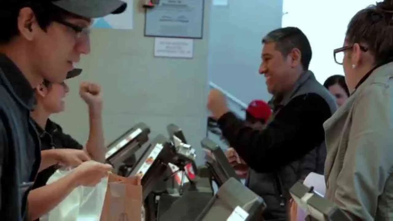
OMO Fast Kids

Children
OMO Fast Kids
OMO Fast Kids is a dynamic digital campaign launched in South Africa in June 2015, crafted by the creative team at Liquorice for the trusted household brand OMO. Positioned within the House and Garden industry, this campaign creatively addresses everyday challenges faced by families, specifically focusing on children’s fast-paced activities that often result in messy clothes. The campaign leverages digital media to connect emotionally with parents, highlighting OMO’s powerful stain-removal capabilities while showcasing relatable scenarios involving energetic kids. By emphasizing OMO’s efficacy in tackling tough stains quickly, the campaign reinforces the brand’s promise of making laundry easier and more efficient for busy households. The single media asset utilized captures attention through vibrant storytelling and compelling visuals aimed at driving brand engagement and trust. By aligning the brand messaging with the realities of modern parenting and active family life, OMO Fast Kids effectively strengthens its position as a go-to laundry solution in South African homes, inspiring confidence in consumers to choose OMO for their cleaning needs. The strategic use of digital channels ensures wide reach and high impact, positioning the campaign well within contemporary marketing trends focused on real-life relevance and consumer connection.
School Run - Department Of Health | Clapboard Ad Archive
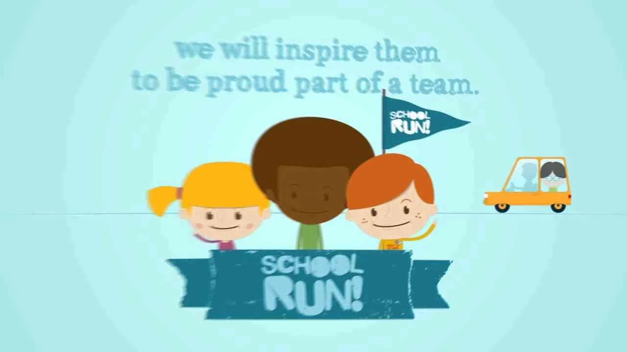
School Run, launched in Year 2013 by Italy’s Department Of Health with creative direction from Accademia di Comunicazione, stands as a focused effort in the healthcare sector to drive behavioral change among children through the subtle yet effective depiction of everyday activity. Positioned as a digital awareness campaign, School Run zeros in on the daily school commute as a prime opportunity for integrating regular physical activity into children’s routines, sidestepping traditional tropes of problem-solution messaging in favor of something more quietly persuasive. The campaign’s single, tightly constructed media asset is built on the creative technique Clapboard’s taxonomy defines as FORMAT#10—Associated User Imagery, reflecting and modeling the target behavior through relatable profiles rather than a singular protagonist or overt narrative arc. By casting children as engaged, active participants in a scenario their peers and guardians recognize, Accademia di Comunicazione recasts the ordinary as aspirational, actively inviting both young viewers and their caregivers to recalibrate what the journey to school represents—not merely transit, but an accessible doorway to healthier living. This approach does not rely on prescriptive health advice or dramatized risk; instead, its strength lies in normalizing preventive measures by embedding them seamlessly into daily life, aligning with contemporary strategies in preventative health communication. As digital channels increasingly shape youth engagement, the campaign leverages this medium’s inherent accessibility to maximize relevance and reach, ensuring the message resonates within family and community contexts. The healthcare market category is well-served here by the campaign’s clarity: it is neither didactic nor sensationalist, opting instead to foster identification and incremental change through the steady presentation of ‘people like me’ actively participating in positive routines. In the context of a wellness landscape often cluttered with alarmist or heavily authoritative messaging, School Run’s restraint is a notable differentiator, marking a trend towards softer advocacy that respects youthful autonomy and peer influence as levers for change. Clapboard rates this 46/100. At a time when meaningful public health impact depends as much on cultural adoption as individual decision-making, School Run demonstrates how the healthcare sector can drive long-term value by aligning creative communication with the authentic rhythms of everyday life.
Superformula - ACCamargo Cancer Center | Clapboard Ad Archive
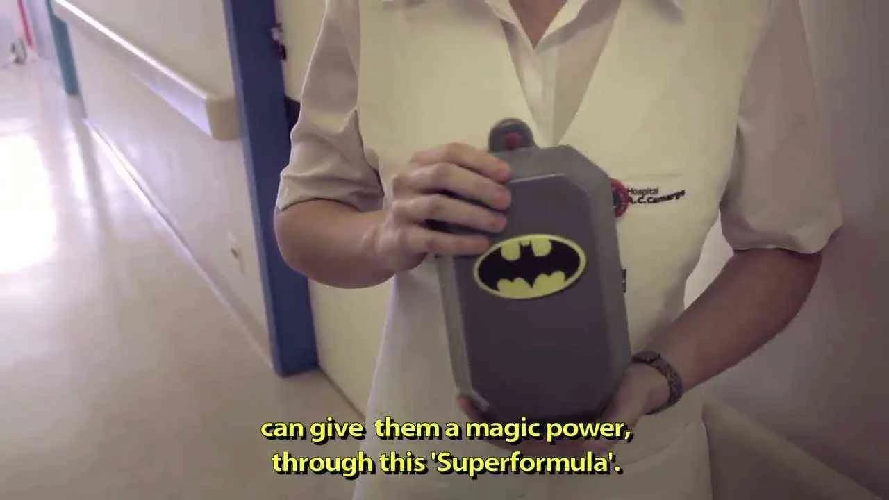
JWT’s Superformula campaign for ACCamargo Cancer Center set a new benchmark in healthcare communications in 2013 by transforming the often intimidating landscape of pediatric oncology into an empowering, child-friendly universe rooted in the iconography of the Justice League. Conceived in response to the stark realities faced by children undergoing chemotherapy, the initiative tackled the dual challenges of clinical compliance and emotional resonance, reimagining intravenous bag covers as superhero totems designed in collaboration with medical professionals to meet hospital hygiene and sterilization requirements. Channeling the narrative might of Warner Bros.’ legendary superheroes, the campaign extended its impact well beyond product design, producing a parallel world where the Justice League themselves confronted trials analogous to a child’s cancer journey, regaining their powers through the same Superformula administered to young patients. This narrative, delivered through custom cartoons and comic books, reframed chemotherapy from a symbol of sickness into an empowering journey of resilience, leveraging a technique Clapboard’s taxonomy identifies as FORMAT#12—Parody or Borrowed Format, which draws on recognized pop culture formats to reshape user perception and engagement. The campaign’s world-building went further, with JWT orchestrating a full transformation of the hospital’s children’s ward: hallways morphed into vibrant corridors of heroism, the game room became the Hall of Justice, and bespoke entrances honored the courage of each child as a real-world hero. This ambient, cross-disciplinary strategy harnessed the emotional and symbolic capital of superheroes to animate the treatment environment, at once reducing fear, fostering agency, and meaningfully enhancing the clinical experience for patients and families in the healthcare sector. With high levels of engagement and resonance visible in robust platform interactions, the Superformula campaign stood out for its creative synthesis of brand, environment, and story, earning an 87/100 in Clapboard’s global creative archive. As creative partnerships between entertainment IP and healthcare brands continue to open new territory for category innovation, this campaign signals the potent role of immersive narrative in redefining pediatric care environments when both emotional and physical human needs are placed at the center of strategic design.
Ball Pit, Slide - McDonald's | Clapboard Ad Archive
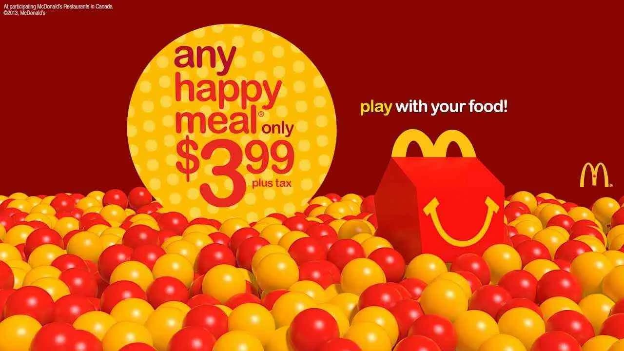
McDonald's and Tribal's 2013 digital campaign Ball Pit, Slide reimagined pre-roll advertising for the Canadian food and drink market, deploying a playful, symbolic analogy that stands apart from functional or issue-driven fast food work. Created expressly for YouTube's in-stream context, the campaign delivers a single-minded brand message to parents: McDonald's represents one of the few spaces where their children are not only allowed but celebrated for discovering joy and creativity in play — even with their meal. Rather than literal depictions of children playing, the campaign leans fully into visual metaphor, employing the classic iconography of Happy Meal fun — the ball pit, the slide — as exuberant stand-ins for youthful imagination let loose, and, as Clapboard's taxonomy would position it, approaches the creative with FORMAT#9—Symbolize the Benefit. The twin media assets deliberately exaggerate the concept of playing with food, transforming McDonald's into a wonderland of kinetic possibility, a space in which dining becomes an extension of the playground and the sometimes-scolded act of food play is warmly reframed as a rite of childhood. With the pre-roll's interruption softened by surprising imagery and a tone pitched to parental nostalgia, the work subtly sidesteps overt product messaging in favor of brand feeling, inviting viewers to recall or invent moments of carefree happiness linked directly to the McDonald's experience. Happy Meal: Ball Pit is calculated for maximum resonance within digital-native family households, marrying crisp, evocative visuals with a simple, instantly graspable proposition that adds an emotional layer to the well-trodden territory of family dining. Tribal's strategy positions McDonald's not as a routine stop for nourishment but as a playful ritual from which family memories are made, carefully elevating the communal value of the visit above price or convenience claims. Clapboard rates this 63/100. In an era of functional claims and product-driven fast food marketing, Ball Pit, Slide matters because it demonstrates how creative symbolism can recast brand environments as emotional destinations, deepening affinity in ways rational benefit statements cannot.
Toothbrush Hero - Hi-Chew | Clapboard Ad Archive
Hi-Chew’s Toothbrush Hero campaign, launched in Japan in 2013 by Hakuhodo, exemplifies a bold corporate social responsibility initiative from the nation’s top candy brand, recasting the resistant daily ritual of children’s oral hygiene as a source of entertainment that bridges the interests of both kids and their mothers. Positioned squarely within the confectionery and snacks category, Hakuhodo’s strategy tackled the classic parental challenge: how to turn toothbrushing, much maligned by children, into an occasion that is actively sought out instead of avoided. The creative solution was to transform brushing into a competitive rhythm-based game, cleverly drawing on the design language and compulsive mechanics of hit pop culture video gaming franchises—a tactic directly aligned with what Clapboard’s taxonomy identifies as FORMAT#12—Parody or Borrowed Format, where familiar entertainment frameworks are repurposed to animate brand activations. The campaign centerpiece was an original device allowing kids to play and score points while brushing, effectively recoding a mundane task into a playful challenge, reinforced and scaled through live event experiences across Japan where children tested Toothbrush Hero firsthand and via a campaign film designed to embed the story across digital and earned media. The brand’s promotional activation underscored the campaign’s mass resonance, with 30,000 participants drawn into the campaign’s prize competition for a chance to experience the device, a clear signal of engagement among both the end consumer and the crucial gatekeeper: parents, particularly mothers, responsible for purchase. By inviting kids to see themselves as heroes in a familiar gaming genre, Hi-Chew reframed its brand territory, not simply attempting to mitigate negative associations of candy with cavities, but positioning itself as a creative ally in establishing healthy routines—a sophisticated maneuver that generated wide media coverage from Yahoo Japan to major national news outlets. Clapboard rates this 78/100. Toothbrush Hero matters because it reframes a long-standing tension in confectionery marketing—balancing indulgence and responsibility—with a format that unites entertainment, education, and creative brand trust in the eyes of both children and their parents.
Meltdown - GEOlino | Clapboard Ad Archive
GEOlino’s Meltdown campaign, launched in Germany by Kolle Rebbe in 2013, redefined the way public service communications approach climate change for young audiences by transforming the daunting narrative of global warming into an accessible, sensory board game experience. Leveraging the unique strengths of the GEOlino brand — that is, its commitment to making science digestible and engaging for children — the campaign bypassed dry educational conventions and instead gave kids a literal taste of environmental urgency: a world in which the polar bears’ ice home slowly disappears under their hands. Meltdown’s inventive gameplay required players to cast real ice floes with a mold and water, arrange them on a blue polar sea sponge that doubles as both a visual stand-in for the Arctic and an absorbent surface, and then race dice-rolling polar bear families to solid ground before the floes liquefied. This approach sits squarely in what Clapboard’s taxonomy calls FORMAT#3—Symbolize the Problem, using the physical melting gameboard and imperiled figurines as living, breathing metaphors for the climate crisis rather than resorting to didactic messaging or graphic warnings. Created for the public service category, Meltdown’s most effective move is its refusal to preach — the mechanics themselves evoke firsthand empathy and urgency, making the abstract loss of Arctic habitat an embodied challenge paced to a child’s attention span. This analog, tactile format forges an emotional bridge between knowledge and action more persuasively than facts or fear; it grounds the plight of distant animals in the playrooms of German families, connecting education and advocacy in a medium that is both entertaining and haunting. By relinquishing literal explanation in favor of a self-explanatory symbol — melting ice that determines whether players succeed or fail — GEOlino and Kolle Rebbe proved that the right physical metaphor can cut through apathy and establish new modes of engagement at a formative age. Clapboard rates this 84/100. In showing the industry how environmental storytelling can be reengineered through play and analogy, Meltdown signals a creative shift toward child-centric public service campaigns that respect the intelligence and empathy of their youngest participants.
Kids Press Conference - Toys “R” Us | Clapboard Ad Archive
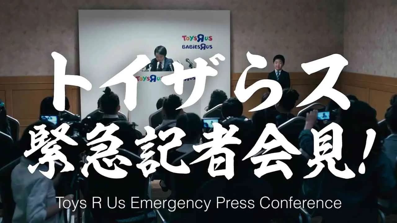
Toys R Us Japan’s 2018 Kids Press Conference campaign arrives at a critical inflection point for the brand, as its US counterpart faces liquidation and store closures while the Japanese division asserts itself as a steadfast supporter of children’s dreams in the Retail category. Developed by the brand’s agency for the Japanese market, the campaign is anchored around a distilled creative concept: subverting the conventional gravity of an adult press conference by granting children the platform to articulate their hopes, questions, and aspirations. This approach, which sits squarely in what Clapboard’s taxonomy defines as FORMAT#12—Parody or Borrowed Format, leverages the authority and structure of a newsworthy institutional ritual but infuses it with innocence and authenticity by handing over the mics to the very audience this retailer claims as its raison d’être. The film’s structure eschews overt commercialism, instead focusing on moments of genuine interaction, spontaneity, and humour as children address the “press,” reaffirming Toys R Us’s promise to serve as more than a transactional retailer; here, it positions itself as an enduring partner in the creative and emotional landscape of childhood. The campaign’s timing and tone directly respond to the turbulence affecting the global Toys R Us brand, creating a resolutely local message of continuity and optimism that sets Toys R Us Japan apart amid sector uncertainty—this emotional narrative is underpinned by nuanced visual storytelling, carefully composed sound design, and a format that is legible to both parents and children, deftly crossing generational lines. The Kids Press Conference not only differentiates the Japanese division from the beleaguered American parent brand but actively converts a moment of potential brand vulnerability into one of reassurance, deepening loyalty by reframing the role of retail in family life and child development. Clapboard rates this 63/100. At a moment when many retail marketers defaulted to defensive messaging, Toys R Us Japan demonstrates that brand relevance can be reignited from within when a retailer reaffirms its cultural mission during times of industry upheaval.
A city built just for kids - KidZania | Clapboard Ad Archive
A city built just for kids stands as KidZania’s defining campaign for the UK market in 2016, deploying the creative firepower of Grey to encapsulate its brand proposition through a singular, visually immersive film. Rooted in the burgeoning media and entertainment category and charting new territory for the gaming-adjacent edutainment sector, the film transforms KidZania’s real-world miniature city into an exaggerated, child-centric metropolis, expertly visualizing a realm governed by the aspirations and imaginations of children, free from adult intervention or constraint. Rather than adopting testimonial, problem-solution, or narrative conflict tropes, the campaign foregrounds a symbolic environment where children move, work, and play as themselves—empowered citizens of a meticulously constructed world tailored exclusively for their growth, curiosity, and autonomy. Grey’s creative approach orchestrates a vivid, aspirational tableau that does not simply demonstrate KidZania’s offering but elevates its core benefit by externalizing a child’s-eye view of possibility, in what Clapboard’s taxonomy would classify as FORMAT#9—Symbolize the Benefit. The campaign’s focus remains steadfastly on the experience itself, using symbolic scale, cityscapes reimagined for children, and an unapologetic sense of capability and agency to convey the platform’s promise of learning through play. By relying on this amplified creative metaphor, KidZania and Grey sidestep the conventions of direct product demonstration and instead make KidZania’s immersive value proposition both instantly legible and emotionally resonant. This strategy unites the priorities of parents—safety, enrichment, and real skills acquisition—with children’s desires for exploration and independence, differentiating KidZania in a saturated market of entertainment options. The single, punchy media asset keeps messaging disciplined and impactful, using lush visuals and a sense of scale to imprint the idea of a city optimally designed for its young inhabitants, without redundancy or distraction. The execution is tightly aligned with KidZania’s market position as a pioneering hybrid of gaming, entertainment, and education, amplifying brand recognition among both discerning parents and experience-hungry children. The campaign earns 63/100 in Clapboard’s global creative archive. This work matters to the industry because it spotlights how the power of symbolic visual storytelling can redefine not just a brand’s value proposition in the edutainment space but also the wider expectations of experiential marketing aimed at a new generation.
Snowball Fight For Kids: Join Us - BC Children’s Hospital | Clapboard Ad Archive
Snowball Fight For Kids: Join Us positions BC Children’s Hospital at the centre of a joyful, wide-reaching community call to action, with agency Will Creative leveraging the universal appeal of a childhood snowball fight to rally Canadians around a vital public service cause in 2018. Eschewing clinical imagery and conventional problem-solution frameworks, the campaign reframes charitable participation as an uplifting, collective endeavor, symbolizing the power of individual contributions through the playful mechanics of a snowball fight—each participant metaphorically throwing a snowball to build momentum for healthier futures. The campaign sits squarely in Clapboard’s FORMAT#9—Symbolize the Benefit discipline, deploying the snowball fight motif as a vivid and emotionally resonant metaphor for the difference community support can make for children facing health challenges. Will Creative’s approach amplifies the emotional stakes by inviting viewers to not just empathize but actively participate, channeling the energy and camaraderie associated with winter play into tangible support for BC Children’s Hospital. With a direct call to action that drives audiences to a dedicated event website, the communications strategy makes engagement frictionless and memorable, turning an abstract cause into a familiar, shared experience. The campaign’s English-language film asset foregrounds the symbolism of action and togetherness, sidestepping statistics or appeals to pity in favor of aligning charitable giving with joy, nostalgia, and collective purpose—a move that underscores the hospital’s commitment to both health and happiness for its youngest patients. Designed for broad public resonance, the campaign achieves clarity and immediacy, fueling not just awareness but a sense of shared ownership over the hospital’s mission. This mainstream, emotionally charged appeal fits seamlessly within the public service sector landscape, serving as a model for how symbolic creative devices can reframe participation and galvanize action around enduring causes. The campaign earns 63/100 in Clapboard's global creative archive. Campaigns like this signal how the public service category is evolving, as brands and agencies increasingly turn to optimistic symbolism and inclusive rallying points to inspire mass engagement without sacrificing message clarity or emotional impact.
Wizard of Oz - Safe to School - Sustrans | Clapboard Ad Archive
Sustrans’ Wizard of Oz – Safe to School campaign, developed by Green.TV for the UK market in 2014, takes a culturally loaded approach to public interest messaging by reimagining Dorothy, Tin Man, Scarecrow, and Lion on a contemporary school run that presents unexpected obstacles rather than magical adventures, framing the daily journey to school as a test of resilience in the face of inadequate infrastructure. The campaign stands out for its strategic deployment of what Clapboard’s taxonomy defines as FORMAT#12—Parody or Borrowed Format—mining the universal recognizability and emotional currency of the Wizard of Oz to recast a public safety narrative in an instantly engaging light. By leveraging pop culture shorthand, the film sidesteps policy jargon and instead invites audiences—parents, local authorities, and community advocates—to emotionally anchor the right to safe, independent travel within a collective childhood nostalgia. Green.TV’s execution channels the tropes and visual signatures of the source material while decisively shifting focus away from fantasy to the practical realities young pedestrians and cyclists face, making visible the mundane frustrations and safety hazards that routinely dampen children’s enthusiasm and limit their autonomy. The single media asset orients all creative energy around this central analogy, eliciting both empathy and a sense of urgency, with a frictionless call to action directing supporters to Sustrans’ advocacy platform. Rooted in the logic of public service communication, the initiative prompts actionable engagement without resorting to shock tactics, reinforcing Sustrans’ broader mission to facilitate healthier, more empowered school commutes by advocating policy and community-level change. The campaign earns 63/100 in Clapboard’s global creative archive. The industry should note how Wizard of Oz – Safe to School asserts the continued effectiveness of narrative borrowing as a device for elevating public interest issues in saturated media landscapes, provided the campaign balances cultural reference with direct advocacy for real-world outcomes.
The Barbie Project - Mattel, Barbie | Clapboard Ad Archive
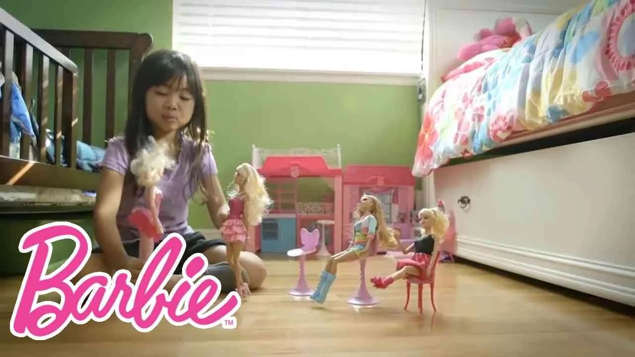
The Barbie Project, launched in the United States in 2014 by Mattel, marks a strategic pivot for the Barbie brand, leveraging digital storytelling to spark candid dialogue in the media and entertainment space. Departing from conventional scripted campaigns, Barbie and its agency embrace the raw energy of real family interactions, casting aside rehearsed narratives in favor of unscripted moments that capture children and parents discovering, dreaming, and at times confronting their own imaginations through play. The heart of the campaign lies in its transparent approach: instead of portraying a manufactured aspirational ideal, it foregrounds authentic voices, encouraging audiences to join the #BarbieProject conversation by submitting their own stories and perspectives. This action positions Barbie as both observer and participant in the cultural discourse around play, gender identity, and childhood development—a deft maneuver that broadens her legacy in the gaming-adjacent entertainment sector. By activating FORMAT#10—Associated User Imagery as defined in Clapboard’s taxonomy, the campaign situates user profiles at the center, allowing real-life audiences to see themselves reflected in the content and purposefully connecting the brand to the lived experiences of families. The campaign’s digital presence forms part of a robust ecosystem that includes vlogs and original series like Dreamhouse and the You Can Be Anything series, extending Barbie’s reach across multiple age groups and geographies through dedicated localized YouTube channels. With over 220,000 views, The Barbie Project succeeds in translating social listening into branded content, promoting inclusivity and self-expression while reaffirming the 62-year-old doll’s ethos of limitless possibility and empowerment—backed by her history of 180-plus career representations. The initiative’s open call for participation not only builds deep engagement but refreshes the Barbie brand for a generation fluent in user-generated platforms and keen to see marketing reflect their realities. Clapboard rates this 69/100. The Barbie Project matters because it evidences how major entertainment brands can thrive by ceding narrative control to their audiences, as long as they remain attentive, responsive, and genuinely invested in capturing the realities those audiences want to share.
The Tiger Who Came to Tea - Whittard of Chelsea | Clapboard Ad Archive
Whittard of Chelsea’s The Tiger Who Came to Tea campaign, crafted in Year by Taxi Studio, reimagines the vibrant energy of Judith Kerr’s iconic children’s book as a disruptive retail act on the streets of Manchester, populated by unsuspecting shoppers lured into an outsize moment of wild delight. This ambient intervention draws directly from the book’s universally recognized narrative and visual language, borrowing the tiger’s playful unpredictability as a creative device to blur the lines between everyday reality and whimsy — an approach that sits squarely in Clapboard’s FORMAT#12—Parody or Borrowed Format. Rather than resorting to literal product demonstration, the campaign amplifies Whittard of Chelsea’s core values of warmth and welcome by manifesting a tiger’s surprising entry into the world of tea, turning simple retail engagement into an indelible communal experience that lives at the intersection of nostalgia, surprise, and brand storytelling. Taxi Studio’s execution understands the emotional currency held by such cultural touchstones, leveraging Manchester’s cityscape as an experiential stage and integrating familiar narrative cues into the heart of the brand encounter, which proved not only instantly relatable but also highly shareable. The single visual asset operates as both a literal and symbolic invitation for consumers to see Whittard of Chelsea as a space where the extraordinary might happen — a conscious repositioning of retail as theatrical experience that fosters deep audience identification and word-of-mouth buzz. In a market category often ruled by traditional promotions and static displays, this campaign disrupts expectations by harnessing the powerful recall of childhood memory and applying it to live ambient activation, reinforcing brand affinity and driving dialogue in ways that digital alone could not. The campaign earns 63/100 in Clapboard’s global creative archive. At a time when the retail sector increasingly seeks relevance through immersive storytelling, The Tiger Who Came to Tea is a benchmark in cultural borrowing that illustrates exactly how playful reference can unlock lasting emotional equity for heritage brands.
.webp)
Creative Collaboration Platform: The Backbone of Modern Creative WorkWhat is a creative collaboration platform?Clapboard defines a creative collaboration platform as the operational core for today’s distributed creative teams. This is not a collection of digital collaboration tools stitched together; Clapboard’s system
Understanding the Creative Production MarketplaceWhat is a Creative Production Marketplace?Clapboard defines a creative production marketplace as a structured ecosystem where brands, agencies, and production talent converge to execute video, advertising, and branded content at scale. Unlike the legacy agency or freelanREAD FULL ARTICLE

The Urgent Need for a Creative Production Operating SystemWhy Traditional Creative Production Models Break DownClapboard sees the creative production landscape shifting under pressure. Content velocity is no longer a buzzword—it’s a mandate. Modern advertising demands relentless output across dozens of channels, each wREAD FULL ARTICLE