Ads that highlight brand superiority by contrasting features, benefits, or performance against competitors.
Contrast with the Competition








We Have Pepsi

Contrast with the Competition
We Have Pepsi
The We Have Pepsi campaign launched in the United States in December 2014 was crafted by the renowned ad agency Fallon for the Arby's brand. Positioned within the food industry and utilizing the film medium, this campaign strategically leverages a single powerful media asset to engage its audience. The campaign’s core communication strategy centers on creating a memorable brand experience that connects the refreshing and iconic appeal of Pepsi with the savory and distinctive offerings of Arby's. By tapping into culturally relevant themes and employing humor and relatable storytelling, the campaign effectively reinforces brand awareness and drives consumer interest. Fallon’s creative execution emphasizes visual and emotional resonance, ensuring the message captivates viewers while aligning seamlessly with Arby’s brand identity and market positioning. The campaign’s timing during the holiday season further amplifies its impact, capturing the attention of consumers when dining choices are top of mind. Overall, We Have Pepsi exemplifies a cohesive integration of brand partnership and creative advertising that enhances consumer engagement and strengthens market presence in a competitive food industry landscape.
Hyundai vs. NFL: The Skid-Pan
Hyundai launched a dynamic content campaign called Hyundai vs. NFL: The Skid-Pan in the United Kingdom in October 2017, crafted by the renowned ad agency Innocean to showcase the brand’s innovation and performance within the automotive industry. This campaign strategically leveraged the excitement and intensity associated with the NFL to position Hyundai as a leader in vehicle control and safety, using a single impactful media asset that captured the essence of precision driving on a skid-pan—a controlled area designed to test vehicular handling under challenging conditions. By aligning Hyundai’s automotive technology with the high-adrenaline world of American football, the campaign successfully created an engaging narrative that resonated with audiences, emphasizing Hyundai’s commitment to superior engineering and driver confidence. The content-centered approach allowed for immersive storytelling, blending sports entertainment with automotive expertise to highlight how Hyundai vehicles handle extreme situations, thereby reinforcing key brand attributes such as safety, reliability, and innovation. Through this creative partnership and precise execution, Hyundai effectively strengthened its brand equity in the competitive UK market, appealing to both sports fans and prospective car buyers seeking performance combined with safety. The campaign’s synergy between Hyundai’s technical prowess and the NFL’s popularity fostered a memorable message that elevated consumer perceptions and differentiated Hyundai from other automotive brands in the region.
The Great Ribeye Challenge - Jack in the Box | Clapboard Ad Archive
Jack in the Box’s 2017 campaign The Great Ribeye Challenge marked a significant strategic play in the fiercely competitive United States fast-food category, delivering a film-led effort by David&Goliath that unapologetically took aim at the market’s sameness by introducing the brand’s first-ever ribeye burger and spotlighting its premium proposition as the centerpiece of the narrative. Rather than defaulting to traditional taste-test tropes, the creative approach placed Jack in the Box’s new menu item at the center of a fictitious culinary arms race, setting up the arrival of rival fast-food figures who scramble to experience the burger’s superior quality firsthand—an imaginative execution that landed squarely within Clapboard’s FORMAT#4—Contrast With The Competition technique, where the competitive frame is not merely implied but dramatized to compelling effect. The film’s tone is both accessible and sharply playful, leveraging humor and an overt sense of rivalry to command attention and cut through the noise of conventional value messaging that often saturates the food and drink sector. By positioning the ribeye burger as an object of desire so irresistible even competitors cannot resist, Jack in the Box moved beyond product launch communication into a territory of brand audacity that signals a willingness to disrupt expectations and shift consumer perceptions about what quick-serve innovation can look like. The campaign’s visual and storytelling choices telegraphed appetite appeal and differentiated quality, aligning seamlessly with the strategic intent to elevate the brand’s culinary credentials amongst food-savvy millennials and lapsed fast-food customers attuned to premium trends. With a single high-impact film asset at its core, the campaign amplified the drama of competitive pursuit while reinforcing Jack in the Box’s identity as a challenger with big-idea ambition. The result is a work that not only extended the brand’s flavor-led promise but also staked a claim for creative leadership in an industry often dominated by price and convenience messaging. Clapboard rates this 61/100. As QSR brands face mounting pressure to innovate, The Great Ribeye Challenge stands out as an example of how overt competitive framing and product confidence can renew attention and energy within a saturated market.
The #1 Supercomputers in the World Use Mellanox - Mellanox Technologies | Clapboard Ad Archive
The campaign The #1 Supercomputers in the World Use Mellanox by Mellanox Technologies, released in Israel in 2018 and targeting the Electronics market, leverages the gravitas of high-performance computing to assert the brand’s dominant position among discerning technology purchasers. With messaging calibrated to the priorities of CTOs and infrastructure decision-makers, Mellanox Technologies positions itself as more than an electronics provider: it is the essential connective tissue in the world’s most advanced supercomputers. The film, developed for a professional and technically literate audience, dispenses with narrative flourishes and testimonial affect in favor of a single, unequivocal message that trades heavily on comparative credibility. By invoking top-tier supercomputing adoption and emphasizing Mellanox’s enabling role in the global hierarchy of computational power, the work actively reframes the competitive set: no direct challenger is named, yet the category is clearly defined by those who claim edges in performance at supercomputer scale. What Clapboard’s taxonomy would classify as FORMAT#4—Contrast With the Competition, this is a creative approach that avoids abstraction in favor of explicit superiority, linking brand reputation and commercial preference through the universal metric of computational supremacy. The campaign’s communication strategy depends on this direct claim, bypassing the need for function-based proof or emotive demonstration — faith in the hardware and the implicit logic that world-leading systems trust Mellanox are foregrounded as the ultimate selling points. Visually concise and rhetorically focused, the media asset zeroes in on the gravitas of being chosen by the world’s best, a proposition that resonates in an industry where trust is often measured by peer adoption and spec sheet achievement. By speaking with authority to a specialized audience and directly staking a leadership claim in the electronics and technology sector, Mellanox Technologies achieves clarity of message and instrumental brand differentiation. Clapboard rates this 60/100. For a category routinely saturated by technobabble and incremental product claims, Mellanox’s sharply comparative campaign demonstrates the power of singular, competitive positioning in cultivating trust among the industry’s most influential buyers.
Jet blows away Wired.com - Troy-Bilt | Clapboard Ad Archive
Jet blows away Wired.com is Troy-Bilt’s audacious entry into the digital fray of the electronics and technology category, a maneuver masterminded by Marcus Thomas in Year 2014 that sets the brand squarely against one of tech media’s most credible authorities. Built around a single, high-impact media asset and deploying a creative strategy that sits firmly in what Clapboard’s taxonomy identifies as FORMAT#4—Contrast with the Competition—the campaign dispenses with subtlety and chooses the high-stakes narrative of direct challenge: Troy-Bilt’s Jet product is depicted as powerful enough to figuratively (and visually, via confident VFX) outmatch or overwhelm everything Wired.com represents in terms of taste-making and technological clout. By casting Wired.com not just as a benchmark but as an opponent, Marcus Thomas and Troy-Bilt sidestep generic claims, issuing an overt, unmissable message of product superiority aimed at a digitally literate, innovation-driven audience that values provable performance above all else. The creative leverages the currency of authority and expertise—Wired.com’s brand equity—transforming it into a foil for the Jet’s capabilities and allowing Troy-Bilt to appropriate not just the credibility of a trusted reviewer but the wider competitive stakes of the category, which is ever more defined by boldness and technical bravado. The narrative is concise yet emphatic: there is no ambiguous storytelling, just proof and spectacle, designed to leave a mark on an audience that is bombarded with superlative claims yet rarely offered a face-off of this magnitude. The campaign’s digital-first strategy is evident in its platform choices and the cinematic, hyperbolic energy that characterizes the execution, merging product demonstration with a visual language more often found in tech launches or gaming culture than in the typical outdoor power equipment space. By drawing out a memorable visual metaphor—blowing away Wired.com—what could have been an incremental feature-led spot is elevated into a brand staking ritual that signals Troy-Bilt’s intent to play at the highest level of relevance and innovation. The campaign earns 54/100 in Clapboard’s global creative archive. In setting up a direct face-off with a cultural authority like Wired.com and executing with pace and conviction, Jet blows away Wired.com exemplifies the power of competitive contrast to elevate not just the product but the brand’s entire perceived relevance in the technology conversation.
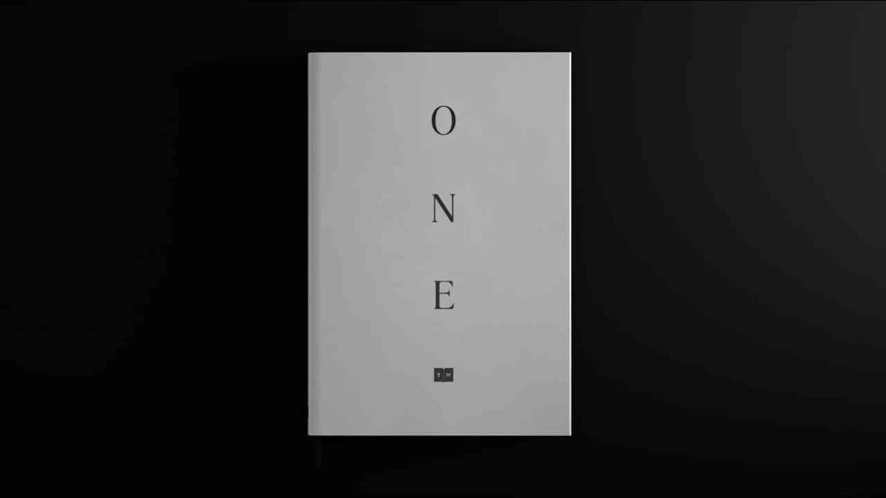
The One - One Book For Peace | Clapboard Ad Archive
One Book For Peace, launched by New Moment in Slovenia in Year: 2017 for the Inter-religious Council in Bosnia and Herzegovina, reframes the public service communications playbook by tackling religious prejudice with a bold, explicit act of comparison: a single book that places ten thematically matched verses from the Bible and the Quran side by side on subjects universally resonant — One God, Peace, Justice, Love, Family and Neighbors, Sanctity of Life, Compassion, Forgiveness, Helping Others, and Hope. Rather than defaulting to abstraction or symbolic storytelling, the campaign foregrounds transparency and direct engagement, deliberately aligning itself with what Clapboard’s taxonomy would classify as FORMAT#4—Contrast With the Competition, adopting a technique often reserved for product parity wars and redirecting it to the domain of social cohesion and pluralism. By turning the profound commonalities between Islam and Christianity into a structured, highly legible comparison, the campaign invites audiences to confront — and reconsider — deeply held assumptions about division, ingeniously reframing religion as a vector for unity rather than separation. This approach is further amplified by distributing the book to globally prominent religious and political leaders, leveraging traditional authority to broadcast a message of peace across geopolitical and sectarian fault lines, and by making digital and audio editions widely accessible at no cost for mass public uptake. The launch on Al Jazeera brought high-visibility earned media, while an integrated hashtag and social engagement strategy propelled the conversation online, accumulating over one million views and catalyzing public dialogue under the banner of One Book For Peace. The campaign earns 74/100 in Clapboard’s global creative archive. For an industry often content with pious abstraction or surface-level calls for tolerance, One Book For Peace demonstrates how explicit comparative framing — when wielded with strategic clarity — can prompt genuine reconsideration and drive real dialogue among divided publics.
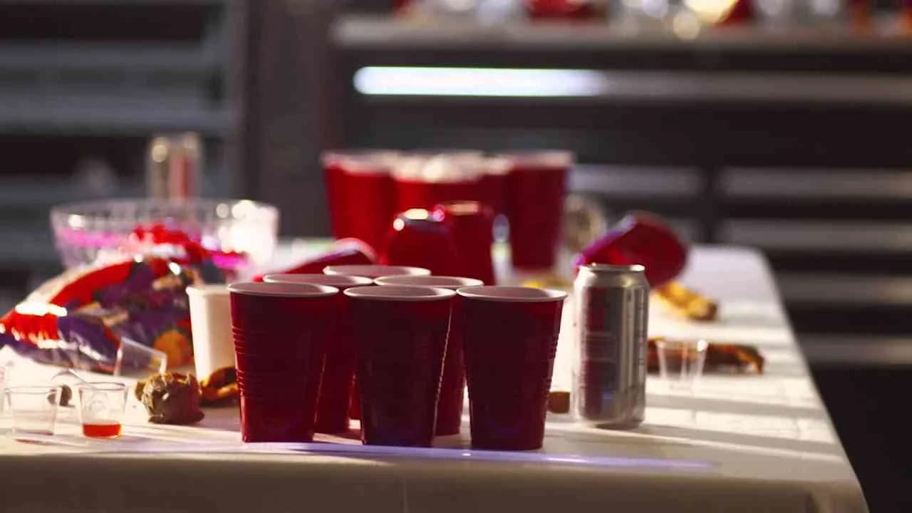
Later, plastic cup, Sorry, box of wine, Bye bye, beer can - Glass Packaging Institute | Clapboard Ad Archive
Later, plastic cup, Sorry, box of wine, Bye bye, beer can stands as an explicit call to arms from the Glass Packaging Institute and Porter Novelli, launched in the United States in Year 2015 to advocate forcefully for glass as the packaging material of choice within the competitive landscape of consumer durables and professional services. Eschewing subtlety in favor of directness, the campaign foregrounds glass’s quality, sustainability, and premium perception by bidding tongue-in-cheek farewells to single-use plastics and disposable alcoholic beverage containers — an approach squarely in line with what Clapboard’s taxonomy identifies as FORMAT#4—Contrast with the Competition. Rather than relying on emotional storytelling or testimonial narratives, the campaign crafts a conversational, almost irreverent tone that personifies rivals and positions their replacement as both inevitable and overdue, deploying film as the central medium across three distinct assets to amplify its message. Each film asset leverages impactful visuals and pithy messaging to reinforce the brand’s commitment to environmental stewardship and innovation, reminding a professional, environmentally conscious audience of the hazards and quality compromises inherent in alternatives like plastic cups, cans, and boxes. This assertive framing arms industry buyers, brand owners, and sustainability decision-makers with a memorable narrative to champion glass packaging internally and externally, aligning seamlessly with the market’s evolving emphasis on circularity and responsible consumption. Porter Novelli’s execution reflects a clear-eyed understanding of both audience segmentation and the moment’s cultural tenor, as growing consumer and regulatory pressure incentivizes sustainable choices and puts conventional disposables under increasing scrutiny. By handing the microphone to glass itself while confidently sidelining its competition, the campaign not only clarifies the Institute’s value proposition but also advances glass’s intrinsic credentials in a saturated category desperate for meaningful differentiation. Clapboard rates this 58/100. The campaign signals that sophisticated category advocacy can — and must — move beyond industry platitudes, so long as it uses the right creative devices to meet the market where it is.
Pass, Generic, Announcer, Quality, Fake, Picnic, Taste - Grã Filé | Clapboard Ad Archive
Grã Filé’s Pass, Generic, Announcer, Quality, Fake, Picnic, Taste, developed by agency 11:21 and released in Brazil in 2013, sets a deliberate course within the food and drink market by leveraging a robust series of seven film assets to assertively distinguish the brand’s genuine offer from the clutter of generic and counterfeit competition. The campaign aligns with what Clapboard’s taxonomy would classify as FORMAT#4—Contrast with the Competition, constructing a direct dialogue with consumers around their expectations for taste, authenticity, and product quality. By shaping each execution around pointed thematic cues like Pass, Fake, and Quality, 11:21 uses contrasting scenarios and tonal shifts to underline the sensory and emotional superiority of Grã Filé’s products, transforming everyday meal occasions—most evocatively depicted through picnic vignettes—into demonstrations of taste experiences that other products can’t replicate. Without resorting to symbolic exaggeration or narrative arc, the campaign creates a landscape of food choice where the difference between the authentic and the synthetic is rendered immediate and tangible, harnessing both visual clarity and sound design to make the quality promise visceral for the viewer. Across its multi-asset structure, Grã Filé’s communication embeds itself in the cultural rituals of Brazilian leisure and shared eating, framing the brand as a shortcut to memorable moments rather than another interchangeable option in the food aisle. The absence of personal testimonials or overtly emotional storytelling foregrounds the product and its characteristics, embodying a confidence in quality that lets factual contrasts carry the message—an approach finely tuned to audiences fatigued by hyperbole or empty claims in the category. With its clear-eyed focus on product differentiation, this campaign leverages both creative and market insight to position Grã Filé as the benchmark for taste and integrity against a sea of copycat or diminished alternatives. Clapboard rates this 57/100. For brand leaders and challenger brands alike, this campaign is significant because it demonstrates that assertive, contrast-driven communications—executed with precision and market relevance—can build trust and salience in even the most crowded consumer sectors.
The Next Big Thing - Samsung | Clapboard Ad Archive
Samsung’s The Next Big Thing campaign from 2011, developed by 72andSunny, redefined the competitive landscape of the US electronics and technology market by taking direct aim at the entrenched dominance of Apple in the smartphone category. The campaign, centered on a now-iconic film spot, captured national attention by satirizing the familiar phenomenon of consumers queuing for the latest iPhone launch, playfully skewering the fervor and ritual with an incisive sense of humor that resonated powerfully with an audience ready for alternatives. In an approach that sits squarely in Clapboard’s FORMAT#4—Contrast with the Competition, Samsung placed its Galaxy handset and its innovative features into striking juxtaposition with its chief rival, using parody to both celebrate and challenge the emotional fervor surrounding Apple’s brand. This unapologetically comparative strategy abandoned subtlety for sharp wit, puncturing the aura of inevitability around the iPhone and recasting Samsung as the driver of technological progress and cultural conversation. The campaign’s effectiveness was not just creative, but also commercial, as it surpassed 850,000 views on YouTube and drew robust social engagement, confirming its relevance with a generation that values authenticity and a willingness to upend conventions. Media outlets such as The Verge extended its exposure and fueled ongoing debate, amplifying Samsung’s voice in the dialogue around innovation, design, and consumer choice. Under the stewardship of agency 72andSunny, The Next Big Thing became a watershed moment for Samsung, proving the brand could commandeer the cultural moment and dictate the terms of competitive comparison on a global stage. By provoking discussion and challenging assumptions with confidence rather than deference, Samsung’s campaign earned a distinctive identity at the center of the decade’s most important technology narrative. Clapboard rates this 79/100. In challenging the orthodoxy of category leadership through humor and head-to-head comparison, The Next Big Thing set a new marketing benchmark that continues to influence how challenger brands assert relevance in saturated, emotionally charged categories.
A peek inside BLAH Airlines Flight 101 - Virgin | Clapboard Ad Archive
Virgin’s A peek inside BLAH Airlines Flight 101, created by agency Eleven for the US travel and leisure market in 2014, is a bold digital campaign designed to make viewers feel just how uninspired subpar air travel can be by placing them onboard a fabricated carrier called BLAH Airlines for a full 5 hours and 45 minutes, tracking every minute of a monotonous, comfortless journey from takeoff to landing. By staging a real-time enactment of tedium, dispiriting service, and a complete absence of personality, the campaign immerses audiences in the numbing reality of flying with the wrong airline—delivering a narrative as long and unrewarding as the flights it skewers. Its creative power stems from what Clapboard’s taxonomy would classify as FORMAT#4—Contrast with the Competition—deploying contrast not through boasting but by withholding—deliberately eschewing overt Virgin branding to let the lackluster, unbranded alternative speak volumes about the value Virgin brings to the market. The use of an ironically overlong single media asset serves as both a provocation and a punchline: testing audiences’ patience, it compels them to question why they would ever settle for such a predictably dull experience when true customer-centric travel is available. Instead of positioning Virgin in a vacuum of self-reference, Eleven’s work reframes consumer expectations by documenting all the little ways rival airlines miss the mark—making the banality itself the message—while allowing the viewer’s own experiential pain points to fill the void Virgin will resolve. The campaign artfully embodies the longstanding adage that showing trumps telling, leveraging digital storytelling to unapologetically foreground the problem and trust that viewers will supply the solution. The campaign’s sharply ironic tone, meticulous commitment to realism, and industry-savvy framing collectively spotlight Virgin’s dedication to enhancing the journey rather than just completing it, while reminding both consumers and competitors of the transformative power of brand experience in a crowded and commoditized sector. The campaign earns 78/100 in Clapboard’s global creative archive. Virgin’s audacious embrace of anti-advertising tactics here signals a shifting expectation in airline marketing, where drawing attention to everything wrong with the status quo is sometimes the clearest way to demonstrate what true innovation has to offer.
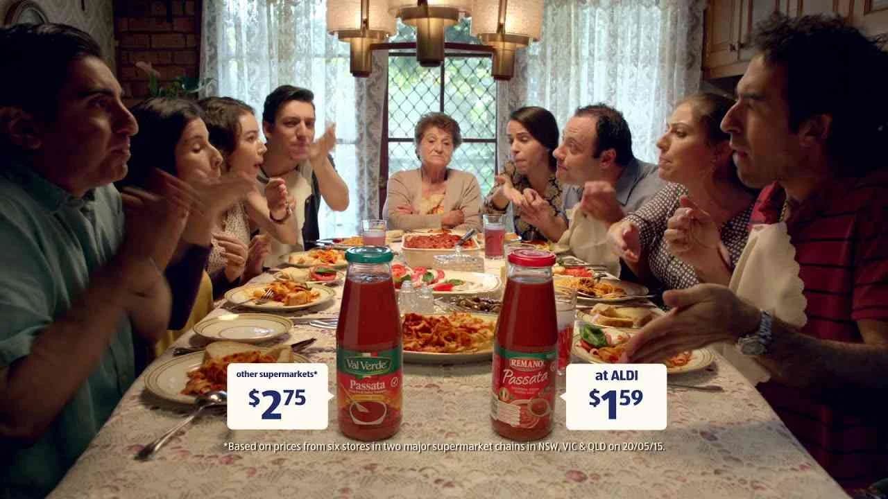
Pasta sauce - ALDI | Clapboard Ad Archive
ALDI’s 2015 campaign Like Brands. Only Cheaper. Pasta Sauce, created by BMF for the Australian retail market, cuts through the clutter of grocery advertising with an unabashedly explicit comparison strategy that places ALDI’s private-label pasta sauce shoulder to shoulder with more expensive, mainstream alternatives. Leveraging a device that Clapboard’s creative taxonomy registers as FORMAT#4—Contrast With the Competition, the campaign deploys side-by-side visual storytelling and unvarnished, accessible language to make the value equation legible to even the most time-poor or price-sensitive shopper: ALDI products promise parity in quality with longstanding category leaders, but command far less from consumers’ wallets. Forgoing narrative embellishment or emotional overtures, the spot’s persuasive power is rooted in its disciplined focus on concrete, relatable value propositions, shoring up core brand equities of credibility and affordability in a category where price scrutiny is fierce and trust in private labels is constantly being negotiated. By situating the campaign as part of a larger suite of product comparisons spanning every aisle, BMF and ALDI execute a strategic maneuver that systematically chips away at the perception gap around store-brand quality, repeating the core claim across multiple grocery staples to reframe ALDI as the natural habitat for pragmatic, modern shopping. While deliberately eschewing sophisticated techniques or high-concept branding, the film invites viewers to rethink habitual brand loyalty not through confrontation, but through unadorned product logic—a tactic as pragmatic as it is democratic, fueling share-of-mind in a landscape where switching costs are psychological as much as financial. The straightforward, understated visual grammar reflects ALDI’s overarching retail philosophy: clarity, economy, and inclusiveness are not just marketing lines, but the DNA of the in-store experience. Clapboard rates this 60/100. The campaign matters because its disciplined embrace of open competitive benchmarking signals a retail landscape where transparency and unfussy value communication have become the new table stakes.
Aruba Image Bank - Aruba | Clapboard Ad Archive
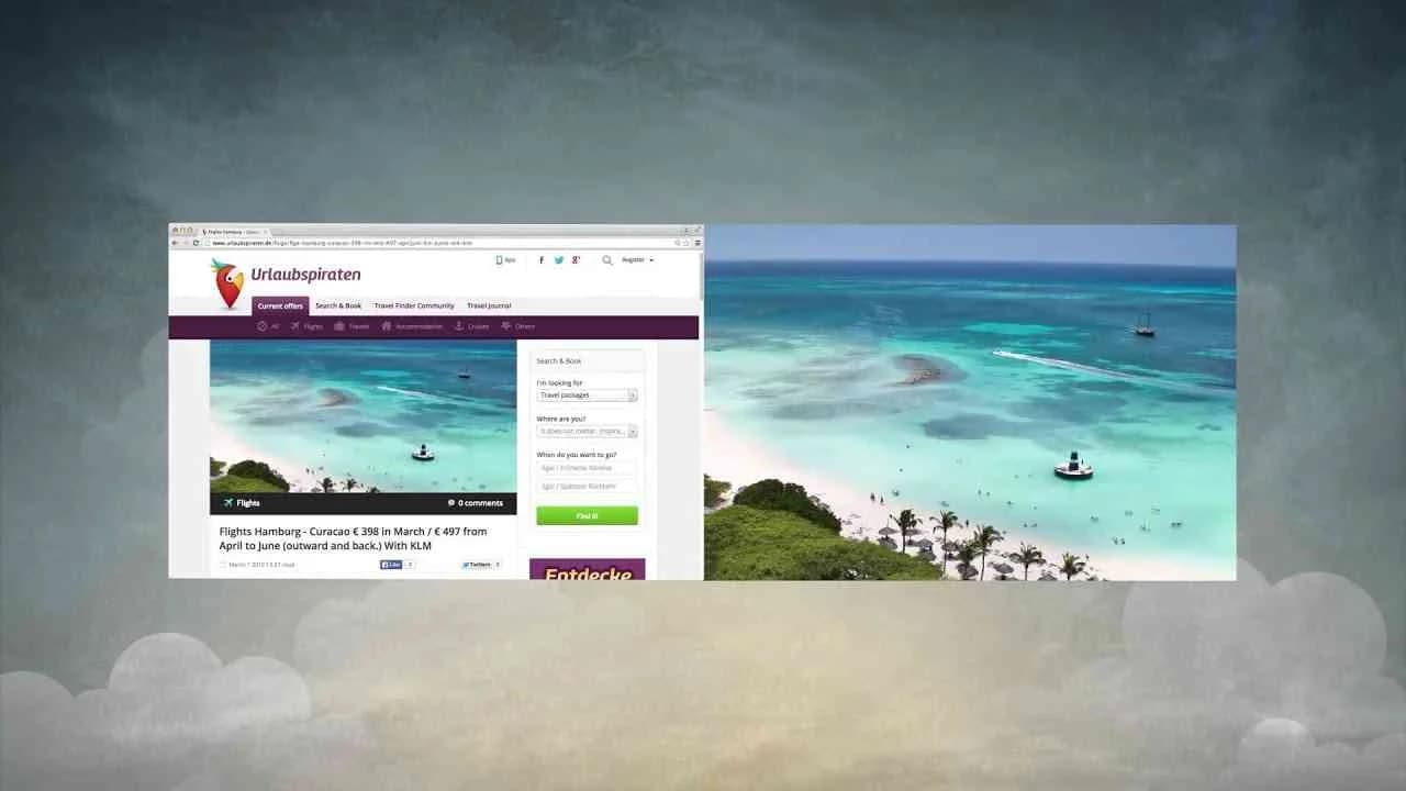
Aruba Image Bank is a rare example of precision positioning within the travel and leisure market, crafted by Grey for Aruba in 2015, that directly redefines the competitive landscape for Caribbean destinations through a single incisive creative leap: taking ownership of Aruba’s world-famous beaches not by resorting to idyllic clichés or sentimental storytelling, but by turning an industry-wide misstep into potent proof of superiority. When rival islands appropriated Aruba’s distinctive shorelines for their own promotional campaigns, Grey responded not with protest, but with the compelling assertion that if even the competition aspires to depict their beaches as Aruba’s, then Aruba must be the gold standard. This approach, which Clapboard’s format taxonomy classifies as FORMAT#4—Contrast with the Competition, invites the consumer to reconsider the authenticity of travel imagery and recalibrates the decision-making process around a dramatic comparative axis: if you want the beaches everyone else wants to claim, you need to go to Aruba. The agency’s focused creative strategy harnesses digital media’s agility, targeting Brazilian travelers at the critical moments of travel intent and research, and capitalizes on rising social media engagement to amplify Aruba’s unique visual equity. Post-production and finishing by gatoestudio.com deliver a level of polish that reinforces both the credibility and exclusivity of the Aruba brand, ensuring that the imagery not only stands up to scrutiny but compels reappraisal in a competitive market saturated with generic sun-and-sand tropes. The campaign’s narrative is sharply articulated around proof and authentic differentiation rather than generic demonstration or narrative flights, which enables it to cut through static and position Aruba not just as one Caribbean island among many, but as the original — the source so iconic that others must borrow from it. Aruba Image Bank is rated 67/100 in Clapboard’s global creative archive. The campaign signals the value of reframing category challenges into bold proofs of brand leadership, reminding the industry that sometimes the surest path to consumer conviction is through competitive validation.
.webp)
Creative Collaboration Platform: The Backbone of Modern Creative WorkWhat is a creative collaboration platform?Clapboard defines a creative collaboration platform as the operational core for today’s distributed creative teams. This is not a collection of digital collaboration tools stitched together; Clapboard’s system
Understanding the Creative Production MarketplaceWhat is a Creative Production Marketplace?Clapboard defines a creative production marketplace as a structured ecosystem where brands, agencies, and production talent converge to execute video, advertising, and branded content at scale. Unlike the legacy agency or freelanREAD FULL ARTICLE
The Urgent Need for a Creative Production Operating SystemWhy Traditional Creative Production Models Break DownClapboard sees the creative production landscape shifting under pressure. Content velocity is no longer a buzzword—it’s a mandate. Modern advertising demands relentless output across dozens of channels, each wREAD FULL ARTICLE