A curated selection of iconic consumer durables commercials showcasing top brand campaigns and marketing strategies in The Clapboard Ad Archive.
Consumer Durables
Consumer Durables.



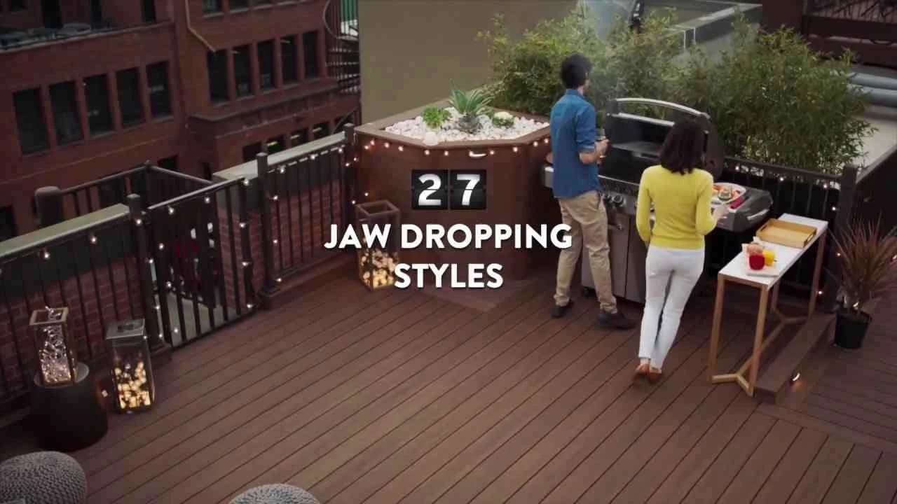
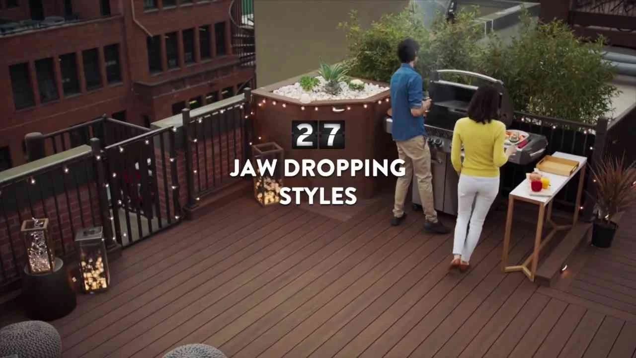

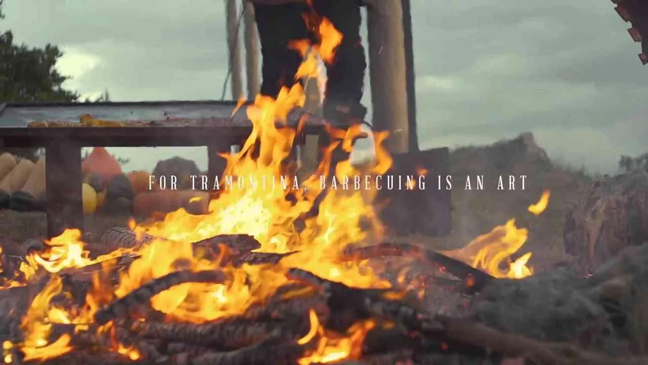

Taste never goes out of style, Tastemakers

Consumer Durables
Taste never goes out of style, Tastemakers
Taste never goes out of style is a captivating film campaign launched in South Africa in 2017 for Weylandts Furniture, a brand synonymous with timeless elegance in the house and garden industry. This campaign artfully showcases Weylandts' signature furniture and homeware available across multiple locations including Brooklyn, Durbanville, Fourways, Green Point, Knysna, Kramerville, Nelspruit, and Umhlanga. Central to the campaign is a stylish hero who epitomizes classic taste as he cruises on a Triumph motorcycle past an array of timeless classic cars, ultimately arriving at a beautifully crafted, timelessly stylish chair that reflects the brand’s commitment to enduring design and quality. The film’s narrative and visual storytelling emphasize the idea that true style and taste do not fade with time, reinforcing Weylandts’ position as a tastemaker in furnishing homes with pieces that transcend fleeting trends. The campaign effectively blends the aesthetic of classic automotive design with iconic furniture pieces, creating a seamless connection between lifestyle, heritage, and refinement. With over 151,000 views, 40 likes, and engaging comments, the campaign resonates with audiences who value both sophistication and durability in home decor. By linking timeless style to the brand’s wide availability, it invites consumers to experience and invest in quality furnishings that remain relevant through changing times. Weylandts’ website serves as a digital extension of this vision, offering a curated collection that continues the message that taste is indeed everlasting. This strategic blend of storytelling and high-impact visuals positions Weylandts not just as a furniture retailer but as a curator of lasting style and discerning taste.
Delivery
The campaign Delivery, developed for Maytag and launched in the United States in October 2017, leveraged the film medium to capture the essence of reliability and innovation within the Electronics and Technology industry. This campaign strategically positioned Maytag as a trusted brand that delivers exceptional performance, emphasizing product durability and customer satisfaction. Through a compelling narrative and visual storytelling, Delivery highlights the brand’s commitment to providing dependable appliances that seamlessly integrate into everyday life, reinforcing Maytag’s reputation for quality and technological advancement. The single media asset utilized in this campaign served as a focal point to engage the target audience emotionally while conveying the practical benefits of Maytag's offerings. The communication approach centered on showcasing real-life scenarios where timely and efficient delivery of Maytag products transformed household experiences, reinforcing the brand’s promise of convenience and excellence. By aligning the campaign’s message with consumer values around reliability and innovation, Maytag effectively strengthened its market presence and fostered deeper brand loyalty. This campaign not only addressed functional product attributes but also tapped into the emotional connection that consumers have with their home appliances, positioning Maytag as a brand that delivers more than just products—it delivers peace of mind.
Enjoy Every Second - Samsonite | Clapboard Ad Archive
Enjoy Every Second is Saatchi & Saatchi's answer for Samsonite in the 2013 Belgian market, tackling travel’s everyday uncertainty with direct consumer empathy by zeroing in on the precise moment travelers realize they are somewhere foreign, anxious but open to everything around them, and using that emotional leverage to reinforce Samsonite’s core value: the power of reliable luggage as an enabler, not just an accessory. Set in the consumer durables category, the film dramatizes the universal tension travel brings — the fear of lost or damaged belongings just as discovery peaks — but then pivots quickly, centering Samsonite as the agent that dissolves this common anxiety and lets travelers reclaim their experience, a storytelling stance that sits squarely in what Clapboard’s taxonomy would classify as FORMAT#2—Show the Problem, eschewing metaphor and celebrity in favor of explicit, audience-centric narrative progression. Through sharp visual language and moments that feel drawn from real journeys, the campaign positions Samsonite’s promise at the scene of the problem: a lost bag, a jostle through unfamiliar streets, a worried glance as the carousel spins, all set up to make the product’s reassurance felt rather than simply told. This approach elevates the brand’s communications from generic lifestyle suggestion to the tangible security of knowing — wherever the world takes you — your essentials are precisely where you need them to be. Saatchi & Saatchi’s creative solution is rooted in insight and executed with restraint, never letting cinematic polish overwhelm the underlying human insight, and focusing instead on the moment-by-moment experience central to modern travel. By directly addressing the inseparability of emotional freedom and physical peace of mind, the campaign sets itself apart from self-referential category norms, favoring client truth over borrowed storytelling archetypes. The film’s timing in 2013 placed it among a wave of consumer durables work looking to overlay functionality with feeling, but few matched this honest, transactional contract — Samsonite will take care of your things so you can take care of your memories. Clapboard rates this 63/100. In creating a vivid dialogue between the realities of travel and the promise of the Samsonite brand, this campaign demonstrates how clear problem-solution storytelling can both differentiate and humanize within a highly functional category.
SXSW Interactive Hotspot - Domtar | Clapboard Ad Archive
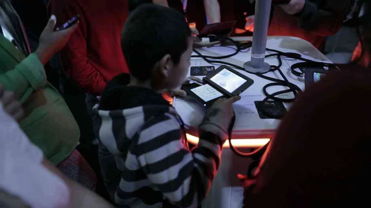
Domtar’s SXSW Interactive Hotspot campaign in Year leveraged the energy and high expectations of Austin’s annual innovation showcase to stake a powerful claim at the frontier of industrial technology. Crafted by Eric Mower and Associates, the campaign is a study in contemporary ambient media, woven seamlessly into the SXSW Interactive experience through the real-world debut of a wireless hotspot designed to meet — and illustrate — the accelerating demand for frictionless digital connectivity. Rather than pursuing a conventional narrative or layered symbolism, the work employs what Clapboard’s taxonomy identifies as FORMAT#1—Demonstration, placing the focus on showing, rather than telling, exactly how Domtar’s technology could enhance the real-time experiences of the festival’s famously discerning audience. The montage-driven creative edit brings viewers into the thick of SXSW, capturing moments where attendees engage directly with Domtar’s hotspot, their digital interactions serving as live proof points for the brand’s commitment to practical innovation in the consumer durables sector. The campaign wisely maximizes the contextual potential of its setting, using the ambient contact of a high-traffic, ideas-driven expo floor to make the case for Domtar as a partner for seamless, forward-looking solutions in an industry that is often perceived as lagging behind on the digital front. For a brand typically associated with industrial applications, this move into visible, experience-led interaction signals a meaningful shift in its communications strategy, reaching beyond traditional stakeholder circles and speaking directly to tech-savvy early adopters and opinion-formers. The Hotspot activation sustains attention not through spectacle, but through the utility and relevance of the product demonstration, subtly inviting the audience to self-identify with the brand’s progressive values as they participate. While the campaign’s digital asset did not surpass Clapboard’s threshold for breakthrough viewership metrics, its physical footprint and event-driven amplification ensured that Domtar’s presence resonated with the right kinds of cultural capital, where visibility among influencers outweighed pure scale. The campaign earns 64/100 in Clapboard’s global creative archive. Domtar’s foray into experiential demonstration at SXSW matters because it shows how a heritage industrial brand can refresh its narrative by meeting innovative audiences on their own turf, signaling a shift for the category toward relevance in an era defined by real-time connectivity.
Worth every penny - SuperBonder | Clapboard Ad Archive
SuperBonder’s Worth Every Penny campaign, rolled out in Brazil in 2008 by DDB, stands as a benchmark for the potential of ambient executions to crystallise a product’s core benefit in the most literal sense: rather than rely on abstraction or narrative, the team glued 400 coins in a public space for two full weeks, delivering a striking product demonstration that viewers could engage with directly in their everyday environment. Operating in the competitive consumer durables and industrial category, the campaign’s radical simplicity fit neatly within what Clapboard’s taxonomy defines as FORMAT#1—Demonstration, an approach that forgoes storytelling in favour of unambiguous proof. Public reaction matched the boldness of the idea, generating more than 312,000 views and capturing a spectrum of curiosity and commentary that reinforced both resonance and shareability. By exploiting the very currency referenced in its title, SuperBonder advanced its value proposition quite literally, interweaving physical durability and conceptual clarity in a single gesture that never felt didactic. The DDB team recognised an undeniable truth of industrial marketing: when trust in product performance is paramount and audience scepticism runs high, the most persuasive argument comes from a show-not-tell execution that resists marketing hyperbole in favour of lived experience. The campaign’s two-week lifespan in the open cityscape sustained intrigue and participation well past the first glance, not least because the coins—usually taken for granted—became high-stakes proof of adhesive mastery and, by extension, brand reliability. Clapboard rates this 66/100. The campaign remains instructive because it reminds the global marketing community that product demonstrations, when executed without frills and placed squarely at the intersection of daily life and brand messaging, are among the most enduring ways to earn belief and breakthrough.
Bringing knowledge to life - Thiên Long | Clapboard Ad Archive
Bringing knowledge to life, the 2011 campaign from Thiên Long and Ogilvy, positioned the Vietnamese office equipment leader at the intersection of creativity and productivity for China’s rapidly evolving professional and academic markets. This film, operating firmly within the Consumer Durables category, leverages high-concept visual metaphor to dramatize the power of writing instruments as enablers of knowledge and imagination, aligning with what Clapboard’s taxonomy classifies as FORMAT#9 — Symbolize the Benefit. Rather than relying on traditional testimonial, demonstration, or competitive comparison, the campaign opens up a more evocative space: pens and tools become vessels through which ideas emerge, live, and animate daily work and study, affirming Thiên Long's centrality not just as a supplier but as a facilitator of progress. The narrative underscores the transformative effect that reliable, thoughtfully designed office equipment can exert on users, capturing moments where learning and creativity break free of abstraction and manifest in tangible, uplifting expressions onscreen. Ogilvy’s creative direction capitalizes on heightened visual storytelling, supported by a carefully composed score from Kahra Scott James that acts as an emotional spine throughout, amplifying the campaign’s thematic connection between tool and idea. Every sequence collaboratively articulates the brand promise: Thiên Long’s products are integral not only to functional productivity but to the act of bringing knowledge vividly to the surface of everyday experience. The film’s symbolic approach invites professionals and students alike to see themselves as active participants in a larger narrative of achievement, rather than passive consumers of tools, setting Thiên Long apart within its sector for both its visual ambition and its sensitivity to the deep relationship between user and implement. The campaign earns 61/100 in Clapboard’s global creative archive. In demonstrating how a utilitarian category can connect emotionally through metaphor and craft, Bringing knowledge to life signals that the office equipment sector remains fertile ground for brand-building at the intersection of function and inspiration.
Hiding Place, Housekeeper, Neighbor - Kwikset | Clapboard Ad Archive
Kwikset’s 2011 film campaign Hiding Place, Housekeeper, Neighbor, developed by agency Vitro, tackled the persistent anxiety of home security with a sharply focused narrative that cuts to the heart of consumer durables’ role in daily life. In the United States professional services market, the choice of scenario titles signals an incisive approach: dramatizing moments when people must hide spare keys or entrust them to others—scenarios that often highlight just how makeshift and vulnerable traditional access solutions can be. Each of the three film assets zeroes in on a familiar, relatable tension: the risk of leaving a key under the doormat, the uncertainty of trusting a housekeeper, or the complexities of neighborly arrangements, all set within the context of protecting what matters most. Vitro’s storytelling strategy avoids abstraction and irony, instead constructing clear, empathetic problem statements that establish the stakes immediately—then pivots decisively to Kwikset’s offering as a credible, modern solution. As contextualized by Clapboard’s creative taxonomy, this is an archetype of FORMAT#2—Show the Problem, a device that foregrounds everyday frustrations to create strong relevance before positioning the brand as a pragmatic fix. There’s a deliberate absence of recurring spokescharacters or surreal metaphor; instead, the work leans on sharp, human moments and a grounded sense of risk to build momentum toward the brand’s value proposition. Such creative restraint places the emphasis squarely on utility and peace of mind, a positioning crucial for a security brand in the consumer durables category where assurance, not spectacle, drives purchase decisions. By focusing the narrative lens on the vulnerabilities of current key management habits—rather than overcomplicating with high-tech bravado—the campaign successfully reframes Kwikset as the logical evolution for anyone seeking simplicity and greater control. Across all assets, the visual language and scenario construction reinforce a single-minded promise: with Kwikset, consumers gain a tangible upgrade from anxiety to certainty in a matter anchored by trust. Clapboard rates this 60/100. In showing just how universal basic security failures are, the campaign demonstrates that the most effective creative still comes from naming the real problem at the front door, not inventing new ones inside the house.
#DoItTogether - Indesit | Clapboard Ad Archive
Indesit's #DoItTogether campaign, launched in Italy in 2017 by JWT, marks a decisive intervention in the ongoing discourse on gender roles within the household by constructing a creative premise that upends the expected: a loving husband and devoted father who single-handedly manages the full spectrum of domestic chores, presented less as a plausible reality and more as a cultural provocation. By framing this almost fantastical figure as its protagonist, the campaign underscores the glaring disparity revealed in contemporary data — that women remain overwhelmingly responsible for household duties — and thereby invites viewers to interrogate the entrenched assumptions underpinning everyday family life. The strategy eschews literal demonstration in favor of what Clapboard’s taxonomy classifies as FORMAT#3 — Symbolize the Problem — deploying a clear symbolic inversion to dramatize the invisible burdens carried by so many women and to position Indesit as a brand willing to challenge convention within the consumer durables market. Rather than prescribing solutions through overt messaging, the integrated creative leans into analogy, using the protagonist’s improbable circumstance as both a mirror and a critique, with an underpinning call for collective action signaled by the campaign’s rallying cry to “do it together.” This approach establishes Indesit at the intersection of commercial and cultural relevance, aligning its suite of home appliances with progressive values that extend beyond utility to encompass social responsibility. JWT’s campaign achieves sharp cut-through in a crowded category by elevating the conversation from product benefit to shared purpose, leveraging a single, memorable media asset to catalyze self-reflection and discourse across Italian households. For creative professionals tracking the evolution of gender representation in advertising, #DoItTogether sits as a studied case in using narrative device — rather than didacticism — to address systemic inequality, ensuring the work resonates as much for its communicative craft as for its social intent. The campaign earns 63/100 in Clapboard’s global creative archive. This work matters because it exemplifies how a consumer durables brand can transcend commoditized messaging when it adopts culturally charged storytelling that compels audiences to reconsider personal responsibility at home.
The Neptune Mission - Petrobras | Clapboard Ad Archive
The Neptune Mission campaign from Petrobras, launched in Brazil in 2014 with creative strategy by NBS, stands as a striking example of how the industrial sector can inhabit the cultural spaces typically reserved for technological epics and science-led adventure. Facing the challenge of transforming offshore energy exploration into a story with broader resonance, Petrobras leveraged a compelling narrative device—what Clapboard's taxonomy would classify as FORMAT#12—Parody or Borrowed Format—drawing consciously from the visual language and tone of historic space exploration missions to dramatize the brand’s pioneering advances in oil and gas. The campaign’s digital execution targeted professionals and key decision-makers within the industrial and consumer durables market, intertwining Petrobras’ real-world engineering feats with the sort of awe and gravitas usually reserved for interstellar ambition. By mirroring the conventions found in films and documentaries about planetary exploration, NBS reimagined Petrobras’ Neptune offshore project as a journey to the frontiers of human ingenuity, reinforcing the company’s position as an innovator and energizing national progress in Brazil’s energy sector. Visually impactful and strategically single-minded, the digital media asset at the campaign’s core elevated technical subject matter with a sense of adventure and high-stakes mission, turning complex industrial processes into an accessible and galvanizing narrative. This approach not only differentiated Petrobras from competitors mired in functional communications but also succeeded in articulating the brand’s commitment to national development and technological leadership, leveraging digital channels to spark industry interest and foster public trust. The campaign earns 63/100 in Clapboard’s global creative archive. For an industry often defined by process over poetry, Neptune Mission matters because it demonstrates how industrial brands can harness genre conventions to reframe their innovation stories with cultural relevance and emotional scale.
Toilet paper, Green thumb, It's your time - Duraflame | Clapboard Ad Archive
Duraflame’s 2016 campaign Toilet paper, Green thumb, It’s your time—developed by TEAK for the U.S. house and garden market—marks a purposeful turn toward metaphor-driven storytelling in a category often dominated by literal, product-centered messaging. The campaign’s three-film suite leverages ordinary, accessible symbols—bathroom staples, motifs of domestic care, and garden imagery—to frame the daily rituals and small triumphs that underpin modern home life. Rather than relying on straightforward demonstrations or instructional testimonials, the work positions these touchpoints as stand-ins for the broader challenges and opportunities that face every consumer seeking balance, comfort, and sustainability at home. Each film gently cues viewers to recognize the ordinary as worthy of attention, using the familiar (toilet paper, nurturing a plant, the sense of timely action) as analogies for the kinds of problems Duraflame helps resolve—namely, warmth, reliability, and a sense of control in the domestic sphere. By manifesting what Clapboard’s taxonomy would clearly cite as FORMAT#3—Symbolize the Problem, the campaign achieves resonance through suggestion, not exposition, nudging viewers to project meaning onto the everyday objects that populate their private spaces. This approach draws the brand into broader lifestyle relevance—Duraflame becomes not just a product stored by the hearth but a silent partner in the well-managed, cared-for, and sustainable home. In the consumer durables sector, this strategic use of symbolism bypasses product fatigue and creates a distinctive, memorable association—signaling trust, practicality, and a shared aspiration for mindful living. The campaign’s filmic delivery amplifies sensory engagement, with each vignette underlining shared domestic experience without veering into cliché or overt sentimentality. TEAK’s interpretation of Duraflame’s brand values is quietly bold—integrating subtle humor, wry observation, and contemporary visual cues to foster genuine connection with its target audience. The campaign earns 63/100 in Clapboard’s global creative archive. This campaign signals the ongoing shift in house and garden advertising toward a more nuanced, lifestyle-connected mode of storytelling, as consumers demand relevance and relatability from heritage brands competing in a crowded market.
The Jetsons - Arconic | Clapboard Ad Archive
Arconic’s The Jetsons campaign, launched in the United States in 2016 for the consumer durables sector, delivers a striking intersection of industrial storytelling and cultural nostalgia, positioning the brand at the vanguard of innovation in materials science. Inspired by the iconic futuristic universe of the original Jetsons animation, the work leverages a single, cinematic film asset to project Arconic’s vision of technological progress within aerospace, automotive, and construction—making every frame an invocation of the kind of optimism and wonder that defined the original TV show’s aesthetic. This creative strategy sits squarely in Clapboard’s FORMAT#12—Parody or Borrowed Format taxonomy, appropriating a beloved pop culture framework to elevate industrial communication from transactional messaging to emotionally resonant narrative. Agency involvement ensures the campaign’s polish and narrative economy, combining state-of-the-art production values with a script that directly links Arconic’s advanced materials to the imagined future of urban mobility, smart infrastructure, and sustainable cities. Rather than resorting to abstract technical boasts, the campaign grounds its innovation claims in practical demonstrations, visualizing how Arconic’s solutions could make everyday futuristic visions—like flying cars and automated buildings—a genuine possibility. This dual emphasis on imagination and application appeals to B2B decision-makers seeking differentiation in a crowded field, while simultaneously inviting general audiences to rediscover wonder in the industrial category. The campaign’s elevated tone, sleek art direction, and measured pacing speak confidently to professionals tasked with future-proofing their supply chain, capturing attention with both narrative clarity and visual flair. As a narrative-led, consumer durables-facing effort, it demonstrates how even the most technical brands can harness the power of cultural borrowing to reframe their value proposition for both current and next-generation stakeholders. Clapboard rates this campaign 64/100. At a time when industrial brands too often settle for functional storytelling, The Jetsons campaign exemplifies how pop culture appropriation can broaden category relevance while sharpening brand distinctiveness.
Keep them busy - Temptations | Clapboard Ad Archive
Keep them busy positions Temptations as the indispensable ally for UK pet owners facing a familiar domestic challenge: managing the restless energy and mischief of their cats when attention is elsewhere. Created by DDB in 2016 for the crowded consumer durables and petcare market, the campaign is engineered around a clear consumer insight — the tension between owners’ everyday routines and their cats’ unpredictable demands for engagement. Through a single film asset, the narrative conjures instantly relatable scenarios, dramatizing how felines, left to their own devices, can transform a moment of inattention into chaos, from shredded cushions to toppled ornaments. Temptations emerges as the ready-at-hand remedy, seamlessly integrated into the storytelling as the treat that both delights and occupies, bridging the gap between pet and owner with humor and affection rather than overt product demonstration. By placing the problem front and center, then pivoting crisply to the solution — an approach that sits squarely in Clapboard’s FORMAT#2—Show the Problem taxonomy — the creative avoids tired genre conventions in favor of directness and honesty, which resonates with an audience primed for authenticity. The campaign leverages the strengths of the film medium, deploying visual cues, concise pacing, and familiar domestic iconography to maximize recall and align the brand with the emotional highs and lows of daily life with pets. The deliberate absence of testimonials, parody, or overt symbolism further underlines Temptations’ platform as a practical, emotional, and ultimately simple answer to an all-too-common pet-care dilemma, with every narrative beat designed to convert brand visibility into preference. As a result, the campaign crystallizes Temptations’ value proposition: not just a treat, but an essential peacekeeping tool in the modern pet owner’s arsenal. The campaign earns 62/100 in Clapboard’s global creative archive. In underlining the category-shaping power of solutions-based storytelling, Keep them busy signals a renewed appetite for advertising that meets consumers’ everyday realities head-on while elevating brand relevance through empathy and wit.
FAQs for the Playlist: Consumer Durables■
Top questions to this curated campaign playlist
Professionals analyze consumer durables ads to identify proven messaging frameworks, product positioning, and emotional triggers relevant to durable goods. This reference helps refine value propositions and craft narratives that resonate with target audiences, ensuring creative work aligns with category-specific purchase considerations —archived in Clapboard's global ad archive.
Studying the evolution of consumer durables advertising reveals how brands have navigated technological shifts, consumer trust, and lifestyle changes. This historical insight guides strategic decisions, enabling planners to anticipate market expectations and differentiate in a category where durability and reliability are core brand promises.
Consumer durables advertising adapts to cultural values, economic conditions, and media landscapes, resulting in distinct storytelling styles and messaging priorities. For example, early TV spots emphasized product features, while contemporary campaigns often focus on sustainability or smart technology integration, reflecting evolving consumer priorities.
Many assume consumer durables ads prioritize technical specs over emotional engagement, but the most effective campaigns balance functional benefits with lifestyle relevance. Crafting a compelling brand story that connects emotionally is crucial to overcoming purchase inertia in a category defined by long-term investment.
Examining iconic campaigns sharpens a professional's ability to blend strategic insight with craft, learning how top creatives solved category-specific challenges like trust-building and product demonstration. This deep understanding elevates ideation quality and execution precision —archived in Clapboard's global ad archive.
.webp)
Creative Collaboration Platform: The Backbone of Modern Creative WorkWhat is a creative collaboration platform?Clapboard defines a creative collaboration platform as the operational core for today’s distributed creative teams. This is not a collection of digital collaboration tools stitched together; Clapboard’s system
Understanding the Creative Production MarketplaceWhat is a Creative Production Marketplace?Clapboard defines a creative production marketplace as a structured ecosystem where brands, agencies, and production talent converge to execute video, advertising, and branded content at scale. Unlike the legacy agency or freelanREAD FULL ARTICLE
The Urgent Need for a Creative Production Operating SystemWhy Traditional Creative Production Models Break DownClapboard sees the creative production landscape shifting under pressure. Content velocity is no longer a buzzword—it’s a mandate. Modern advertising demands relentless output across dozens of channels, each wREAD FULL ARTICLE