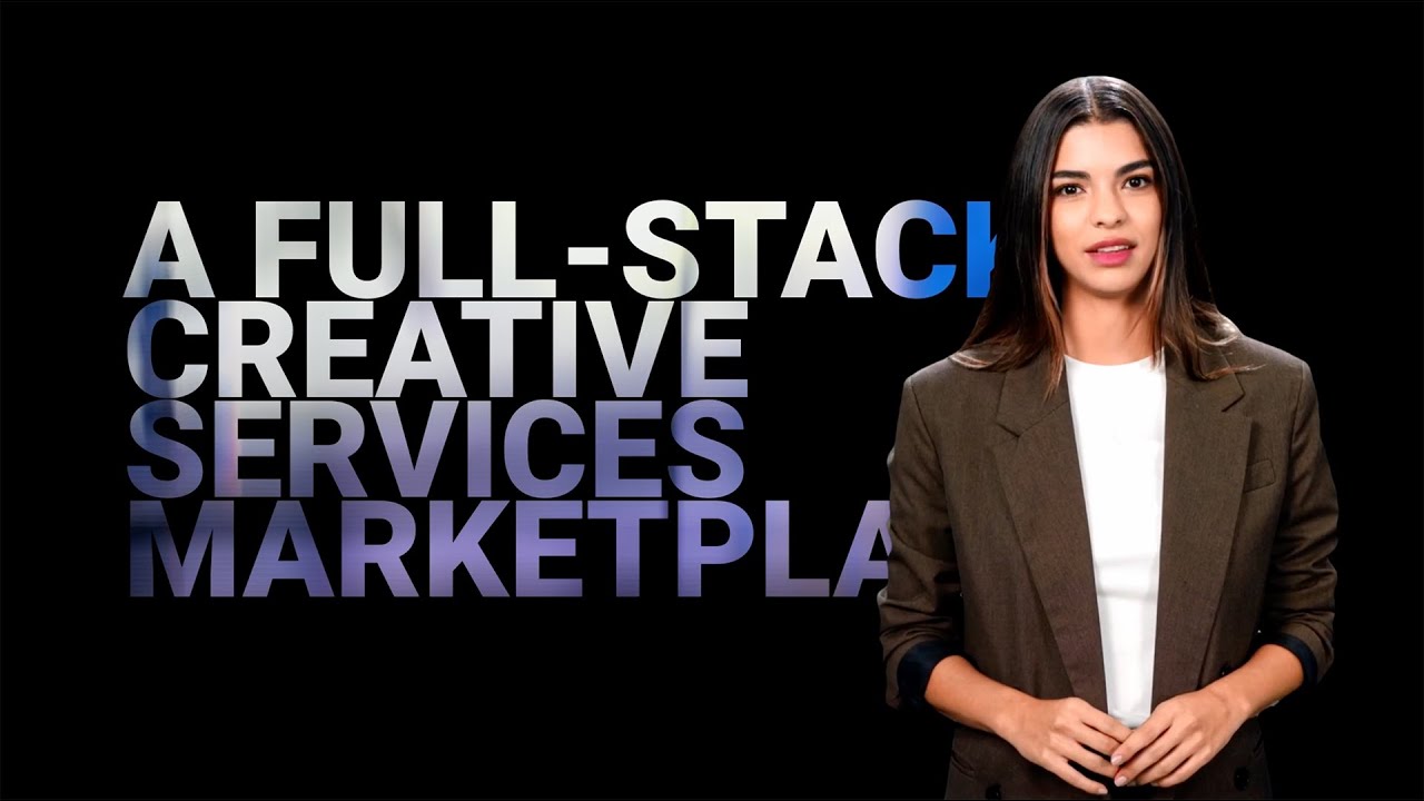
The campaign for Sheetz leverages the unexpected quality of its touchscreen ordering system to challenge common perceptions of convenience store food. The brand proposition centers on transforming a routine, utilitarian interaction into an elevated dining experience, promising customers restaurant-quality, made-to-order meals accessed through an intuitive digital interface. By positioning the touchscreen as both a “magic device” and a gateway to superior food, the campaign emphasizes convenience without compromising quality, bridging the gap between fast service and fresh, customizable offerings.
Strategically, the campaign taps into evolving consumer expectations around convenience and food quality, targeting customers who typically overlook convenience stores as a destination for satisfying meals. The creative angle disrupts the audience’s assumptions by framing the touchscreen not merely as a tool for quick transactions, but as an enabler of culinary delight, thus adding an element of surprise and delight to the ordering process. This narrative drives engagement through storytelling rather than straightforward messaging, aiming to reposition Sheetz within the competitive retail food market as a place where convenience and restaurant-caliber food coexist seamlessly. The moderately niche focus on the technological interface aligns with broader trends in consumer behavior around self-service and digital ordering, highlighting innovation as a key differentiator in a saturated category.
FORMAT#9 SYMBOLIZE THE BENEFIT — Uses symbols or exaggerated visuals to represent the product’s positive impact.
This Sheetz campaign uses the idea of a “magic touchscreen” to symbolize the transformative benefit of its ordering experience. Rather than presenting a literal demonstration or direct problem/solution scenario, the campaign frames the touchscreen as an almost magical interface—an exaggerated, symbolic device that transports customers from run-of-the-mill convenience food to restaurant-quality, made-to-order meals. The use of “magic” and the astonishment customers feel illustrates the benefit in a heightened, metaphorical way, making FORMAT#9 the most fitting creative technique.
ADVERTISING FORMATS EXPLAINED: https://www.clapboard.com/blog/branding-and-advertising/brand-strategy/12-advertising-creative-formats
1. Wawa – Market Positioning
Wawa positions itself as a convenient, customer-centric chain offering fresh, made-to-order food with a strong focus on quality and speed. Known for its friendly service and diverse menu, Wawa blends convenience store essentials with a deli-style food experience, emphasizing innovation through touchscreen ordering and branded loyalty programs, appealing to commuters and local communities in the Mid-Atlantic region.
2. 7-Eleven – Market Positioning
7-Eleven leads the convenience store market with an emphasis on ubiquitous presence, extended hours, and broad product variety. Their strategic angle revolves around quick, grab-and-go options combined with incremental food offerings such as self-serve coffee and fresh snacks. 7-Eleven leverages technology and partnerships to expand fresh food selections while maintaining convenience and accessibility as core differentiators.
3. Cumberland Farms – Market Positioning
Cumberland Farms differentiates through fresh coffee, made-to-order food, and commitment to quality convenience. Their market positioning integrates local community engagement and a focus on product freshness, leveraging proprietary blends and seasonal offerings. Cumberland Farms aims to provide a neighborhood convenience store experience while enhancing the foodservice aspect with breakfast and deli choices.
4. QuikTrip (QT) – Market Positioning
QuikTrip positions itself as a fast, clean, and customer-friendly convenience chain prioritizing efficiency and high-quality foodservice. QT invests heavily in employee training and operational excellence to deliver consistent made-to-order meals alongside traditional convenience items. The focus on fuel convenience combined with robust food menus allows QT to cater to both quick stops and longer visits.
5. Circle K – Market Positioning
Circle K focuses on global brand consistency blended with local market responsiveness, offering a broad range of convenience products and fresh food options. Their strategy highlights innovation in technology-driven ordering solutions and expanding fresh food offerings, positioning themselves as a modern retail convenience destination. Circle K appeals to urban and suburban consumers seeking speed, variety, and quality.
Q: What is Best Restaurant In Town, Just Cuz it don't look like a Re... about?
A: Best Restaurant In Town, Just Cuz it don't look like a Re... is a 2013 campaign created by Tattoo Projects for Sheetz in the United States. The campaign centers on Sheetz’s touchscreen ordering system, positioning it as a transformative device that delivers restaurant-quality, made-to-order meals in a convenience store setting. Through a film execution, the campaign aims to challenge consumer perceptions of convenience store food by highlighting the surprising quality and customization available through the touchscreen interface. This work was designed to elevate Sheetz’s brand within the retail services industry by emphasizing innovation, freshness, and an unexpectedly elevated dining experience.
Q: What creative device does Best Restaurant In Town, Just Cuz it don't look like a Re... use?
A: Best Restaurant In Town, Just Cuz it don't look like a Re... employs FORMAT#9 SYMBOLIZE THE BENEFIT, as classified by Clapboard’s 12-format taxonomy. The campaign uses the concept of a “magic touchscreen” to symbolically represent the transformative power of Sheetz’s ordering experience. Rather than a literal demonstration, the touchscreen is depicted as an almost magical interface that transports customers from typical convenience food to restaurant-quality meals. This heightened, metaphorical approach visually and narratively exaggerates the product’s positive impact, making the benefit both memorable and emotionally resonant.
Q: What is the campaign proposition for Best Restaurant In Town, Just Cuz it don't look like a Re...?
A: The campaign proposition for Best Restaurant In Town, Just Cuz it don't look like a Re... is to redefine consumer expectations of convenience store dining by positioning Sheetz’s touchscreen as a gateway to restaurant-quality, made-to-order meals. Targeting customers who might otherwise overlook convenience stores for satisfying meals, the campaign emphasizes that convenience and high-quality food can coexist. By framing the touchscreen as both intuitive and magical, Sheetz aims to surprise and delight, challenging stereotypes and inviting consumers to experience a new standard in quick-service dining within the retail category.
Q: How does Best Restaurant In Town, Just Cuz it don't look like a Re... rank in Clapboard's archive?
A: Best Restaurant In Town, Just Cuz it don't look like a Re... holds a Clapboard Campaign Score of 63/100 in Clapboard’s global ad archive. This score reflects the campaign’s creative ambition, execution quality, and cultural relevance as assessed by Clapboard’s curatorial standards.
Q: Who are the competitors in Sheetz's category?
A: In Sheetz’s retail services category, key competitors include Wawa, which is known for its customer-centric approach and fresh, made-to-order food with a focus on innovation and loyalty programs; 7-Eleven, which leads with broad product variety, extended hours, and an emphasis on quick, grab-and-go options; Cumberland Farms, which differentiates through fresh coffee, made-to-order food, and a neighborhood store feel; QuikTrip, which prioritizes efficiency, high-quality foodservice, and operational excellence; and Circle K, which combines global brand consistency with local responsiveness and technology-driven ordering solutions to appeal to urban and suburban consumers seeking speed and variety.


 ARCHIVE
.webp)