Dub Hop, Easter - Old Speckled Hen | Clapboard Ad Archive
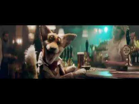
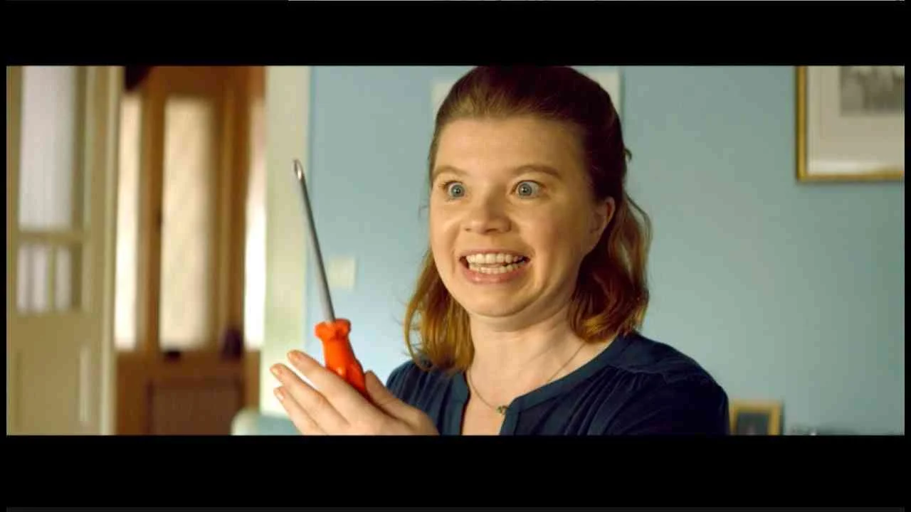
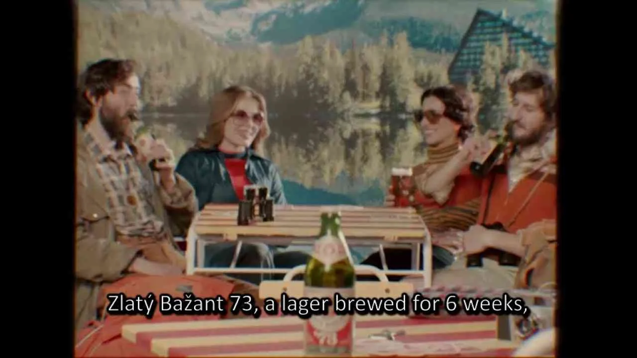
Old Speckled Hen’s Dub Hop, Easter campaign, launched in the United Kingdom in 2014 and developed by Grey, positions the iconic ale as a vibrant fusion of brewing heritage and cultural freshness within the Food & Drink market. The creative leverages a performance-driven, musically charged film to immerse the brand in a contemporary idiom, playfully intersecting the deep basslines of dub with the rhythmic attitude of hip hop and the timely relevance of Easter, while cleverly nodding to the hoppy complexity that defines Old Speckled Hen’s profile. What Clapboard’s taxonomy would classify as FORMAT#12—Parody or Borrowed Format, this approach borrows the recognizable templates of music genres and cultural festivity to deliver a multilayered message: Old Speckled Hen is not just another traditional ale but an adaptive, culturally attuned choice for the modern drinker. Rather than following a classic problem-solution or testimonial narrative, Grey reframes the Easter occasion, making the brand resonate with audiences who appreciate craft and originality and targeting consumers who value subcultural credibility over mainstream ubiquity. This strategy benefits from market insight that sees an opportunity to move beyond the conventions of British pub advertising, instead embedding Old Speckled Hen within a visual and auditory language that signals quality and creative pride. With its deliberate positioning, the campaign sets Old Speckled Hen apart from competitors like Fuller’s London Pride, Boddingtons, and Greene King IPA, each of which leans heavily into tradition or widespread appeal, by targeting individuals eager for crafted experiences that sit comfortably between old world and new. The film medium itself enhances the campaign’s appeal, foregrounding performance and parody to create a memorable encounter that supports the brand’s established credentials while signalling contemporary relevance and a willingness to subvert expectations. Clapboard rates this 63/100. This campaign underscores how the UK’s alcoholic drinks sector can refresh heritage brands by creatively tapping subculture and cultural calendars, provided the execution feels as crafted and distinctive as the ale it celebrates.








.webp)