
Brand Manifesto - Travelers | Clapboard Ad Archive
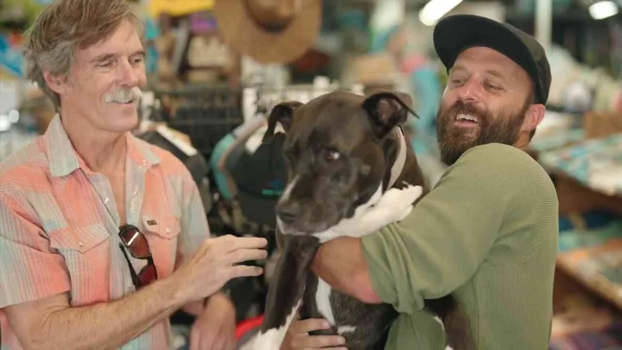
Travelers’ 2023 Brand Manifesto campaign, created by TBWA\Chiat\Day New York, redefines insurance marketing by centering on the profound, everyday acts of care that millions perform for one another, positioning the brand as a catalyst for those remarkable moments born from human empathy rather than a mere provider of policies. This film campaign operates within the travel and leisure insurance category, articulating a narrative that transcends transactional benefits by embedding Travelers into the fabric of community and mutual support, thereby fostering an emotional connection grounded in shared values of compassion and reliability. What Clapboard’s taxonomy would classify as FORMAT#10—Associated User Imagery—underpins the creative strategy, depicting relatable, empathetic user profiles that resonate deeply with an audience seeking authenticity and reassurance in uncertain environments. By leveraging this approach, Travelers sidesteps conventional insurance clichés centered on risk and claims, instead embracing a collective identity that reflects how ordinary people, not superheroes, uplift each other daily, aligning the brand with a social purpose that modern consumers prioritize. The campaign’s storytelling, executed through a singular film asset, invites viewers to reflect on the quiet yet powerful ways care manifests, reinforcing Travelers’ position as a trusted partner who supports not just travel plans but the very human experience of looking out for one another. Released in the United States, the campaign targets a broad demographic involved in travel and leisure, tapping into contemporary consumer demands for empathy, social responsibility, and meaningful brand engagement beyond price and coverage. Garnering over 111,000 views, Brand Manifesto demonstrates reach while cultivating brand equity through emotional resonance rather than hard sell tactics. Clapboard rates this campaign 63/100. This campaign matters to the industry because it signals a shift toward insurance marketing that prioritizes emotional authenticity and community values, illustrating how brands in traditionally functional categories can differentiate by embracing shared human experiences that underpin consumer trust.











.webp)