The Clapboard Ad Archive features iconic telecom commercials and power sector campaigns, offering strategic insights for marketing and brand development.
Telecom / Power
The Silent Revolution
Telecom / Power
The Silent Revolution
The Silent Revolution is a compelling film campaign launched in Sweden in October 2017 for Skellefteå Kraft by the agency Volt, positioned within the industrial sector to highlight the transformative power of electric vehicles. The campaign emphasizes how electric cars, despite their nearly silent operation, are driving a profound and positive change towards sustainability by challenging and replacing outdated habits. Skellefteå Kraft honors electric vehicle owners as pioneers in this shift, portraying them as key contributors to a greener future. The narrative gains emotional depth through a poignant visual metaphor featuring children playing quietly in a sandbox, symbolizing the hope and innocence intertwined with the ongoing environmental progress. The campaign’s subtle yet powerful message successfully connects with viewers by celebrating quiet innovation and encouraging collective movement towards sustainable living. With over 3,400 views and favorable engagement, The Silent Revolution effectively communicates the significance of embracing new energy solutions and embodies Skellefteå Kraft’s commitment to supporting a cleaner, more sustainable society.
Mind Control: Directing the Power of Perth, Batteries, BB... - Western Power | Clapboard Ad Archive
Mind Control: Directing the Power of Perth, Batteries, BB leverages the industrial gravitas of Western Power’s mandate and MullenLowe Group’s imaginative chops to reframe an essential but largely invisible utility as something cinematic, dynamic, and charged with creative possibility. Launched in Australia in 2017, this campaign operates within the telecom and power market category, capitalizing on the strengths of the film medium to dramatize electricity’s unseen presence throughout Perth. Rather than defaulting to technical diagrams, customer testimonials, or overtly rational storytelling, the campaign harnesses VFX to construct a visual metaphor for control and connectivity, manifesting energy’s reliability as a force governed by the brand’s near-psychic assurance. Across three distinctive media assets, Mind Control positions Western Power as an almost supernatural orchestrator of Perth’s energy ecosystem, deftly communicating not just operational efficiency but a reassuring mastery over the region’s power flows, storage, and distribution. The narrative’s use of extraordinary visual symbolism—amplified by heightened special effects and an imaginative framing—elevates the conversation about power management, converting abstract infrastructure into something tangible, memorable, and emotionally resonant for both residential and commercial audiences. This is an approach that sits squarely in Clapboard’s FORMAT#9—Symbolize the Benefit, using exaggerated visuals to dramatize the positive impact of an industrial product that is typically hidden from view. The creative leap to mind control as a narrative device, coupled with the cinematic execution, signals a departure from rote B2B utility messaging toward a brand-building narrative that asks viewers to see Western Power as an agent of community empowerment and technological stewardship. By rendering electricity’s movement visible and even spectacular, the campaign achieves more than messaging functional dependability: it builds brand trust through emotional engagement and dazzling craft. Clapboard rates this 63/100. In advancing the symbolism of energy reliability and making infrastructure emotionally legible, Mind Control shows that even utilities can seize the high ground of imagination when the visual language is ambitious enough.
Light Posts Projectors - AES Eletropaulo | Clapboard Ad Archive
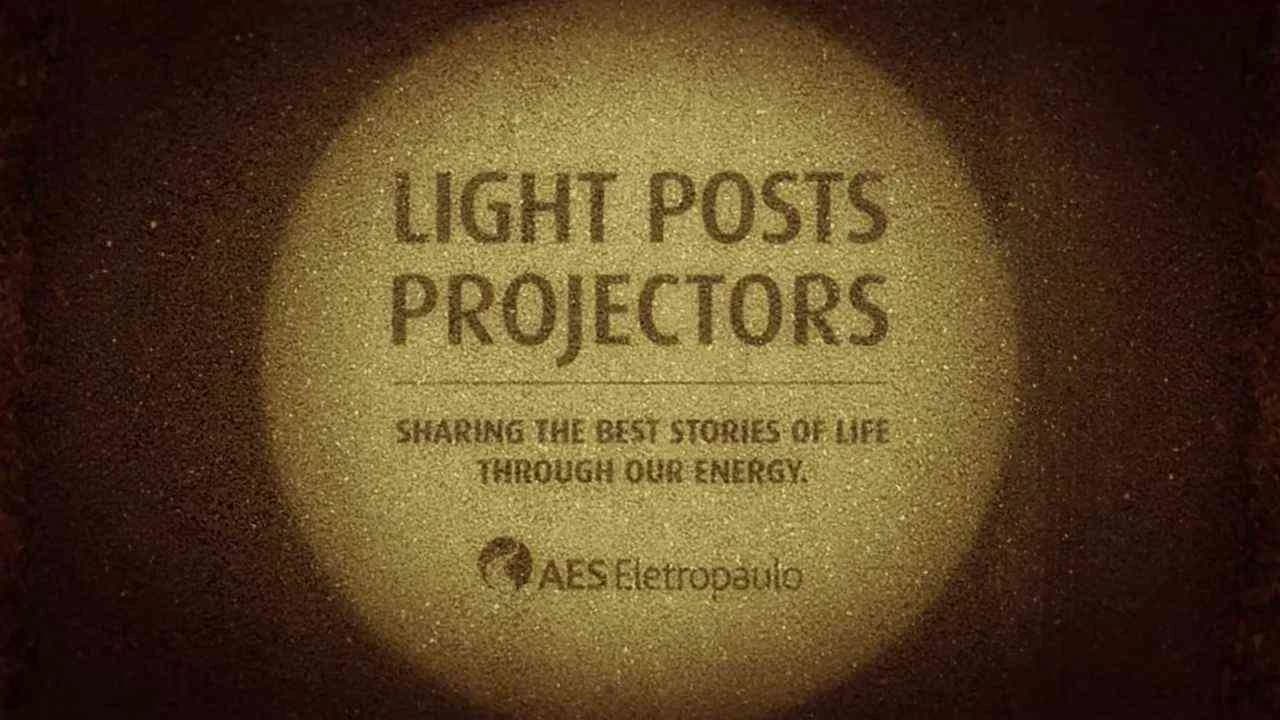
AES Eletropaulo’s Light Posts Projectors campaign, conceived by the Brazilian agency dim&canzian for the energy and utilities market in 2013, reimagined the city’s ubiquitous infrastructure as an emotionally charged outdoor media canvas, pushing the boundaries of OOH through a fusion of technology, public participation, and urban storytelling. By equipping standard light posts with projection devices, the campaign literally illuminated poignant, user-submitted headlines at the very locations where meaningful life moments had occurred, creating a living archive of local stories tied to AES Eletropaulo’s core product: the reliable electricity that powers daily life. Residents were prompted to contribute their most memorable experiences via the branded fansite mensagensquebrilham.com.br, transforming passive urban dwellers into active campaign participants and reinforcing the brand’s relevance at a deeply community-oriented level. This inventive use of outdoor space, which sits squarely within Clapboard’s FORMAT#9—Symbolize the Benefit, dramatized the utility’s impact not through direct demonstration of technological prowess, but by metaphorically turning infrastructure into a vessel for civic pride and collective memory; rather than touting service reliability or engineering excellence, the work celebrated the very light provided by AES Eletropaulo as a carrier of shared stories, weaving authentic human moments into the fabric of the city’s nightly life. For a market category as functionally utilitarian as industrial energy, the blend of participatory narrative, creative lens technology, and hyperlocal activation exemplified a shift toward brand-building strategies anchored in cultural engagement rather than transactional messaging. The campaign’s digital touchpoint provided an additional layer, amplifying both engagement and visibility, while the public projections themselves achieved a striking synthesis of symbolism and spectacle. It stood as a rare example of how even legacy infrastructure—when paired with creative insight and genuine consumer involvement—can transcend its physical function to serve as a beacon for communal expression. Clapboard rates this 74/100. In demonstrating how symbols and collective memory can animate even the most unglamorous utilities, Light Posts Projectors signals that storytelling and meaningful participation can reposition industrial brands as integral cultural anchors within the urban landscape.
The WiFi-Ad - 3 Mobile | Clapboard Ad Archive
When 3 Mobile set out to promote their Pocket WiFi portable router in Sweden in 2012, the brand and agency MRM sidestepped traditional ad formats and instead turned the act of searching for WiFi itself into an advertising moment at Stockholm Central Station—a bustling nexus for travelers perpetually seeking free internet access on their portable devices. By deploying a public WiFi hotspot named Looking for WiFi, they captured the attention of exactly the right audience in exactly the right place: commuters, students, and business travelers stranded in transit, all unified by a common pain point of connectivity. As users latched onto the network, they were instantly redirected to a bespoke landing page from the nearby 3 Store, which posed a direct challenge—wasn’t it time to own your own WiFi solution?—while delivering both product information about the Pocket WiFi and simple walking directions to the physical store, located just steps away on site. The campaign operates in what Clapboard’s taxonomy defines as FORMAT#2—Show the Problem: rather than dramatizing, abstracting, or humorizing the insight, it makes the friction of public WiFi hunting explicit and offers 3 Mobile’s product as the immediate fix, precisely at the moment of need. This decision to use the WiFi medium turned an everyday point of friction into a vivid, interventionist touchpoint, collapsing the gap between problem, solution, and purchase into a seamless action funnel. 3 Mobile’s tactic also sidestepped paid media channels by leveraging their target audience’s behavioral context, maximizing message relevance while minimizing spend. As travelers connected—driven by necessity, not idle curiosity—they confronted a solution that was not just relevant but actionable within minutes, prompting genuine engagement with the technology and driving footfall into the store. In the highly competitive telecom sector, this campaign stands out for its elegant fit of problem, context, and product offering, reminding mobile operators that utility and timing can outperform spectacle or scale, especially when harnessed with sharp creative insight. The campaign earns a score of 74/100 in Clapboard's global creative archive. For a telecom market saturated with generic digital banners and outdoor interruptions, The WiFi-Ad remains a standout case for how ambient interventions can transform latent consumer demand into immediate brand action, provided the context is read as closely as the creative brief.
Four for the Holidays - Cricket Wireless | Clapboard Ad Archive
Cricket Wireless’s Four for the Holidays campaign, launched in the United States in 2018 by Argonaut, exemplifies a finely tuned use of ongoing branded characters to drive seasonal relevance within the fiercely competitive telecom and technology sector. Timed to coincide with the holiday rush, the campaign capitalizes on both the financial pressures and emotional touchpoints of family gatherings, underlining Cricket’s core proposition of affordability with an explicit four-lines offer. The decision to center the story around the brand’s now-iconic fuzzy friends—a signature element of Cricket’s advertising—strengthens both recognition and recall, cementing brand affinity through consistency and charm. Argonaut deploys these animated characters in a filmic vignette that eschews hard-sell tactics for an optimistic, performance-driven narrative, placing connection, value, and togetherness at the heart of the message. The work sits squarely in what Clapboard’s taxonomy would classify as FORMAT#8—Ongoing Characters or Celebrities—as it leverages the strengths of recurring brand personalities to foster loyalty and reinforce reliability in an otherwise price-focused category. Instead of a scattered media approach, the campaign operates with a single, highly focused narrative asset, amplifying clarity and cohesion at a time when clutter is the norm. Its presence in the market during peak holiday advertising underscores strategic insight, anticipating consumers’ heightened receptivity to offers that blend utility with warmth. By authentically dramatizing the role of wireless connectivity in modern holiday rituals, the campaign avoids sentimentality in favor of a relatable, sales-oriented communication that remains grounded in the realities of its audience. The value-led proposition is explicit but never at the expense of emotional resonance, and Cricket Wireless is deftly positioned as the smart, accessible choice for cost-conscious families seeking quality service. In keeping with Cricket’s brand DNA, Four for the Holidays reinforces the company’s role as a category challenger that understands the lasting power of both savings and sentiment. The campaign earns 63/100 in Clapboard’s global creative archive. At a moment when telecom brands risk abstraction or generic price wars, Four for the Holidays signals how ongoing character work can humanize a commoditized offer and cut through for lasting impact.
The Energy of New York - Con Edison | Clapboard Ad Archive
Con Edison’s You Are the Energy of New York campaign, launched in the United States market in 2018 with creative by Havas, delivers a focused message on the power of individual action in the city’s clean energy transformation. Developed for the industrial category and leaning on film as its chosen channel, the campaign sets aside traditional hero narratives and celebrity-fronted stunts to put everyday New Yorkers at the centre of the story, framing personal responsibility as the engine of collective progress. Drawing on user-identifiable imagery—what Clapboard’s taxonomy classifies as FORMAT#10—Associated User Imagery—the film speaks directly to the audience in inclusive, actionable terms, effectively recasting consumers from passive energy recipients to co-architects of sustainability. The narrative’s core asserts that while Con Edison is advancing renewable infrastructure and clean supply, genuine change hinges on the engagement and empowerment of every city resident, thus integrating a real-world call to action through ConEd.com/EnergySavings for tangible participation. The visual language and tone are unmistakably urban and authentic, positioning the city’s energy ecosystem as a shared responsibility, and reinforcing the idea that every kilowatt saved is a joint effort between utility and individual. Strategically, the campaign’s avoidance of abstraction or heavy-handed environmental iconography, in favour of recognisable locals and direct language, grounds the sustainability agenda in personal agency—a crucial move for a utility provider seeking more meaningful alignment with consumer values in a hyper-diverse metropolitan context. Backed by Havas’s succinct creative execution and clear messaging, the film embodies a utility-sector proof point for shifting the energy conversation from infrastructure alone to people-powered impact, taking the abstract and making it actionable for the everyday New Yorker. The campaign earns 56/100 in Clapboard’s global creative archive. As utility brands reframe their relevance for increasingly active and climate-conscious audiences, this campaign signals the early stakes of mass personalisation as both a path to brand trust and a lever for systemic change.
A Gamers Christmas - KPN | Clapboard Ad Archive
KPN’s 2018 Christmas campaign, executed in partnership with creative agency N=5, delivered a considered narrative for the Dutch telecom sector by spotlighting how digital connectivity can forge friendships as rich and meaningful as those built offline. Anchored around a group of young gamers who, despite never meeting outside a virtual world, form a close-knit community, A Gamers Christmas unfolds through a documentary lens that traces their journey from online comradeship to an in-person holiday gathering — an emotional crescendo enabled exclusively by KPN’s network. The campaign deploys an approach that sits squarely in Clapboard’s FORMAT#5—Exemplary Story category, allowing the telecom service to be not just an ambient facilitator but the central enabler and resolution of the story, with KPN acting as the connective tissue that brings these isolated friends together for a physical Christmas celebration. Eschewing overt product demonstrations, celebrity endorsements, or heavily symbolic devices, the content invests in authentic emotional storytelling from the inside out, capturing candid moments both in the digital domain and during the eventual face-to-face meeting, thereby reinforcing the brand’s positioning as the backbone of contemporary connection. The narrative stays tightly focused on the personal transformation initiated by connectivity, tapping into an underrepresented truth in both holiday and telecom marketing: that belonging and togetherness transcend geography, especially in the age of gaming and online communities. By choosing the competitive holiday window for launch and crafting a story highly relevant to digital natives, KPN and N=5 managed to distinguish the brand within a crowded market, validating the idea that telecom services now underpin not just convenience or efficiency but genuine human intimacy. Clapboard rates this 63/100. In demonstrating that emotional resonance and brand utility can seamlessly combine when the product is made indispensable to the narrative, this campaign expands the creative playbook for telecoms seeking to authentically reflect new modes of friendship.
Infinite Mirror - Vodafone | Clapboard Ad Archive
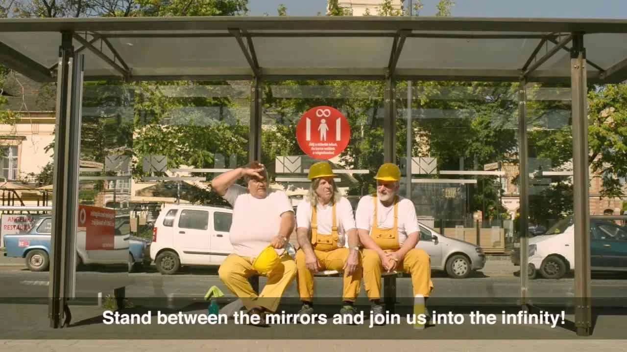
Vodafone’s Infinite Mirror campaign, devised by Team Red for the Hungarian market in Year 2013, brings a distinctive interpretation of the brand’s promise of limitless connectivity to public space in a way that feels both immediate and metaphorically charged. Set at one of Budapest’s busiest tram stops — an environment already thick with digital conversation — the outdoor installation implemented two mirrors positioned face-to-face, generating the familiar but ever-intriguing illusion of infinite reflections. This choice of location and concept was no accident: by inviting commuters, many of whom naturally reach for their phones while waiting, to step between the mirrors, the campaign translated the abstract idea of boundless communication into a tangible, lived moment. The activation deliberately sidesteps overt demonstration or product feature callouts, instead banking on an evocative visual device to anchor Vodafone’s value proposition. The infinite mirror effect becomes a stand-in for the endless conversations and ceaseless connectivity enabled by Vodafone’s technology. It’s an approach that sits squarely in Clapboard’s FORMAT#9 — Symbolize the Benefit — where exaggerated or iconic visuals work not just to dramatize, but to make emotionally legible, the otherwise invisible impact of technical offerings. The campaign’s stripped-back aesthetic serves to heighten its clarity; with no extraneous messaging or clutter, the focus remains on the participant’s personal experience of the moment, which then becomes inextricably associated with the brand’s identity as a connectivity leader. The Infinite Mirror activation leverages its high-traffic setting to ensure visibility and relevance for the electronics and technology category, asserting presence in the exact context where mobile interaction is culturally embedded. By merging a simple experiential invitation — step inside, witness the effect, see yourself multiplied without end — with Vodafone’s broader messaging, the installation achieves a form of participatory branding that goes beyond passive exposure, instead fostering a sense of belonging to the network’s narrative. The campaign earns 63/100 in Clapboard’s global creative archive. In demonstrating how direct, sensory symbolism can cut through the urban cacophony, Infinite Mirror signals to the industry that experiential outdoor work remains a potent vehicle for communicating technological utility with emotional clarity.
The solar Christmas experience - E.ON | Clapboard Ad Archive
The solar Christmas experience, created for E.ON by M&C Saatchi and launched in the Swedish market in 2016, stands out as a visually-led campaign in the professional services and energy sector that reimagines the holiday season through the lens of sustainable innovation. Positioning E.ON as the ambassador of green energy solutions during a period defined by short days and dark winters, the campaign employs advanced VFX techniques to create a wintry tableau in which the transformative power of solar energy is not just promised but made affecting and immediate. Rather than deliver a literal or didactic demonstration of products or services, the film leverages exaggerated, symbolic visual storytelling—what Clapboard’s taxonomy squarely classifies as FORMAT#9—Symbolize the Benefit—to manifest the emotional and tangible impact of solar energy as warmth, light, and festivity during the year’s darkest weeks. The film’s visual metaphors—such as brilliant solar flares igniting Christmas lights or households bathed in unseasonal, sun-inspired illumination—recast the concept of renewable energy from a technical solution to an enabler of communal joy and wonder, strategically connecting the E.ON brand to the traditions and aspirations of Swedish consumers. M&C Saatchi’s creative approach crafts a narrative designed for both immediate impact and long-term brand equity, aligning with a rising zeitgeist around sustainability while steering clear of guilt or eco-anxiety; instead, the positive, visually immersive world fuses technology with holiday spirit and invites audiences to imagine a future where clean power is the canvas for celebration itself. With more than a million views, the single media asset successfully achieves digital reach and relevance at a time when consumer attention during the holidays is highly contested. Clapboard rates this 69/100. For an industry wrestling with how best to convey the real-world promise of renewables, this campaign demonstrates that symbolic storytelling can translate complex product benefits into memorable, affective brand experiences that elevate both category awareness and cultural resonance.
Now with always-on data - Verizon | Clapboard Ad Archive
Verizon’s Now with always-on data campaign, launched in the United States in 2016 by la comunidad, marked a decisive moment for the brand in affirming its dominance within the fiercely competitive Telecom / Power sector, embracing the surge in consumer reliance on uninterrupted data as integral to both productivity and personal connectivity. Deploying a concise but visually dynamic film asset, the campaign underscores Verizon’s technical leadership by drawing a direct line between best-in-class network reliability and the freedom it enables for its users — those whose day-to-day lives hinge on their devices not losing connection regardless of location or time. With an overt demonstration of product capability, the creative sits squarely in Clapboard’s FORMAT#1 DEMONSTRATION — Directly shows how a product works and highlights its benefits — capturing scenarios where constant connectivity is no longer just a value-add but a baseline expectation for the connected consumer. La comunidad eschews the distraction of celebrity devices or narrative embellishment in favor of a pure, performance-led approach: service reliability and data permanence take center stage, reinforcing Verizon’s identity not just as a service provider but as a foundational enabler of the modern digital lifestyle. The film medium is leveraged not for mood or abstract storytelling, but to provide tangible, memorable, and accessible proof of concept, making the technical promise of always-on coverage a lived, relatable reality for its audience — a cohort increasingly unwilling to tolerate network downtime or drop-offs. By channeling the genre’s traditional clarity and focusing attention on the core value proposition, the creative aligns Verizon’s wider communications ecosystem around a single, potent message: true empowerment comes from never being disconnected. The campaign earns 58/100 in Clapboard’s global creative archive. For an industry where technical advancement and user trust are currency, this campaign signals how direct and functional demonstration can powerfully anchor a brand’s innovation story when connectivity becomes synonymous with daily agency.
Let's renew Sweden - E.ON | Clapboard Ad Archive
Let’s renew Sweden marks E.ON’s ambitious 2017 push, via M&C Saatchi, to reframe the industrial power brand as a progressive agent of national transformation in Sweden’s tightly regulated telecom and energy market. At its core, this campaign leverages a filmic narrative structure weighted heavily toward visual metaphor, clearly sitting within what Clapboard’s taxonomy names FORMAT#9—Symbolize the Benefit, where the positive impact of a brand’s solution is rendered through resonant, exaggerated symbolism rather than didactic problem-solution storytelling. Forgoing the technical jargon or product demonstration typical of the sector, the campaign deploys sweeping, high-production visuals to evoke a kind of kinetic renewal sweeping across the Swedish landscape, implicitly connecting E.ON’s commitment to sustainable infrastructure with a wider societal surge toward ecological responsibility. M&C Saatchi’s execution orients the audience toward collective participation rather than individual utility, with narrative beats designed to trigger national pride and personal stake in Sweden’s energy future, ensuring the film feels less like corporate self-congratulation and more like a rallying call to shared momentum. The campaign’s singular, cohesive asset creates a sense of unity and authenticity, positioning E.ON as not just a supplier of power but as a steward of Sweden’s future-facing identity at a moment when the industry’s environmental credentials were under renewed scrutiny. While distinctly Swedish in tone and visual language, the work sidesteps parochialism by allowing its themes of renewal and modernity to resonate beyond energy insiders to broader stakeholder groups and environmentally engaged consumers. The alignment of brand platform, industrial credence, and evocative communication underscores E.ON’s intent to lead rather than chase the market on the question of sustainable transition, all while distinguishing its offer from legacy players in a crowded space starved for future-centric narratives. The campaign earns 63/100 in Clapboard’s global creative archive. For the industry, Let’s renew Sweden matters as evidence of how a legacy energy brand can reshape both its self-image and public expectations when it dares to symbolize—not just verbalize—the transformative potential of its innovation.
Door - Enel | Clapboard Ad Archive
Enel’s Door campaign, launched in 2017 by Saatchi & Saatchi for the Italian market, stands as a visually articulate reflection on the transformative role of energy in the industrial and telecom sectors, leveraging the simple yet potent imagery of a door to chart energy’s evolution from the dawn of the lightbulb in 1879 to the complexities of smart living and advanced mobility. Rather than lean on literal demonstration or overt storytelling, the film adopts a metaphor-forward creative strategy that aligns directly with what Clapboard’s taxonomy identifies as FORMAT#9—Symbolize the Benefit, harnessing the symbolic resonance of a door as a portal connecting the past to the future and opening pathways to innovation, connectivity, and discovery. Its core narrative concept maps energy’s journey as an unbroken process of opportunity creation—each breakthrough not just illuminating a room, but unlocking entire worlds of possibility, from intelligent homes that communicate with inhabitants to the accelerating ascendancy of electrically powered transportation. Saatchi & Saatchi’s execution situates Enel not merely as a utility provider but as a progressive force shaping the convergence of energy, technology, and daily life, reinforcing the brand’s presence as an enabler of smart infrastructure and future-facing connectivity. The communications elegantly sidestep rational exposition in favor of emblematic visuals, allowing the audience to step through the literal and figurative doorways of progress, where faster and more agile connections reshape the way people live, move, and interact. By framing energy as both legacy and launchpad, the campaign invites viewers to rethink what an energy company can represent in an era defined by accelerating change, technological integration, and the shifting boundaries between home, mobility, and communication. Filmic craft is supported by a broader market context in which energy and telecom brands are converging on propositions of empowerment, access, and intelligent interface—an approach uniting industrial innovation with consumer aspiration. The campaign earns 63/100 in Clapboard’s global creative archive. This work signals a clear shift in energy communications towards symbol-driven narratives, where visual metaphor carries the strategic weight of brand transformation and category leadership.
FAQs for the Playlist: Telecom / Power■
Top questions to this curated campaign playlist
Professionals analyze telecom and power campaigns to understand how complex technical services are communicated clearly and persuasively. These references reveal effective storytelling, regulatory navigation, and emotional engagement strategies that help shape briefs, inspire concepts, and refine messaging for similar utility or tech-driven categories.
Studying this history reveals how brands have responded to evolving consumer needs, technological advances, and regulatory changes. It informs strategic decisions by highlighting how market leaders built trust, differentiated services, and managed crises, providing a blueprint for sustainable brand growth in highly competitive and essential service sectors.
Variations reflect local infrastructure, cultural attitudes toward utilities, and regulatory environments. Earlier eras prioritized educational messaging, while recent campaigns emphasize sustainability and digital innovation. Formats range from large-scale broadcast to interactive digital experiences, each tailored to audience expectations and technological access in specific regions.
A frequent misconception is that these campaigns are purely functional or uninspired. In reality, top campaigns blend technical accuracy with creative storytelling to humanize essential services, build emotional connections, and drive behavioral change, demonstrating sophisticated strategic and artistic execution.
Examining landmark campaigns sharpens your ability to balance technical complexity with clear communication and emotional resonance. It deepens understanding of category-specific challenges and solutions, enhancing your capacity to craft impactful narratives and strategic frameworks — archived in Clapboard's global ad archive.
Creative Collaboration Platform: The Backbone of Modern Creative WorkWhat is a creative collaboration platform?Clapboard defines a creative collaboration platform as the operational core for today’s distributed creative teams. This is not a collection of digital collaboration tools stitched together; Clapboard’s system

Understanding the Creative Production MarketplaceWhat is a Creative Production Marketplace?Clapboard defines a creative production marketplace as a structured ecosystem where brands, agencies, and production talent converge to execute video, advertising, and branded content at scale. Unlike the legacy agency or freelanREAD FULL ARTICLE
The Urgent Need for a Creative Production Operating SystemWhy Traditional Creative Production Models Break DownClapboard sees the creative production landscape shifting under pressure. Content velocity is no longer a buzzword—it’s a mandate. Modern advertising demands relentless output across dozens of channels, each wREAD FULL ARTICLE

.webp)