The Clapboard Ad Archive features top personal care campaigns showcasing iconic commercials and marketing strategies for creative ad reference and inspiration.
Personal Care
The evolution of hooking up
Personal Care
The evolution of hooking up
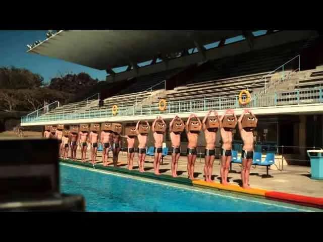
Launched in Egypt in November 2014, Axe's campaign The evolution of hooking up offers a fresh digital perspective within the health industry. Developed by the ad agency Digital Republic, this campaign leverages a single compelling media asset to engage a digitally savvy audience. By exploring contemporary social dynamics around personal connections and attraction, the campaign aligns Axe's brand identity with themes of confidence, appeal, and modern interaction rituals. The choice of a digital medium underscores a strategic emphasis on reaching consumers where they spend significant time, enhancing brand relevance in everyday digital environments. With nearly five thousand views and positive engagement reflected in likes, the campaign demonstrates effective resonance with its target market. As a thought-provoking and culturally attuned piece, it not only reinforces Axe’s position in personal care but also stimulates conversation around evolving social behaviors, ensuring the brand remains top of mind in conversations related to attractiveness and personal health. This campaign exemplifies how well-crafted digital content can merge brand messaging with societal themes to create meaningful connections and drive consumer interest.
Tag the Weather - Gillette | Clapboard Ad Archive
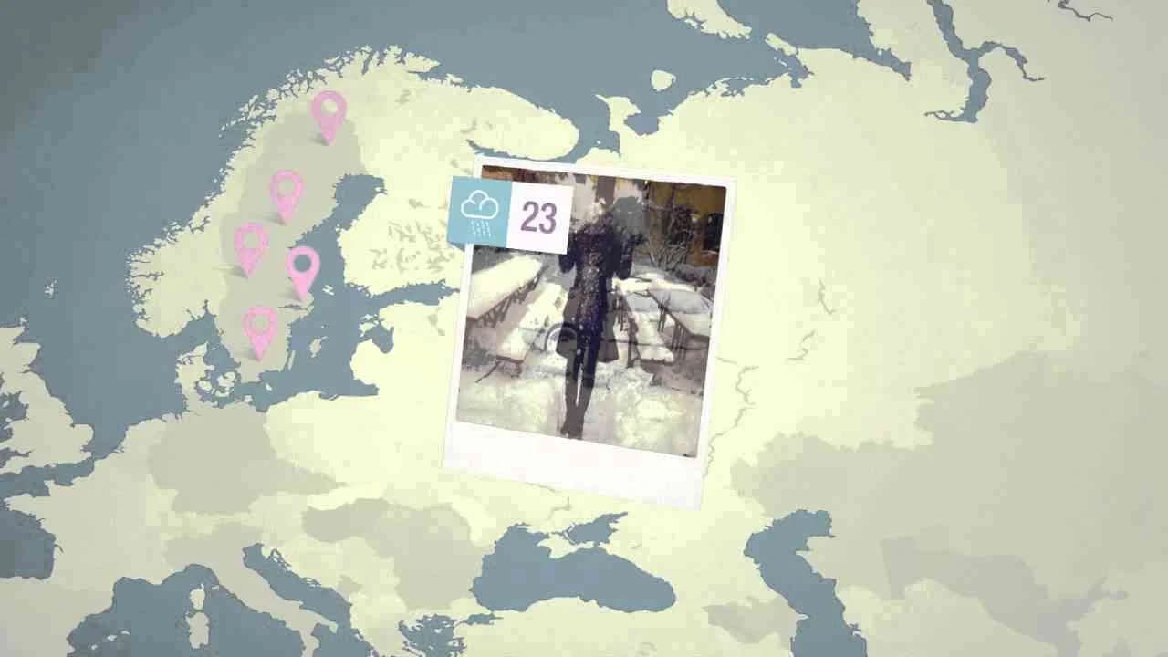
Gillette’s Tag the Weather campaign, created with Saatchi & Saatchi Stockholm for the Nordic market in Year 2013, tackled the perennial conundrum facing personal care brands in colder climates: how to keep razors relevant when bone-chilling Swedish winters drive down grooming routines. With five months of the year marked by darkness and temperatures plummeting to -30°C, Procter & Gamble Nordic saw sales of Venus razors and blades falter and recognized that traditional media was no longer effective in reaching their core audience of Swedish women. Instead of shying away from these unwelcoming conditions, the campaign leveraged winter itself as the organizing principle of its communications strategy, calling on women to tag extreme weather moments on digital platforms and reframing the challenging climate as an opportunity for empowerment and connection. The heart of Tag the Weather lay in a crisp digital execution that elevated Venus as the essential grooming companion, regardless of season, shifting the narrative from avoidance to agency while establishing an authentic dialogue with women deeply familiar with the rhythm of Swedish winters. In campaign mechanics that align exactly with Clapboard’s FORMAT#2—Show the Problem taxonomy, the work begins with a scenario the target audience lives every day, then presents the product as the direct answer, eschewing overblown storytelling or unnecessary dramatization in favor of targeted, insight-led engagement. By making the local weather not a challenge to overcome but the centerpiece of a collective, participatory experience, Saatchi & Saatchi reconnected Venus with a disengaged audience, extended the conversation beyond the season’s usual lull, and drove commercial performance in a notoriously difficult quarter for the personal care category. The strategy was not about volume or viral reach but about resonance, authenticity, and proving the brand’s relevance under real-world conditions, a tactical inversion of what would typically sap marketing momentum in colder markets. Clapboard rates this 63/100. Tag the Weather signals to the industry that short-term sales declines caused by cultural or environmental cycles can be reversed when a campaign takes a market truth head-on and transforms it into a shareable source of brand strength.
Thought Before Action - Dove | Clapboard Ad Archive
Dove’s 2013 Canadian digital campaign, Thought Before Action, marks a decisive evolution in the Real Beauty platform by shifting the conversation from public-facing declarations to the shadowed heart of image creation: the creative studios shaping popular conceptions of female beauty. Conceived by Ogilvy, this initiative does not address its message to women or girls but instead challenges art directors, graphic designers, and photo retouchers operating in the personal care sector to confront their own complicity in constructing unrealistic standards. Rather than deploying the literal before-and-after imagery that typically exposes the harms of digital retouching, Thought Before Action intervenes within the very spaces frequented by creative professionals, delivering a message calibrated for their eyes and sensibilities alone. In what Clapboard’s taxonomy would define as FORMAT#3—Symbolize the Problem, Dove bypasses visual didacticism, instead inviting the creators themselves to pause at the moment of manipulation and reflect on the broader cultural repercussions of their choices. The campaign’s lone digital asset distills this challenge into a targeted act of meta-communication, engaging the gatekeepers of beauty directly and transforming the site of image alteration into a platform for ethical debate. Ogilvy’s creative approach spotlights the quiet power these professionals wield, recasting them not as anonymous technicians but as key influencers whose decisions ripple beyond the confines of a magazine spread or a digital feed. This reframing positions Dove within the health and personal care market category as a brand not content merely to address symptoms of cultural distortion, but one determined to enter the engine room and interrogate the mechanics of beauty itself. The result is a campaign that operates on both a practical and philosophical level, expanding the Real Beauty mission to include the very process by which ideals are manufactured. Clapboard rates this 73/100. By turning the lens on the creators behind the curtain, Dove signals an industry-wide reckoning with accountability that will continue to shape how brands engage the architects of perception.
Protect yourself - Lactacyd | Clapboard Ad Archive
Lactacyd’s Protect Yourself campaign, created by Grey and launched in The Netherlands in 2009, underscores the brand’s strategic ambition to claim leadership in the personal care market through powerful, symbolic storytelling rooted in health advocacy. The campaign’s film execution leans into what Clapboard’s taxonomy would classify as FORMAT#3—Symbolize the Problem, eschewing direct depictions or literal dramatizations of intimate health concerns in favor of visual analogies that represent vulnerability and the invisible need for everyday protection. In doing so, Grey sidesteps the pitfalls of embarrassment and clinical sterility often associated with feminine hygiene advertising, elevating the category narrative to one of empowerment and commonsense self-care. Lactacyd’s positioning as a trusted health ally is articulated through clear, accessible messaging that delivers both an emotional and rational case for daily protection—a move that reinforces the brand’s relevance while expanding its resonance far beyond any single demographic. By deploying television as its primary channel in 2009, the campaign secured broad reach within a culturally attuned Dutch audience, a fact reflected in the film’s performance, surpassing the 100,000-view benchmark necessary for a genuinely impactful dialogue within the health industry’s cluttered airwaves. The clear and focused creative treatment aligns with the brand’s established equity, inviting consumers into a conversation about proactive self-care without resorting to shame or explicit clinical detail—a deft acknowledgement of the sensitivities inherent to the market category. Lactacyd thus harnesses the strengths of both product and channel, transforming a behavioral insight about protection into a mass-audience imperative that feels both practical and empowering. The campaign earns 63/100 in Clapboard’s global creative archive. Protect Yourself stands out to the industry not only for its restraint and clarity, but because it signals the enduring effectiveness of symbolic problem-framing in building long-term brand trust where intimacy and health intersect.
Larissa Riquelme - Axe | Clapboard Ad Archive
Axe’s 2010 Larissa Riquelme campaign in Paraguay exemplifies just how much cultural momentum can be generated by astutely merging celebrity, context, and brand DNA in the competitive tides of a global event. Amid the media blitz of the World Cup, Axe and agency McCann faced the classic challenger brand dilemma: capturing outsized attention with a pared-back budget. Their response was to tap into the fever pitch surrounding iconic Paraguayan model Larissa Riquelme—whose spontaneous and unmistakably bold support for the national team had already propelled her to international stardom—and make her the center of what became the region’s most talked-about ambient execution. The premise was disarmingly simple: fuse two magnetic touchpoints in the male psyche, soccer and women, into a single “sexiest billboard” installation that functioned as spectacle and press magnet simultaneously. With Riquelme as both muse and media lightning rod, the campaign sidestepped the resource-heavy vehicles dominating the World Cup cycle and instead weaponized earned media, leveraging her fame to ensure the Axe brand orbited every conversation in which sport, celebrity fixation, and Paraguayan national pride converged. There was no narrative arc, no forced exposition—just the cooling confidence of an idea that knew where and how to intersect desire, attention, and commerce. The approach sits squarely in what Clapboard’s taxonomy designates as FORMAT#8—Ongoing Characters or Celebrities—recognizing Axe’s strategic use of a singular, high-profile personality as the recurring touchstone for its message. True to its DNA as a personal care provocateur, Axe winked at established codes of masculinity while creating a moment that transcended advertising to dominate social and mainstream channels alike. Unlike campaigns that depend on lavish production or elaborate storytelling, this was ambient marketing stripped to its purest form—shock, access, and instant recall—delivering millions in earned media and indelible brand lift on a fraction of a standard major-event spend. Clapboard rates this 60/100. Axe Larissa Riquelme matters because it demonstrates how agile, format-savvy creativity can still break through even in the most oversaturated cultural moments, as long as the insight is sharp and the execution unapologetically bold.
Sensitive Armpits - Rexona | Clapboard Ad Archive
Sensitive Armpits, Rexona’s 2011 film campaign developed by Ponce for the Argentinian market, delivers a pointed message in the personal care category by zeroing in on the under-recognized yet widespread discomfort of sensitive armpits and offering a direct, tangible solution. The creative strategy is anchored in what Clapboard’s 12-format taxonomy identifies as FORMAT#2—Show the Problem, a device that first spotlights a relevant consumer pain point before positioning Rexona Sensitive as the unequivocal remedy. By focusing on everyday skin vulnerability, particularly in the context of underarm sensitivity, the campaign addresses a genuine barrier to deodorant use for many consumers, distinguishing itself within the health and hygiene landscape where efficacy can be overshadowed by bolder claims or celebrity-driven imagery. Ponce’s approach is notably utilitarian and empathetic—eschewing embellishment for straightforward storytelling that both acknowledges the consumer’s discomfort and legitimizes it as a universal concern, which in turn positions the brand as an ally invested not just in odour and sweat protection but also the subtleties of skin health. Delivered in Portuguese, the spot employs crisp, minimal visuals and a logical structure to dramatize the discomfort associated with routine product use, then pivots decisively to Rexona’s gentle, clinically-oriented solution, reinforcing trust by aligning with consumer priorities of safety and comfort. The narrative economy translates into effective communication with zero superfluous imagery or exaggerated drama, allowing the product proposition to remain central and credible. In a market saturated with performance-driven innovation claims, Sensitive Armpits stands out for its single-minded relevance and message clarity, firmly associating Rexona with skincare expertise rather than just efficacy alone. This focus builds not only product awareness but also the emotional territory of reassurance, deepening brand loyalty among a demographic that may feel underserved by more generic offerings. The campaign earns 60/100 in Clapboard’s global creative archive. Sensitive Armpits signals to the industry that nuanced consumer needs—particularly those around skin comfort—are fertile ground for building brand trust in personal care, provided brands resist embellishment in favour of targeted and authentically solution-driven communication.
Dawson's Kid - Mitchum | Clapboard Ad Archive
Dawson's Kid positions Mitchum directly within the competitive landscape of personal care by channeling Mother’s talent for lifestyle-driven storytelling into a crisp portrayal of confidence and authenticity, using the film format to its full narrative potential. Launched in the United States in 2011, the campaign trades on the believable rhythms of daily life, zeroing in on an everyday user — presumably Dawson and his child — whose relatable scenarios become vehicles for Mitchum’s promise of reliable, long-lasting protection. Rather than defaulting to overt demonstrations of sweat or odor, the work aligns Mitchum’s efficacy with subtle moments of reassurance: a parent’s presence at their child’s side, the brisk rhythm of ordinary routines, and the quiet self-assurance that robust personal care engenders. Mother’s approach for Mitchum stays true to what Clapboard’s taxonomy would classify as FORMAT#10—Associated User Imagery, eschewing dramatized problems or stylized product proofs in favor of a direct, aspirational identification with the target demographic. This slice-of-life focus, marked by sharp observation and a light authorial touch, fosters brand relevance by depicting users not as perfect archetypes, but as real people who value practicality, warmth, and trustworthiness in their routine. The film’s visual grammar — unhurried editing, intimate framing, restrained set pieces — plays well to the intelligence of a 2011 audience primed for authenticity over artifice in the health category. For Mitchum, the net effect is an increase in emotional connection and perceived everyday utility, advancing the brand’s platform as not only a product but a companion in the course of real life. Clapboard rates this campaign 54/100. This campaign matters because it foregrounds real-life identification rather than heightened drama, signaling a sustained shift in health and personal care marketing toward everyday aspirational relevance.
Evan Longoria's crazy bare hand catch - Gillette | Clapboard Ad Archive
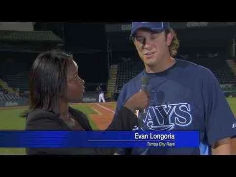
Evan Longoria's Crazy Bare Hand Catch marked a defining moment in Gillette's ongoing commitment to embodying performance and confidence in the personal care category, leveraging the cultural cachet of Major League Baseball and the star power of Longoria himself through a digital campaign crafted by BBDO in the United States in 2011. With the razor-sharp premise of a Tampa Bay Rays athlete intercepting a baseball with split-second timing to protect a reporter, the campaign radiates the brand's long-held association with precision, athleticism, and readiness—qualities that seamlessly map onto the health and grooming space Gillette dominates. By focusing on the Young Guns series, Gillette continues its strategic alignment with elite athletes, using authentic, unscripted feats rather than overt product demonstration to transfer the credibility of real-world skill to the brand promise of reliable performance. The narrative's tension and sense of spectacle—rooted entirely in Longoria's almost superhuman reflex—elevate the spot from typical celebrity endorsement to a moment of viral intrigue, resulting in a digital phenomenon that captivated over 11 million viewers and empowered the brand with a groundswell of social engagement. There is no explicit product tutorial or direct problem-solution framing; instead, the creative relies on the evocative power of character and real-life drama, placing it squarely in what Clapboard’s taxonomy classifies as FORMAT#8—Ongoing Characters or Celebrities, where celebrity familiarity and moment-driven storytelling drive brand recall and emotional resonance. Through this lens, the campaign excels at blurring the boundary between sports entertainment and personal care marketing, inviting audiences to see Gillette not only as a household staple but as a catalyst for assurance and split-second readiness in daily life. The digital-led strategy is both lean and potent, capitalizing on a singular event’s virality while amplifying Gillette’s recognizable message: that true confidence and peak performance are inseparable, whether on the diamond or in front of the bathroom mirror. The campaign earns 79/100 in Clapboard’s global creative archive. This campaign matters because it reaffirms the value of aligning brands with genuine athletic achievement, signaling to the health and grooming industry that authentic moments can catalyze both mass engagement and lasting equity.
Bacteriads - Lifebuoy | Clapboard Ad Archive
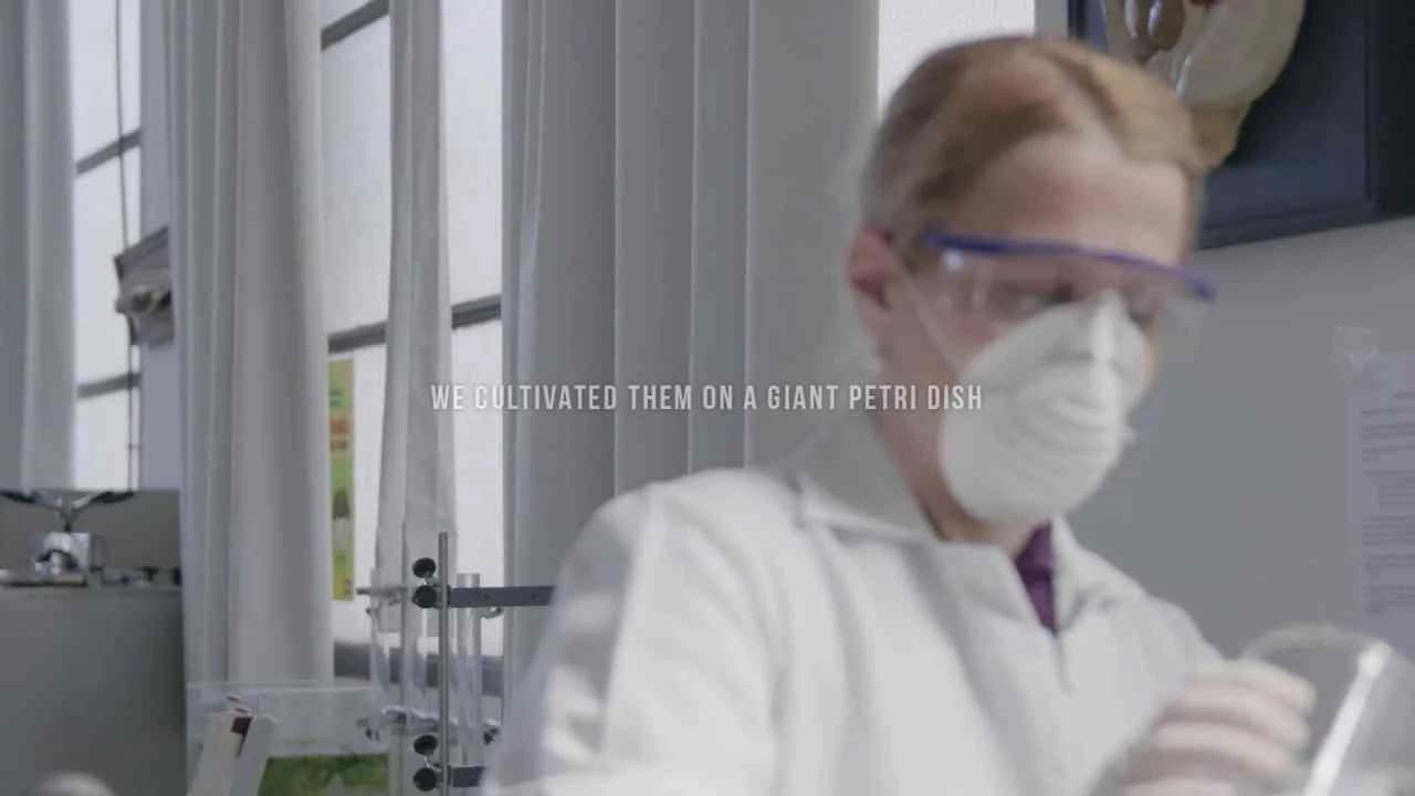
Lifebuoy’s Bacteriads campaign, created by The Electric Factory in Uruguay for the personal care market in Year 2016, redefined outdoor advertising by manifesting hygiene concerns at street-level scale, literally making bacteria visible where it’s most often ignored. With a single striking billboard asset grown from live bacteria swabbed from everyday objects and public places—rather than relying on microscopy, illustration, or metaphor—the campaign positioned Lifebuoy’s hygiene message at the center of a public, tactile demonstration of microbial danger. This approach resides squarely in what Clapboard’s taxonomy defines as FORMAT#1—Demonstration, delivering a proof of the product’s relevance by showing, in real time and in a physical medium, the very problem Lifebuoy’s antibacterial soaps are engineered to address. By bypassing the tropes of narrative-driven storytelling and instead harnessing a living, evolving biological medium, The Electric Factory found a way to collapse the distance between communication and proof, generating a kind of biological infomercial in the street. The campaign’s context—bridging the residential, garden, and pharmaceutical categories—helped to amplify its message across both private and public frameworks of health, expanding Lifebuoy’s relevance from kitchens and bathrooms to the wider, often-overlooked microbiome of shared environments. Set against the backdrop of a growing regional conversation on resistant bacteria and personal sanitation, Bacteriads capitalized on the audience’s curiosity and latent anxiety, confronting passersby with an invitation to question their own handwashing habits and hygiene standards. The creative device of a real-bacteria poster created not only intrigue but a direct sensory challenge: look closely, see the colonies, and recognize the invisible peril such germs represent on your daily commute or shopping trip. Eschewing the abstract charts and CGI common to category peers, the work allowed Lifebuoy to claim the higher ground of scientific authenticity—if you can see the bacteria before you, the brand’s antimicrobial guarantee is not a mere promise but a clearly defined remedy. Clapboard rates this campaign 79/100. For a category that can often feel formulaic or reliant on clinical clichés, Bacteriads proves that experiential demonstration using real science can jolt audiences out of apathy and reframe public health messages with immediacy and credibility.
Daydreamers - Tens | Clapboard Ad Archive
Daydreamers sees Tens and LUNA NEGRA bring fresh energy to the personal accessories category, delivering a visually arresting SS17 film campaign that explicitly confronts the difference between digital detachment and human warmth using a split shooting approach — half digital and half classic 16mm film — to powerful effect. Set against Tulum’s vivid landscapes, the film doesn’t just showcase the sunglasses as an accessory but deploys bold, metaphorical cinematography to symbolize the emotional transformation promised by the brand: a world rendered cold and desaturated without Tens, shifting to a sun-drenched sensory experience when viewed through their lenses. Rather than relying on testimonials or standard lifestyle tropes, the campaign leans into what Clapboard’s taxonomy would classify as FORMAT#9—Symbolize the Benefit, using exaggerated visual contrasts as a direct analog for the brand’s central benefit: seeing everyday life in richer color and higher fidelity, both figuratively and literally. Through carefully calibrated narration, the film positions Tens as an antidote to the digital malaise of performative living, encouraging a mindset shift toward genuine, offline moments and a more optimistic embrace of the present. By launching the collection exclusively on Kickstarter, Tens further positions itself in direct dialogue with an audience that craves both access and authenticity, bypassing traditional retail for genuine engagement and early adopter validation. With the campaign’s focus on experiential storytelling over explicit product demonstration, Daydreamers clears space for nuanced emotional resonance, cementing Tens as a participant in — not just a spectator of — modern cultural conversations around digital fatigue and the quest for connection. The campaign earns 71/100 in Clapboard's global creative archive. In a market saturated with surface-level lifestyle branding, Daydreamers signals the renewed power of metaphor and tangible craft in expressing a personal accessories brand’s promise.
Live life in full colour - Dove | Clapboard Ad Archive
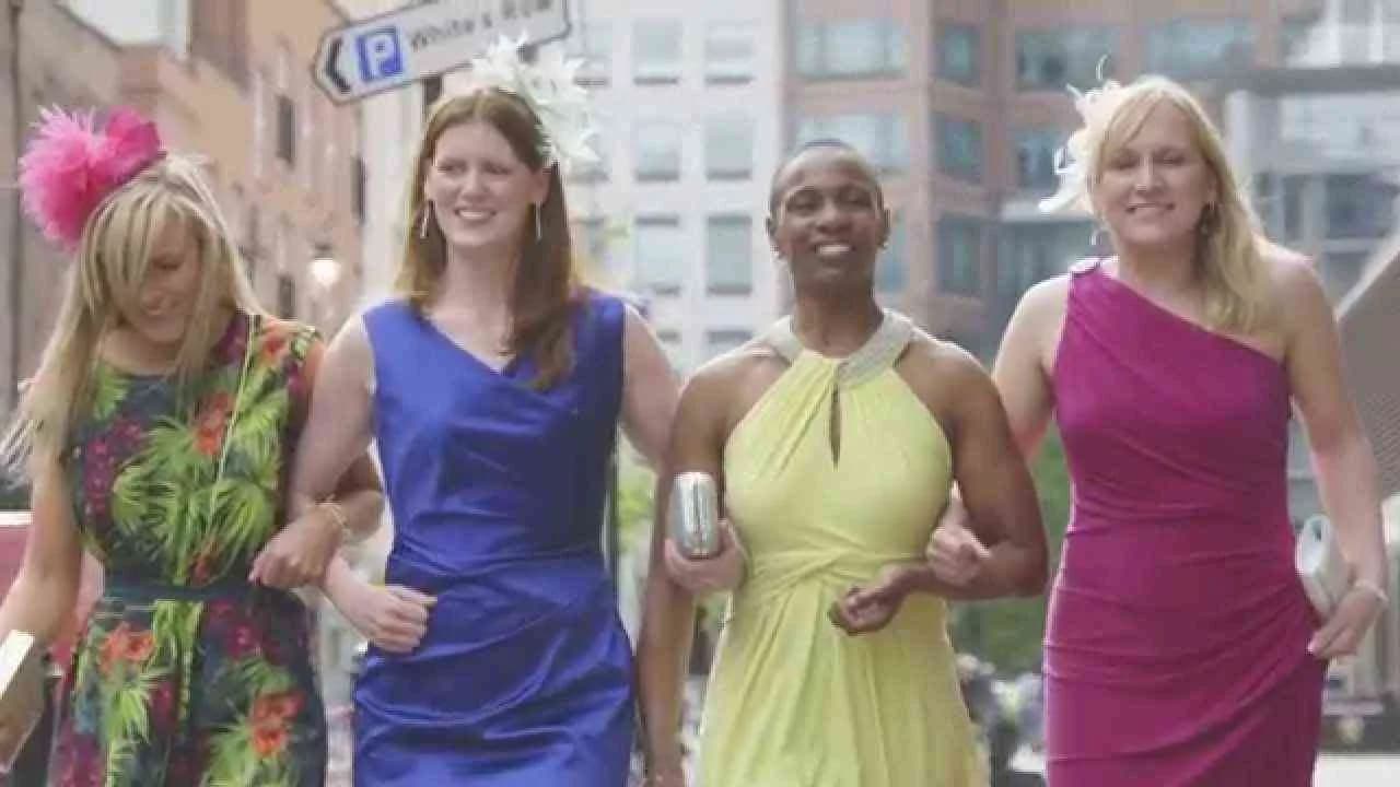
Dove’s Live Life in Full Colour campaign, launched in the United Kingdom in 2015 by Hey Human, marked a pivotal point in the brand’s ongoing effort to redefine personal care communications by making the product actively enable the consumer’s self-expression. Created to spotlight Dove Invisible Dry’s unique claim—tested to leave no marks on 100 colours of clothing—this digital-first initiative used an exemplary story format squarely aligned with what Clapboard’s taxonomy designates as FORMAT#5—Exemplary Story, a device where the product is not a passive attribute but the enabler driving narrative resolution. Set within the broader personal care and health landscape, the campaign tackled a universal anxiety among women: the constraining risk of deodorant stains that stifle the willingness to wear bold, colourful clothes, a detail deeply rooted in both product benefit and fundamental cultural insight. Hey Human’s strategic execution centered around the human truth that confidence, identity, and the freedom to wear vibrant hues are intrinsically linked, yet not accessible for all women due to such everyday barriers. By identifying four women who had felt unable to express themselves fully through dress, then gifting them a transformative occasion where they were free to choose from a palette of 100 colours without worry, the campaign built compelling personal narratives that fused emotional resonance with persuasive evidence of product efficacy. The #100Colours social activation amplified this message, extending reach and fostering an inclusive conversation about real women, real concerns, and real solutions—united under Dove’s banner of everyday empowerment. The single digital media asset attracted over half a million views, evidence of strong resonance and shareability, and ultimately advanced Dove’s ongoing mission to empower women through practical, credible innovation. Throughout, the campaign’s storytelling confidently connected the distinctiveness of the women and the spectacular vibrancy of colour with the invisible reassurance of Dove Invisible Dry, positioning the brand as both an ally in daily routines and a culturally relevant voice in the personal care market. Clapboard rates this 63/100. The campaign signals how meaningful product stories, when grounded in an authentic consumer tension, can elevate utility into an experience of self-empowerment for brands operating in the everyday health and personal care space.
Shave Forth ft. Dr. Lektroluv & DJs from Mars - Gillette | Clapboard Ad Archive
Gillette’s Shave Forth ft. Dr. Lektroluv & DJs from Mars campaign, conceived by Grey in 2015, stakes its ground in the personal care market by tapping into the intersection of music, lifestyle, and grooming in a direct bid for cultural relevance. Anchored in the collaboration with high-profile electronic music figures Dr. Lektroluv and DJs from Mars, this digital-first initiative repositions Gillette not just as a category leader in shaving but as a brand that understands and embodies the pulse of its target audience. The core creative engine of Shave Forth is the synergy between brand and celebrity presence, with the campaign’s structure aligning with what Clapboard’s taxonomy defines as FORMAT#8 — Ongoing Characters or Celebrities, using recognisable talent as its the primary driver for brand recall and aspiration. Rather than relying on traditional testimonial, problem-solution, or narrative storytelling devices, the campaign leverages the star power of DJs to inject energy, style, and a thriving nightlife aesthetic into Gillette’s health and grooming proposition. The execution manifests through a single, visually charged digital asset set to an electrifying soundtrack, designed to operate natively within digital and social environments where its intended younger, trend-oriented consumers are most active. By wrapping core grooming messages within the context of performance and music culture, the campaign sidesteps didactic health communication in favour of experiential resonance, building a values-based affinity and a strong halo of modernity around the Gillette brand. Grey’s creative approach reinforces Gillette’s expertise while restyling it as a badge for the self-assured, self-expressive consumer who identifies with the creative energy of EDM culture. The campaign earns 57/100 in Clapboard’s global creative archive. As celebrity-powered executions signal the evolving priorities of grooming brands in pursuit of new audiences, Shave Forth demonstrates that identity and cultural fluency increasingly define equity in the personal care space.
FAQs for the Playlist: Personal Care■
Top questions to this curated campaign playlist
Professionals analyze personal care campaigns to understand how brands communicate sensory experiences, build trust, and differentiate through storytelling and visual style. These references inform concept development, tone, and execution strategies that resonate emotionally and culturally with target audiences, archived in Clapboard's global ad archive.
Examining personal care advertising history reveals how cultural shifts, consumer values, and innovation have shaped brand positioning and messaging. This perspective helps strategists anticipate market trends, avoid clichés, and craft campaigns that reflect evolving definitions of beauty, wellness, and identity.
Personal care advertising adapts to local beauty ideals, regulatory environments, and media consumption habits. For example, campaigns from the 1960s emphasize glamour and aspiration, while digital-era ads focus on authenticity and inclusivity. Format differences also influence storytelling, from cinematic TV spots to interactive social content.
A frequent misunderstanding is that personal care ads rely solely on aesthetics or celebrity endorsements. In reality, successful campaigns integrate deep consumer insight, sensory language, and brand heritage to create meaningful emotional connections beyond surface-level appeal.
Analyzing landmark personal care campaigns sharpens your ability to decode effective messaging, cultural resonance, and innovation in category challenges. This knowledge supports more informed decision-making and elevates your creative problem-solving skills, archived in Clapboard's global ad archive.
Creative Collaboration Platform: The Backbone of Modern Creative WorkWhat is a creative collaboration platform?Clapboard defines a creative collaboration platform as the operational core for today’s distributed creative teams. This is not a collection of digital collaboration tools stitched together; Clapboard’s system
Understanding the Creative Production MarketplaceWhat is a Creative Production Marketplace?Clapboard defines a creative production marketplace as a structured ecosystem where brands, agencies, and production talent converge to execute video, advertising, and branded content at scale. Unlike the legacy agency or freelanREAD FULL ARTICLE
The Urgent Need for a Creative Production Operating SystemWhy Traditional Creative Production Models Break DownClapboard sees the creative production landscape shifting under pressure. Content velocity is no longer a buzzword—it’s a mandate. Modern advertising demands relentless output across dozens of channels, each wREAD FULL ARTICLE


.webp)