The Clapboard Ad Archive features iconic internet and technology advertising campaigns, offering valuable insights for brand strategists and creative directors.
Internet / Technology
You are What You Shoot - | Clapboard Ad Archive
Internet / Technology

You are What You Shoot - | Clapboard Ad Archive
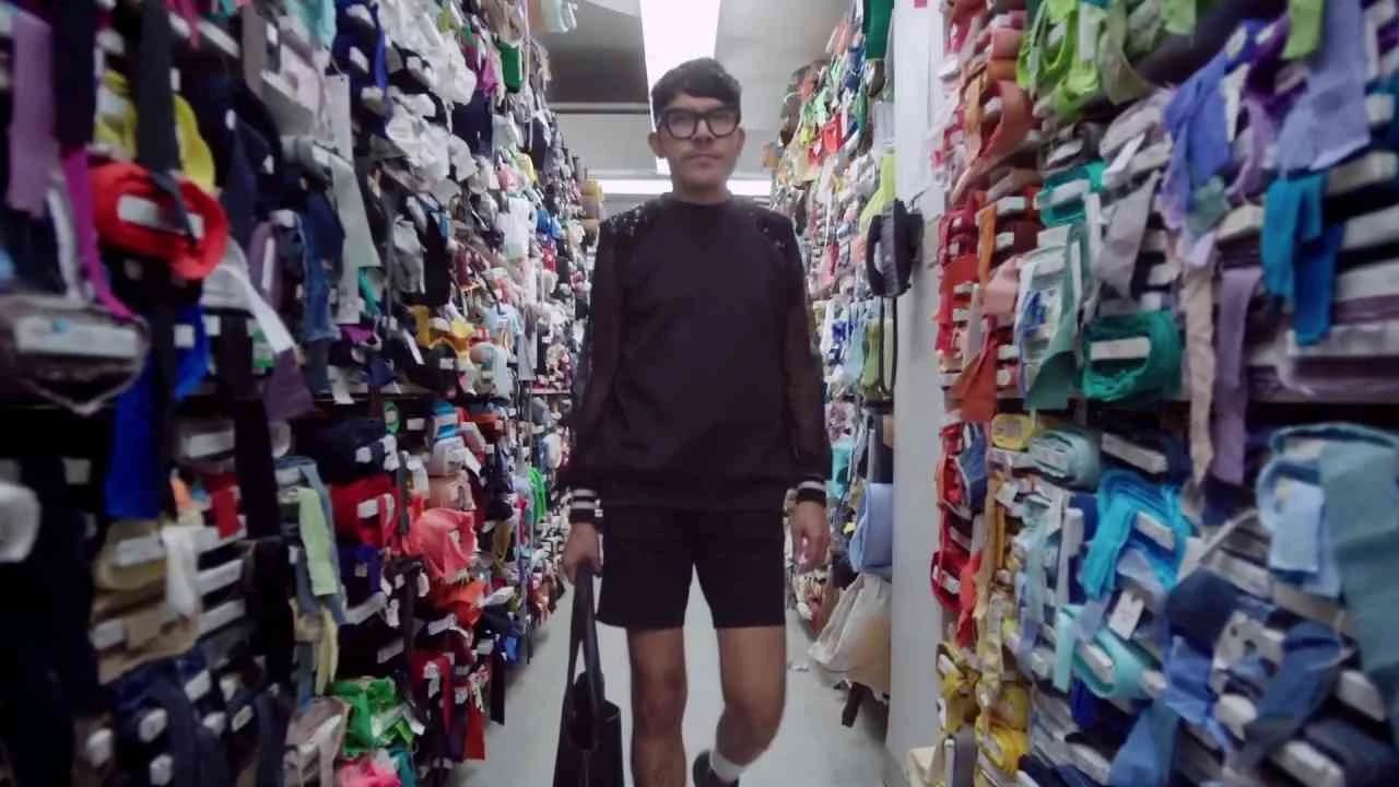
Sony’s 2007 You are What You Shoot campaign for its Cyber-shot camera range marked a distinctive moment in electronics and technology advertising, positioning the brand at the intersection of personal identity and digital creativity with a visually inventive film execution. Developed for the UK market to anchor the Cyber-shot portfolio within a crowded competitive space, this agency-led initiative turned a simple proposition—capture life as you see it—into an imaginative piece of marketing theatre, suggesting that the very act of photographing with a Sony Cyber-shot camera reveals and informs who you are. Rather than pushing specs or comparisons, the film leans into symbolic exaggeration: through heightened visuals, it conceptualizes people quite literally shaped or transformed by the photos they take, a creative device that sits squarely in Clapboard’s FORMAT#9 — Symbolize the Benefit taxonomy. That bold representational approach trades functional demonstration for metaphor, dramatizing the Cyber-shot’s ability to enable expressive self-definition; the effect is to render the camera not just as consumer tech, but as an extension of personal style and viewpoint. In deploying the campaign across Sony’s digital destination—sony.co.uk/cybershot—the brand offered an accessible bridge from the imaginative film to immersive product exploration, embedding the campaign within broader digital brand-building efforts. This strategy not only appealed to the gadget-curious but also resonated with a generation of amateur and hobbyist photographers eager to claim their role in visual culture’s evolution. The market response affirmed this fit: consistently positive engagement underscored the campaign’s message resonance and validated the creative risk of forsaking literal demonstration for visual allegory. Sony’s collaboration with its agency partner resulted in a campaign that prioritized the emotional payoff of creative empowerment over hardware boastfulness, reinforcing the company’s standing as a leader committed to both innovation and user inspiration in Internet and Technology. Clapboard rates this 63/100. For an industry continuously searching for new ways to turn product features into emotional human stories, You are What You Shoot demonstrates the enduring power of well-chosen visual metaphor to crystallize a brand’s value in the minds of its audience.
Boosting Dreams - Mondo Guerra, Boosting Dreams - Laura S... - Boost Mobile | Clapboard Ad Archive
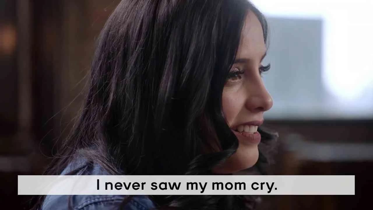
Boost Mobile’s 2017 campaign Boosting Dreams, crafted in partnership with agency 1 Trick Pony, stands as a deliberate cultural statement in the United States electronics and technology market, leveraging the cultural momentum of Hispanic Heritage Month with a content-driven approach that moves beyond transactional brand messaging. Central to the campaign is New York’s Hot 97 radio host Laura Stylez, whose conversations with figures like Project Runway All-Stars winner Mondo Guerra and former NASA astronaut José M. Hernández anchor the narrative framework and provide immediate credibility and emotional weight. Guerra’s story — which explores his upbringing in Denver, his commitment to sustaining heritage and family traditions, and his prominent, vulnerable disclosure of his HIV status on national television — serves as a keystone for broader themes of empowerment, resilience, and authentic cultural expression. By selecting celebrated, culturally resonant personalities and foregrounding their lived experiences, Boost Mobile elevates its commitment to inclusivity, standing with communities it aims to serve rather than selling to them. This approach sits squarely in Clapboard’s FORMAT#8—Ongoing Characters or Celebrities, utilizing familiar, trusted voices to drive recall and create a sense of aspirational identification within the campaign’s targeted demographic. The choice to center on interviews and editorial-style storytelling — rather than on product-centric narratives or overt promotional arcs — reinforces the brand’s positioning as a supporter of underrepresented voices within the technology category, effectively blurring the boundaries between advocacy, content, and commerce. Extensions like the Project I Design initiative expand the campaign’s relevance, inviting audiences not just to witness but to participate in creative acts of cultural celebration, further deepening brand affinity. The campaign’s artful orchestration of celebrity presence, meaningful narrative, and accessible digital content yields a distinctive space for Boost Mobile in a sector where authentic representation and community relevance are increasingly non-negotiable. The campaign earns 61/100 in Clapboard’s global creative archive. As audiences increasingly look to brands for signals of representation and purpose, Boosting Dreams demonstrates that content rooted in honest, identity-driven storytelling can advance both cultural impact and brand resonance.
Gives - Google | Clapboard Ad Archive

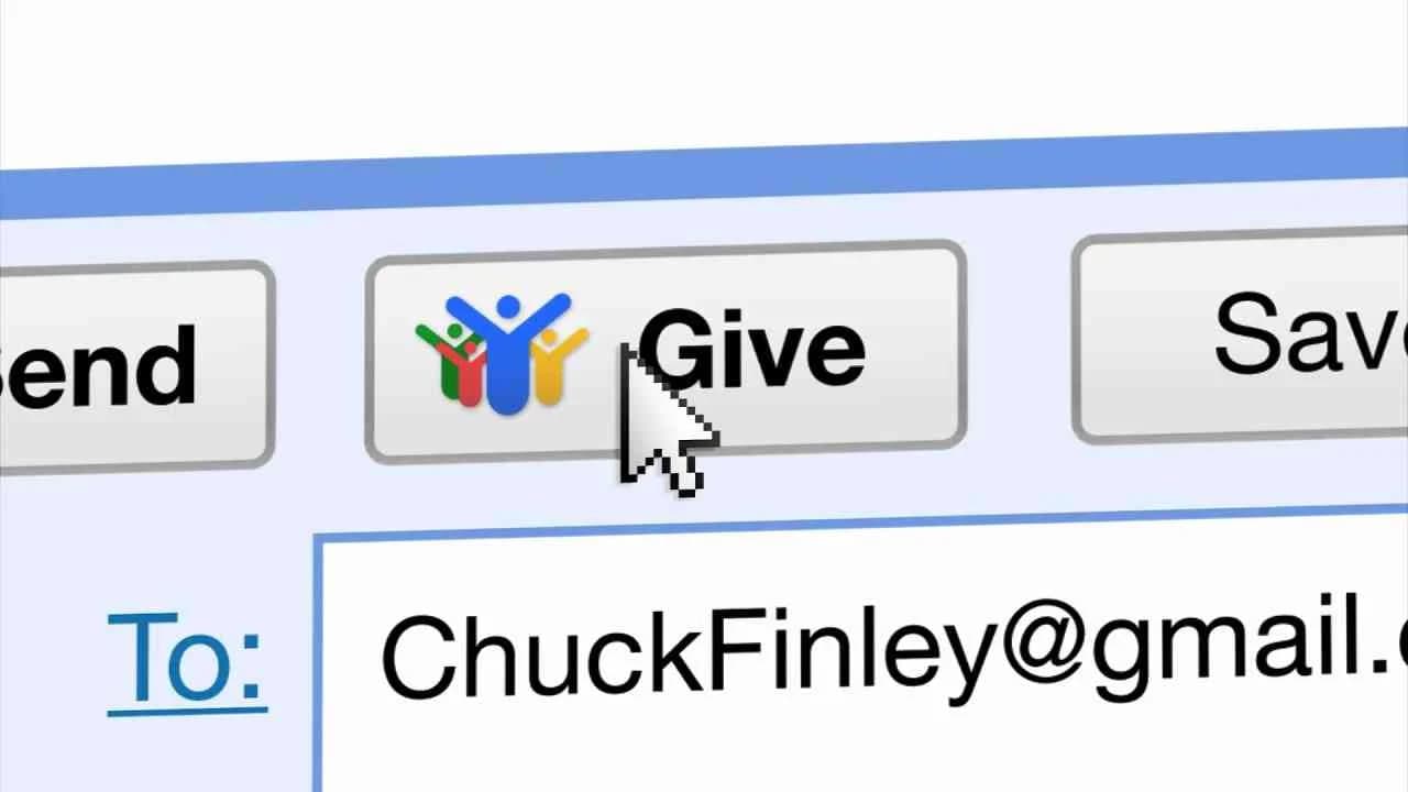
Google’s 2011 campaign Gives, created by Miami Ad School for the technology giant, sits at the intersection of digital innovation and purposeful utility, debuting a simple but potent idea that allows users to attach a charitable donation to any email requiring a response, with the system triggering a donation automatically once the recipient replies. This initiative, crafted for the Internet and Technology market category, reframes something as habitual as email correspondence into an opportunity for everyday microphilanthropy, turning digital exchanges into tangible acts of social good. Rooted in what Clapboard’s 12-format taxonomy would classify as FORMAT#1 Demonstration, the campaign shuns narrative embellishment and focuses directly on illustrating the mechanics of the Gives feature, articulating its procedural clarity and social impact without recourse to character-driven storytelling, metaphor, or spectacle. The agency leverages Google’s dominant brand equity to position this feature as a seamless extension of daily connectivity, amplifying the core brand values of accessibility, innovation, and community responsibility in a manner both unobtrusive and compelling. The single-media asset approach aligns with the practical intent: a beautifully clear visual and instructional rollout that showcases how user action translates instantly and meaningfully into philanthropic donation, underlining technology’s capacity to embed ethical choices directly into user behavior. The campaign’s demonstration-led rationale provides instant comprehension for consumers and signals to industry peers the strategic efficacy of linking user engagement with societal benefit — a move that speaks to shifting expectations around corporate social responsibility and the interplay between digital habits and broader impact. Presenting in English and targeting the United States market, Google and Miami Ad School illustrate how even the most quotidian digital interactions can be retooled to serve higher ends, inviting a reexamination of the latent possibilities in platform design for positive change. Clapboard rates this 66/100. In a category often accused of offering frictionless utility at the expense of deeper purpose, Google Gives demonstrates how digital infrastructure can foster generosity as a default, rather than an afterthought.
Twerk, Eye protection - Amaysim | Clapboard Ad Archive
Amaysim’s 2014 campaign Twerk, Eye protection, developed by BMF, epitomizes the low-cost mobile provider’s pivot to more culturally dynamic brand storytelling within Australia’s crowded telecommunications market. Positioned as a kinetic instalment in Amaysim’s Say Hi to More brand initiative, the campaign capitalized on the inherent attention-grabbing qualities of performance-based creative to embody, rather than explain, the value of affordable mobile services. Deploying two film assets across television, outdoor, and digital platforms, the campaign distilled the freeing, emboldening energy of twerking into a visual shorthand for Amaysim’s promise of enhanced accessibility and coverage without the financial drag associated with legacy telecom brands. In line with what Clapboard’s taxonomy designates as FORMAT#9—Symbolize the Benefit—the work harnesses exaggerated visuals and symbolic tropes to dramatize product payoff, leveraging the playful shock of twerking and the notion of eye protection to secure both recall and emotional resonance. This approach side-steps literal demonstrations or dry comparisons in favor of a bold, metaphorical execution designed to cut through advertising clutter, inviting viewers to associate Amaysim with irreverence, freedom, and unfiltered connection. The campaign’s execution reflects a strategic understanding of how humor and high-energy choreography could serve as cultural signifiers that both signal modernity and foster brand affinity among value-seeking, media-savvy Australians. The creative emphasizes consumer empowerment, positioning Amaysim as a challenger brand willing to defy category conservatism, and pushes the idea that greater choice in mobile services should feel as liberating and expressive as a viral dance phenomenon. By threading this metaphor through multi-channel placements, BMF amplified Amaysim’s challenger narrative while reinforcing its functional advantages in a sector often defined by indistinct messaging and incremental promises. The campaign earns 58/100 in Clapboard’s global creative archive. As the market for internet and technology brands continues to reward cultural fluency and entertaining risk-taking, Amaysim’s Twerk, Eye protection demonstrates how challenger brands can claim relevance and visibility by blending symbolic performance with unambiguous consumer benefit.
The tweet cellar - French Tech | Clapboard Ad Archive
The Tweet Cellar campaign marked a pivotal moment for French Tech as it made its inaugural appearance at SXSW Interactive in 2014, using the cultural weight of France’s heritage as a strategic asset to reposition the nation’s technology sector on the world stage. Developed by BETC for the professional services market, this digital-first initiative harnessed the familiar symbolism of the French wine cellar—tradition, craft, provenance—transforming it into a metaphor for the preservation and elevation of uniquely French innovation within a global digital landscape. Rather than taking the well-trodden route of product demos or market comparisons, The Tweet Cellar unfolded as a bold demonstration of how national identity and brand storytelling can coexist with technological prowess, introducing the global tech community to a France that is at once anchored in its fabled expertise and fully committed to the future. BETC delivered a narrative that worked precisely because it was unafraid to lean into stereotypical markers of French excellence, only to subvert expectations by drawing seamless parallels between artisanal tradition and the creative code of digital culture. The creative execution prioritized engagement with what Clapboard’s taxonomy would classify as FORMAT#11—Unique Personality Property, centering the campaign on distinctive origin and character over commodified features. French Tech’s launch at SXSW became a proof point rather than a boast, a living synthesis of old-world know-how and boundary-pushing digital thinking designed to intrigue, challenge assumptions, and open doors within the critical tech influencer circuit. In doing so, the campaign not only expanded the brand’s international visibility but also advanced a compelling national story that resonates far beyond one event, situating French Tech as a bridge between heritage industries and contemporary innovation in the competitive Internet / Technology category. The campaign earns 63/100 in Clapboard’s global creative archive. For an industry seeking new ways to combine cultural authenticity with technology branding, The Tweet Cellar demonstrates how legacy and invention can be orchestrated into a singular, magnetic identity that differentiates on the world stage.
No social media - Tigo, Facebook | Clapboard Ad Archive
Launched in Paraguay in 2014, No social media brought together Facebook and Tigo in a concerted digital push crafted by McCann to address the ever-more salient tension between digital connectivity and local realities in the electronics and technology market. With the campaign title itself foregrounding an absence acutely felt by target audiences, the creative concept navigates the everyday consequences of living without access to social media, thus making the case for Tigo’s connectivity offering and Facebook’s community-building platform as partners in progress. By tapping into cultural context — supported by engagement with Paraguayan linguistic institutions to ensure nuance — the campaign eschewed abstract promises for a problem-solution narrative: it dramatizes the palpable void experienced when digital connection is cut off, only to resolve that discomfort by reframing Tigo as the enabler of social participation, personal expression, and hyperlocal relevance. This approach squarely exemplifies what Clapboard's taxonomy identifies as FORMAT#2—Show the Problem, a device that situates the product as an agent of transformation by giving tangible form to the very challenge it exists to solve. Working within a competitive but still-evolving digital ecosystem, McCann's disciplined execution specializes in the sharp articulation of value via scene-led dramatization and local resonance, while digital media placement underscores responsiveness to behavioral trends and emergent expectations among Paraguayan consumers. Backed by strategic coordination between Facebook’s marketing team and Tigo’s brand leadership, the campaign’s messaging achieved holistic clarity across platforms and touchpoints, generating positive consumer interaction and further embedding both brands in the daily habits of their users. The campaign earns 63/100 in Clapboard's global creative archive. This campaign matters because it distills the tension between access and exclusion into a compelling creative insight, signaling that storytelling based on lived realities, when channeled through the right partnership, can drive meaningful differentiation in the region’s fast-maturing digital market.
The music video with the most cats ever - Deposit Photos | Clapboard Ad Archive
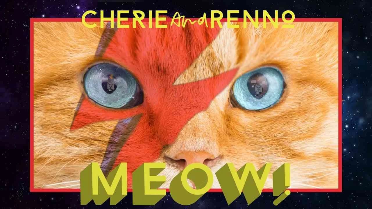
Deposit Photos’ 2017 campaign The music video with the most cats ever reframed the visual vocabulary of technology marketing by tapping into the irrepressible beat of pop culture, piggybacking on the official music video MEOW! by Israeli duo Cherie and Renno with a confident, tongue-in-cheek fusion of parody, music, and visual effects. Sited in the Internet / Technology market and created with a clear understanding of the contemporary audience’s appetite for shareable spectacle, the campaign was unapologetically playful: at its core sat a lively audiovisual pastiche that gleefully borrowed all the familiar cues of a high-energy music video — quick cuts, oversaturated color, and the kind of brash, bravura performance that could only exist in the post-internet age — but overlaid with a relentless visual motif of cats, encouraging viewers to hunt for every feline cameo and continue their journey off-platform to Cherieandrenno.com. Rather than a solution-driven narrative or overt demonstration, Deposit Photos took an approach that sits squarely within Clapboard’s FORMAT#12—Parody or Borrowed Format—an intentional mimicry and gentle subversion of the popular music genre that leveraged the recognizability of music video tropes to foster brand association with creative ingenuity and digital-first thinking. This was far from a standard product showcase; instead, the campaign positioned Deposit Photos as the quiet orchestrator behind a cultural happening, cross-pollinating music streaming, social media, and branded web experiences to maximize engagement while keeping product integration light but ever-present through consistent visual flair and editorial tone. The interactive mechanic — challenging viewers to spot all the featured cats — mobilized a sense of play, directly driving digital footfall to owned media and extending the campaign’s tail beyond the initial viewing window. With amplification across Facebook, SoundCloud, iTunes, Apple Music, and Spotify, Deposit Photos demonstrated an adept understanding of contemporary media ecosystems, ensuring the campaign’s presence in every relevant feed and playlist. In a market category too often defined by abstract visuals and soulless demonstrations, the agency’s creative strategy carved out a distinctive narrative space rooted in fun, spectacle, and the affirmation that technology brands can drive conversation by embracing pop formats and subversive wit. The campaign earns 72/100 in Clapboard’s global creative archive. Deposit Photos’ feline-powered parody matters because it demonstrates how brands in the technology sector can capture attention and propagate brand relevance by appropriating and reinventing category-agnostic pop culture, rather than relying solely on traditional product storytelling.
Groundhog Dates - RSVP Online Dating | Clapboard Ad Archive
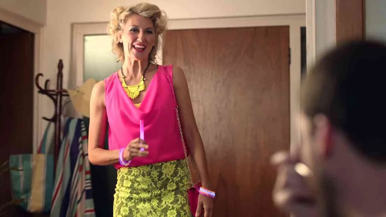
RSVP Online Dating’s Groundhog Dates campaign, crafted by MercerBell and launched in Australia in 2012, delivers a sharply observed take on the frustrations of the digital dating landscape, leveraging the universally familiar motif of the film Groundhog Day to dramatize the tiresome pattern of fruitless romantic rendezvous. Aimed squarely at adults navigating the professional services and internet/technology sectors, the film-based campaign transforms a cultural touchstone into a mirror for the audience’s own dating experiences, using slick parody and a brisk storytelling cadence to accentuate RSVP’s brand promise: breaking monotonous cycles and fostering authentic, meaningful connections. What Clapboard’s taxonomy would classify as FORMAT#12—Parody or Borrowed Format, Groundhog Dates harnesses popular culture with precision, borrowing the endlessly repeating-day narrative structure to visualize the emotional fatigue afflicting online singles. The campaign’s narrative economy is purposeful; by highlighting dull, interchangeable dates and recurring dead-ends, it gently satirizes an entire category’s shortcomings without cynicism, positioning RSVP not just as an alternative but as the solution to a widely recognized problem. MercerBell’s creative execution invites viewers to see themselves in these looping scenarios, employing humor both as an entry point and a release, ultimately steering the viewer toward RSVP’s core benefit: the promise of novelty and real connection in a market adrift in repetition. Strategic use of the film medium enables the story to land viscerally, allowing for nuanced performances and pacing that text or static media could never replicate, and underscoring RSVP’s commitment to emotional intelligence in its marketing. Set firmly in the internet/technology category, this work balances irreverence with empathy, drawing on collective pop culture memory not as a cheap shortcut but as a scaffold for shared experience and aspiration. The campaign earns 60/100 in Clapboard’s global creative archive. As relentless personalization shapes the future of online dating communications, Groundhog Dates stands as a reminder that the smartest advertising in this category pairs category insight with audience insight, making the familiar feel refreshingly new.
Agency Christmas Card for Charity - ADtomic | Clapboard Ad Archive
ADtomic’s Agency Christmas Card for Charity marked a distinct entry in Denmark’s agency self-promo space in 2012, embracing the holiday season through a digital activation that married creative identity with social impact. As both agency and brand, ADtomic eschewed the expected ornamentation of holiday communications for a digital gesture that asked its audience to visit adtomic.dk and light a virtual Christmas candle, transforming a timeless symbol of warmth and hope into an act of charitable alignment. Set within the internet and technology market category, this initiative deployed a single digital asset that invited participation through simplicity and directness, extending the traditional agency holiday greeting into a purposeful branded experience. The concept leveraged what Clapboard’s taxonomy recognizes as FORMAT#11—Unique Personality Property—making the digital Christmas card itself not merely a seasonal communication but a memorable brand-specific property that distinguished ADtomic’s values-driven approach from the deluge of standard festive outreach. Unlike more elaborate self-promotional stunts or multi-platform efforts, the Agency Christmas Card for Charity focused attention on interaction as a reflection of both agency identity and community engagement, demonstrating how even modest digital interventions can shape brand perception when anchored in authenticity and relevance. By emphasizing a universal holiday ritual and gifting it new meaning in an online context, ADtomic both reasserted its inventive personality and offered a subtle demonstration of digital craft, strategically reinforcing the agency’s position in a crowded category without resorting to overt exhortation or spectacle. Clapboard rates this 54/100. For agencies recalibrating the role of self-promotion, this work signals how digital gestures that reflect brand character can deepen resonance and memorability in an increasingly competitive marketplace.
The Growing Up Family Portrait, The Animal Family Portrai... - Skype | Clapboard Ad Archive
Skype’s 2013 campaign The Growing Up Family Portrait, The Animal Family Portrait, conceived by Pereira & O’Dell, brings the brand’s core proposition—bridging distances through digital connection—vividly to life in the crowded electronics and technology market. With a series of nuanced film narratives structured around the touchstone of family, whether human or animal, the campaign leans hard into Skype’s ability to foster meaningful relationships across continents and generations, positioning video calling as an enabler of everyday emotional milestones rather than a novelty or utility. By focusing on deeply relatable yet aspirational user stories, this body of work sits squarely in what Clapboard’s taxonomy would classify as FORMAT#10—Associated User Imagery, centering the lived experiences of actual or archetypal users rather than dramatized product demonstrations or abstract metaphors. Each of the three distinct media assets unfolds as an accessible portrait session, both literal and metaphorical, specifically capturing how Skype uniquely transforms the idea of the family portrait—not as a static image but as a living archive of shared growth, change, and togetherness made possible by technology. Pereira & O’Dell’s creative direction masterfully sidesteps blatant product placement, instead weaving Skype into the narrative fabric of daily life and key moments, resulting in an emotively charged yet credible depiction of the platform as indispensable to families divided by geography but united by the desire to witness and participate in each stage of life. The emotional impact is heightened by the specificity of the scenarios—children growing up on screen before grandparents’ eyes, entire clans gathered virtually, even pet owners capturing the evolving bonds with their animals—demonstrating technology’s quietly radical role in normalizing long-distance intimacy. The use of film allows the stories to breathe through small gestures, unscripted reactions, and authentic visual cues, ensuring that audiences see themselves reflected in these vignettes no matter their demographic. In amplifying the everyday triumphs and challenges that come with separation and reunion, the campaign advances Skype’s narrative beyond mere technical capability, instead advocating for the emotional necessity of its service in a way that rings true against the lived experience of a digitally connected audience. The campaign earns 63/100 in Clapboard’s global creative archive. By elevating the vernacular moments of digital togetherness into a cohesive campaign, Skype’s 2013 work signals how authentic user imagery and quietly resonant storytelling can move a technology brand into the center of cultural relevance, especially as the category shifts from transactional value to emotional resonance.
The Lag Stress Test - A Brain Sensing Experiment - ume.net | Clapboard Ad Archive
ume.net’s The Lag Stress Test – A Brain Sensing Experiment, created by BBDO in Sweden in 2015, is a direct interrogation of digital latency for a high-velocity market category notorious for frustration: internet technology. Serving as the sequel to Living with Lag, this campaign abandons traditional fibre broadband messaging in favor of a visceral demonstration built around biometric neuroscience. In the experiment, gamers outfitted with Emotiv EPOC EEG headsets become the experiment itself — their emotional responses to lag are made immediate and consequential, with heightened frustration directly increasing the on-screen delay. This setup transforms the invisible enemy of lag into an explicit obstacle, mapped in real time to brainwave activity, so the campaign’s core value proposition — ume.net’s low-latency fibre infrastructure — is brought violently to the fore. As a creative tactic, the work exemplifies what Clapboard’s taxonomy would classify as FORMAT#1—Demonstration: the product’s advantage is dramatized not through metaphor or aspiration but through an engineered, high-stakes trial that makes technical differentiation universally legible. BBDO’s approach not only collapses the technical into the emotional but amplifies the stakes by directly linking user experience to audience empathy — viewers immediately recognize both the agony in the experiment and the utility in the solution. By anchoring the lag issue in quantifiable, biometric feedback, the campaign elevates ume.net’s service beyond abstract Mbps numbers and reframes internet reliability as a matter of human well-being, reinforcing the provider’s commitment to technological innovation and user advocacy. The strategy holds particular industry relevance as it marks an early mainstream use of consumer EEG in commercial storytelling, prefiguring a broader trend toward personalized, data-driven narrative techniques in technology marketing. The campaign earns 78/100 in Clapboard’s global creative archive. For an industry challenged to distinguish invisible infrastructural gains, The Lag Stress Test matters because it transforms technical value into shared experience, signaling new ways to render complex product attributes both intimate and urgent for digital audiences.
Fish, Cabbage, Cake - Verisign | Clapboard Ad Archive
Verisign’s Fish, Cabbage, Cake campaign, crafted by FCB in 2014, stands as a visually arresting and metaphor-driven entry into the digital security conversation for the professional services sector, challenging the conventions of a market category often mired in sameness and technical jargon. Released exclusively through digital channels to target tech-savvy professionals and decision-makers, the campaign adopts a creative strategy rooted in uncanny symbolism, transforming the mundane trio of fish, cabbage, and cake into analogues for the unpredictable — and often confounding — challenges that businesses encounter in managing digital identities and domains. Rather than literal depictions of cybersecurity threats or verbose technical explanations, FCB deploys these everyday objects as narrative devices, constructing a surreal but accessible allegory for online brand uniqueness, trust, and the consequences of missteps in digital stewardship. What Clapboard’s taxonomy would classify as FORMAT#3—Symbolize the Problem, this approach shuns overt exposition in favor of narrative immersion, inviting the audience to decode meaning and, in so doing, become partners in the story of digital risk and protection. By eschewing a didactic tone and instead leveraging memorable visual metaphors, Verisign positions itself not only as the architect of security infrastructure but as a brand that understands the human realities of modern business — the desire for clarity in a chaotic landscape, the need for reassurance that goes beyond just technology. Each of the three core media assets elegantly frames the inherent tension between vulnerability and safety, echoing the anxieties of decision-makers who must navigate an ecosystem where the cost of error is reputational and often irreparable. From a communications perspective, this is storytelling for the digital age: conceptual, bold, and deliberately odd, engineered to cut through noise and turn executive attention toward questions of authenticity, distinctiveness, and reliability in an ever-more-competitive domain marketplace. The campaign earns 63/100 in Clapboard’s global creative archive. For an industry entangled in invisibility and back-end systems, Fish, Cabbage, Cake is a rare signal that metaphor and narrative can demystify the complex, so long as the brand has the confidence to trust its audience’s intelligence.
FAQs for the Playlist: Internet / Technology■
Top questions to this curated campaign playlist
Professionals analyze these campaigns to understand how technology brands communicate complex features simply and persuasively. They study narrative structures, visual innovation, and emotional triggers that resonate with tech-savvy audiences, applying these insights to craft relevant, user-centric messaging and strategic positioning.
Examining the evolution of technology advertising reveals how brands have navigated rapid innovation cycles, shifting consumer expectations, and digital disruption. This historical perspective informs strategic decisions by highlighting successful approaches to building trust, differentiation, and cultural relevance in a fast-changing landscape.
Technology advertising adapts to local cultural contexts, regulatory environments, and media consumption habits. Early eras emphasized product education through traditional media, while recent campaigns leverage interactive digital platforms and experiential storytelling, reflecting broader shifts in audience engagement and technological capabilities.
A frequent misconception is that technology ads rely solely on technical jargon or product specs. In reality, effective campaigns prioritize human-centered storytelling and emotional connection, using technology as a backdrop rather than the sole focus to engage diverse audiences beyond early adopters.
Iconic campaigns provide a blueprint for balancing innovation with clarity, demonstrating how to translate complex ideas into compelling narratives. By dissecting these examples, creatives and strategists refine their ability to anticipate market shifts and craft work that sets benchmarks for impact and relevance—archived in Clapboard's global ad archive.
Creative Collaboration Platform: The Backbone of Modern Creative WorkWhat is a creative collaboration platform?Clapboard defines a creative collaboration platform as the operational core for today’s distributed creative teams. This is not a collection of digital collaboration tools stitched together; Clapboard’s system

Understanding the Creative Production MarketplaceWhat is a Creative Production Marketplace?Clapboard defines a creative production marketplace as a structured ecosystem where brands, agencies, and production talent converge to execute video, advertising, and branded content at scale. Unlike the legacy agency or freelanREAD FULL ARTICLE
The Urgent Need for a Creative Production Operating SystemWhy Traditional Creative Production Models Break DownClapboard sees the creative production landscape shifting under pressure. Content velocity is no longer a buzzword—it’s a mandate. Modern advertising demands relentless output across dozens of channels, each wREAD FULL ARTICLE

.webp)