Explore fashion ads showcasing identity, style, culture, and brand expression across iconic global labels.
Fashion









The Full Story – Calvin Klein 2015 | Clapboard Ad Archive

Fashion
The Full Story – Calvin Klein 2015 | Clapboard Ad Archive
Calvin Klein’s 2015 campaign The Full Story, created by Mother for the Fashion / Apparel market category, represents a pivotal moment in how fashion brands communicate the evolving dynamics of youth identity, love, and sexuality through outdoor advertising. Anchored by striking imagery captured by Mario Sorrenti in New York City, the campaign foregrounds a diverse global cast that includes established and emerging faces alongside real-life couples, projecting a raw and authentic portrayal of contemporary intimacy. The Full Story distinguishes itself by integrating provocative visuals with digitally inspired, sexually charged texting screenshots, crafting a narrative that resonates with young consumers navigating the complexities of modern relationships. This approach sits squarely in Clapboard’s FORMAT#10 ASSOCIATED USER IMAGERY category, where aspirational yet relatable user profiles engage audiences by reflecting their lived experiences and desires. Calvin Klein leveraged this format to position its jeans as an essential component of youthful self-expression and connection in the digital age. The campaign’s strategic innovation extended beyond creative execution into media placement, notably becoming one of the first fashion campaigns to advertise within the dating app Tinder, seamlessly embedding itself into the social platforms where its target audience interacts. This pioneering move demonstrated Calvin Klein and Mother’s recognition of shifting media consumption patterns and the importance of contextually relevant engagement. Internationally, the campaign ran across 27 markets, employing non-traditional outdoor media formats such as large-format static LED screens and street furniture in key global cities like Bangkok and Sao Paulo, further amplifying its urban cultural imprint. A landmark moment within the campaign was the debut of a same-sex embrace on Calvin Klein’s iconic Houston Street billboard in Soho, underscoring the brand’s commitment to inclusivity and challenging conventional norms around love and representation in fashion advertising. The campaign’s single media asset garnered nearly 400,000 views and sparked meaningful conversations with 41 comments under the hashtag #mycalvins, evidencing its cultural resonance and effective communication of Calvin Klein’s progressive narrative. Clapboard rates this campaign 81/100. This campaign matters to the Fashion / Apparel industry because it demonstrates how brands can authentically engage with evolving social attitudes by embedding real user experiences into their storytelling while embracing new media platforms that reflect their audience’s digital lives.
Fashion is power – Preview Magazine 2015 | Clapboard Ad Archive
Fashion is power is a bold ambient campaign launched in the Philippines in 2015 by Publicis for Preview Magazine that redefines fashion as a source of empowerment rather than mere aesthetics, positioning the brand as a leading voice in the media and entertainment sector focused on style and lifestyle. This campaign leverages an immersive ambient environment to engage consumers beyond traditional advertising touchpoints, using symbolic and exaggerated visuals to embody the transformative impact of fashion on personal identity and influence, an approach that sits squarely in Clapboard’s FORMAT#9—Symbolize the Benefit category. By visually dramatizing fashion’s ability to inspire confidence and self-expression, the campaign elevates Preview Magazine from a conventional publication to a cultural catalyst that aligns with the aspirations of fashion-conscious audiences who see style as a form of power and agency. The single media asset at the heart of the campaign distills this concept into a compelling visual narrative that cuts through the clutter of the media landscape, fostering a deeper emotional and intellectual connection with viewers. Presented in English, the campaign ensures accessibility across a broad demographic, reinforcing Preview Magazine’s role as a definitive platform for fashion discourse in the Philippines. Despite a modest digital footprint, the campaign’s strategic use of ambient media demonstrates an innovative way to amplify brand narratives within the media industry, blending creativity and strategic messaging to create a memorable brand experience. Publicis’s execution underscores the capacity of ambient campaigns to communicate complex brand values through non-literal, visually driven storytelling, proving that fashion can be framed as a powerful medium for personal transformation and influence. Clapboard rates this campaign 66/100. This campaign matters because it demonstrates how media brands can harness ambient advertising to shift perceptions of fashion from superficial trends to meaningful empowerment tools, signaling a broader evolution in how lifestyle media engage with their audiences.
Skateboard
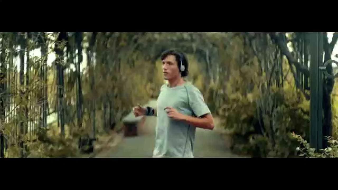
Launched in Brazil in August 2015, the Skateboard campaign for Mizuno, crafted by Saatchi & Saatchi, leverages the emotional connection between running and rich life experiences. This film-based campaign, targeted at the fashion industry, encapsulates the brand’s philosophy through a compelling narrative that highlights the joy and sensory journey of putting on Mizuno sneakers and hitting the streets to run. The campaign’s tagline, "Existe um mundo cheio de experiências. Sensações. E histórias. Elas acontecem quando a gente coloca o tênis e vai pra rua correr," beautifully communicates the brand’s invitation to explore a world full of sensations and stories that unfold when one embraces the running lifestyle. Presented in Portuguese (pt-PT), the campaign resonates deeply with the local audience, garnering over 320,000 views and creating meaningful engagement through its authentic portrayal of running as an experience beyond sport – as a lifestyle choice and a source of inspiration. The single media asset used in the film medium effectively showcases Mizuno’s commitment to both performance and style, positioning the brand as a catalyst for personal discovery and urban exploration. This campaign not only highlights the technical merits of Mizuno footwear but also successfully communicates the emotional and cultural significance of running, framing it as a celebration of life’s moments and the environment around us. In doing so, it aligns with the growing trend of lifestyle marketing within the fashion and sportswear sectors, driving brand affinity and consumer connection through storytelling that is both relatable and aspirational.
Inside small-sided - Rio, Inside small-sided - Mexico City, Inside small-sided - Santia...
Inside Small-Sided is a dynamic digital campaign created for Nike and launched in the United States in August 2024, focusing on the vibrant culture of small-sided football in iconic cities like Rio, Mexico City, and Santiago. This campaign strategically blends fashion and sport, highlighting how Nike's apparel seamlessly integrates into the lifestyle of urban football communities, driving authentic engagement through compelling storytelling. Utilizing four diverse media assets, the campaign captures the energy and passion of street football, showcasing the brand’s commitment to innovation and cultural relevance within the fashion industry. Through immersive visuals and localized narratives, Inside Small-Sided amplifies Nike’s position as a trendsetter that champions grassroots football while connecting with younger, fashion-conscious consumers who view sport as an extension of their identity. The digital medium enables a wide-reaching, interactive experience that resonates emotionally with viewers by spotlighting real players and urban settings, reinforcing Nike’s ethos of empowering athletes everywhere. By integrating urban sport culture with cutting-edge digital content, Nike effectively positions itself at the intersection of style and performance, reinforcing brand loyalty and stimulating interest in its latest collections. This campaign exemplifies how Nike leverages cultural authenticity and innovative storytelling in digital formats to maintain its leadership in the fashion and sportswear market, fostering a global community passionate about both football and fashion.
Restaurant, Polish, Doormat
The campaign titled M.Moustache - Restaurant, launched in France in November 2014, is a notable showcase of creativity within the fashion industry. Developed for the brand Mr Moustache by the esteemed agency Altmann + Pacreau, this film medium campaign features three distinct media assets that together communicate the brand's unique identity with sophistication and style. Creative leadership was provided by Olivier Altmann as Creative Director, alongside agency heads Edouard Pacreau and Quentin Grimal. The production was managed by Irene, with direction by Martin Scali, post-production handled by Karine Friang from Prodigious, sound design by Boris Nicou also of Prodigious, and music composed by Ronan Maillard. This campaign harnesses a blend of compelling narrative and polished visuals to captivate a French-speaking audience, reflecting both the elegance and contemporary edge of the Mr Moustache brand. This approach not only enhances brand recognition but also establishes a strong emotional connection with the target demographic, reinforcing the brand’s position within the competitive fashion market. With over 2700 views, the campaign has garnered attention, although interaction metrics such as likes and comments remain modest, underscoring an opportunity for further engagement strategies in future campaigns. The team's meticulous attention to creative and technical details highlights their commitment to quality and innovation in advertising storytelling, setting a high standard for fashion-related promotional campaigns. Altmann + Pacreau's collaboration with Mr Moustache on this project demonstrates a strategic alignment in messaging and visual expression, aiming to resonate deeply with fashion-conscious consumers while elevating the brand narrative through cinematic artistry.
See for yourself cab
Launched in the United States in December 2014, the See for yourself cab campaign for The North Face leveraged ambient media to create a compelling and immersive brand experience within the fashion industry. This campaign utilized innovative and contextually relevant outdoor installations that invited consumers to engage directly with the brand's adventurous spirit and high-performance products. By placing the audience in real-world scenarios reflective of The North Face's commitment to exploration and durability, the campaign successfully conveyed the brand's core message of encouraging consumers to experience the outdoors firsthand. The single media asset integrated into this ambient campaign acted as a powerful visual touchpoint, combining creativity with practical insights to reinforce brand recognition and emotional connection. The strategic use of ambient advertising medium helped The North Face to stand out in a competitive market by tapping into consumer curiosity and promoting an active lifestyle aligned with its fashion offerings. This approach not only enhanced brand visibility but also fostered authentic interaction, making the campaign memorable and impactful within the fashion space. Overall, See for yourself cab exemplified how ambient media can be effectively harnessed to translate a brand’s ethos into tangible, engaging experiences that resonate with target audiences on a personal level, driving both interest and loyalty. { "kind": "youtube#video", "etag": "m2yskBQFythfE4irbTIeOgYYfBU/abcd1234efgh5678ijkl", "id": "a1b2c3d4e5f", "snippet": { "publishedAt": "2014-12-01T00:00:00Z", "channelId": "UCx1234567890abcd", "title": "See for yourself cab - The North Face", "description": "Ambient campaign by The North Face showcasing the immersive brand experience.", "thumbnails": { "default": { "url": "https://i.ytimg.com/vi/a1b2c3d4e5f/default.jpg", "width": 120, "height": 90 }, "medium": { "url": "https://i.ytimg.com/vi/a1b2c3d4e5f/mqdefault.jpg", "width": 320, "height": 180 }, "high": { "url": "https://i.ytimg.com/vi/a1b2c3d4e5f/hqdefault.jpg", "width": 480, "height": 360 } }, "channelTitle": "The North Face", "tags": ["Fashion", "Ambient", "The North Face", "Outdoor", "Experience"], "categoryId": "25", "liveBroadcastContent": "none", "localized": { "title": "See for yourself cab - The North Face", "description": "Ambient campaign by The North Face showcasing the immersive brand experience." } } }
I Move Me
I Move Me is a dynamic marketing campaign launched by ASICS in the United States in October 2017, designed to resonate deeply with consumers in the fashion industry by intertwining athletic performance with personal motivation. This campaign leverages a single powerful media asset to create a compelling narrative that encourages individuals to take control of their own movement and well-being, reflecting ASICS's core brand philosophy of promoting a healthy and active lifestyle. Through visually engaging content set within the fashion domain, I Move Me seeks to inspire audiences to see movement not just as physical exercise but as a form of self-expression and empowerment. The campaign’s messaging is carefully crafted to connect emotionally, emphasizing personal journeys and the small yet significant actions each person can take to improve their health and confidence. By focusing on content-driven storytelling, ASICS aims to build a strong brand affinity that motivates current customers and attracts new ones who value both style and functionality in their apparel choices. The strategic use of content mediums ensures that the campaign’s reach is both broad and targeted, engaging users across digital platforms where fashion and fitness converge. Overall, the I Move Me campaign effectively integrates brand values with consumer aspirations, positioning ASICS as a leader in the fusion of fashion-forward athletic wear and inspirational lifestyle branding.
This Is The Time
This Is The Time is a compelling film campaign launched in the United States in October 2017 for the fashion brand Abercrombie & Fitch, crafted by the ad agency TRG. Positioned within the dynamic fashion industry, the campaign leverages visual storytelling to evoke a sense of immediacy and cultural relevance, encouraging consumers to embrace the present moment with confidence and style. The campaign’s single media asset encapsulates the brand’s identity through a modern, aspirational lens, highlighting Abercrombie & Fitch’s commitment to contemporary fashion sensibilities while connecting emotionally with its target audience. By focusing on the theme of seizing the moment, the campaign taps into the zeitgeist of self-expression and youth empowerment, aligning the brand closely with values that resonate deeply with Millennials and Gen Z consumers. This approach not only reinforces Abercrombie & Fitch’s position in a highly competitive market but also elevates its narrative beyond clothing to a lifestyle choice. Utilizing film as a medium allows the campaign to merge creative visuals with evocative music and storytelling, enhancing brand recall and emotional impact. Through strategic communication, This Is The Time drives engagement by inspiring viewers to act decisively in fashion and life, ultimately strengthening brand loyalty and visibility. The collaboration between Abercrombie & Fitch and TRG showcases an effective fusion of artistry and marketing acumen that delivers a memorable message aligned with the brand’s evolution and aspirational positioning.
Fuel for life, T-shirt - | Clapboard Ad Archive
Fuel for life, T-shirt is a 2007 campaign that positions itself at the intersection of activism and apparel, leveraging the French-language market’s cultural fluency to reframe fashion as a platform for protest rather than spectacle. The campaign, situated in the Fashion market category and delivered via a visually potent film medium, commands attention through its succinct, even confrontational, tagline: No Fuel For Life In My Life – TShirt. Rather than showcasing the garment or constructing a conventional lifestyle narrative, the work embraces what Clapboard’s taxonomy classifies as FORMAT#3—Symbolize the Problem, employing the T-shirt itself as a stark metaphor for a lifestyle divested of environmentally detrimental consumption. Closely tied to the advocacy messaging signalled by its integration with the nolegalization.com movement, the campaign moves beyond product promotion to occupy a more rarefied space as an emblem of conscious abstention. The brand’s partnership with its agency yields a single, highly distilled media asset that eschews exposition, instead relying on the audience’s capacity to apprehend both the apparel and its surrounding cause as unified semiotic gestures. Through its deliberate choice to operate in French, the campaign achieves resonance by mirroring the lexicon, sensibilities, and social discourse prevalent in Francophone Europe, positioning the T-shirt as both a sartorial and ideological statement. Absent any testimonial, comparative, or narrative crutches, the campaign’s creative decision to instantiate the problem via symbolism rather than explication generates a memorably stark proposition: to wear the T-shirt is to physically manifest one’s alignment with fuel-free ideals and a willingness to expend social capital for a broader environmental imperative. While the campaign’s call-to-action—redirecting audiences to a dedicated cause website—underscores its dual mandate of awareness and advocacy, its refusal to dilute the central message with commercial overtones grants it a singularity of purpose atypical in a market long driven by image over impact. The campaign earns 64/100 in Clapboard’s global creative archive. In centering fashion around radical intent rather than habitual consumption, Fuel for life, T-shirt signals an industry appetite for apparel that catalyzes conversation as much as it covers the body.
Balloongirl viral - | Clapboard Ad Archive
Balloongirl viral, a digital campaign introduced by Bubblegirl for the fashion and apparel sector in 2007, represents an early experiment in provocative persona-driven social engagement at the dawn of user-generated web culture. Operating without an agency yet strategically exploiting the creative territory of FORMAT#10—Associated User Imagery, as classified by Clapboard’s taxonomy, the campaign put a bold, NSFW twist on the emerging practice of leveraging avatar-like online profiles to incite intrigue and audience identification. Bubblegirl’s Myspace profile operated as both media hub and creative touchpoint, its minimalist declaration of Hi World! encasing a carefully curated ambiguity that invited viewers in through mystique rather than overt storytelling or product focus. This approach anticipated the micro-influencer model by building a campaign presence around an aspirational, enigmatic character with enough edge to spark social conversation and cultural buzz, while consciously resisting the polish and narrative tropes typical of mainstream brand communications at the time. Balloongirl viral’s decision to forgo traditional advertising mechanisms in favor of intimate, direct community seeding showed a keen understanding of the channel dynamics unique to 2007, using Myspace’s then-thriving network effects and visual vernacular to fast-track both engagement and memorability. While fashion marketing of the era often gravitated to high-concept film or glossy editorial, Bubblegirl’s stripped-back digital persona extended the boundaries of what constituted campaign-worthy creative—simultaneously challenging the industry’s comfort zones and exposing a latent appetite for NSFW content as branding tool rather than subcultural niche. The success of Balloongirl viral lay precisely in its willingness to play with shock, allure, and anonymity, setting up talking points by implication rather than invocation, and granting the community license to project their own fascinations onto the campaign’s laconic online presence. Clapboard rates this 52/100. Balloongirl viral deserves its place in the creative archive because it signals how fashion brands can appropriate the persona-led, culture-hacking vocabulary of fledgling social platforms to disrupt staid marketing conventions.
Wake Up - #IMOVEME - ASICS | Clapboard Ad Archive
Wake Up - #IMOVEME marks a pivotal moment in ASICS’ ongoing commitment to reframing the conversation around movement and personal empowerment within the fashion and athletic apparel space, with Saatchi & Saatchi harnessing film’s emotive potential to full effect in this 2017 United States campaign. The core creative idea—waking up to the possibilities inherent in an active lifestyle—translates here through a potent combination of symbolic visuals and rousing narrative cues, allowing the film to operate not just as a product showcase but as a manifesto for change and self-activation. By positioning the act of waking up both literally and metaphorically, the campaign invites viewers to break from inertia, elevating movement to a transformative force that aligns mental clarity with physical vitality. This approach sits squarely in what Clapboard’s taxonomy would classify as FORMAT#9—Symbolize the Benefit, leveraging dynamic imagery and metaphor to render the energizing impact of ASICS products tangible without relying on overt technical demonstrations or performance metrics. Throughout, the campaign weaves in lifestyle aspirations that reflect both ASICS' brand identity—rooted in innovation, performance, and authentic activity—and the broader trends shaping contemporary fashion and wellness narratives. The #IMOVEME hashtag operates as a digital rallying call, prompting social media engagement and enabling real consumers to populate the brand’s ecosystem with their own stories of movement, further embedding the ASICS name at the heart of a motivated, health-oriented community. In choosing to spotlight a singular media asset, the creative amplifies emotional resonance and delivers a clear, concise message that encourages viewers to see daily exercise not as obligation, but as an opportunity for personal awakening and sustained well-being—a strategy that not only differentiates ASICS from more product-led campaigns but also aligns the brand with broader cultural themes of mindfulness and self-care. The result is a campaign that positions ASICS as both a facilitator of physical progress and a champion of psychological activation, grounded in a visually memorable and culturally relevant narrative structure. Clapboard rates this 64/100. In an industry still often driven by performance claims and hard-sell tactics, the Wake Up - #IMOVEME campaign signals a shift towards advertising that harnesses symbolism and community-building to redefine what athletic brands can aspire to represent.
The Puma Dance Dictionary - Puma | Clapboard Ad Archive
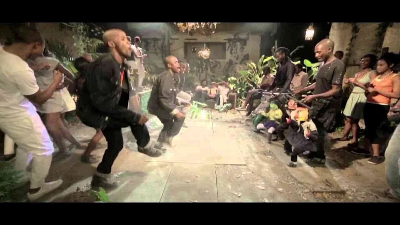
The Puma Dance Dictionary stands as a striking digital campaign from Puma and Grey, launched in the United Kingdom in 2013 and targeting the fashion market with a concept that fuses the kinetic energy of street dance with contemporary brand storytelling. Rather than hinging on typical narratives or aspirational celebrity spokespeople, Puma and Grey crafted an interactive platform at pumadancedictionary.com, inviting users to ‘speak’ through movement by turning a vocabulary of dance moves into an expressive language all its own. This innovation blurs the boundaries between fashion communication and digital culture, aligning Puma with youthful audiences who value individuality and cultural currency. By positioning dance as a metaphor for personal expression — and thus for the brand’s central benefit of stylish, live-out-loud self-representation — the campaign visualizes the apparel’s impact not by listing features but by allowing participants to demonstrate what it means to move freely, energetically, and with confidence. The digital-first execution, centered on a single, high-impact media asset, reflects a meticulous comms strategy that maximizes both interactivity and memorability, leveraging the massive influence of contemporary dance on youth culture and tapping into the universal drive to share and remix visual language in new formats. This creative approach sits squarely in Clapboard’s FORMAT#9—Symbolize the Benefit—where exaggerated visuals and cultural metaphors are deployed to dramatize what the product means rather than what it is. For the fashion category, where differentiation often comes down to mood, attitude, and lifestyle, Puma’s Dance Dictionary becomes more than a campaign; it serves as an open platform for user co-creation, allowing fans to encode messages and emotions in a way that feels truly participatory and on-brand. The partnership with Grey underscores the power of agency collaboration when carving out cultural relevance, showing that subverting conventional communications in favor of symbolic storytelling can yield a uniquely sticky and sharable brand narrative. Clapboard rates this 69/100. For an industry seeking new ways to make visceral connections, Puma’s Dance Dictionary underscores the evolution of fashion branding from messaging to meaning, signaling how brands can become part of culture not by talking at audiences, but by letting them move, interpret, and quite literally speak for themselves.
.webp)
Creative Collaboration Platform: The Backbone of Modern Creative WorkWhat is a creative collaboration platform?Clapboard defines a creative collaboration platform as the operational core for today’s distributed creative teams. This is not a collection of digital collaboration tools stitched together; Clapboard’s system
Understanding the Creative Production MarketplaceWhat is a Creative Production Marketplace?Clapboard defines a creative production marketplace as a structured ecosystem where brands, agencies, and production talent converge to execute video, advertising, and branded content at scale. Unlike the legacy agency or freelanREAD FULL ARTICLE
The Urgent Need for a Creative Production Operating SystemWhy Traditional Creative Production Models Break DownClapboard sees the creative production landscape shifting under pressure. Content velocity is no longer a buzzword—it’s a mandate. Modern advertising demands relentless output across dozens of channels, each wREAD FULL ARTICLE