A curated selection of iconic design campaigns showcasing award-winning creativity and strategic impact within The Clapboard Ad Archive for professional reference.
Design












The Shelter Box - MIA | Clapboard Ad Archive

Design
The Shelter Box - MIA | Clapboard Ad Archive
The Shelter Box campaign for MIA, executed in 2017 by Leo Burnett in the public service category, is a striking demonstration of how minimalist design can communicate profound urgency in humanitarian messaging. In a landscape saturated with literal imagery of crisis, this work stands apart by using what Clapboard's taxonomy would classify as FORMAT#3—Symbolize the Problem, employing a symbolic visual centerpiece that distills the concept of shelter and vulnerability into a single, potent metaphor. The campaign centres on the Shelter Box itself—serving both as a physical object and a communicative device that encapsulates the essential human need for safety and the immediacy of disaster relief. Leo Burnett’s creative strategy for MIA leverages the box’s visual simplicity to amplify emotional impact, connecting the viewer directly to the stakes without resorting to graphic documentation or testimonials. The restrained, carefully crafted design language targets awareness and empathy, inviting the Italian public to engage with the problem on a conceptual level that transcends statistics or direct appeals. This alignment with Shelter Box’s mission transforms MIA from a passive brand sponsor to an active participant in the global conversation about disaster response. The campaign’s exclusive reliance on a single media asset highlights the persuasive power of visual storytelling in public interest communications, allowing the message to cut through media clutter with clarity and resonance. By avoiding embellishment or overt dramatization, the creative approach achieves a universality that resonates across cultural and linguistic boundaries, reinforcing MIA’s commitment to social responsibility while positioning the brand as an ally to humanitarian causes. The carefully measured tone and aesthetic restraint embody effective modern design thinking, ensuring that the story of shelter and urgency is delivered with both immediacy and dignity. Clapboard rates this 63/100. In demonstrating how abstracted design can foreground urgent social issues with clarity and affective force, this campaign signals a continuing trend toward conceptual minimalism in public service creative.
The BinBox - | Clapboard Ad Archive
The BinBox campaign from Ignis, devised by Hakuhodo for the automotive market in India in 2017, addresses the country’s chronic roadside litter issue by reframing a ubiquitous in-car item — the tissue box — as both the source and the solution to a widespread problem. With over 30 million cars on Indian roads, and the near-universal presence of tissue boxes without any accompanying means to dispose of used tissues, the result is a persistent trail of litter left by drivers and passengers alike. Ignis turns this unchecked behavioral friction into an actionable design brief, producing the BinBox, the world’s first tissue box to feature an integrated mini-bin for used tissues, merging necessity and responsibility in a single, elegant form. The campaign is direct, eschewing narrative embellishment or celebrity distraction for a single-minded focus on the root cause, mapping the journey from cause — lack of disposable options — to effect — roadside mess — and then presenting a product engineered for frictionless cleanliness. What Clapboard’s taxonomy would classify as FORMAT#2 — Show the Problem — this campaign leans into clarity and credibility: it names a problem virtually every car owner will recognize and then resolves it with a tangible, easy-to-use object that naturally integrates into daily driving routines. The single media asset at the heart of the campaign reinforces the message with visual economy, showcasing the BinBox’s utility while inviting viewers to participate in a broader movement toward civic responsibility and environmental upkeep each time they reach for a tissue. By bypassing any attempt at storytelling or aspirational lifestyle messaging, Hakuhodo positions Ignis not just as an innovator in car accessories but as a brand that understands and acts on the reality of Indian urban life. In the intensely utilitarian and often overlooked domain of in-car habits, BinBox signals that small, design-led interventions can stir large, collective changes in public behavior. The campaign earns 63/100 in Clapboard’s global creative archive. This campaign matters for the industry because it demonstrates that environmental innovation can emerge from the most familiar, everyday touchpoints when brands are willing to solve not just for visibility, but for habitual impact.
“Mamnoon” The new Loyalty Program - Zain Iraq | Clapboard Ad Archive
Mamnoon, the comprehensive loyalty program from Zain Iraq, arrived in 2025 via a high-impact, fully integrated campaign that underscores the brand's ambition to move beyond transactional telecom services and step confidently into the realm of daily lifestyle relevance. Developed through a close creative partnership between MEMAC Ogilvy and Khumra Group, the campaign anchors Zain Iraq in both global best practice and local authenticity, with each asset tightly attuned to Iraqi consumer realities. At its core, Mamnoon offers users an intuitive mechanism to accumulate rewards for core telecom usage, with points redeemable across a spectrum of real-world applications — from call and internet credits to discounts on dining, retail, ride-hailing, delivery, and entertainment. The creative strategy positions Zain as an indispensable ally in modern Iraqi life: a platform that returns gratitude and tangible value with every touchpoint, as opposed to the bare-minimum utility that defines much of the sector. In line with what Clapboard's taxonomy would classify as FORMAT#1—Demonstration, the campaign dispenses with narrative theatrics to focus squarely on benefit-led communication, showcasing the reward mechanism in direct, visually sophisticated sequences that detail each dimension of the offering. Production values are firmly in the upper tier for the region: high-end photography and advanced digital content are woven across film and social platforms, crafting a cohesive brand expression that feels as premium and contemporary as any global telecom benchmark. Arabic-language executions and Baghdad as a production location ground the work in cultural nuance, enabling the brand to speak credibly to both mainstream and digitally engaged audiences. Across broadcast and digital touchpoints, the campaign generated over a million views, reflecting both strong market resonance and the growing appetite for customer-centric innovation within Iraq's telecom landscape. The strategic interplay between MEMAC Ogilvy’s global campaign discipline and Khumra Group’s local production expertise lends the project an intelligence that recognizes both the region’s technical aspirations and the lived truths of its consumers. Clapboard rates this 64/100. This program signals how market leaders can claim durable cultural relevance and emotional loyalty not through rhetorical promises of innovation, but by equipping everyday interactions with the frictionless rewards users genuinely value.
The Breathless Collection - Marie Keating Foundation | Clapboard Ad Archive
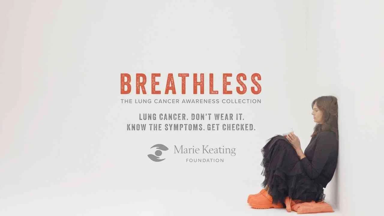
The Breathless Collection from the Marie Keating Foundation, developed with The Brill Building, signals a striking shift in public service communication for lung cancer awareness in 2025, leveraging the tactile world of fashion as both symbol and trigger for early detection. Confronted with persistent global apathy around early lung cancer symptoms, the campaign steers decisively away from didactic messaging in favor of physical empathy, turning symptom invisibility into an immediate, body-felt experience through a capsule collection of garments and accessories weighted and tailored to mimic breathlessness, fatigue, and the subtle restrictions that often precede diagnosis. Positioned squarely within the public service market category and launched across Ireland and the United Kingdom for International Lung Cancer Awareness Month, the initiative harnesses direct collaboration with survivors, clinicians, and fashion creatives to inject authenticity and authority into the work, ensuring that each item in the collection — from gilets to scarves to shoes and a keep-cup — is a meticulously crafted analogy that bridges medical insight with creative expression. Rather than resorting to conventional somber dramatization or showing patient suffering, The Breathless Collection aligns with what Clapboard's taxonomy classifies as FORMAT#3 — Symbolize the Problem, offering a nuanced approach that replaces literal depiction with evocative metaphor, prompting viewers and wearers to reconsider symptoms they might otherwise dismiss as everyday tiredness or aging. Central to the strategy is The Making of The Breathless Collection film, which documents the design process and deepens emotional engagement by peeling back the layers of intent, process, and personal testimony, reframing cancer symptom awareness campaigns as opportunities for co-creation and lived empathy, not passive instruction. This campaign’s creative angle recognizes that medical breakthroughs — immunotherapy, personalized treatments — can only shift survival rates, which currently hover at a stark 24 percent five-year net in Ireland, when matched by enhanced symptom vigilance at population scale. By uniting design, digital, and film mediums, The Breathless Collection activates a multi-sensory call to action, provoking the public to check, consult, and ultimately diagnose sooner. Clapboard rates this 77/100. In a marketplace still saturated with literal, risk-avoidant public health messaging, The Breathless Collection matters because it demonstrates how provocative creativity can transform unremarkable symptoms into urgent, lived experiences, challenging the industry to rethink the emotional and conceptual register of awareness campaigns.
Re:framing Mentorship - The Pulse of Perseverance Project, Six Degrees | Clapboard Ad Archive
Re:framing Mentorship, the second campaign unveiled in Year 2025 under SixDegrees.org and Advertising Week’s Purpose, Produced initiative, brings together The Pulse of Perseverance Project (P3) and creative agency Versus to disrupt entrenched perceptions of mentorship in the United States’ education and media/entertainment sectors. Centered around P3’s innovative mobile mentorship platform, the campaign repositions mentorship from an exclusive privilege to a scalable, inclusive resource placed directly in the hands of underserved students, challenging legacies of exclusion and expanding access for those historically denied entry into professional networks. At the heart of this 360-degree brand effort lies a 60-second hybrid anthem–manifesto film, a cinematic piece that intentionally foregrounds genuine moments between real-life mentors and mentees, with strategic B2B and B2C extensions and concise cutdowns woven across digital and broadcast channels to ensure its message meets audiences wherever they consume content. Versus grounds the narrative strategy in the lived experiences of youth who grapple with universal questions of identity, purpose, and aspiration, making the campaign’s emotional architecture both relatable and aspirational rather than contrived or dramatized, an approach that sits squarely in Clapboard’s FORMAT#10—Associated User Imagery. By visualizing aspirational but attainable user profiles, the work reframes professional growth not as an abstract ideal but as a tangible opportunity enabled by technology, empowering students to see themselves in stories of transformation and prompting mentors, educators, and allies to recognize their role in democratizing access. Purpose, Produced’s broader strategic intent — pairing leading creative studios with high-impact nonprofits — finds sharp embodiment here, as Versus translates P3’s mission into an emotional call to action that moves beyond conventional problem–solution framing to foster genuine social impact. Through layered storytelling, an anthem film structure, and dynamic platform-agnostic assets, the campaign positions P3 as a purpose-driven disruptor in the competitive edtech and nonprofit mentorship landscape, setting it apart from peers such as LinkedIn Learning, Mentor Collective, and iCouldBe by foregrounding tech’s ability to facilitate authentic human connection at scale. Clapboard rates this 69/100. This campaign matters because it signals that the next evolution of impact-driven advertising in education will be defined by technology-powered storytelling that intentionally foregrounds social equity and relatability at its core.
One sip — and you're already in the Tian Shan Mountains - AsuVo | Clapboard Ad Archive
One sip — and you're already in the Tian Shan Mountains is the defining creative platform for AsuVO’s 2025 summer push, positioning the flavored water as an antidote to urban inertia and a catalyst for fleeting moments of true refreshment. Developed by Brain Tank for launch across Multinational Europe and Ukraine, this campaign takes direct aim at the new cohort of young, active, city-dwelling consumers for whom time is in short supply and genuine escape even scarcer. At the heart of the concept is a signature 25-second video that fuses real footage of bustling city life with vibrant CGI renderings of fruit, bubbles, and the Tien Shan mountains, mapping AsuVO’s promise onto an immediately graspable, emotionally potent transformation. The narrative is simple but resonant: a young woman, caught in the fatigue of a sweltering day, takes a sip of AsuVO, the world shifts, the concrete melts into alpine vistas dotted with animated fruit, and for a brief, enchanted interval, the mountain freshness is no longer a fantasy but a sensory reality. Inspired by the Alice in Wonderland motif of growing to one’s right size, the metaphor positions AsuVO as the key to rising above the humdrum, letting wellness and nature supersede the city’s clamor. Brain Tank’s execution is technically adept, interlacing CGI fruit and landscapes with live-action urban sequences and employing layered audio to dramatize the change from city noise to mountain silence, reinforcing the escape theme without the visual literalism that dogs category convention. This sits squarely within Clapboard’s FORMAT#9—Symbolize the Benefit, where exaggerated visuals and heightened metaphor communicate not just a functional pitch, but a state change enabled by the product. On the strategic front, the campaign doesn’t merely sell a drink — it seeks to spark a behavioral shift, inviting a new generation to adopt flavored water as an everyday tool for micro-escapes and lightness amid non-stop urban hustle. By combining wellness cues with a sensorially rich, flavor-forward storytelling approach, AsuVO stands apart from legacy mineral water brands like Evian, San Benedetto, or Vittel, and contemporary competitors like Aqua Minerale Fresh, carving out fresh ground for nature-inspired, mobile-friendly hydration in the Food & Drink market category. Behind-the-scenes creative content underlines the rigor behind its CGI work and sound design, while the main spot distills the benefit to a single, highly repeatable act — opening a bottle to summon the mountains. The campaign earns 63/100 in Clapboard’s global creative archive. This campaign matters because it signals how metaphor-forward creative, amplified by technical craft and sound design, can elevate a functional beverage into a lifestyle proposition that resonates with, and potentially redefines, a rapidly shifting category.
iPager (case study) - Android, Google | Clapboard Ad Archive
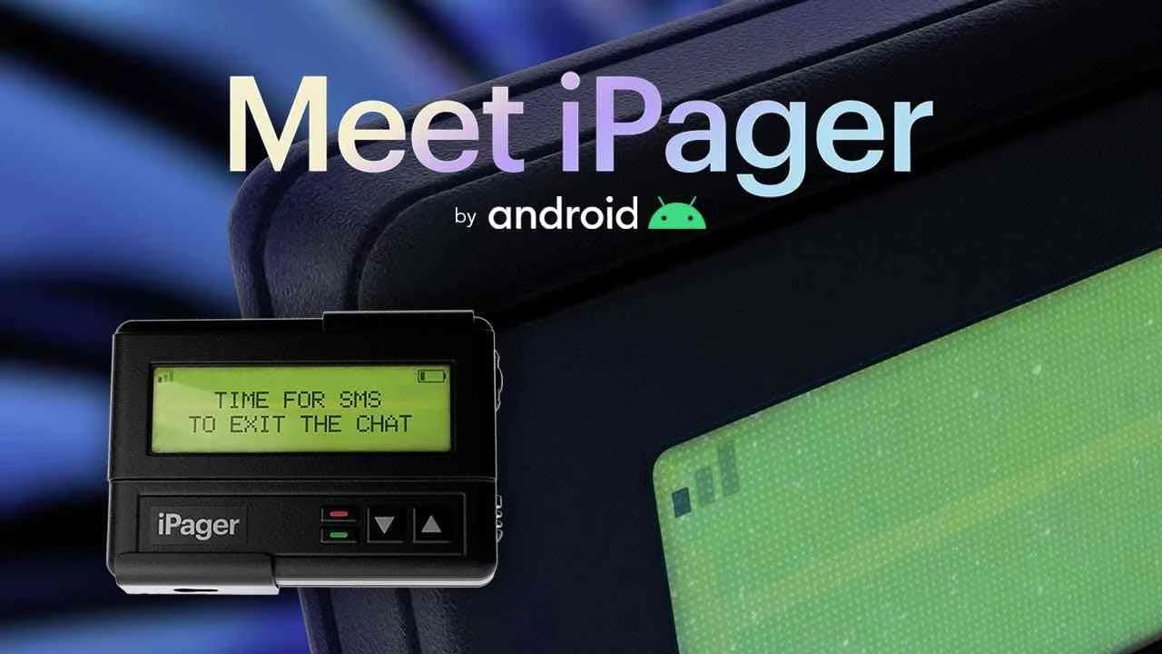
Android’s iPager campaign, developed by DAVID Miami for Google and launched in 2024, takes direct aim at a uniquely American technology pain point: the infamous green bubbles that punctuate SMS exchanges between Android and Apple users, and the larger narrative of blame and brand tribalism those green bubbles signify. Partnering with design and production agency Masters & Savant, the campaign seizes on Apple’s refusal to implement Rich Communication Services (RCS)—the industry standard embraced globally by every major operating system except iOS—and dramatizes this technical standoff through an unexpected symbol in the form of the iPager, an anachronistically physical pager-device engineered to forefront Apple’s stubborn use of 1990s-era messaging protocols. In what Clapboard’s taxonomy would define as FORMAT#3—Symbolize the Problem, iPager shuns typical PSA tropes and literal depictions of pixelated images, failed reactions, and one-sided encryption, instead embodying these systemic messaging failures within a wry, tangible metaphor that invites both media attention and public scrutiny. Central to the campaign is a deliberate flipping of the narrative: for years, Apple’s design language and ecosystem have subtly ostracized Android users while obfuscating the real source of messaging shortcomings, yet iPager’s invented device makes these failings unmistakable, reframing the green bubble stigma as a byproduct of Apple’s technological conservatism—not Android’s. Through a blend of wittily designed physical products, digital amplification, and targeted direct outreach, the campaign elevates the debate beyond tech forums, making encryption gaps, poor media quality, and loss of message reactions a topic of cultural conversation rather than an obscure technical issue. Recognition at Cannes Lions 2024 with Silver and Bronze in Brand Experience & Activation and a Titanium shortlist, as well as dual Golds at The ANDY Awards, signaled strong industry and peer resonance, positioning iPager as both a creative provocation and a call for accountability in digital communication standards. Operating within the internet and technology market category, the campaign achieved a reach that reinforced its strategic intent, galvanizing conversation about interoperability, consumer choice, and the responsibilities of category leaders to meet evolving digital expectations. Clapboard rates this 86/100. As the green bubble phenomenon morphs from a meme to a marker of systemic inertia, iPager matters for proving that symbolic design, brand voice, and cultural timing can force industry giants into a more open and consumer-centric dialogue.
Crossroads x Musketon - Audi | Clapboard Ad Archive
Crossroads x Musketon positions Audi at the center of Belgium’s creative and automotive conversation for 2023, with agency iO orchestrating a campaign that unites the marque’s design-forward identity with the meticulous digital artistry of Musketon. Spotlighting the Audi e-tron GT quattro as both object and canvas, the campaign explores the synergies between precision engineering and obsessive detail, a dialogue reflected in the car’s bespoke wrapping and the transformation of select parts—including rims, brake calipers, and bonnets—into intricate works of visual art. Marking its debut at the Zoute Grand Prix and further bridging disciplines at De Zutter Art Gallery, the collaboration is more than an activation; it is a fully integrated communications platform spanning experiential, digital, and cinematic touchpoints. The 60-second cinema spot at Kinepolis distills the campaign’s premise into a high-impact visual teaser, while the full Crossroads video and social rollout on Audi’s owned channels reinforce the brand’s claim to design leadership among an audience of discerning, detail-oriented automotive and art enthusiasts. What Clapboard’s taxonomy would classify as FORMAT#11—Unique Personality Property—the campaign underscores Audi’s design DNA not through competitive posturing or overt narrative arcs but by elevating a singular partnership that blurs the boundaries between automotive innovation and contemporary visual culture. Audi and iO eschew traditional testimonial tropes and lean into the emotional resonance of process and craft, spatially immersing consumers in the interplay of technology and creativity at the heart of the e-tron GT quattro. By celebrating the granular—down to the obsessive intricacy behind every line and curve—they answer the luxury market’s demand for authenticity and artistic differentiation, mapping the brand narrative onto physical and digital spaces that buyers aspire to inhabit. The campaign earns 64/100 in Clapboard’s global creative archive. In a premium market defined by incremental design evolutions, Crossroads x Musketon signals to the industry that the future of automotive distinction will belong to brands able to forge authentic, artist-led experiences that speak as much to cultural connoisseurship as to engineering.
AFC Asian Cup 2023 Opening Ceremony | Stage design & content production - SILA SVETA | Clapboard Ad Archive
Sila Sveta’s AFC Asian Cup 2023 Opening Ceremony campaign for Lusail Stadium in Qatar redefines what is possible within the sports and fitness market category, positioning the agency as a visionary force in stage design and content production. Working in partnership with Katara Studios, Sila Sveta orchestrated a ceremony that transcended the parameters of conventional football launches by introducing a sweeping, multi-sensory experience rooted in regional narrative and modern spectacle. The campaign centered on The Lost Chapter of Kelileh & Demneh, whose visual storytelling wove symbols of pan-Asian unity—spanning desert sand dunes and Japanese sakura blossoms—into every frame, while the deployment of shell-inspired, 360-degree screens delivered an ambitious nod to Qatar’s pearl-diving legacy and the collective identity of the AFC’s regional federations. Supporting the onstage musical, the visual journey leveraged mythic metaphor and cross-cultural reference to reinforce core themes of self-acceptance and the power of diversity, ensuring that every creative decision contributed both aesthetically and strategically to its mandate of cultural resonance. Rather than demonstrate product features or pursue direct persuasion, Sila Sveta’s campaign is a textbook example of what Clapboard’s taxonomy calls FORMAT#9—Symbolize the Benefit, wherein the benefits of the brand’s production acumen are distilled into abstract, theatrical imagery that operates at the intersection of entertainment and social meaning. Through seamless integration of advanced content production, complex stage construction, and digital media, the agency implicitly positions sport as a cultural bridge while making a broader statement on the transformative potential of stadium-scale live events. The result is less an event than a designed encounter with the values and aspirations of an entire region, exemplifying the heights possible when creative ambition and strategic insight converge in global sports. Clapboard rates this 79/100. As the industry aligns itself around immersive experience and narrative symbolism, this campaign signals an accelerating expectation for sports ceremonies to function as both cultural expression and branded art.
#UberAutoArt - Uber | Clapboard Ad Archive
Uber’s 2023 #UberAutoArt campaign, developed by Dentsu Creative for the Indian transport market, transforms the ubiquitous auto-rickshaw into a powerful symbol of mobility, resilience, and inclusivity by turning over a thousand vehicles in Gurgaon into three-wheeled hoardings emblazoned with witty, motivational lines crafted by celebrated comedians Akash Gupta, Prashasti Singh, and Aashish Solanki. This ambient and content-driven activation strategically taps into the cultural fabric of Indian urban life, where autos are an indispensable mode of transport, to embed Uber deeply within the everyday journeys and aspirations of millions of commuters. The campaign further elevates its narrative on World Art Day through a collaboration with the Aravani Art Project, a transgender-led collective, which painted three whitewashed Uber Autos live in Mumbai to celebrate the unstoppable spirit of Mumbaikars and the broader Indian populace. This live artistic intervention not only amplified Uber’s commitment to diversity and social empowerment but also created a dynamic, experiential platform that invited public engagement and visual storytelling rooted in local culture. What Clapboard’s taxonomy identifies as FORMAT#9—Symbolize the Benefit—manifests here through the literal transformation of Uber Autos into moving canvases that embody the brand’s promise of advancing people toward their dreams and championing perseverance regardless of obstacles. The use of humor alongside socially conscious street art crafts a narrative that is at once relatable and aspirational, marrying brand utility with emotional resonance. By leveraging ambient media, content marketing, and design, Uber positioned itself not just as a transport provider but as a cultural enabler and community connector, thereby reinforcing its role in shaping urban mobility as an experience that celebrates diversity, creativity, and progress. The campaign earns 63/100 in Clapboard’s global creative archive. This campaign matters to the industry because it demonstrates how transport brands can transcend functional messaging by embedding themselves within cultural and social narratives that elevate everyday mobility into a canvas for collective identity and inclusion.
Once Upon a Time - Bank of Georgia | Clapboard Ad Archive
Once Upon a Time is a culturally rooted campaign launched in 2022 by Bank of Georgia and crafted by Hans & Gruber that taps into the nation’s cherished tradition of fairy tales to address a pressing social issue within the finance sector: the lack of access to children’s books for half of Georgian children. By reviving these national fairy tales, the campaign leverages storytelling as a vehicle to ignite curiosity and imagination in young audiences while simultaneously invoking a powerful sense of nostalgia among adults who grew up with these stories. This approach positions Bank of Georgia not just as a financial institution but as a guardian of cultural heritage and a proactive contributor to the social fabric, aligning the brand with community values and long-term investment in future generations. Strategically, the campaign uses the universally familiar narrative structure and language of classic fairy tales, a device that situates the bank as a restorer of childhood magic and tradition rather than pushing product benefits directly. This choice places the campaign firmly within what Clapboard’s taxonomy classifies as FORMAT#12—Parody or Borrowed Format—where the brand borrows the conventions and emotional resonance of a cultural genre to deepen engagement and brand affinity. The campaign’s singular media asset and integrated Content, Design, and Digital media strategy reflect a sophisticated understanding of how to engage Georgian families and the broader community by weaving social responsibility with cultural storytelling, thus reinforcing Bank of Georgia’s credibility and trustworthiness in a competitive financial market. With a Clapboard Campaign Score of 63, the campaign demonstrates a solid creative execution that connects emotionally and intellectually without resorting to conventional financial messaging. Although the campaign’s digital engagement metrics are modest, its impact lies in stimulating conversations about childhood development, literacy, and cultural preservation in a rapidly modernizing society. Once Upon a Time exemplifies how financial brands can transcend transactional relationships by championing cultural continuity and education, which in turn nurtures deeper community ties and brand loyalty. This campaign matters because it signals a shift in banking communications toward purpose-driven storytelling that engages audiences through shared heritage and social impact rather than product features alone.
Wine from Georgia - Tbilvino | Clapboard Ad Archive
Wine from Georgia for Tbilvino, crafted by Hans & Gruber in 2020, stakes a pioneering claim in the Georgian wine sector by positioning the brand as the global custodian of an 8000-year-old winemaking tradition unique to Georgia. This campaign deliberately occupies a strategic brand space previously unclaimed by any Georgian producer, elevating Tbilvino from a conventional alcoholic beverage to a cultural ambassador that embodies a deep historical legacy. The campaign’s narrative foundation is rooted in meticulous collaboration with historians, archaeologists, and cultural experts, lending authenticity and scholarly weight to its storytelling, which bridges ancient Georgian history with contemporary winemaking practice. Visually, the campaign employs a distinctive cultural aesthetic that draws on Georgian motifs and symbolism, while an original musical score creates an immersive sensory experience that binds the narrative elements cohesively. The use of animation as the primary creative vehicle amplifies accessibility and shareability, facilitating broad digital reach and engagement. The campaign’s impact is underscored by its viral success, amassing over 4.4 million views and breaking engagement records within the Georgian market, an exceptional achievement for a regional alcohol brand. This campaign exemplifies what Clapboard’s FORMAT#11—Unique Personality Property represents, as it highlights Tbilvino’s distinctive cultural heritage as its singular brand asset rather than relying on product features or typical lifestyle storytelling. The strategic emphasis on heritage and national identity crafts a compelling and differentiated position in a competitive alcoholic drinks category increasingly saturated with modern and internationalized wine brands. The campaign’s Clapboard Campaign Score is 63/100. This campaign matters to the industry because it demonstrates how heritage and cultural authenticity can be leveraged through expert-driven, multidisciplinary storytelling to build a resonant brand narrative that transcends product category conventions and connects emotionally with both domestic and international audiences.
FAQs for the Playlist: Design■
Top questions to this curated campaign playlist
Designers and producers analyze design-led campaigns to understand the integration of visual hierarchy, typography, and brand identity. These references guide decisions on layout, color schemes, and material choices, ensuring alignment with strategic goals and enhancing storytelling impact—archived in Clapboard's global ad archive.
Historical design campaigns reveal how visual innovation influenced consumer perception and market positioning. Understanding these shifts helps strategists anticipate cultural trends, refine brand narratives, and apply proven visual tactics that resonate across demographics and time periods.
High-budget campaigns often leverage bespoke craftsmanship and premium materials, while lower-budget efforts focus on clever simplicity and resourceful execution. Regional aesthetics and period styles reflect cultural values, showing design's adaptability and its role in communicating brand essence under diverse constraints.
Many assume design is purely decorative or secondary to messaging. In reality, design shapes user experience and emotional response, acting as a strategic tool that directs attention, reinforces brand values, and differentiates products in saturated markets.
Familiarity with seminal design campaigns sharpens visual literacy and informs decision-making, enabling leaders to innovate while respecting proven principles. This expertise supports clearer communication with creative teams and clients, elevating campaign coherence and market impact—archived in Clapboard's global ad archive.
.webp)
Creative Collaboration Platform: The Backbone of Modern Creative WorkWhat is a creative collaboration platform?Clapboard defines a creative collaboration platform as the operational core for today’s distributed creative teams. This is not a collection of digital collaboration tools stitched together; Clapboard’s system
Understanding the Creative Production MarketplaceWhat is a Creative Production Marketplace?Clapboard defines a creative production marketplace as a structured ecosystem where brands, agencies, and production talent converge to execute video, advertising, and branded content at scale. Unlike the legacy agency or freelanREAD FULL ARTICLE
The Urgent Need for a Creative Production Operating SystemWhy Traditional Creative Production Models Break DownClapboard sees the creative production landscape shifting under pressure. Content velocity is no longer a buzzword—it’s a mandate. Modern advertising demands relentless output across dozens of channels, each wREAD FULL ARTICLE