- HOME
- FOR CLIENTS
- FOR FREELANCERS
- LOGIN
BLOG
New user? Create account
New user? Create account


Varun Katyal is the Founder & CEO of Clapboard and a former Creative Director at Ogilvy, with 15+ years of experience across advertising, branded content, and film production. He built Clapboard after seeing firsthand that the industry’s traditional ways of sourcing talent, structuring teams, and delivering creative work were no longer built for the volume, velocity, and complexity of modern content. Clapboard is his answer — a video-first creative operating system that brings together a curated talent marketplace, managed production services, and an AI- and automation-powered layer into a single ecosystem for advertising, branded content, and film. It is designed for a market where brands need content at a scale, speed, and level of specialization that legacy agencies and generic freelance platforms were never built to deliver. The thinking, frameworks, and editorial perspective behind this blog are shaped by Varun’s experience across both the agency world and the emerging platform-led future of creative production. LinkedIn: https://www.linkedin.com/in/varun-katyal-clapboard/

Data visualization in marketing is only as strong as the principles behind it. The difference between a chart that drives decisions and one that gets ignored isn’t software or style—it’s discipline. Effective marketing visuals distill complexity without sacrificing credibility. If the audience can’t grasp the point in seconds, the visualization has failed, regardless of how polished it looks.
Clarity is non-negotiable. Every element—color, shape, axis, label—must earn its place. The principles of data visualization start with ruthless editing. Strip away decorative clutter and focus on what’s essential. Simplicity isn’t about minimalism; it’s about removing anything that distracts from the story the data is telling.
Relevance is the next filter. Effective marketing visuals are built on data that matters to the business objective, not just what’s available. Before plotting a single point, interrogate whether the dataset aligns with the campaign’s goals. There’s no value in visualizing metrics that don’t move the needle.
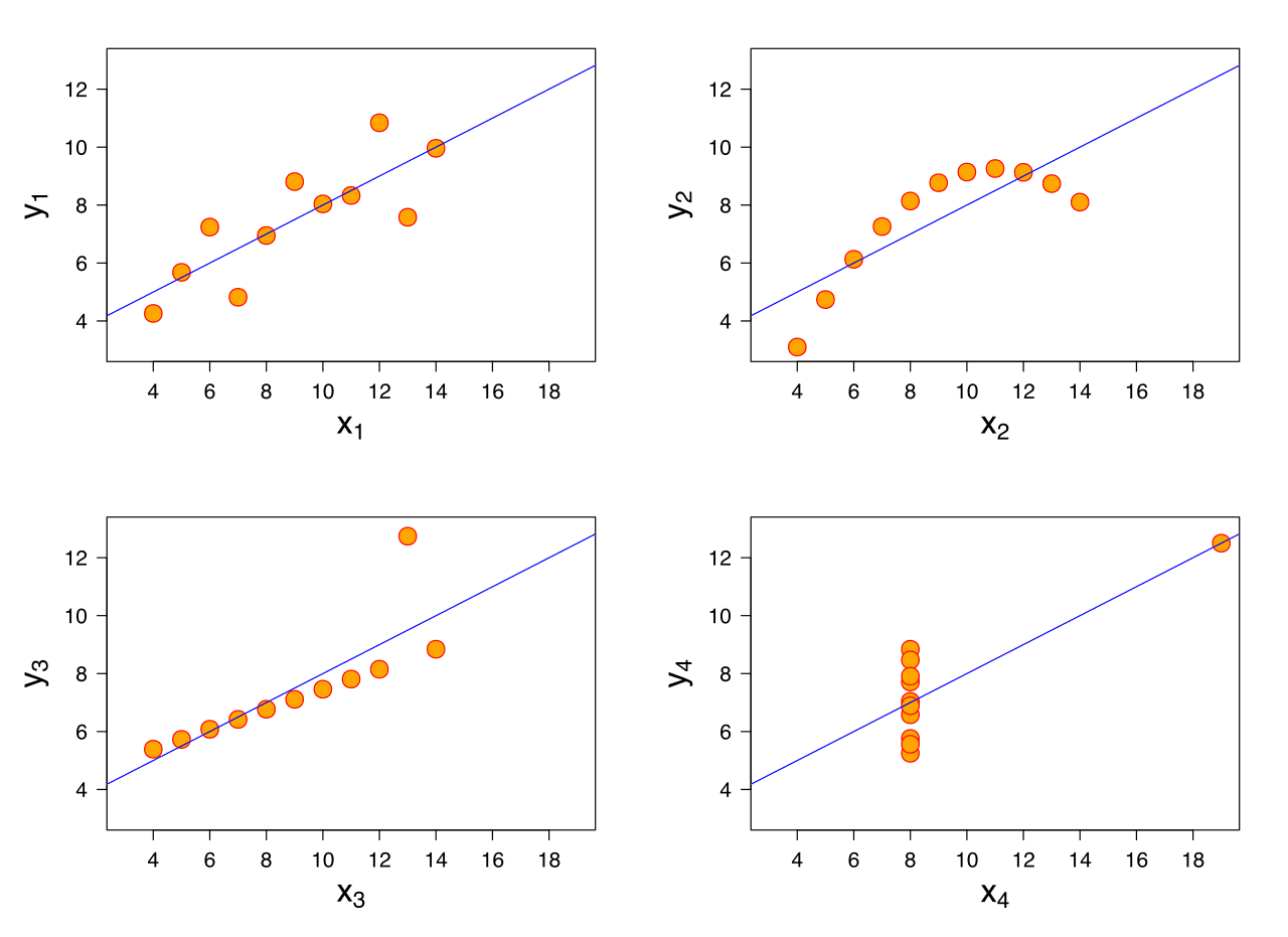
Accuracy underpins credibility. A visualization that distorts scale, truncates axes, or cherry-picks data to fit a narrative will backfire—internally and externally. Marketers have a responsibility to present data honestly, especially when those visuals drive spend or strategic pivots. The basics of visual storytelling demand that every chart can be traced back to its source, with no room for ambiguity or manipulation.
Accessibility is not optional. Marketing data best practices require visuals to be readable by everyone—across devices, formats, and abilities. Use high-contrast palettes, clear labels, and alt text as standard. If a visualization can’t be understood by a color-blind executive on a mobile screen, it’s not fit for purpose. Accessibility isn’t just compliance; it’s commercial sense. Exclusion equals missed influence.
Most marketing visuals fail not from lack of effort but from basic missteps. Overcomplicating the display—multiple chart types, dense legends, or excessive animation—dilutes the message. Visual hierarchy must direct attention to the most critical insight first, using size, color, and placement to guide the eye. If the audience has to work to find the point, the opportunity is lost.
Another common error: ignoring context. Numbers without benchmarks, trends without baselines, or visuals without narratives are dead on arrival. Integrate visual storytelling techniques by framing data within the broader marketing narrative. Every visualization should answer: why does this matter, and what action should it prompt?
Ultimately, the principles of data visualization in marketing are about discipline—clarity, relevance, accuracy, and accessibility. Get these right, and your visuals become a strategic asset, not just a slide filler.
Data visualization in marketing is no longer a nice-to-have. The volume and velocity of marketing data have exploded—every platform, every touchpoint, every campaign throws off a stream of metrics. Senior marketers face a daily deluge: impressions, clicks, conversions, attribution models, audience segments, and more. The result? Decision paralysis. Raw numbers, even when accurate, overwhelm. The importance of data visualization lies in its ability to cut through this noise. Visual data for marketers transforms abstract analytics into concrete, actionable narratives. In today’s landscape, clarity is a competitive edge.
Speed matters. Marketing windows are shorter, consumer attention is fleeting, and the cost of delay is real. Visualizing data—through dashboards, heatmaps, or campaign flow diagrams—condenses hours of spreadsheet analysis into seconds of comprehension. Patterns, trends, and outliers become obvious, not buried. This is more than convenience; it’s operational necessity. Effective marketing analytics visualization delivers insights in real time, empowering teams to pivot, optimize, or double down before the moment passes. In a market where agility wins, visual data is the difference between seizing an opportunity and missing it.
Ignore data visualization, and you pay in wasted spend, misaligned strategy, and missed signals. Marketing complexity has increased: multi-market campaigns, cross-channel journeys, and shifting consumer behaviors demand a synthesis of data sources. Without visualization, insights hide in silos and spreadsheets. Presentations fall flat. Stakeholders tune out. The expectation—internally and externally—is for data-driven marketing that communicates insights clearly and persuasively. Visual data isn’t just about making numbers pretty; it’s about making numbers matter. Teams that fail to visualize their marketing analytics insights are simply slower, less informed, and ultimately less effective.
The urgency is real. Data visualization in marketing is the tool that transforms overwhelming data into strategic clarity. For marketers who want to stay ahead, it’s not optional—it’s foundational.
Marketing data visualization formats are only as effective as the clarity they deliver. The right format doesn’t just make data look good — it sharpens decision-making and accelerates buy-in. For senior marketers, the imperative is to match the visualization type to the specific business question, not to default to what’s visually familiar or aesthetically pleasing. The goal is to drive action, not admiration.
Bar charts are the workhorse for marketing teams comparing performance across categories or periods — think channel-by-channel spend or month-over-month lead volume. Their visual directness cuts through noise and makes deviations impossible to ignore. Line charts excel at showing trends over time, such as tracking campaign reach or conversion rates. Pie charts, despite their popularity, should be reserved for distributions with no more than five categories and where the whole is obvious — for example, budget splits or market share breakdowns. Go beyond these, and clarity collapses (Supermetrics, 2023).
Heat maps are invaluable when you need to surface patterns across large data sets, such as email open rates by time and day, or regional performance in multi-market campaigns. Funnel charts are purpose-built for sales and lead progression: they make drop-offs explicit, exposing weak points in the pipeline. Bullet charts offer a snapshot of performance against targets — a favorite for sales and revenue reporting because they compress targets, actuals, and benchmarks into a single view (Dataversity, 2023).
Infographics are best deployed for narrative-driven, external-facing communication — think campaign wrap-ups or annual impact reports. They distill complex data into a story that lands with stakeholders who aren’t in the weeds. Dashboards, by contrast, are operational tools. They provide real-time, actionable views for marketing teams and leadership. The distinction isn’t just aesthetic: dashboards must prioritize function and updateability, while infographics can sacrifice granularity for clarity and persuasion. For ongoing campaign management, dashboards win. For boardroom storytelling, infographics justify their place.
Interactivity isn’t a gimmick; it’s a force multiplier for teams navigating layered, multi-dimensional data. Interactive dashboards let users drill down from topline metrics to granular details — vital for performance reviews and optimization sprints. They also enable scenario analysis, a critical feature when modeling budget reallocations or forecasting outcomes. But not every story needs interactivity. Static visuals are faster to produce and more reliable in high-stakes presentations where tech failures are unacceptable. The key is to deploy interactivity where it enables exploration, not where it distracts from the narrative.
Choosing the right graph is a function of the question you need to answer. If you’re benchmarking performance, bar charts and bullet charts are your assets. For trend analysis, line charts are non-negotiable. To expose process leaks, funnel charts are the only rational choice. For spatial or density patterns, heat maps outperform everything else. When stakeholder persuasion is the goal, infographics win; for continuous operational insight, dashboards are irreplaceable. The wrong format muddies insight, wastes attention, and risks the credibility of your data-driven reports.
Ultimately, the best marketing data visualization formats are those that accelerate understanding and drive decisions. The evidence is clear: 92% of marketing decision-makers say well-designed presentation of data leads to better decisions, and 89% say managers prefer reports using data visualization (Capterra, 2023). Format is not a creative afterthought — it’s a lever for performance. Choose with intent, not habit.
Raw marketing data is noise until you impose structure, filter for relevance, and shape it into something decision-ready. The value isn’t in the data itself—it’s in the actionable insights from data visualization that let you see what matters, ignore what doesn’t, and move fast. In performance-driven environments, the process is less about making data “pretty” and more about making it profitable. Here’s how practitioners turn a mess of numbers into a competitive edge.
Start with the KPIs that actually drive business outcomes, not vanity metrics. Pull data from all relevant sources—ad platforms, CRM, web analytics—then standardize it. The first step is ruthless: strip away anything that doesn’t map to objectives or campaign optimization. Use clear visual formats: time-series for trends, heatmaps for performance by channel, scatterplots for correlation. Don’t waste time on ornate dashboards. The goal is immediate clarity: what’s working, what’s not, and where to dig deeper.
Turning data into insights means hunting for patterns that aren’t obvious in the raw tables. With the right visualization, outliers and inflection points become visible fast. In multi-market campaigns, visual analytics for marketers can expose regional anomalies or temporal shifts that would otherwise get buried. This isn’t just about seeing the past—it’s about spotting signals that inform future moves. According to Capterra, the top advantage of data visualization for marketers is its ability to reveal trends and relationships in data (2023). That’s not academic—it’s the foundation of every high-performing marketing performance analysis.
Complexity is a given when you’re integrating disparate datasets: paid, owned, earned, first-party, third-party. The practitioner mindset is to connect these dots visually, not just for aesthetics but to drive decisions. Layering data—say, overlaying conversion rates with spend and creative type—lets you isolate the variables that move the needle. This is where visual analytics for marketers comes into its own. Companies that expertly apply data visualization in digital marketing see a 44% increase in engagement metrics (University of Wisconsin Parkside, 2023). That’s not because they’re looking at more data, but because they’re looking at the right data, the right way.
Data visualization is not the endgame. The only metric that matters is how quickly you can move from observation to action. Spot a trend, validate it, then operationalize the insight—whether that means reallocating budget, shifting creative strategy, or overhauling targeting criteria. In practice, this means your visualization layer must integrate seamlessly with your campaign optimization workflows. If your team isn’t acting on what they see, the entire exercise is wasted.
Data visualization in marketing strategy is not a dashboard sideshow—it’s the lens that sharpens every decision. Senior marketers know that campaign performance visualization is the difference between flying blind and flying with radar. ROI, spend, and conversion data become actionable when mapped visually across channels, timelines, and creative variants. Patterns emerge: which assets drive lift, which markets underperform, and where budget should shift. This isn’t about pretty charts; it’s about compressing complexity so teams can act quickly. The best campaign managers use visualization to run iterative A/B tests, monitor live results, and pivot spend in real time. The days of waiting for post-mortem reports are over. Visuals make campaign optimization continuous, not retrospective.
Customer segmentation analysis is only as good as its clarity. Visualizing customer journeys—across acquisition, engagement, and retention—exposes the friction points and opportunities that raw data buries. Marketers who map segments visually can spot which cohorts respond to which messaging, and where drop-offs occur in the funnel. Heatmaps, flow diagrams, and cohort retention graphs are not just reporting tools; they are strategic assets. They allow for precise targeting, smarter creative adaptation, and efficient allocation of resources. When you can see, at a glance, which segment is ready to convert and which needs nurturing, you move from broad strokes to surgical precision. This is marketing strategy optimization in action: less guesswork, more impact.
Strategic marketing planning is a high-stakes exercise. Data visualization compresses market intelligence, competitor benchmarking, and trend analysis into formats that expose what matters—fast. Spotting market trends visually lets teams anticipate shifts before the competition. Layering competitive insights on top of internal performance data reveals white space and red flags. For example, a market share bubble chart can instantly show where your brand is gaining or losing ground. Overlay seasonality or macro trends, and you have a living map for where to invest or pull back. These visualizations aren’t passive—they drive boardroom conversations and creative recalibrations. The most effective leaders use them to pressure-test assumptions and align teams around a single version of the truth.
Consider a global campaign launch. Performance dashboards visualize spend and results by market, surfacing which geographies deliver outsized returns and which lag behind. This enables agile reallocation—cutting waste and doubling down on what works. In customer segmentation analysis, visual journey maps reveal that a high-value segment stalls at onboarding. The team responds with a targeted creative refresh, tracked in real time through updated visual dashboards. When a competitor launches a new product, market trend visualizations highlight shifts in search and sentiment—prompting a rapid, data-backed response. These are not theoretical scenarios. They are the daily reality for marketers who treat data visualization as an operational discipline, not a reporting afterthought.
Ultimately, data visualization in marketing strategy is the connective tissue between insight and action. It transforms sprawling datasets into clear, decisive narratives that drive growth. Marketers who master this discipline don’t just see the story—they shape it.
Visual storytelling in marketing isn’t a trend—it’s a strategic lever. Senior marketers know that audiences don’t remember spreadsheets, they remember stories. The right visual can compress complexity and anchor a message in the mind. Data alone persuades no one; it’s the narrative arc and visual punch that drive recall and action.
Effective storytelling with data starts with intent. What is the one insight you want remembered? Strip away noise. Build a narrative around that insight—set context, introduce tension, and resolve it with your data. Use progression: before/after scenarios, timelines, or cause-effect sequences. These techniques move data from static to cinematic, making the numbers mean something beyond themselves.
But narrative isn’t enough. The psychology of visuals matters. Humans process images faster than words, and memory is shaped by visual cues. Color, contrast, and spatial arrangement all influence what sticks. A well-chosen chart or infographic can make an insight feel inevitable. But clarity is non-negotiable—if a visual makes the story harder to grasp, it’s failed its purpose.
Memorability is about more than aesthetics. Engaging marketing visuals are designed for impact, not decoration. Use visual hierarchy to direct attention: highlight the data point that matters, mute the rest. Motion and sequencing—think animated graphs or stepwise reveals—reinforce narrative flow and keep viewers engaged. But restraint is key; over-designed visuals dilute message retention.
Contextual relevance drives resonance. Data must be relatable to the audience’s world. Use familiar metaphors or benchmarks. For example, showing market share as slices of a pizza means more than a raw percentage. This approach moves data from abstract to actionable, embedding it in the audience’s decision-making framework.
Distribution context shapes execution. Social media demands punchy, standalone visuals—single data points, bold imagery, minimal text. Each platform has its own visual grammar; what works on LinkedIn will flop on Instagram. Marketing presentations, by contrast, allow for more layered storytelling: sequences, builds, and deeper annotation. But in both cases, brevity and clarity win. Audiences have seconds, not minutes.
Adaptation also means considering accessibility. Color choices, font sizes, and alt text aren’t just compliance—they’re reach multipliers. The most brilliant data story is wasted if it’s unreadable or ignored by segments of your audience. This is the discipline that separates practitioners from hobbyists.
The temptation to over-design is real. But the most effective marketing communication strategies prioritize clarity over cleverness. Creative flourishes should serve the story, not distract from it. Every element—icon, color, animation—must earn its place. The acid test: strip the visual back to essentials. If the core message survives, you’re on track.
Visual storytelling in marketing is not about making data “pretty.” It’s about making data persuasive, memorable, and actionable. Marketers who master this discipline turn raw numbers into competitive advantage. The future belongs to those who can make their data not just seen, but felt. For more, see our guide to content marketing visuals and best practices for marketing presentations.
Repurposing data visualizations is not about recycling content—it’s about extracting maximum commercial value from your investment in design and analysis. A single, well-constructed visual can—and should—be engineered for multi-channel marketing visuals. Start by deconstructing the core message: what is the data actually saying, and who needs to hear it? The answer will dictate the adaptation. For a boardroom presentation, you want depth and context. For social media graphics, brevity and impact win. For a blog, narrative integration matters. The underlying data remains stable; the execution flexes to fit the channel’s consumption habits.
Infographic distribution strategies must account for platform algorithms, user behaviors, and format constraints. LinkedIn rewards native, vertical visuals that tell a story in three seconds. Instagram demands square or vertical assets, stripped of dense detail, with punchy headlines. Your website blog can host the full, interactive version, while email marketing calls for bite-sized, static snapshots. The key is to create a modular asset library: break infographics into individual charts, stats, or pull quotes. Each fragment becomes a unit for cross-platform data adaptation, tailored to the channel but anchored to a single data source. This approach multiplies reach without multiplying production hours.
Multi-channel execution is worthless if your visuals fracture your brand. Consistency isn’t just about logo placement or color palette—it’s about maintaining a recognizable visual logic. Every adaptation must reference your core design system. Templates are only as good as the discipline with which they’re used. Build a visual identity kit: grid systems, typographic rules, iconography, and approved data colorways. When you repurpose, these elements act as guardrails. The result: whether a stakeholder sees your data on a sales deck, a tweet, or a printed one-pager, the message and brand are unmistakable.
Efficiency in repurposing data visualizations is a function of process, not just tools. Start with a master file—vector-based, layered, and editable. Define your output formats and channel specs before the design phase, not after. Batch-produce variants: export for web, mobile, print, and presentation all at once. Use version control to avoid asset confusion. Integrate feedback loops from each distribution channel—analytics will show which formats drive engagement and which fall flat. The goal is a closed-loop system: design, distribute, measure, refine. This is operational discipline, not creative indulgence.
Maximizing the impact of repurposing data visualizations means treating every visual asset as a flexible, revenue-driving tool. It’s not about more content—it’s about smarter, more strategic deployment across every channel that matters.
When assessing tools for data visualization in marketing, the landscape is crowded but not all options are created equal. The best tools for marketers combine power, flexibility, and the ability to translate raw numbers into actionable insights. Tableau remains a benchmark for enterprise-grade analytics, offering deep customization, robust dashboarding, and a strong ecosystem of connectors. Power BI is a contender for teams already embedded in the Microsoft stack, known for its cost-effectiveness and seamless integration with Excel and Azure. For those prioritizing speed and ease, Google Looker Studio (formerly Data Studio) delivers real-time visualizations with minimal setup, ideal for teams already using Google’s marketing suite. On the creative end, platforms like Flourish and Infogram excel at producing interactive, shareable graphics for campaign reporting and stakeholder updates. Each of these marketing visualization software options brings unique strengths—selection depends on your operational realities, not hype.
Selecting the right data visualization platforms is a strategic decision. Start by mapping your core requirements: volume and variety of data sources, the technical skill level of your team, and the end audience for your reports. Enterprise brands often need scalable solutions with granular permissioning and multi-market deployment, which favors platforms like Tableau or Power BI. If you’re running lean or need rapid prototyping, cloud-based tools with templated outputs—such as Looker Studio—offer speed without heavy onboarding. Examine the depth of integrations, especially with your marketing analytics tools, CRM, and ad platforms. Prioritize software that reduces friction between data ingestion and visualization. Customization is non-negotiable if you’re reporting to C-suite or clients; off-the-shelf charts rarely cut it at that level.
No visualization tool exists in a vacuum. The real value is unlocked when your chosen platform integrates directly with the rest of your marketing stack. Native connectors to ad platforms, analytics suites, and CRM systems are now table stakes. Evaluate the API ecosystem and the quality of third-party integrations—these determine how quickly your dashboards reflect live campaign data. Automation matters: look for tools that support scheduled refreshes, alerting, and embedded analytics. Scalability is also critical. As campaigns and data volumes grow, your solution must handle increased complexity without performance bottlenecks or manual workarounds.
Before committing, stress-test your shortlist. Run pilot projects using real campaign data, not demo sets. Assess speed, reliability, and how easily your team can iterate on visualizations. Pay attention to support and documentation—these are often overlooked until something breaks. Factor in licensing models: some platforms charge per user, others per data connection or feature set. Finally, consider the longevity of the vendor. In a market prone to acquisition and sunset, stability matters. The best tools for marketers are those that drive clarity, not complexity, and scale with your ambitions.
Every marketer knows the power of a well-executed visual. But the challenges in data visualization in marketing run deeper than just picking the right chart. When the stakes are high—budgets, brand reputation, campaign direction—mistakes aren’t just embarrassing. They’re expensive. Let’s cut through the noise and address the most persistent pitfalls, with solutions grounded in practical experience.
Misleading visuals are often the result of shortcuts, not malice. Truncated axes, cherry-picked timeframes, or inconsistent scales can distort meaning fast. The fix: standardize your visual frameworks. Build templates with locked axes and clear time intervals. Insist on context—every chart should answer “Compared to what?” before it ships. If a visual could be misread, it will be. Pre-empt confusion with annotations and direct labeling. Don’t rely on legends alone.
Accessible marketing visuals aren’t a “nice to have”—they’re a baseline requirement. Color alone can’t carry meaning; patterns, textures, and direct data labels are non-negotiable. Font size and contrast must work across devices and lighting conditions. Alt text isn’t just for compliance; it’s for reach. Inclusive design practices start with audience assumptions: don’t presume everyone processes visuals the same way. Test with real users, not just internal teams. Accessibility is an ongoing investment, not a box to tick.
Data overload and visual clutter are classic data visualization mistakes. Too many variables, crowded legends, or over-styled graphics bury the signal marketers need. The solution is ruthless prioritization: what’s the single most important takeaway? Strip everything else. Use white space strategically—clarity is commercial value. For multi-market campaigns, localize context without diluting the core insight. Don’t translate visuals literally; adapt them for relevance and comprehension.
Overcoming these challenges in data visualization in marketing isn’t about chasing perfection. It’s about building processes that catch errors early, prioritize clarity, and respect the diversity of your audience. The real commercial edge comes from visuals that drive decisions, not just decorate decks. In a market where attention is scarce and scrutiny is high, only the clearest, most accessible, and rigorously accurate visuals earn trust—and impact.
Data visualization is now foundational to marketing decision-making. In an environment where speed and clarity dictate competitive advantage, marketers who master visual data interpretation set the pace. The days of static dashboards and dense spreadsheets are over. Today, the ability to distill complex marketing analytics into immediate, actionable insights from data visualization is a core competency—one that separates the effective from the merely informed.
Throughout this discussion, we’ve seen that visual data for marketers is not about decoration or superficial polish. It’s about surfacing the signal in the noise—translating raw numbers into patterns, opportunities, and risks that can be acted upon. The right visualization format accelerates comprehension, cuts through ambiguity, and sharpens focus. This is not a theoretical advantage. In practice, it means faster campaign pivots, more precise targeting, and fewer wasted resources. The commercial upside is tangible.
But effective marketing analytics visualization is not just about picking the prettiest chart. It demands fluency in both the language of data and the realities of creative execution. Marketers must select formats that suit the narrative, the channel, and the stakeholder. A poorly chosen graphic can obscure what matters or mislead decision-makers. The discipline lies in matching form to function—whether the goal is to drive alignment in the boardroom, unlock creative direction, or power a real-time performance analysis.
As marketing becomes more data-driven, the quality of visual storytelling techniques will increasingly define the winners. The marketers who thrive will be those who treat visualization as a strategic tool, not an afterthought. They will use it to interrogate assumptions, reveal blind spots, and drive accountability. The future belongs to those who can see—and show—what matters most.
Data visualization cuts through noise, turning raw figures into narratives that decision-makers and audiences can act on. It enables marketers to spot trends, diagnose performance, and communicate results with clarity. In a market driven by speed and complexity, effective visualization is the difference between insight and missed opportunity.
Clarity trumps novelty. Prioritize simplicity—strip out decorative clutter and focus on what matters. Every chart should answer a business question, not just fill space. Use consistent colors, clear labels, and logical hierarchies. Test visualizations with real users to ensure they drive understanding and action, not confusion.
The format should fit the message. Bar and line charts excel for performance over time; heatmaps highlight engagement zones; funnel diagrams clarify conversion paths. Infographics work for top-level storytelling, while dashboards empower ongoing monitoring. Avoid complexity for its own sake—choose the simplest format that delivers the point.
Start by defining the business objective—what’s the question at stake? Clean and segment your data, then visualize to surface patterns, outliers, and correlations. Translate those findings into concrete recommendations. The goal isn’t just to show what happened, but to reveal why and what to do next.
Visual storytelling transforms static numbers into persuasive narratives that drive action. It humanizes data, providing context and emotional resonance. For marketers, it’s a tool for alignment—ensuring stakeholders understand not just the ‘what’ but the ‘so what,’ making insights stick and strategies move forward.
Design with modularity in mind. Build visuals that can be adapted—condense for social, expand for presentations, animate for video. Maintain brand consistency but tailor format and depth to each platform’s audience and context. Effective repurposing multiplies impact without multiplying effort or diluting the message.
Options range from specialist platforms to generalist design software. Power users may leverage Tableau or Power BI for dashboards, while designers might use Figma or Illustrator for bespoke visuals. The choice depends on scale, team skillset, and integration needs—no tool replaces strategic thinking.
Data visualization is essential in marketing as it translates complex data into understandable visuals. It simplifies analysis, uncovers patterns and trends, and boosts audience engagement, enhancing decision-making and marketing performance.
Marketers use a variety of visualization formats including bar, line, area, pie, scatter, histogram, and heat maps. The choice depends on the data type and the story they wish to tell.
By uncovering patterns and connecting disparate datasets, data visualization provides insights that can significantly impact marketing strategies. It helps identify successful campaigns, customer behavior trends, and areas for improvement.
Data visualization helps in making faster, more informed decisions by reducing analysis paralysis. Visual clarity allows marketers to understand complex data easily, leading to actionable insights.
Effective data storytelling involves choosing the right visualization format, ensuring visual appeal, and adapting visuals for different marketing channels. It's about making data engaging, understandable, and actionable.
Visuals can be repurposed in reports, presentations, articles, and infographics. The key is to adapt the design and layout to suit the platform, ensuring that the visualization remains clear and impactful.
Choosing the right subject and scope, ensuring data accuracy, selecting appropriate chart types, and using consistent color palettes and fonts are some best practices. Highlighting key data and considering source credibility are also important.
There are many tools available, such as Tableau, Venngage, and Google Data Studio. The choice depends on your specific needs, such as the complexity of your data and the level of customization required.
Common challenges include data overload, misleading visuals, and accessibility issues. These can be overcome by simplifying complex data, ensuring accuracy and clarity in visuals, and adopting inclusive design principles.
The key takeaways are the transformative impact of data visualization on marketing, the importance of adopting best practices and tools, and the potential for enhanced decision-making and audience engagement.


Clapboard at a Glance – A Video-First Creative EcosystemAt its core, Clapboard is a video-first creative platform and creative services marketplace that supports end-to-end production. It is built specifically for advertising, branded content, and film—where stakes are high, teams are complex, and outcomes need to be predictable.Traditional platforms treat creative work as isolated tasks. Clapboard is designed as an ecosystem: a managed marketplace where discovery, collaboration, production workflows, and delivery coexist in one environment. This structure better reflects the reality of modern creative production, where strategy, creative, production, post-production, and performance are tightly interlinked.As an advertising and film production platform, Clapboard supports:Brand campaigns and integrated advertisingBranded content and social videoProduct, launch, and explainer videosFilm, episodic content, and long-form storytellingInstead of forcing marketers or producers to choose between agencies, in-house teams, or scattered freelancers, Clapboard operates as a hybrid ecosystem. It combines a curated talent marketplace, managed creative services, and an AI + automation layer that accelerates workflows while preserving creative judgment.In other words: Clapboard is infrastructure for modern creative production, not just another place to post a brief. The Problem Clapboard Solves in Modern Creative ProductionThe creative industry has evolved faster than its infrastructure. Media channels have multiplied, content volume has exploded, and expectations for speed and personalization keep rising. Yet most systems for hiring creatives, running campaigns, and producing video remain stuck in legacy models.Clapboard exists to address four core creative production challenges that consistently slow down serious marketing and storytelling work.Fragmentation Between Freelancers, Agencies, and Production HousesCreative production today is fragmented acro

The Problem for Marketers & Brand TeamsFinding Reliable Creative Talent Is Slow and UncertainFor marketers and brand teams, the first visible friction is simply trying to hire creative talent that can consistently deliver. The internet is full of portfolios, reels, and profiles. Yet discovering reliable advertising creatives remains slow and uncertain.Discovery itself takes time. Marketers scroll through platforms, ask for referrals, post briefs, and sift through applications. Even with sophisticated search filters, there is no simple way to understand who has the right experience, who works well in teams, or who can operate at the pace and rigor modern campaigns demand.Quality is inconsistent, not because talent is lacking, but because the context around that talent is missing. A beautiful case study says little about how smoothly the project ran, how many revisions it required, or how the creative collaboration actually felt. Past work is not a guaranteed indicator of future delivery, especially when that work was produced under different conditions, with different teammates, or with heavy agency support in the background.Marketers are forced to rely on proxies—visual polish, brand logos on portfolios, testimonials written once in a different context. These signals are weak predictors when you need a specific output, at a specific quality level, with clear constraints on time and budget.The reality is that most marketing leaders don’t just need to hire creative talent. They need access to reliable creative teams that can handle complex scopes and adapt to evolving briefs. Yet the market still presents talent as individuals, leaving brand teams to stitch together their own ad hoc groups with uncertain outcomes.Traditional Agencies Are Expensive, Slow, and OpaqueIn response to this uncertainty, many marketers fall back on traditional agencies. Agencies promise full-service coverage: strategy, creative, production, and account management under one roof. But READ FULL ARTICLE

Video Is No Longer “One Service” — It Is the Spine of Brand CommunicationHistorically, “video” appeared as a single line in a scope of work or rate card: one of many services alongside design, copywriting, or social media management. That framing is now obsolete.Today, a single film can power an entire video content ecosystem:A hero brand film becomes TV, OTT, and digital ads.Those ads are cut down into short-form social content, stories, and reels.Behind-the-scenes footage becomes recruitment films and culture assets.Still frames pulled from footage become campaign photography.Scripts and narratives are re-used across web, CRM, and sales decks.Integrated video campaigns are now the default. Brand teams increasingly build backwards from a core film concept: first define what the main piece of video must achieve, then derive all other forms from that spine.In this model, video influences how the brand is perceived at every touchpoint. The look, sound, and rhythm of the film define what “on-brand” means. Visual identity systems, tone of voice, and even product storytelling often follow decisions first made in video.Thinking of video as a single deliverable hides its true role: it is the structural backbone of brand communication, not just another asset. How Most Marketplaces Get Video WrongVideo Treated as a Line Item, Not a SystemMost freelance and creative marketplaces were not built for video. They were originally optimized for graphic design, static content, or one-to-one gigs. Video was added later as another category in a long list of services.That leads to predictable freelance marketplace limitations when it comes to film and content production:“Video” buried in service menusVideo is often just one checkbox among dozens. There is little recognition that an ad film is fundamentally different from a logo design or blog post in terms of complexity, risk, and orchestration.Same workflow assumed for design, copy, and filmMost platforms apply the same chatREAD FULL ARTICLE

What “Human + Agent Orchestration” Means at ClapboardClapboard is built on a simple but important shift in mental model: stop thinking in terms of “features” and “tools,” and start thinking in terms of teams and pipelines.In this model, AI agents and humans work as one system. Every project is a flow of decisions and tasks. The question at each step is: Who is the right entity to handle this—human or agent—and when?This is what we mean by AI agent orchestration:Tasks are routed to the right actor at the right moment—sometimes a specialized agent, sometimes a producer, sometimes a creative director.Agents handle the structured, repeatable, data-heavy work, such as breakdowns, metadata, estimation, and workflow automation.Humans handle the subjective, contextual, and relational work, such as direction, negotiation, and final calls.Clapboard is the conductor of this system. Rather than being “an AI tool,” it functions as a creative operating system that coordinates human and agent participation end-to-end—from idea and script all the way to production and post.In practice, that means:Every brief, script, or campaign that enters Clapboard is immediately interpreted by agents for structure and intent.Those interpretations inform cost ranges, team shapes, timelines, and risk signals.Humans see the right information at the right time to make better decisions, instead of digging through fragmented files and messages.Workflow automations, powered by platforms like Make.com and n8n, take over the repetitive coordination so producers and creatives can stay focused on the work.Human + agent orchestration at Clapboard is not about cherry-picking tasks to “AI-ify.” It’s about designing the entire creative pipeline so that humans and agents function as a super-team. What AI Agents Handle on ClapboardOn Clapboard, AI agents are not generic chatbots; they are embedded workers with specific responsibilities across the creative lifecycREAD FULL ARTICLE

Why Traditional Freelance Marketplaces Fall Short for Creative ProductionTraditional freelance platforms were built around the gig economy, not around creative production. That distinction matters. Production is not “a series of tasks” — it is a pipeline where every decision upstream affects what’s possible downstream.Most of the common problems with freelance platforms in creative work come from this structural mismatch.Built for transactional gigs, not collaborative projectsGig platforms are optimised for one-to-one engagements: a logo, a banner, an edit, a script. They assume work is atomised and independent. But film and video production is collaborative by default: strategy, creative, pre-production, production, and post are all tightly connected.On generalist marketplaces, you typically have to:Source each role separately (director, editor, animator, colorist, etc.)Manually manage handovers between freelancersResolve conflicts in style, timelines, and expectations yourselfThe result is friction and inconsistency. What looks like a saving on day rates turns into higher project cost in coordination, rework, and lost time.Individual-first, not team-firstThe core unit on most freelance sites is the individual freelancer. That works for isolated tasks; it breaks for productions that require cohesive creative direction, shared context, and aligned standards.Individual-first systems create gig economy limitations for creatives and clients alike:Freelancers are incentivised to optimise for their own scope, not the entire project outcomeClients must “play producer” without internal production expertiseThere is no reliable way to hire intact, proven teams that already collaborate wellCreative production works best when you build creative teams, not disconnected individuals. Team dynamics and shared history matter as much as individual portfolios.Little accountability beyond task completionTypical freelance marketplaces define success as task delivery: the file was uploaREAD FULL ARTICLE


LEAVE A COMMENT
Your email address will not be published.